Picking The Best Home Color Combination: 5 Top Tips
Are you researching color combinations for your home? Welcome to your one-stop shop for all things color. My name is Katie and as a professional Color Consultant, I help homeowners create beautiful color schemes for their homes every day! Today, I’m sharing my top tips for you to do this process- no interior designer necessary, and no need to pay for expensive pre-made color palettes on Etsy! I will share how to create one you love, plus my free pre-made palettes too. Keep reading for all the colorful goodness!

Home Color Combinations: Expert Tips and Tricks!
I get it! Choosing the perfect color combinations can feel overwhelming when designing your home’s interior. The colors you select will set the tone for each room and create the atmosphere you want to live in. Whether you’re working with an open floor plan, designing a cozy living room, or selecting paint for a small space, this guide will help you confidently navigate the world of colors. Here are five top tips to find the best home color combination. Here’s a line up of the tips and tricks I’ll be sharing:
- Why flow and cohesion are important.
- How to use tried and true color pairings for a harmonious interior.
- Why neutrals are the easiest part to mess up!
- Keeping chroma consistency is key!
- Why lighting makes all the difference.
Plus I will share some fun and fabulous pre-made color palettes to get your creative juices flowing!
TIP 1: Consider Whole House Color Cohesion and Flow
One of the most important lessons I learned from my mentor (and have seen how this plays out in real life during my color consultations) is that cohesion is very important. You probably already understand that, since you are researching color schemes!
The flow from space to space and the cohesive feeling of the combination of colors makes effortless flow. Like designing a capsule wardrobe, picking a whole house paint scheme relies on curating a selection of colors that all work together. That way the entire home feels cohesive.
The good news is, it will naturally narrow down all the choices. My advice is to start with one color you love and then build from there.
While the colors all need to flow, it is important to consider that every room in your home serves a unique purpose. Don’t forget that the color combinations you choose should reflect the room’s function and mood. In every home color consultation, I ask homeowners what the room is used for and how they want to feel in each room!
Tip 2: Use The Color Wheel To Make Color Choices

The color wheel is a fundamental tool for both interior design professionals and homeowners decorating their homes. It organizes colors into a circular format, showing relationships between primary, secondary, and tertiary colors.

Ways to Use The Color Wheel To Create Your Home Color Palette
Understanding the color wheel will help you create harmonious paint schemes for your home.
- Complementary Colors: These are opposite on the color wheel, like blue and orange or red and green. They create vibrant, high-contrast combinations, ideal for spaces where you want energy and drama.
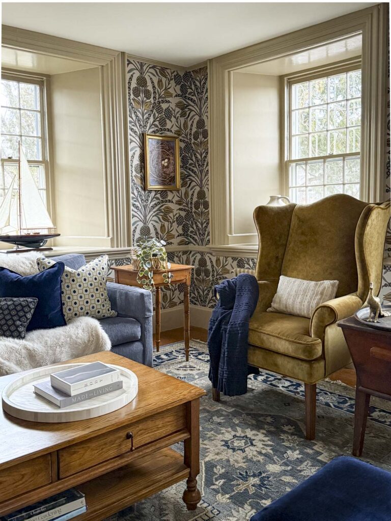
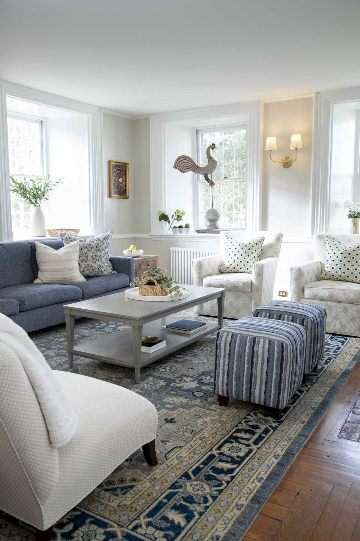
- Analogous Colors: These sit next to each other, such as blue, green, and teal. Analogous color schemes offer a soothing, cohesive look perfect for bedrooms or living rooms.
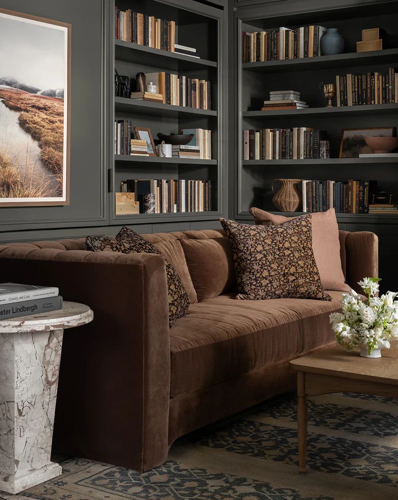
- Monochromatic Colors: Variations of a single color, such as different tones of blue, create a sophisticated and calming atmosphere.
Keep in mind, there are varying degrees of intensity of colors! You can use these elements of color theory while using an entirely low-chroma or dirty color palette to keep everything feeling muted and soft. More on this in the next section!
By leveraging the color wheel, you can experiment with different schemes to find what works best for your home.
Tip 3: Pick A Color Chroma and Neutrals That Harmonize
If you haven’t read up on chroma yet, you may want to read this post about clean colors and what that means. From there, you’ll be able to do the next step effortlessly!
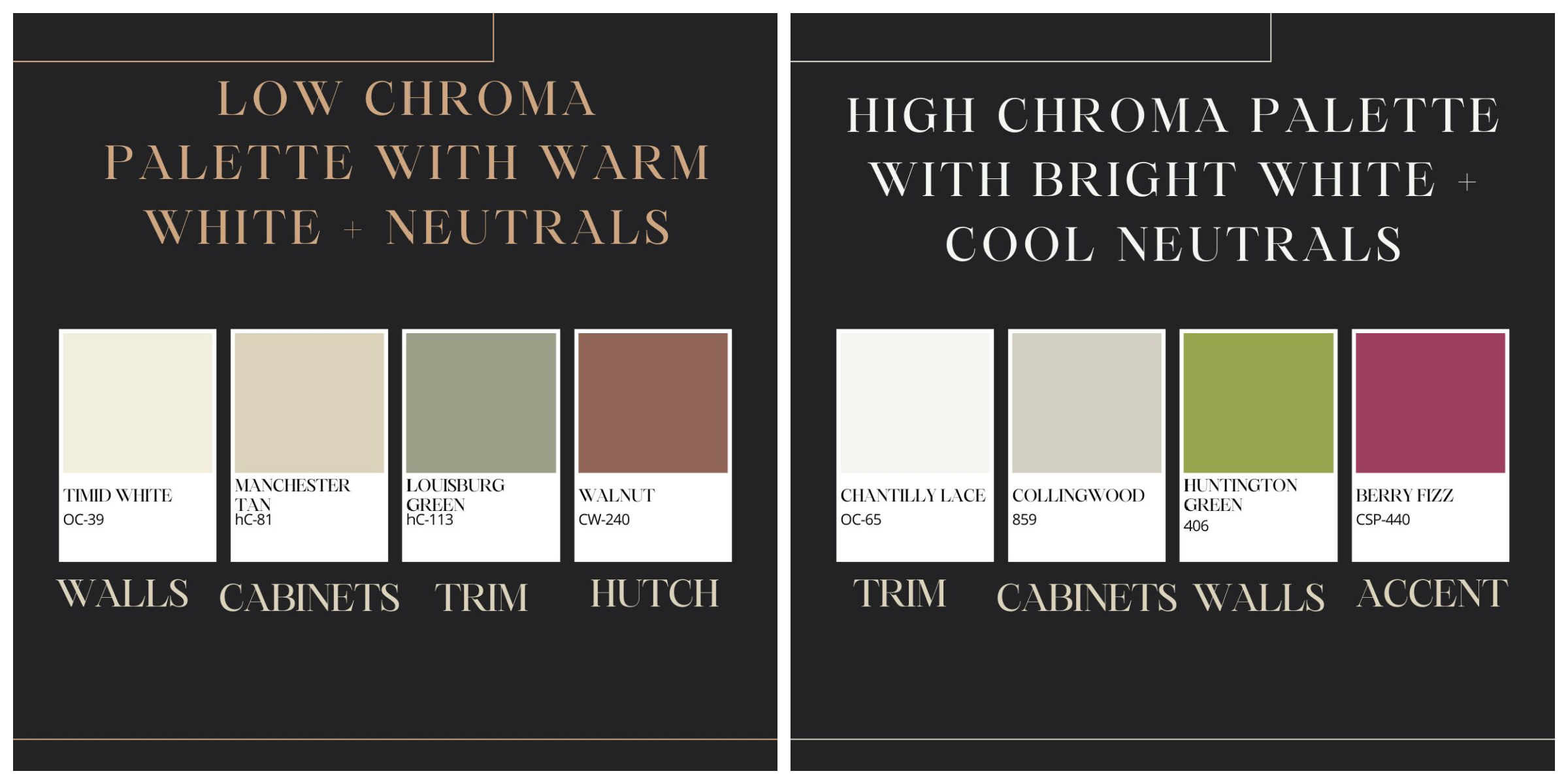
In general if you like bright splashy colors, they go better with cooler less saturated neutrals. And the converse is true of the more muted shades you would find in New England-style interiors. These do well with creamy off whites and warm beige, tans and khaki tones.
Knowing this will help you craft your home color palette and pick your neutrals!
- Decide whether you like low chroma or high chroma and keep all the hues your palette within the same rage- don’t mix!
- From there, you’ll be able to pick your neutrals because vibrant and clean colors go better with whites, off-whites and grays.
PRO TIP: If your room feels off, it may be due to the blend of neutrals in your palette. Most neutrals have a subtle undertone (for example, khaki has a subtle green undertone) and when mixed together they can clash, making the room seem off. Compare them side by side and if one feels oddly pink for example, you probably mismatched your neutrals!
Tip 4: Pay Attention To Light
Lighting dramatically affects how colors appear in your home. Natural light changes throughout the day, altering the way paint looks in a room. For example, light colors, such as light green, can appear washed out in rooms with a lot of natural daylight, while deeply saturated colors like royal blue can seem dull in artificial light.

- South-Facing Rooms: These spaces get bright, warm light, making cool colors like soft blues and greens a great choice to balance the warmth. Pick main colors with a low to medium amount of saturation for a softer look.
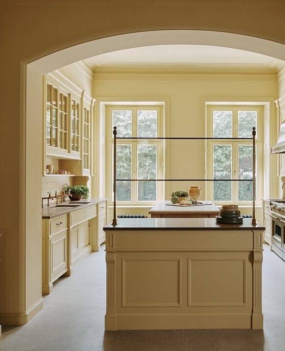
- North-Facing Rooms: These tend to have cooler, dimmer light. Avoid cool undertone colors for these spaces. Warm colors, such as creamy yellows or terracotta, can help make these rooms feel more inviting. While exterior paint colors tend to get brighter when painted on a whole house, interior colors can darken, especially in North rooms.
- Artificial Lighting: Consider how your light fixtures affect color. Warm light bulbs will enhance warm colors, while cool LEDs complement cool tones. Color experts recommend looking at the bulbs’ CRE and to opt for those above 90 for the best color rendering.
Testing paint samples on your walls and observing them at different times of the day is essential to ensure you choose the perfect color.
Tip 4: Use Neutrals To Bring a Whole House Paint Scheme Together
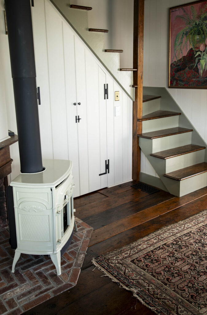
Neutral tones like white, cream and beige are versatile and timeless. They serve as the foundation of many successful interior color schemes. I tell my color consulting clients that if they’re not committed to a particular color, its always safe to use a neutral on the walls and to add colors in pops in the form of furnishings, an accent wall, an area rug and accessories. This is called an Accented Neutral Scheme and it is relatively easy to create.

- White Walls: White walls provide a blank canvas, allowing you to experiment with bright colors in your furniture and decor. Benjamin Moore’s Navajo White is a popular choice for its subtle warmth and peachy undertones. I love a warm white paint color or cream paired with wood and earth-tone textiles.
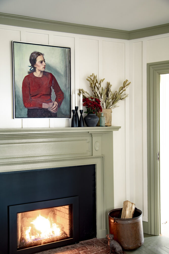
- Earthy Color Palette: Soft taupe and sandy beiges like Tapestry Beige, Ben Moore Muslin or Edgecomb Gray, and muted greens like Creekside Green or Nantucket Gray create a grounded, calming effect. Pair these with natural materials like wood and stone for a cohesive look.
- Layering Neutrals: Use different shades and textures within the neutral family to add depth and interest to a space without overwhelming it.
- Soften Contrast: While I love rich tones like dark green and dark blue they can create a lot of contrast. I used mid tone neutrals in my master bedroom to soften a high contrast paint color scheme. The light wall colors and dark wallpaper on the accent wall created drama. I was able to soften the contrast by adding a mid tone natural Belgian Linen duvet cover and neutral carpet to help bridge the gap. Another way to do this is to use a less saturated version of the same hue that is also lighter in value. For example, instead of a brighter red, try a rusty peach paint instead.
Neutral tones are particularly effective in open floor plans, where they provide a unifying backdrop for varying design elements.
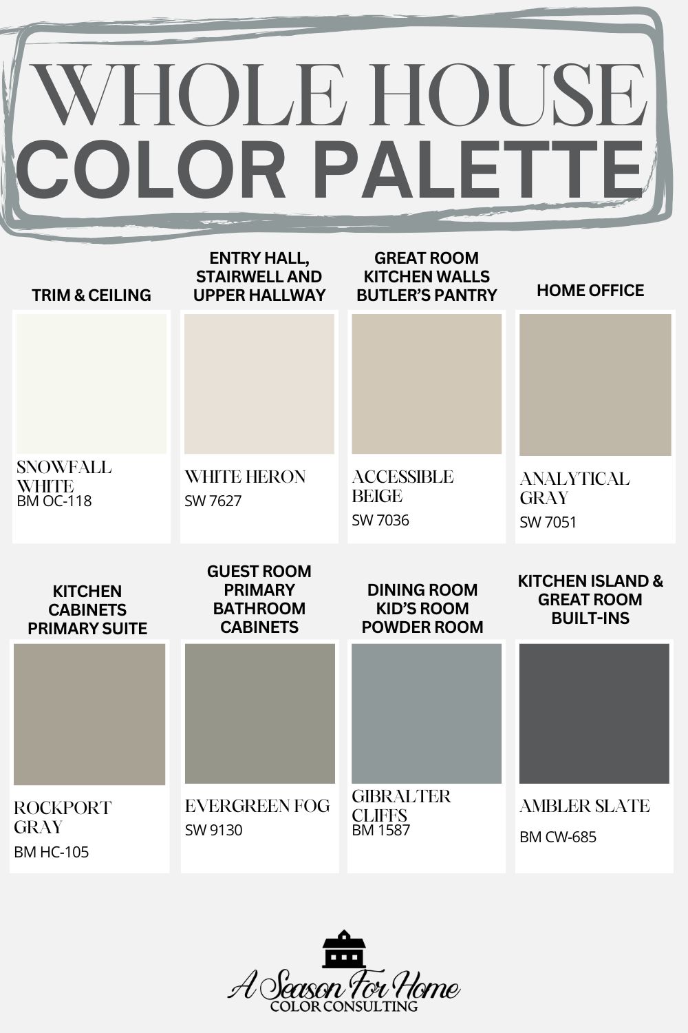
Free Home Color Scheme
If you are looking for a jumping-off point, try one of these free color palettes I created. You can use them as a starting point and then tweak them to suit the needs in your home with your fixed elements and lighting conditions!
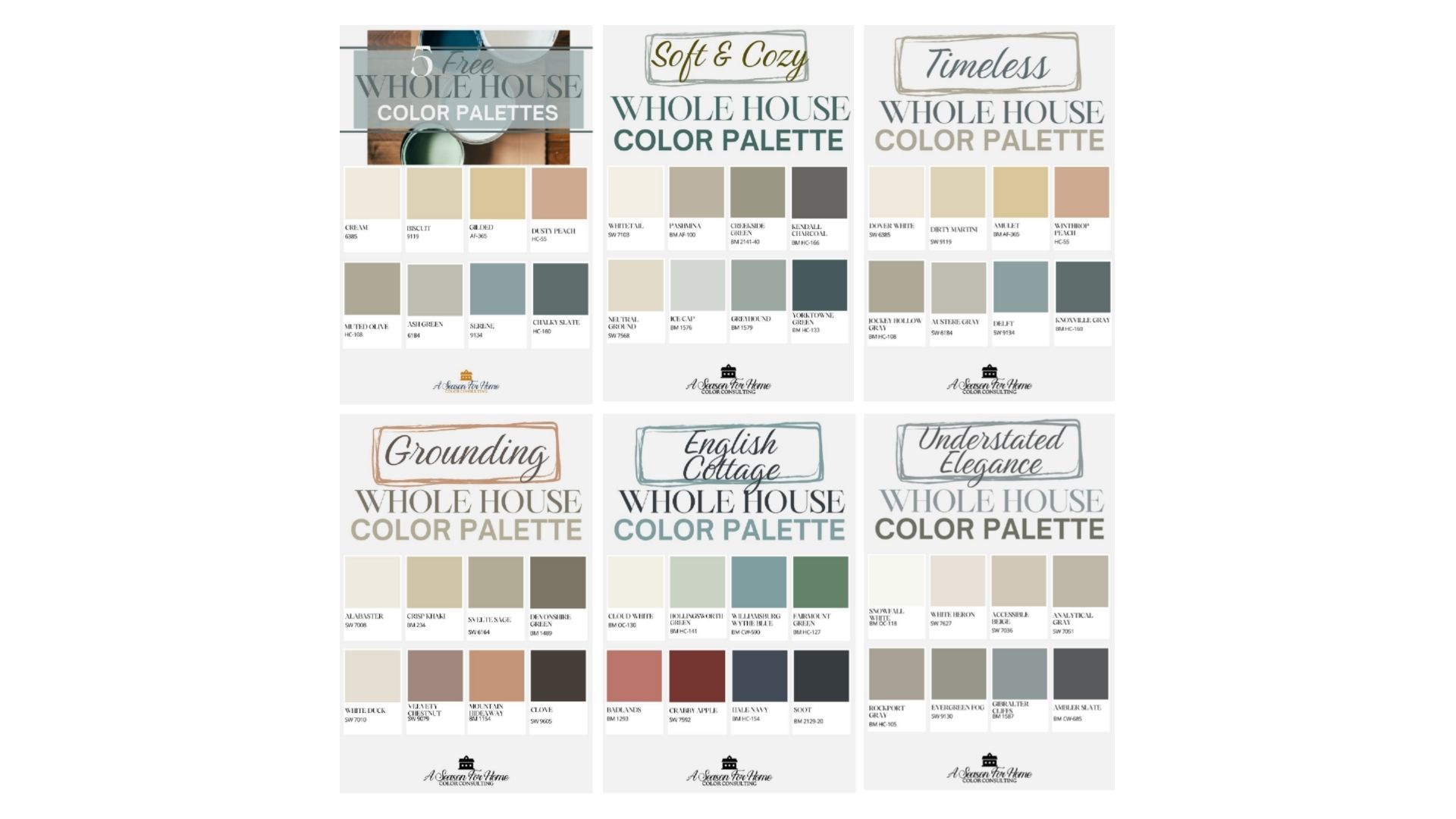
You can access them here. You can also get more tips on how to use these paint color schemes here.
Finding Your Best Home Color Combination
Choosing the right color combinations for your home doesn’t have to be overwhelming. By considering the flow between rooms, understanding the role of light, and using tools like the color wheel, you can create a color harmony. Start by identifying your desired mood for each space and build your palette around those goals. Remember, every room has its own function and personality, so your color choices should enhance both. Whether you opt for a bold complementary scheme or a soft, monochromatic look, let your vision guide the way.
Neutrals remain a timeless choice for creating balance and cohesion throughout your home. They serve as a versatile foundation, allowing you to layer in color and texture through furniture, accessories, and accent walls. Don’t forget to test your selections in different lighting conditions to see how they truly look in your space.
With these strategies, you can confidently transform your home into a space that reflects your style and meets your needs, one thoughtfully chosen color at a time. If you do this right, you’ll also have the added benefit of moving furniture from one space to another and it will all work together!
And remember if all else fails you can do a virtual color consultation with me. Learn more about working with a color consultant here.
Want more color tips? Here are some suggested readings!
- For those who don’t love yellow undertones read our Natural Cream review.
- If you love historic homes, hi!! And you may be into this post about Common Mistakes I See In Old Houses Here in New England
- If you have any existing gray furnishings or fixed elements but want to warm up your space, consider using a taupe wall color like Smokey Taupe.
amazing color tips