Clean Colors: What are they?
When I was working as an interior design assistant, I learned the difference between clean colors and dirty colors. Today I will explain the difference between clean and dirty colors and why it will make or break your color schemes for interior decorating. I’ll show you how keeping clean and dirty colors separate is so important! Read on to learn a simple trick for creating a cohesive color scheme that flows from one space to the next without clashing or creating any jarring contrasts.
First of all, let’s preface this discussion by saying I am not a fan of calling colors “dirty” because that connotes they are bad. I personally prefer these so-called “dirty” colors over clean ones! When working with clients to pick out their home color palettes, I like to call dirty colors “low chroma”, “muted”, “complex”, “earthy” etc. Conversely, I refer to clean colors as high chroma, pure and bright.
The first time I heard a color described as “clean” I had already achieved my degree in Art, but I had never heard of clean colors or dirty colors before. {I had heard about the importance of keeping my brushes clean when creating a painting, but that was it!}
Knowing the difference between clean and dirty colors was essential in doing my job as a design assistant! My boss was a well-known color expert and in the Color Marketing Group. Before she sent me out into the design center to bring back samples of “red” fabric, she taught me that even a subtle difference in chroma can really make or break a color scheme.
In this post, I will go over what a clean color is, when to use them and when not to! I will also share some examples so you can SEE just what I am talking about!
Essential Color Vocabulary
Before we get into clean vs dirty colors, I need to go over a little bit of vocabulary and color theory. There are four terms that are essential to understanding what a clean color is: Hue, Value, Saturation and Chroma. If you already know these terms, jump ahead to What Is Clean Color in the following section.
What is hue?
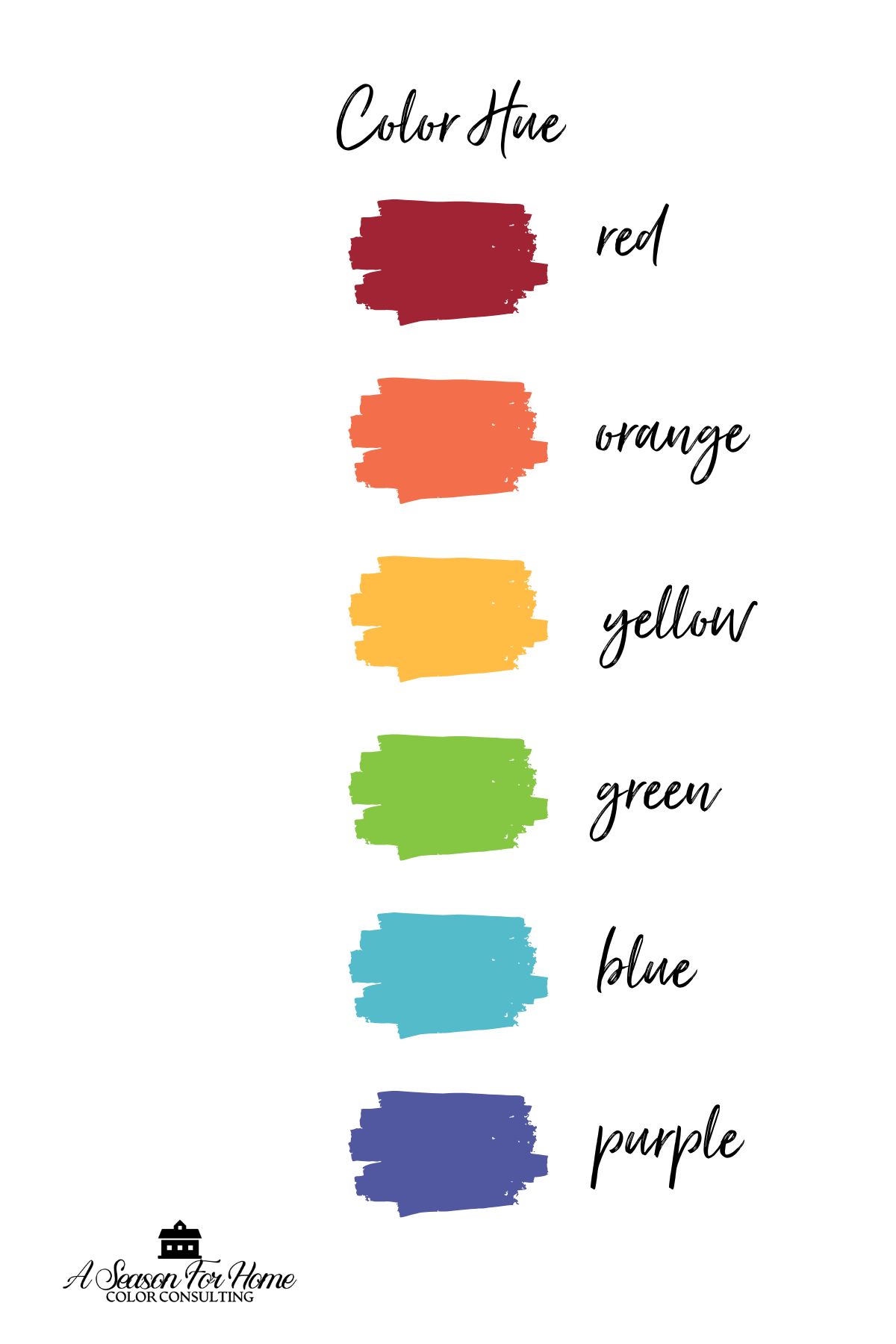
In color theory, hue refers to the pure, base color of the spectrum, such as red, blue, yellow, green, etc. Hue is the color’s name.
- Primary hues: Red, blue, yellow (cannot be created by mixing other colors).
- Secondary hues: Green, orange, violet (created by mixing two primary hues).
- Tertiary hues: Red-orange, yellow-green, etc. (created by mixing a primary with an analogous or adjacent secondary hue).
What is Color Value?
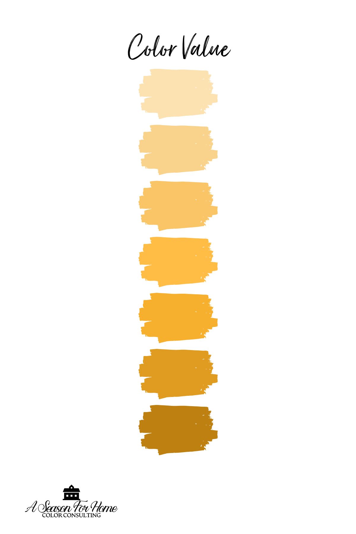
Another property of color is value, which refers to the lightness or darkness of a color. In talking about house paints we measure this in a scale called Light Reflectance Value (LRV). LRV measures the amount of visible light a color reflects, on a scale from 0 (absolute black, no light reflected) to 100 (pure white, maximum light reflected).
- Colors with a high value (or high LRV) are lighter, like soft pastels or whites, which reflect more light.
- Colors with a low value (or low LRV) are darker, like deep navy or charcoal, which absorb more light.
If that doesn’t make a ton of sense to you, maybe this will help. During a color consultation I tell clients to forget all about the hue of the color when trying to understand value and instead think of a gray scale from white to black and everything in between. Once you can visualize that you can understand value.
What is Saturation?

The third key property of color is saturation which refers to the amount of pigment in a color. It describes how vivid or intense a color appears. As an artist, I describe it like this: The more of a single hue pigment you add to the base or paint medium the more you will increase the saturation. Saturation is a relative term that serves in proportion to a colors value.
What is Chroma?
The last vocab word to know for this discussion is chroma. This term is often confused with hue, but they’re different. Here’s how:
- Hue is the basic, pure color on the spectrum, like red, blue, or green. It defines the “type” of color based on its position on the color wheel. Hue answers the question, “What color is it?”
- Chroma, on the other hand, refers to the purity of a color. It measures how clean or dirty a color is. It measures how much gray a hue has.
For example, both a bright firetruck red and a muted brick red share the same hue (red), but their chroma levels differ. The firetruck red has high chroma, while the brick red has low chroma.
High chroma means the color is a pure hue, while low chroma means gray, brown or a complimentary color is added into the pure hue to make it appear more muted, muddied or grayish.
What is a Clean Color?
It is important to understand that colors have hue, value and saturation. Each property can be tweaked to change the color! And it is important to understand any hue (green, blue, red etc) can have variations that are either clean or dirty!
A clean color is a high chroma color, whereas a dirty color is a low chroma color.
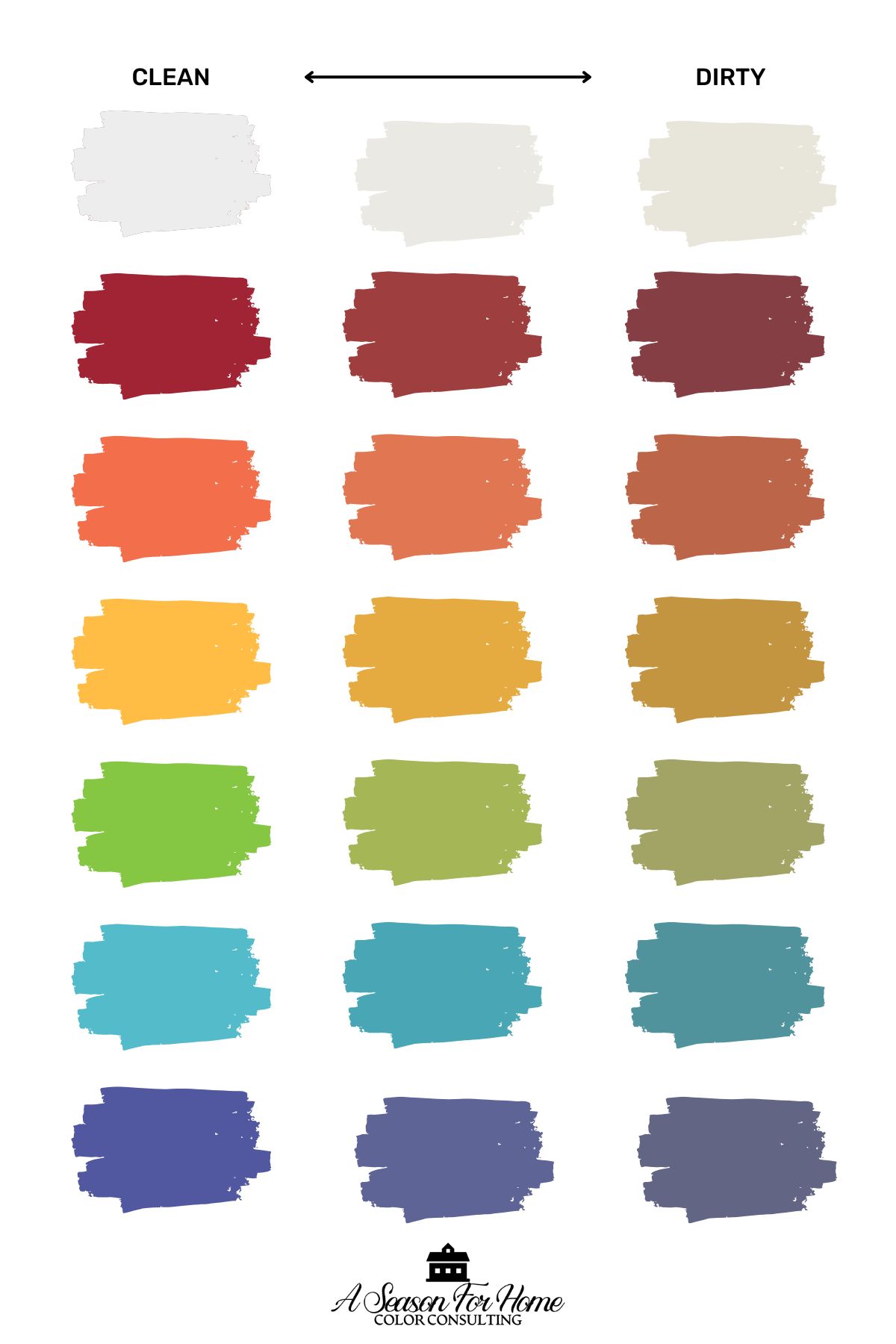
A clean color is a hue that is pure, bright, fresh and simple. When talking about mixing colors on the color wheel, a clean color is a single pure hue or one made from mixing two primary (or analogous colors.)
Clean colors do not have other pigments (from across the color wheel) to muddy them.
Conversely, a dirty color will appear more muted and complex. They’re a little more je ne se quoi! Like an expensive perfume that has a touch of musk, these dirty colors often have a touch of their complimentary color blended in in a small amount to make them less stark.
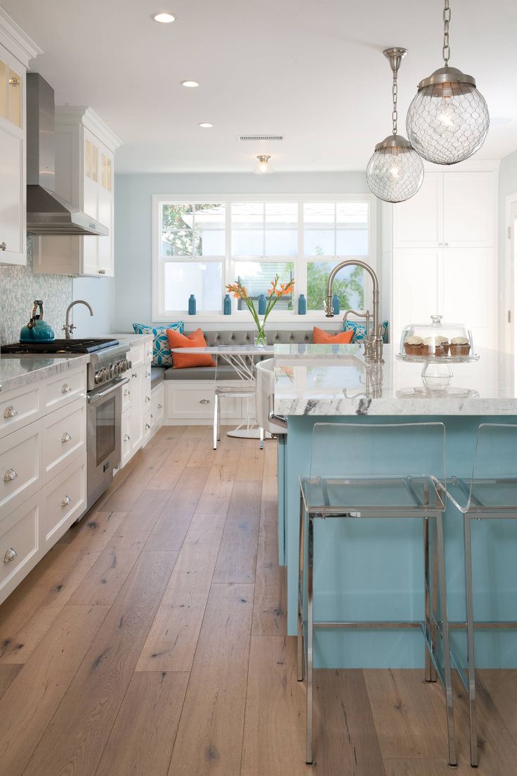
Below you can see two kitchens. One uses a clean palette and the other a dirty palette.
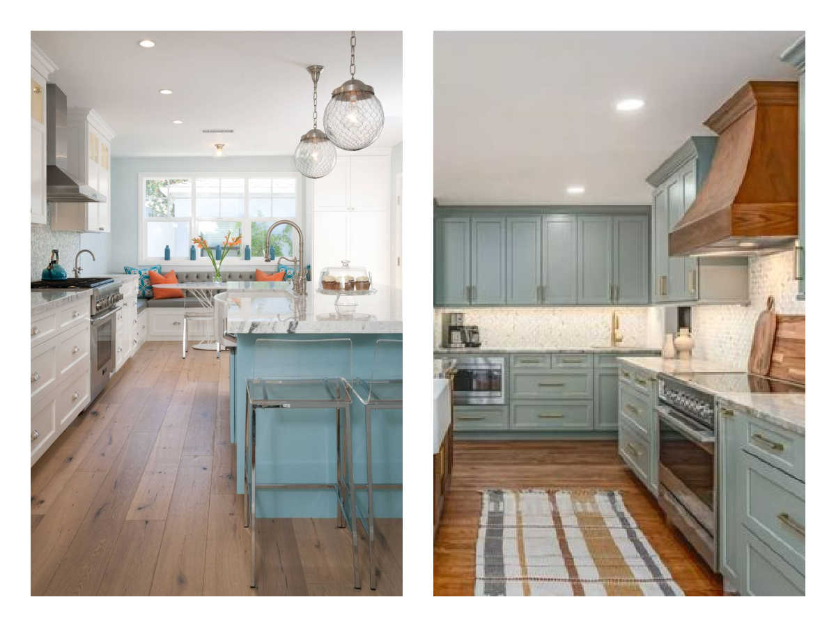
Above Left: In the first example on the left the aqua blue cabinets and orange pillows are clean colors.
Above Right: In the second photo on the right, the cabinets are a more complex blue-gray-green and they are paired with a rug with complex earth tones. The second palette is all dirty colors.
When To Use Clean Colors
- Use clean colors to decorate your home if you love them and prefer them over dirty colors.
- If you like a fresh, bright look.
- If your fixed elements in your interior space (like countertops, flooring and unchangeable surfaces like fireplace surrounds) are mostly cool grays.
- If you love to decorate with black and white with pops of colors. Clean colors look awesome in these spaces.
When To Avoid Clean Colors
- Do not use clean colors when your fixed elements are warm and earthy. For example, if you have travertine floors or tile or a brown granite countertop you will have an easier time working with low chroma colors.
- In general, if you like to decorate with mostly cream and beige you should avoid clean colors. When paired with warm neutrals clean colors can look jarring and brash.
- Most importantly, don’t use them if you don’t like them. Before every color consultation, I work with a client to determine if they prefer one over the other using sample images and a shared Pinterest board. It is important to surround yourself with the colors you love. So if you lean toward more muted subdued tones don’t decorate with clean colors.
Color Rule: Do not Mix Clean and Dirty Colors
You will also want to avoid them if your whole house is already decorated with more muted colors. Which brings me to the most important part of this post: you should not mix clean and dirty colors!
Don’t worry there are clean and dirty versions of all the colors so you’ll still be able to decorate with all your favorite colors, you just need to pick the right ones, and then keep in the same color family.
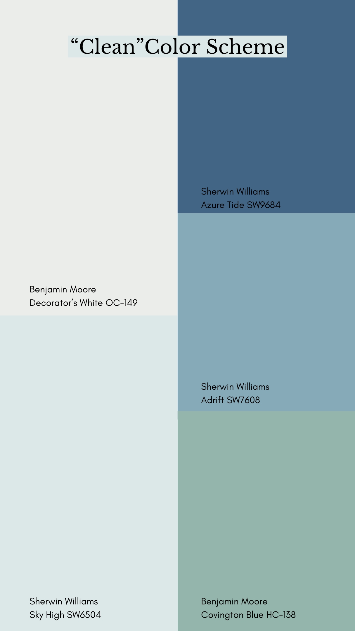

For example I have two monochromatic blue color schemes above that show the use of both types of colors. Both look great! It’s just a matter of deciding which one you like better, and sticking with it.
When picking a color scheme for your house, it is important to keep the chroma of the colors in the same range so they all live happily together.
Examples of Mixing Dirty and Clean Colors
Now let’s look at a few examples showing color schemes where clean and dirty got mixed together. Below on the left you can see a color scheme which is comprised of all clean colors plus one low chroma yellow, aka dirty color. (I picked Lapland, AF-410.)
On the right the exact same palette is used swapping in a cleaner yellow color for the Lapland. Take a moment to study these two!
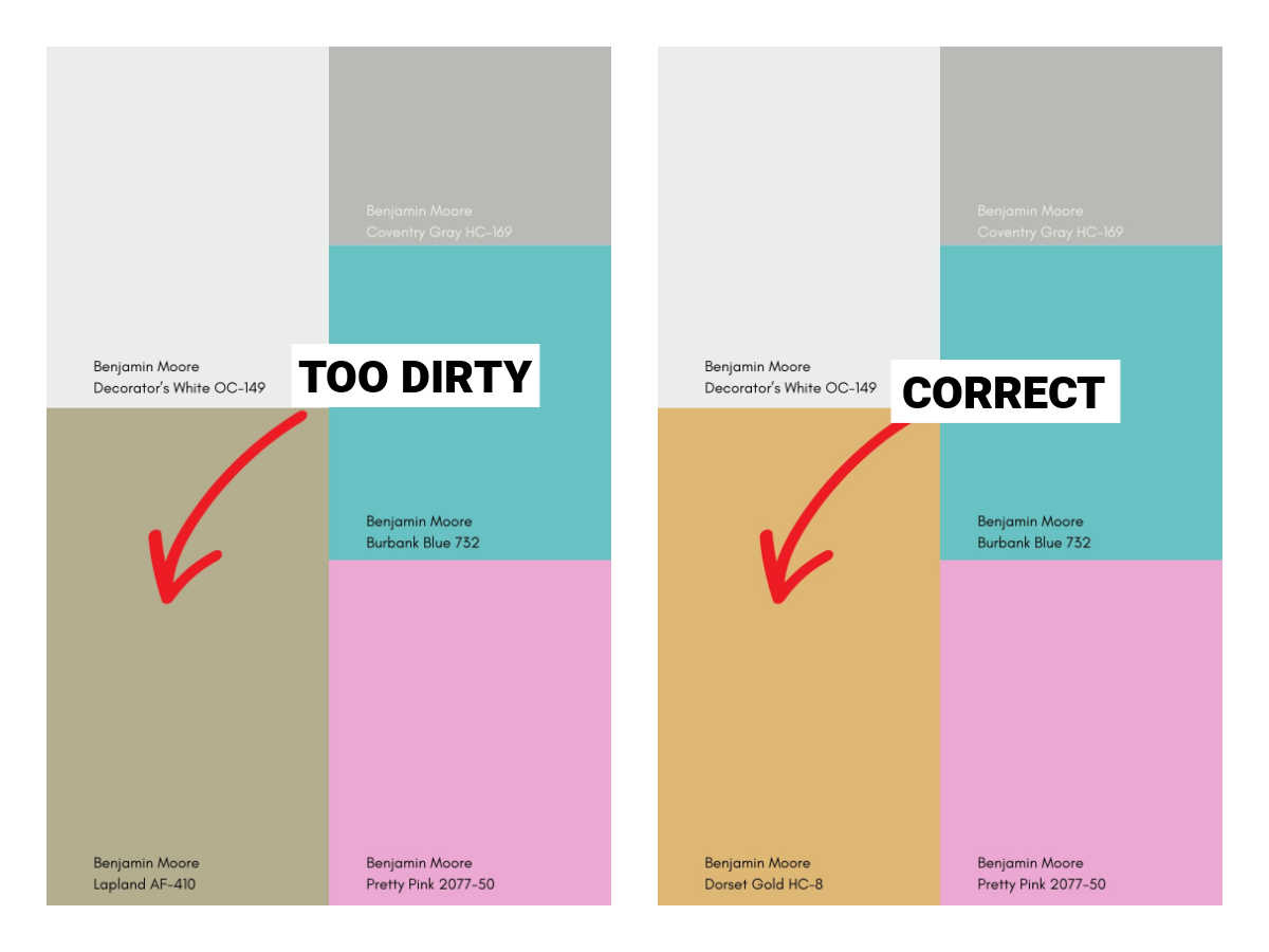
Once you study the two palettes it is clear that breaking the rule of mixing clean and dirty colors is a rule for a reason! That said, there are exceptions to this, but in general leave the rule-breaking to the experts who know when they can get away with it.
Or perhaps you may be thinking, well maybe Lapland is just an ugly color. Not so! When Laplad is paired with other colors with a similar chroma, ones that are equally dirty, it is a real beauty of a color! See below how harmonious it looks in an all-dirty palette.
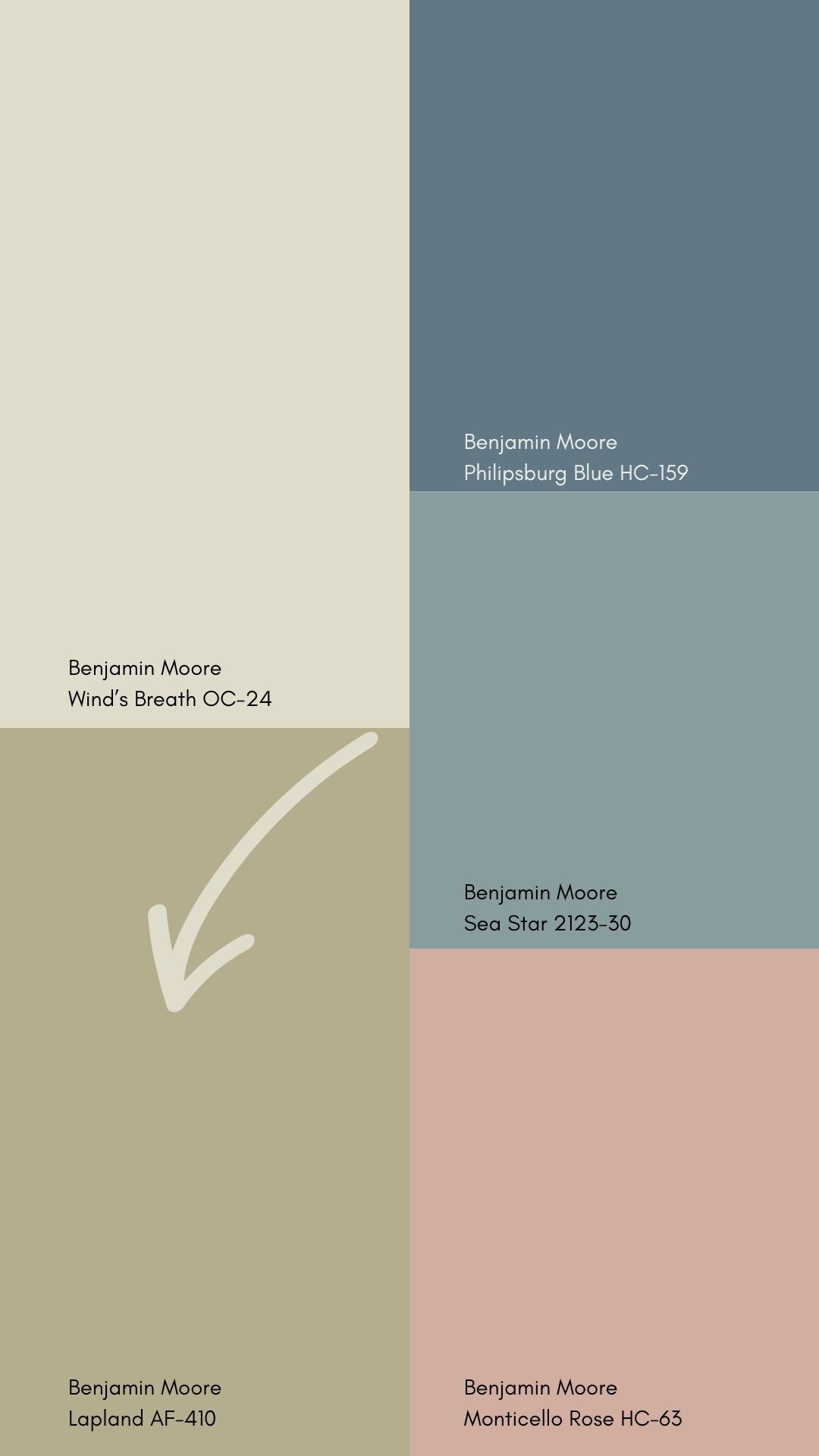
When paired with these other complex shades, all of which are muted hues, it suddenly seems just right!
How Can I Tell If a Color is Clean or Dirty?
The best way to know if your color is clean or dirty is to compare it to another hue in the same family. Colors are always affected by what is next to them, so to study them, understand their undertones and determine if they have a low or high chroma you must compare them to a control color.
To find the undertone of neutrals, we use a gray to find them. However, to see the chroma of a colors you have to use the most “primary” version of the color for best results.
For example, if I wanted to find out if my yellow was dirty or clean I would place a paint chip of a brighter, saturated yellow next to it to compare it. That way you can see the undertones.
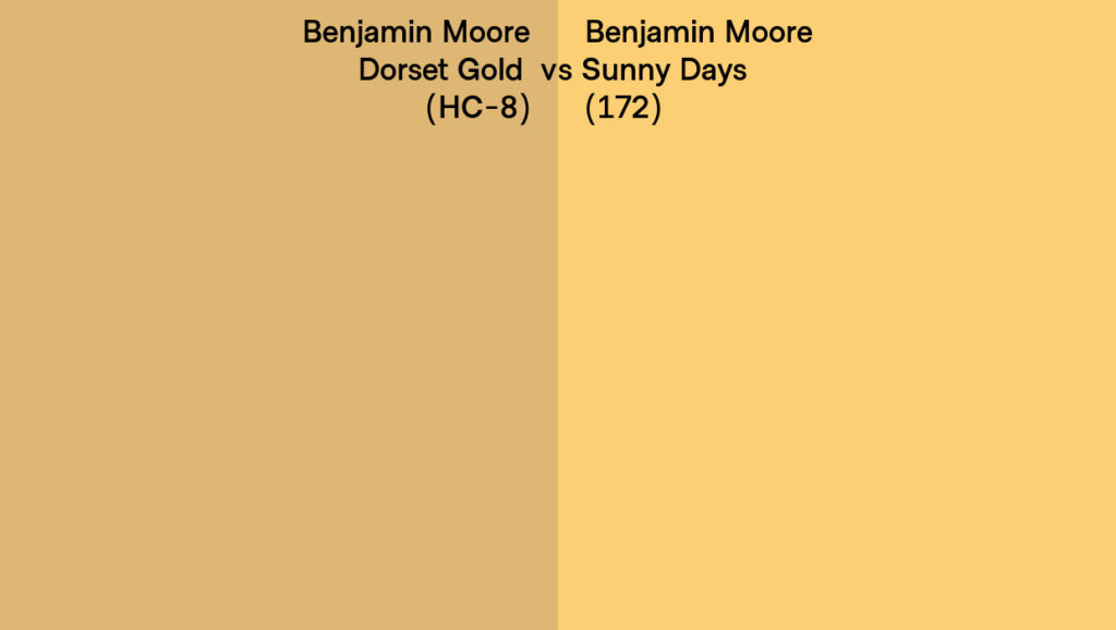
To complicate matters… there are varying degrees of dirty or cleanliness too! Oh no! Remember this image we just talked about (shown again above) when I added Dorset Gold into our “clean” palette to fix the problem Lapland created??? Well, I have news. Dorset Gold is fairly “dirty” when compared to an even cleaner yellow! So in other words, it is always relative.
How To Pick The Right Level Of Chroma
Let’s say you read all this and you’re more confused than ever. There’s good news.
- Go Historical: Many paint companies have historical color palettes and in general, these colors are all on the dirty end of the spectrum. So if you’re not sure, and you prefer more muted and complex colors you can stick to picking from the historical deck.
- Use a Curated Brand: In general, all of Farrow and Ball colors are dirty and are curated so that you can pair them easily.
- Use Only One Deck or Collection: Sherwin Williams recently launched some color capsules. I also like the Affinity colors collection from Ben Moore for picking a palette within the same range of chromatic cleanliness.
- If you like clean colors, the Sherwin-Williams fan deck separates out the clean colors nicely.
- And if you’re not sure still, maybe it is time for a one-on-one color consultation with me! I am booking online virtual color consultations for interiors and exteriors as well as in-person color consultations in Vermont only.
Are clean and dirty colors another way of saying cool and warm colors? You say don’t mix the two but I thought you could mix warm and cool colors- example – warm white oak flooring with a cool green cabinet color?
Thanks for clarifying.
Warm and cool refer to the hue, not so much the chroma. Warm colors are generally red, yellow and orange. And cool colors are green, blues and purple. Of course there are warmer greens and cooler greens so this term warm/cool is more of a way to compare colors to one another. And it is okay to combine warm and cool colors. A common color scheme is to place complimentary colors together which come from opposite sides of the color wheel. So when you do this you always get a warm and cool.