Taupe Paint Colors
If you are searching for a shade of paint that feels warmer than gray but not yellow, taupe is the answer. Today’s post is for you because I have all my favorite Taupe Paint Colors listed below! I’ll also share whites to pair with taupe, a color pairings and when to avoid using taupe (and what to do instead).
If you are new here, my name is Katie. I am a certified color expert and all-around paint-obsessed gal. Through my color consulting business, I have helped everyday homeowners choose paint colors for their homes, from the Rocky Mountains to sunny Florida. In today’s post, I am sharing the best taupe paints from Benjamin Moore and Sherwin-Williams that I actually use with my clients.
If you like Accessible Beige, you’ll Love These Taupe Paint Colors
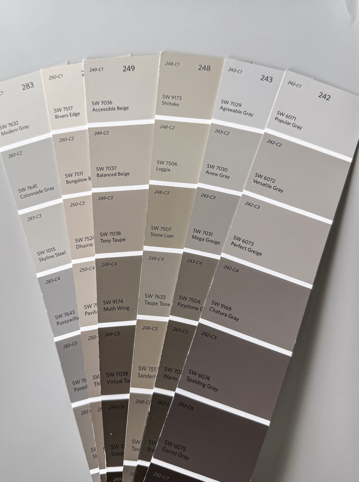
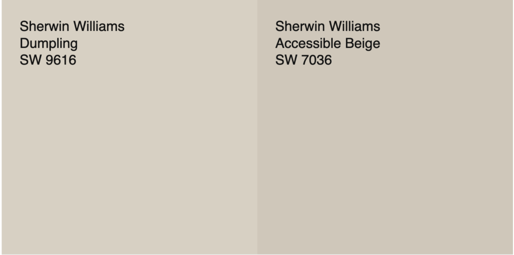
If you love the idea of using a warm neutral wall color but want to avoid a true beige (that would slide straight into early-2000s vibes) you are not alone! A lot of my clients have this same quandary and inevitably ask me about Sherwin-Williams’s super popular Accessible Beige.
This is arguably the most popular taupe paint on the market. {Aside: Though the name calls it a “beige”, it is actually much less saturated. Read the difference between beige and taupe here.}
While I love Accessible Beige, and in fact it is included below in this lineup of my favorite taupe paint colors, I wanted to create a more comprehensive collection of paints that have a similar vibe, but vary in value and undertone to fit every home’s unique lighting and needs.
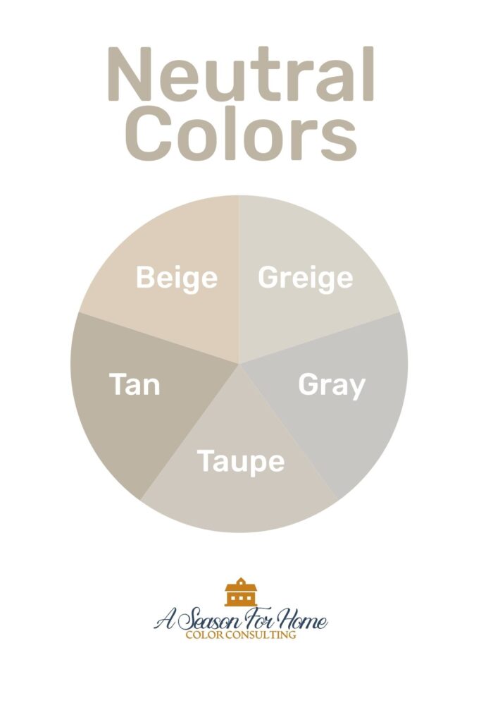
What Is Taupe Color?
- Taupe is a warm neutral color that sits between tan and gray.
- When lightened, it becomes greige.
- Taupe is similar to beige in value, but it is far less saturated and has a relatively cool color temperature.
- Some mushroom-leaning taupes have a slight green undertone, while others are more sandy and lean a little peachy. While these are all technically taupes, the distinguishing factor is the relative amount of gray mixed in.
- In northern exposure with cooler or bluer light taupe can have an almost purplish cast.
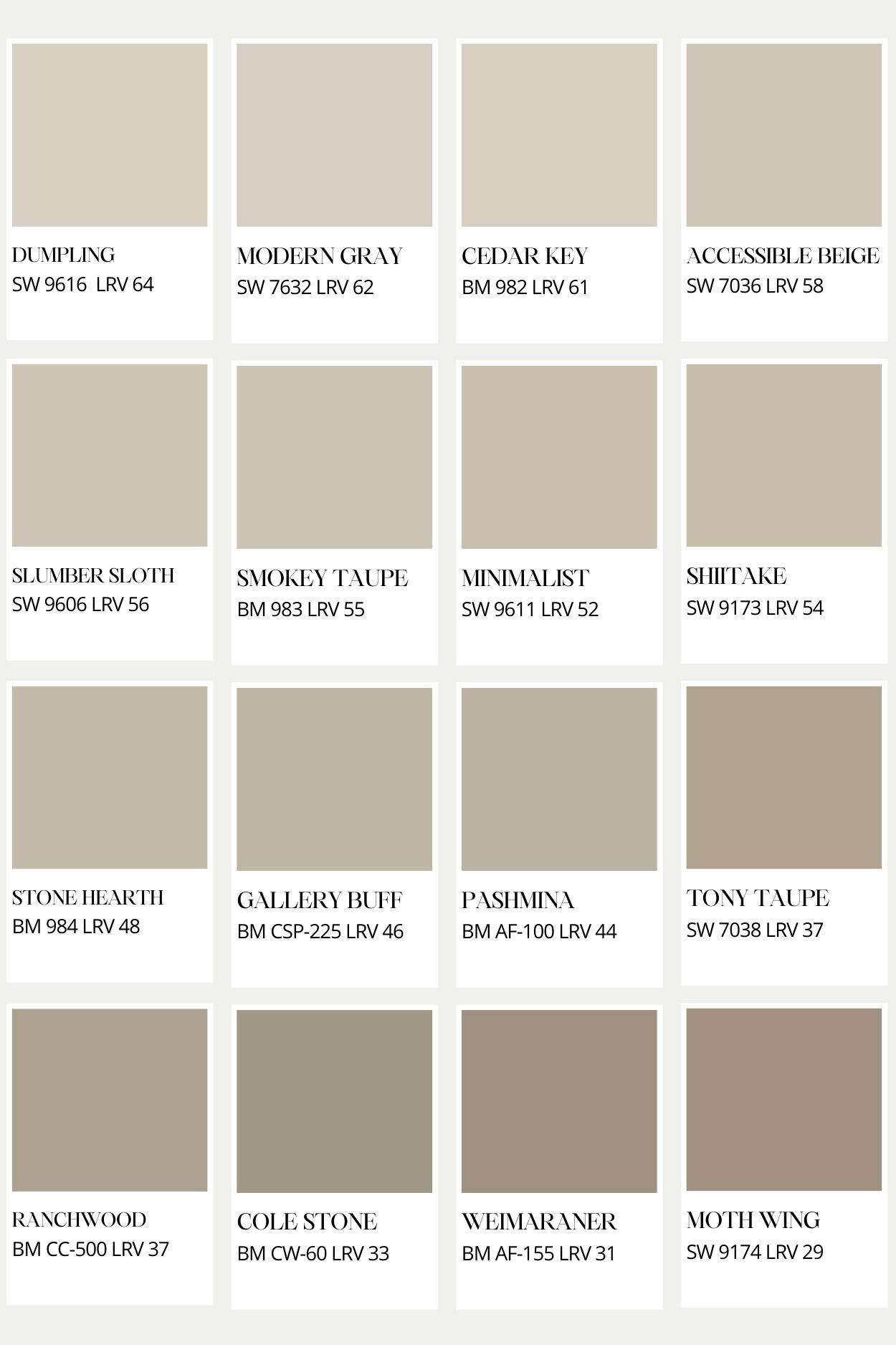
16 Taupe Paint Colors (Lightest To Darkest)
Below is my list of taupe paint colors I recommend to clients and have used in my own home.
Pro Tip: The taupe paint colors in this list are medium-light to medium-dark. (65 to 30 LRV.) If you are looking for something lighter than these colors, then you are probably looking for a greige paint color. Ballet White and Natural Cream are two favorite greige colors. You may also find my Minimalist Paint Colors helpful- there are some other options listed there that you’d like.
I’ve arranged them from lightest to darkest, and you will see in the below graphic that there is a range of tonality due to the undertones. These are all technically taupe, but some lean sandy (reddish) and some lean green. Theres another interesting thing about taupe in that it can do funny things in low light. So make sure to look at actual paint chips before buying samples! As with all paint colors, these will look different on the screen than in real life- and taupe is especially prone to variations from screen to reality!
Sherwin-Williams Dumpling – LRV 64
When a client wants a lighter shade of Accessible Beige, a lot of times, they will ask me about lightening it by a certain percentage (which is a common internet thing that I do not recommend). Instead, I say go with a known entity and try Dumpling!
This designer collection color is bordering on greige territory but has enough depth to still feel like a taupe. I love it with tone-on-tone pairings (like with White Duck or Minimalist by Sherwin-Williams) It is soft and bright but doesn’t look gray.
Sherwin-Williams Modern Gray – LRV 62
I included this one for the true minimalists here. It is a barely there wall color for people who do not like a hint of yellow. Which is another way of saying it can look gray to those of you who have a higher tolerance for warmth.
If you are leaning toward this color, make sure to buy a sample from Samplize before you commit to buying a whole gallon of this paint as it can skew pink in certain light.
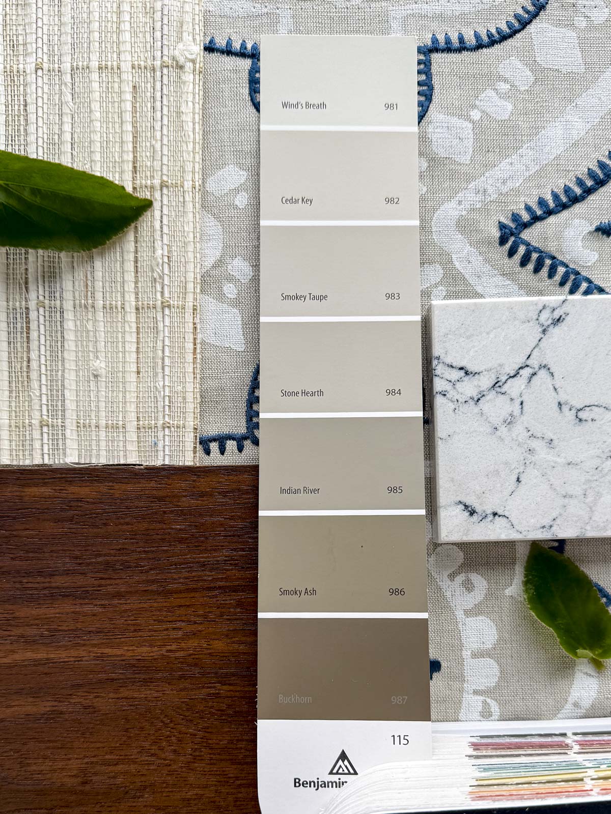
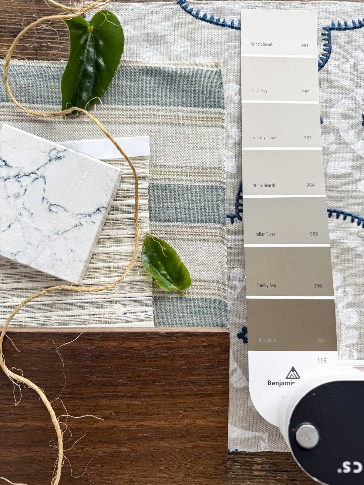
Benjamin Moore Cedar Key – LRV 61.05
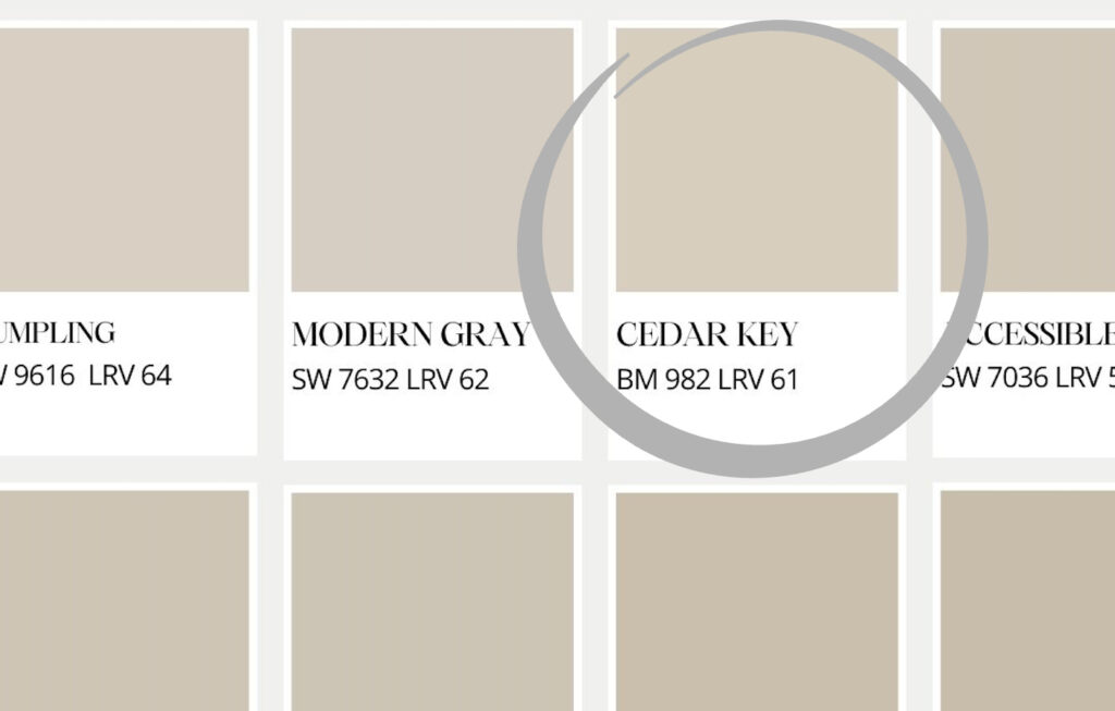
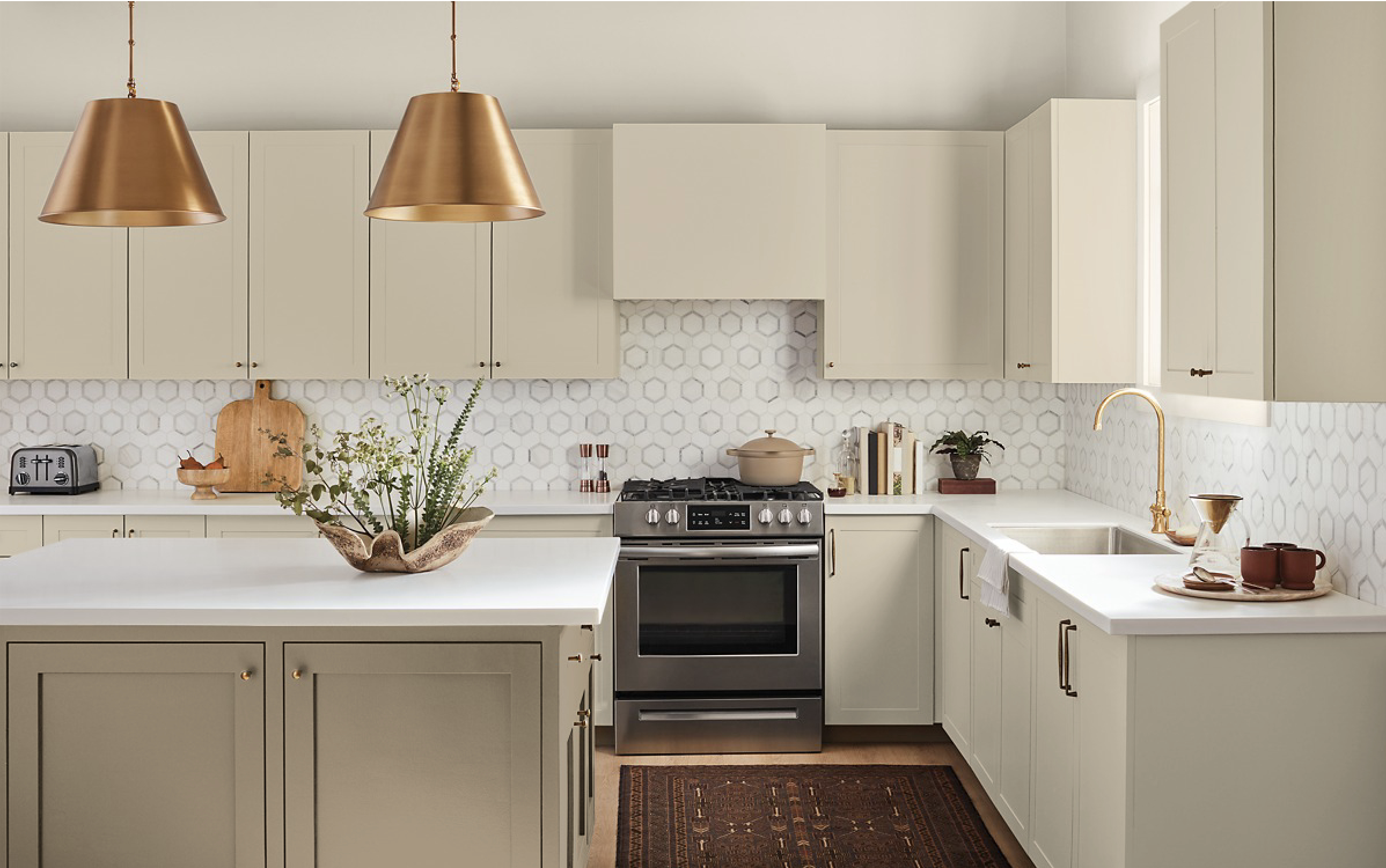
As you can see from my above graphic, Cedar Key is super similar to Dumpling and Modern Gray. It is a little creamier than Modern Gray and can still skew purplish in darker rooms so make sure to check out our troubleshooting tips below for this issue. Cedar Key by Benjamin Moore is on the same paint chip as Wind’s Breath (see my Minimalist Colors), Smokey Taupe and Indian River (see below.) It’s a really good wall color in Southern-facing rooms and would be lovely on kitchen cabinets or a bathroom vanity.
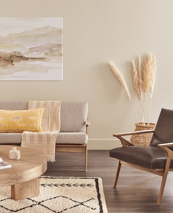
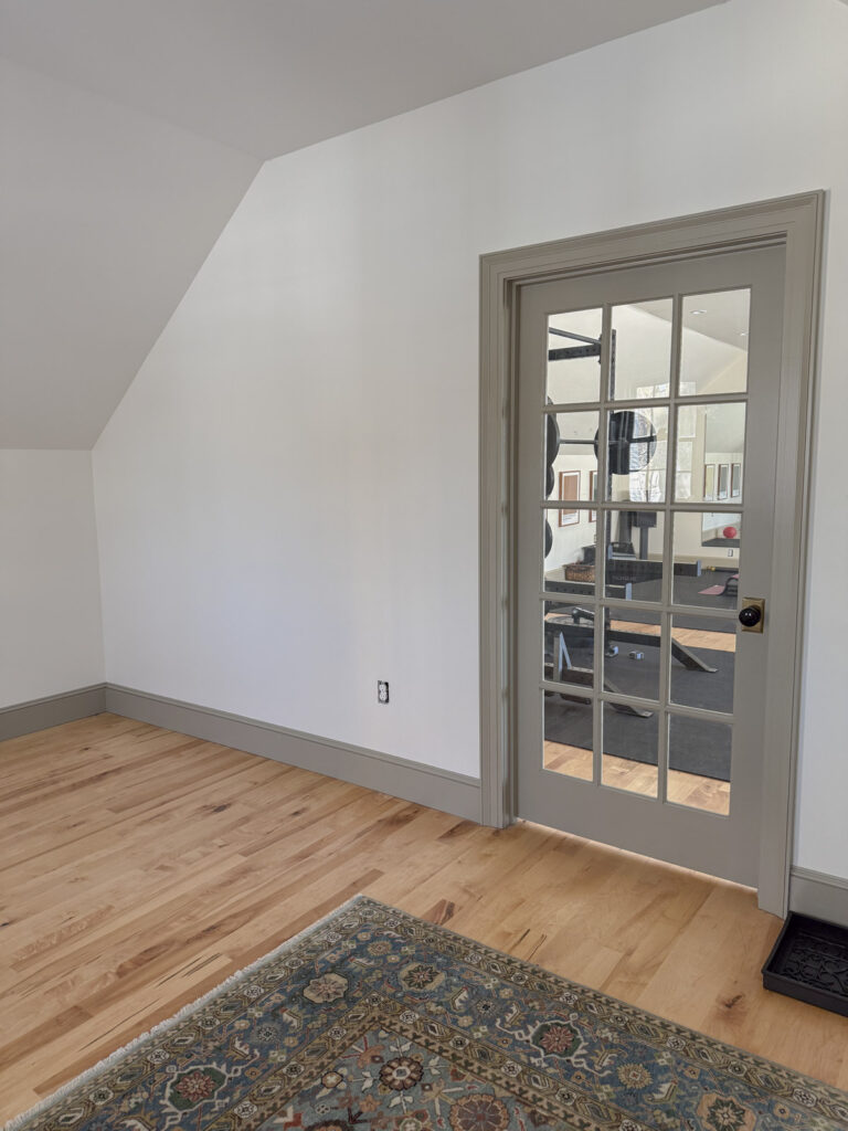
Sherwin-Williams Accessible Beige – LRV 58
Accessible Beige is like the homecoming queen in a John Hughes film. You kind-of hate her because she is so perfect. Even still, I love this color and have specified it more times than I can count. What can I say, if it ain’t broke…
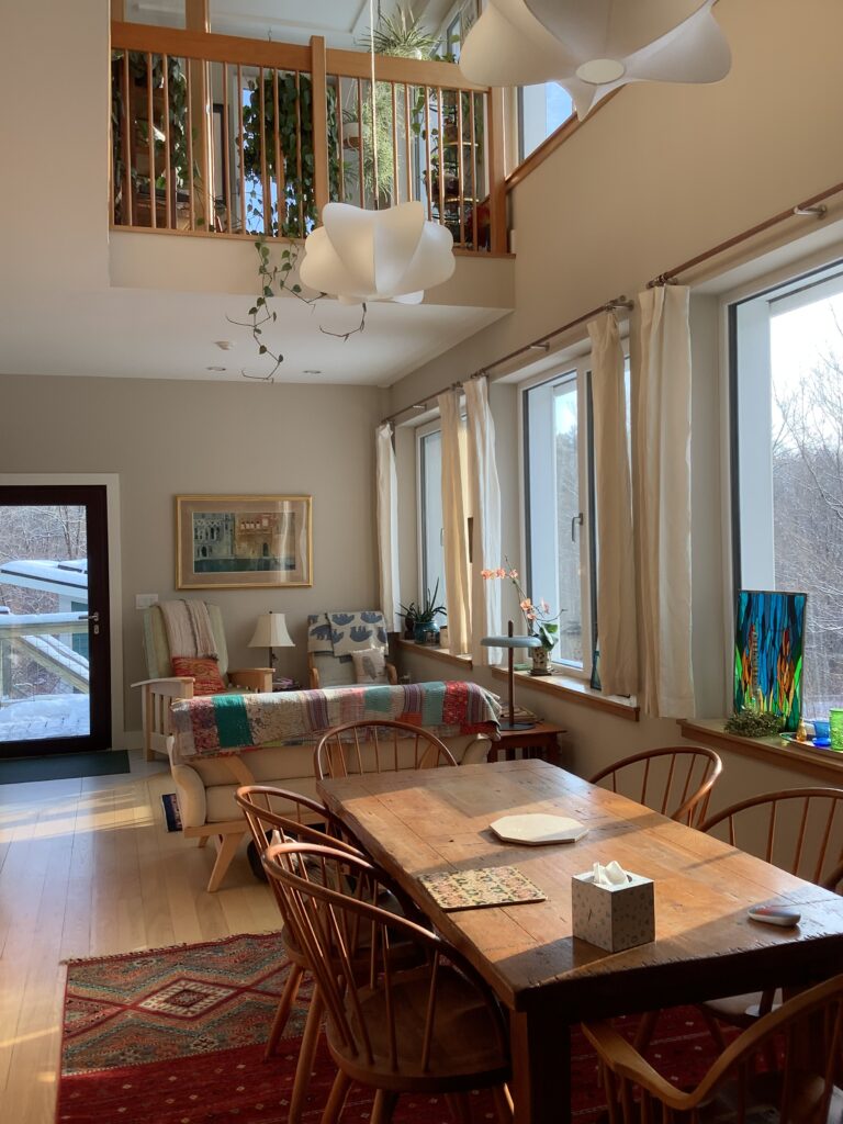

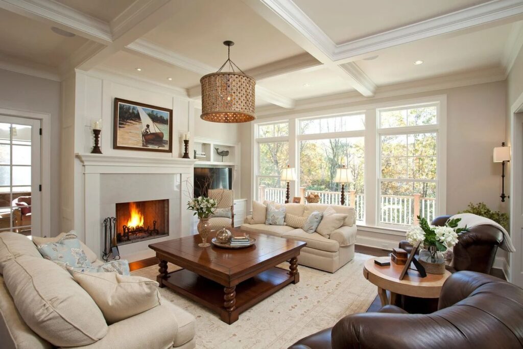
Seriously, Accessible Beige is a great whole-house taupe paint color because it has plenty of depth without being too dark. Above you can see Accessible Beige in my client’s home. They have a two story Great Room that is flooded with light. We paired it with crisp white trim for a tradtional look. It looks great with their low-chroma decor.
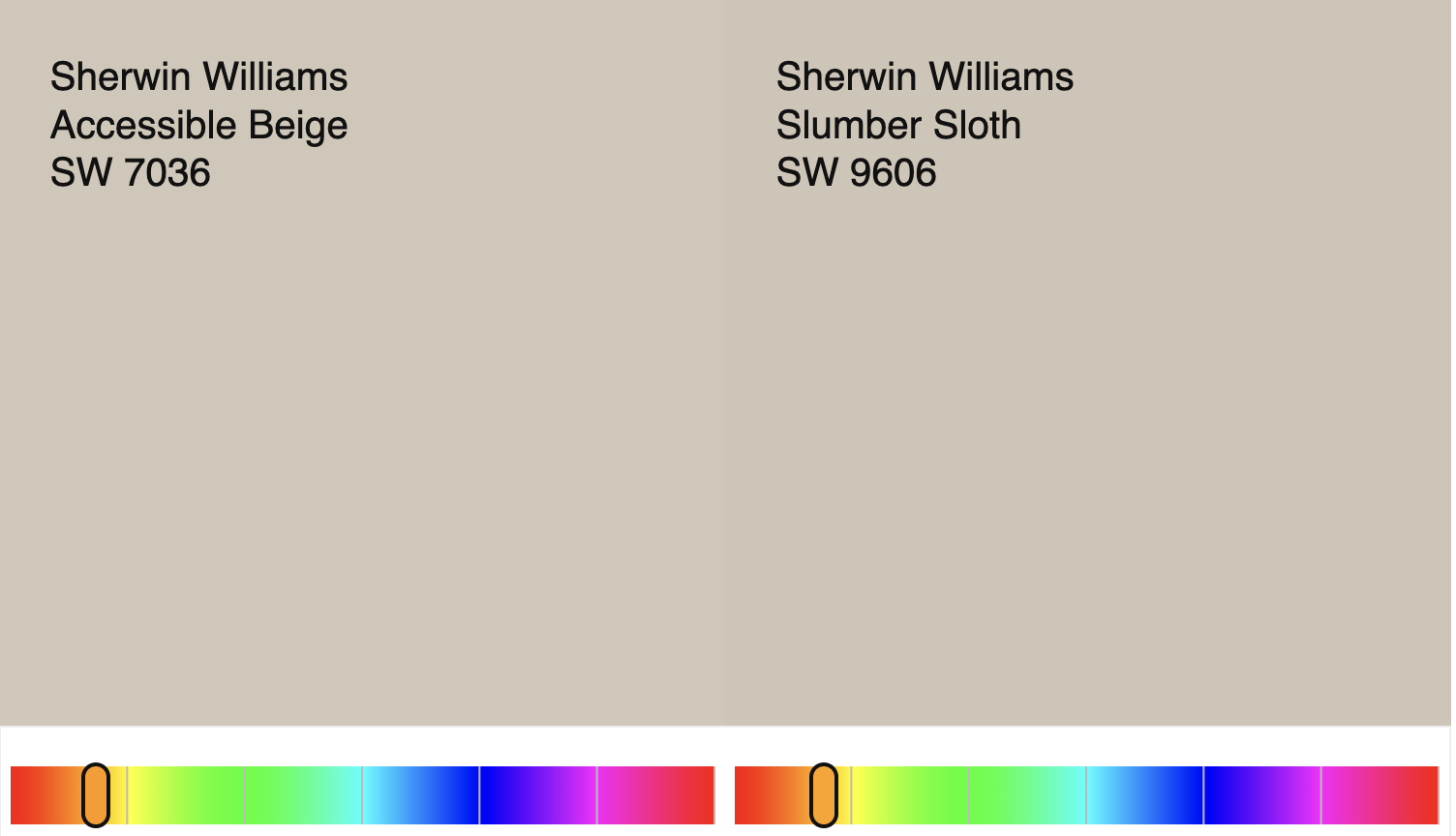
Sherwin-Williams Slumber Sloth – LRV 56
If Accessible Beige is the it-girl of taupes, then Sluber Sloth is like Jan Brady. This gorgeous taupe paint color needs more recongnition IMO and I have no idea why it isn’t as popular as Accessible Beige! They are virtually the same but it is just a touch moodier/ darker.
This is a great color for a bedroom to create an enveloping feel or for a home office where you want it to feel elevated, peaceful and den-like.
Note this list is arranged by value and with this paint color we are getting into the values of taupe, where I personally like them better with a darker trim color (like SW White Duck.) These taupes that fall in the mid 50s LRV and below are good ones to use for contrast trim or on wainscotting.
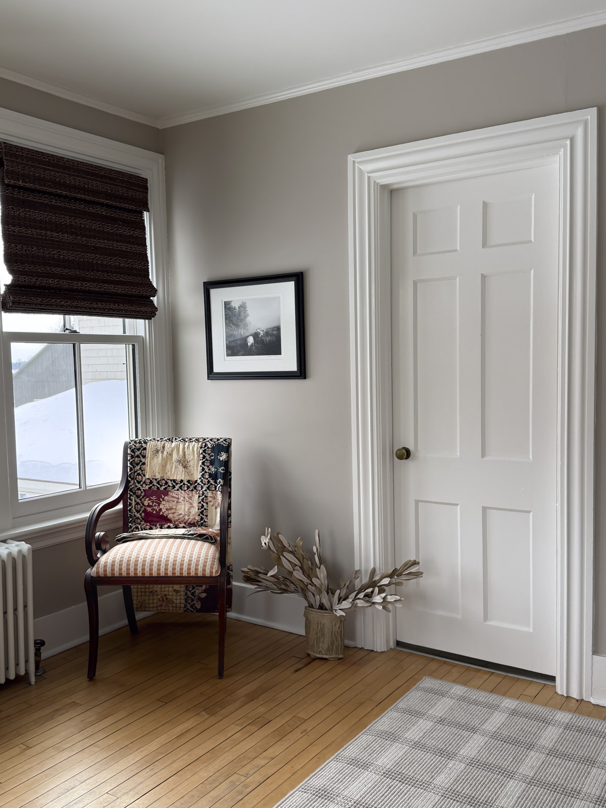
Benjamin Moore Smokey Taupe – LRV 54.53
I’ve used this paint color a bunch. I heart it! I’ve written a full review of Smokey Taupe with more photos.
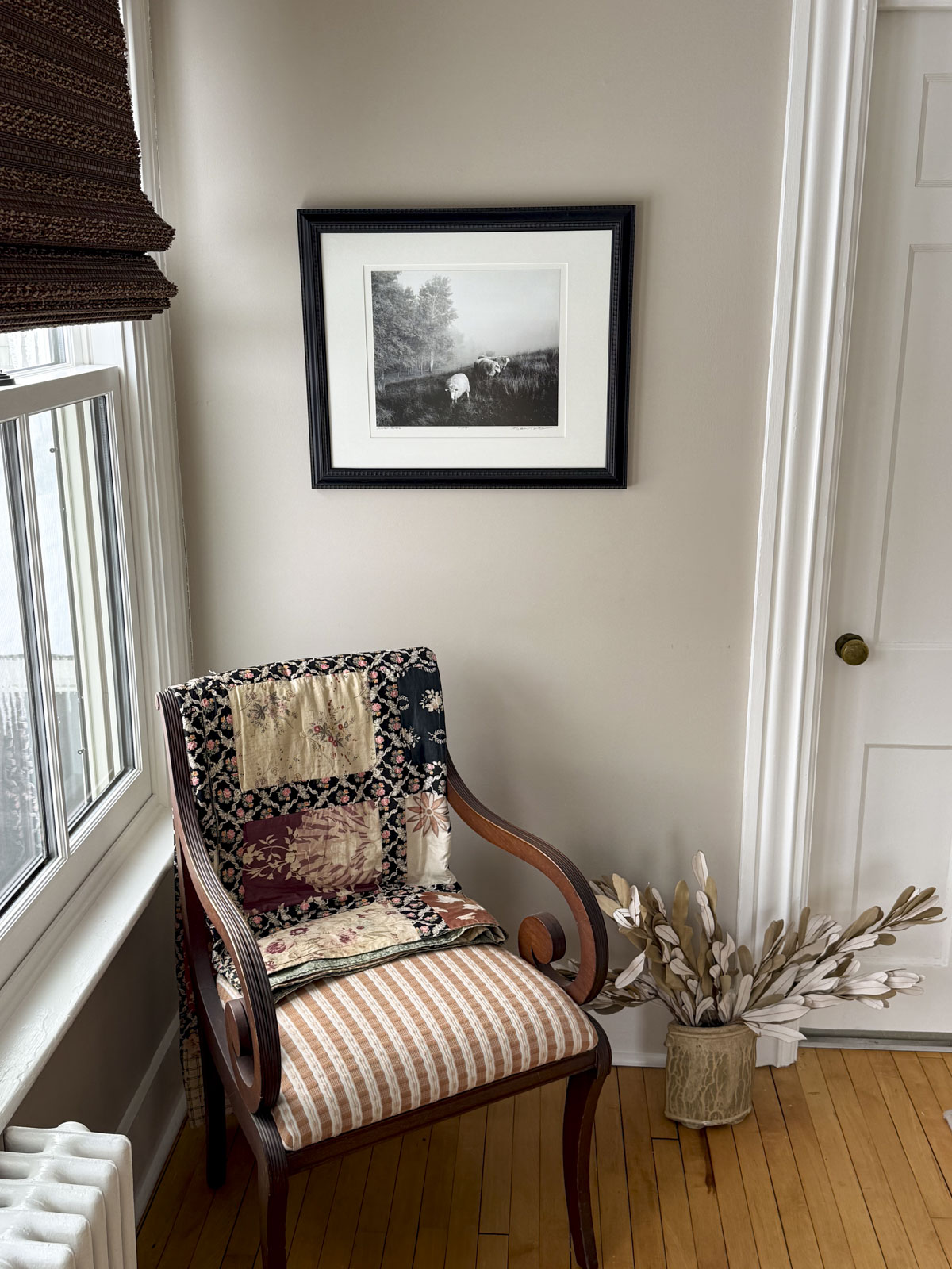
You can see in the above photo how it looks in our guest bedroom. This room faces south and gets plenty of light, but I do live in Vermont and we don’t get tons of sunny days. I have observed this paint color a lot and it can go oddly purple on low light overcast or snowy days. And in warmer sunny light it can look pink. Here you can see it at around noon on a snowy day. It is paired with White Dove by Benjamin Moore here.
Sherwin-Williams Minimalist – LRV 52
Promise me you will check out this mid-tone taupe paint color from Sherwin-Williams. While on paper it looks too saturated, once you buy a large sample of it, you will see it has gorgeous warmth without looking yellow or like an old-school beige paint color.
It is a good choice if all the colors you are looking at look gray/flat in your space. Minimalist pulls through in these rooms! I’ve used it as a feature wall behind a headboard to add grounding to a bedroom. I have also used it in brightly lit living rooms and sunrooms. (Pair it with Dumpling for a super dreamy designer look!)
Sherwin-Williams Shiitake – LRV 51
When all else fails, Shiitake is to the rescue. It has a sandy tone that works well for cabinets and millwork, giving it softness and warmth without feeling like a dated yellow beige. It’s a popular look when paired with black hardware (I recommend it with Oil Rubbed Bronze over matte black) and deep chocolate brown accents.
My clients who love white oak furniture and Champagne Bronze hardware love Shiitake for a cabinet color for a warm neutral kitchen. It goes equally well on walls with White Oak cabinets!
Benjamin Moore Stone Hearth – LRV 48.45
If I had to describe the aesthetic of Benjamin Moore Stone Hearth, I’d say it gives Farrow & Ball vibes in the best way. It is sort of like a putty or mushroom paint color that was sent to it’s room to think about what it has done. It is a little moody and little deep and I love that about it.
Stone Hearth is exactly the kind of paint color I love to see on plaster walls in older homes here in New England. It has old-world charm but feels modern because it lacks any gold tones.
Unlike Shiitake and Minimalist (both listed above), Stone Hearth has a faint green undertone that keeps it feeling cool, but it will not go pink or violet in low light. If anything, it can get a little too serious or austere looking in darker rooms, so make sure to buy a sample and test it out. If your room is darker, it is also a good one to use for woodwork and use your brighter off-white on the walls.
Benjamin Moore Gallery Buff– LRV 46
Everything I just said about Stone Hearth above goes for this color too. (Same about the moodiness and hidden green undertone.) It is just a click darker.


If you are one to try cool decorating trends like color drenching (or color capping) Gallery Buff is a great color to do it with- and it won’t make your space feel like a cave!
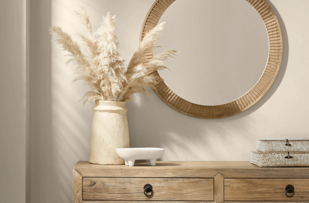
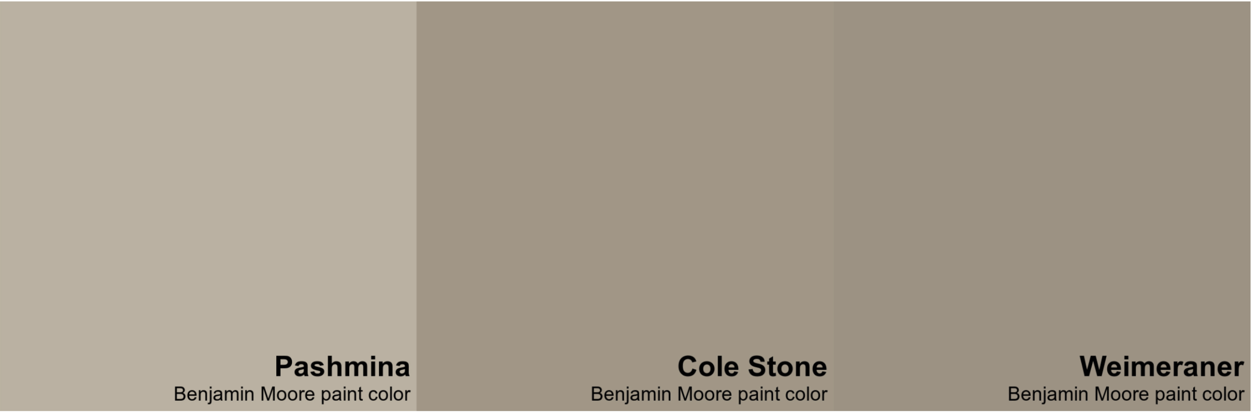
Benjamin Moore Pashmina – LRV 44.2
Pashmina is a really popular Benjamin Moore color from their Affinity deck. I have recommended it in color consultations, and I always love seeing the after photos because it looks great in every home I have seen it!


Above, you can see it in a real homeowner’s music room. This space was a challenge because it didn’t have any windows. We decided to embrace the den-like feel and use Pashmina to make it feel even cozier!

I love the fact that it has a secret green undertone that you would only notice if you were comparing it side by side with a bunch of other similar colors. It is this quality that keeps it feeling cool, and modern and not like a yellow beige. Artificial lights can eliminate this green color and make it feel gray. So if you use this space mostly at night, keep this detail top of mind!
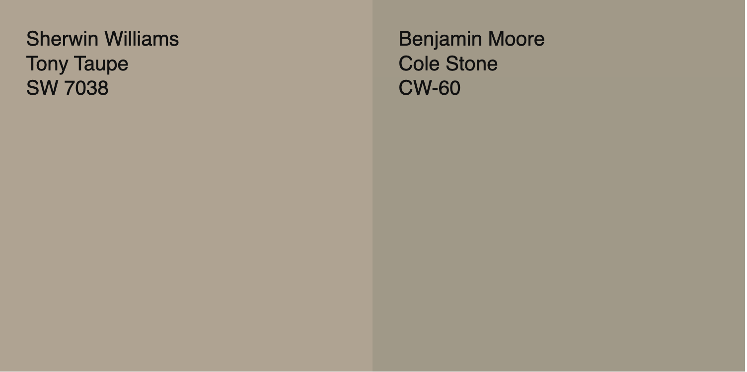
Sherwin-Williams Tony Taupe – LRV 37
Confession: I have tried to get my clients to use Tony Taupe, but I have yet to have someone take the plunge. It is just a touch too dark for walls in most houses here in New England. I am including it here anyway because it is a beautiful color, and an excellent example of a darker taupe.
This taupe is one of the more brown ones I have included, and doesn’t have the same cooler gray feel that some of the others in these darker values. If you are thinking about a brown for color drenching, I vote for Tony Taupe. Look at this bedroom for an idea of how it would look! Stunning!
For my New England peeps, and those of us who live in old houses with small windows and low light, use Tony Taupe as an accent color for a kitchen island when paired with one of the lighter taupes mentioned above, or even White Duck. It is in fact on the same paint chip as Accessible Beige, so if you are looking for a kitchen accent to pair with Accessible Beige, consider Tony Taupe!
This is also a great taupe to look into for an exterior- but it can look a little brown depending on the exposure of your main facade. More on that below!
Benjamin Moore Indian River / Ranchwood – LRV 36.6
This darker taupe color is known by two names: Ranchwood and Indian River. It is one of those taupes here that leans more green and less sandy but it is minimally so.
I used Indian River in our guest bathroom. Friends, this tiny room is in serious need of a remodel, so I almost didn’t want to include photos here. But… I feel like this is helpful for you to see, so here goes.
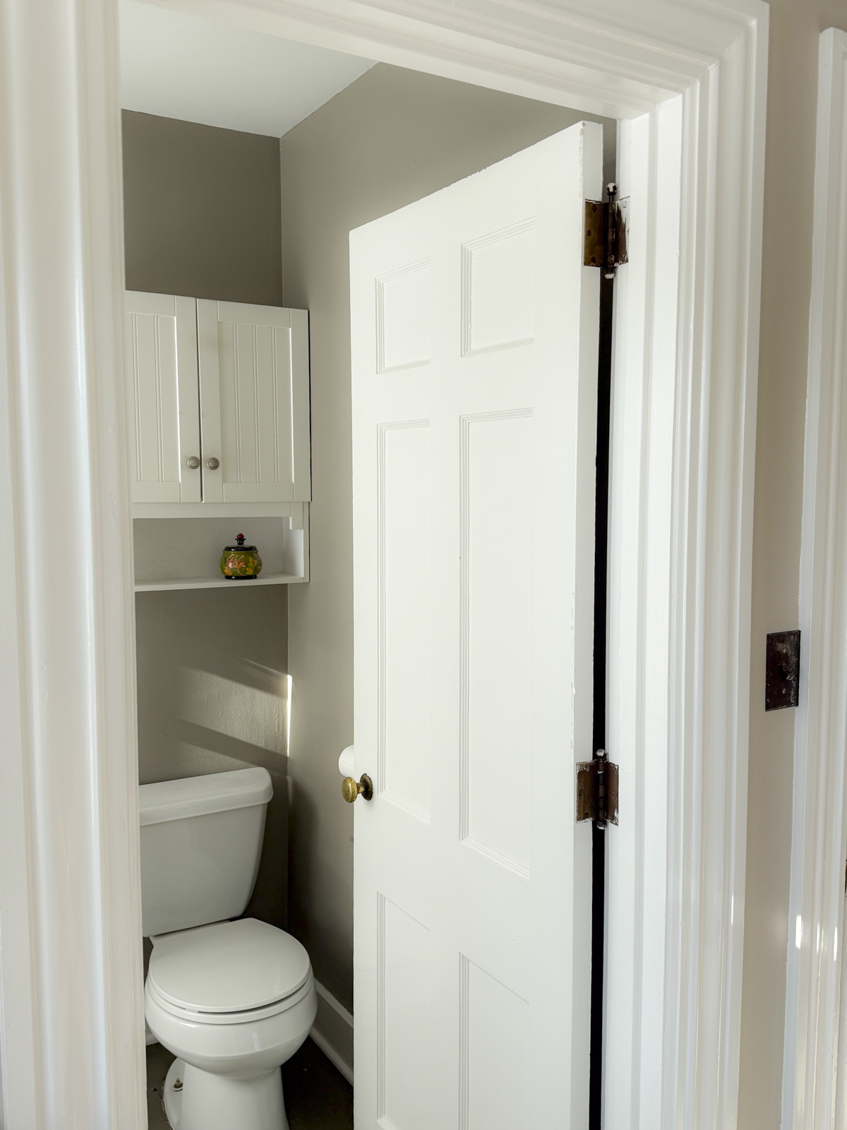
OMG please do not judge. Fixing this space is on our five-year plan but there have been bigger fish to fry in this old house! Anyway, these photos show the depth in value, lack of saturation and super-subtle green undertone.
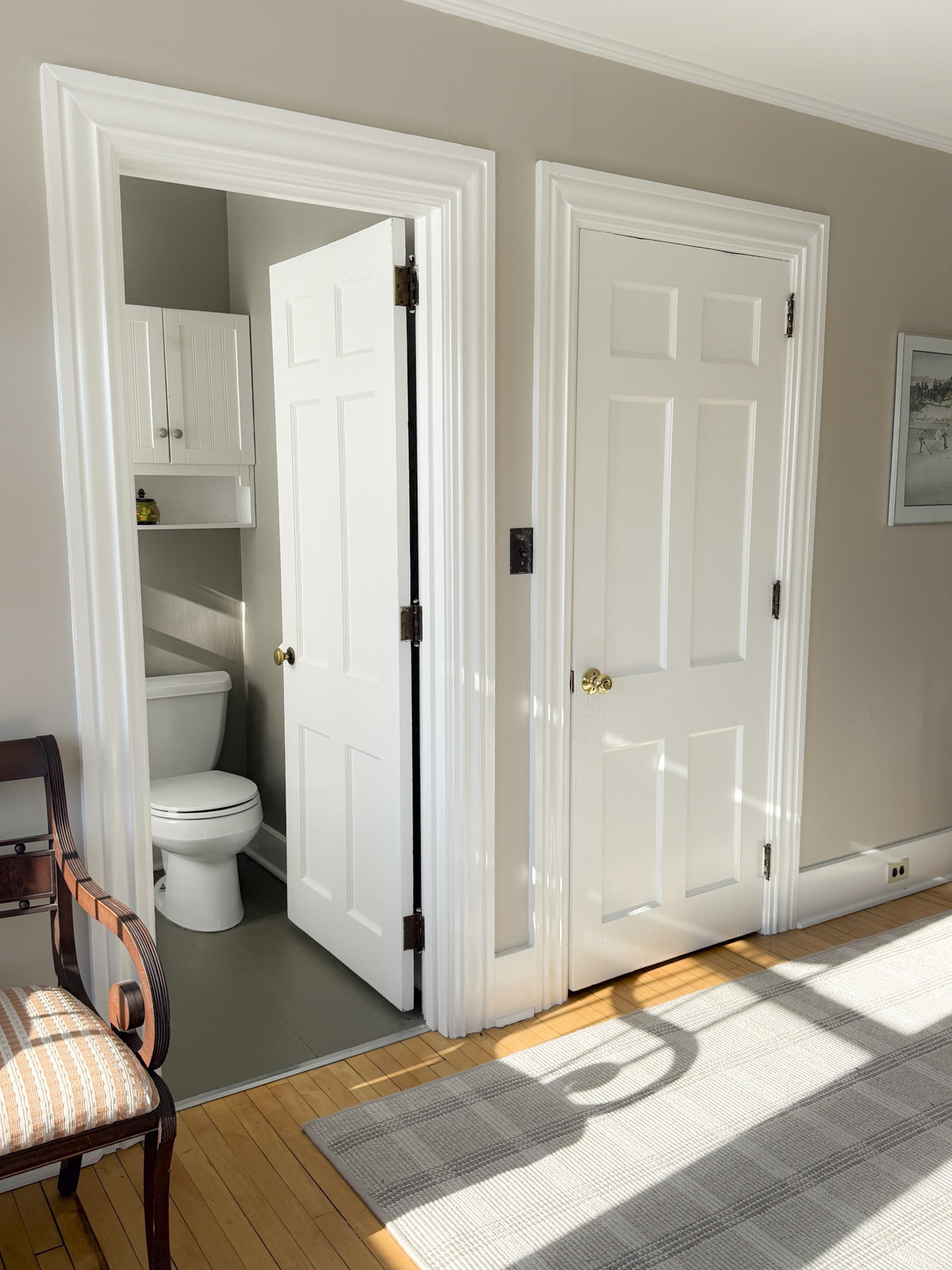
Indian River/Briarwood is an excellent choice for an exterior paint color scheme. I think it would also be a lovely addition to a room painted in lighter colors used only for accents (like on a mantle or built in cabinets or bookshelves.)
It is also the kind of color that works well in small spaces (like this tiny bathroom) or in a mudroom or office.
Benjamin Moore Cole Stone – LRV 32.87
From the Benjamin Moore Williamsburg collection, Cole Stone is a colonial-inspired paint color with a deep, grayish tone. This taupe feels like it belongs in a building on Independence Mall. It is beautiful for interiors and exteriors.
I chose it for the trim and wainscotting in these pictured areas to give a historical vibe to this space. I used it for the trim and wainscotting, and paired it with Benjamin Moore Swiss Coffee wich is a warm bright white with a touch of green in its undertone.
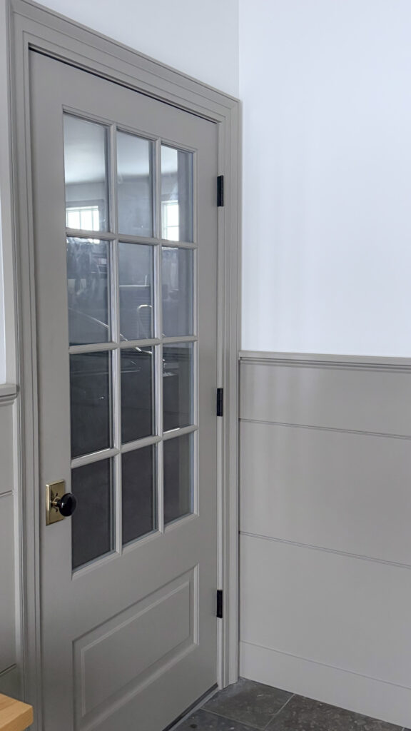
As you can see in my photos here of this space, Cole Stone is another one of the taupes that lacks a sandy quality and instead feels a little like a warm gray-green. If it feels to gray to you, go back and take a second look at Tony Taupe!
Benjamin Moore Weimaraner – LRV 30.99
Weimaraner is another winner from the Affinity Deck from Benjamin Moore. This dark taupe is a beauty for exteriors or for accents (like furniture, cabinets, stairs etc.)

It has great depth of value if you need a darker element in your space and everything else feels too soft. For example, if you are decorating with white oak and champagne bronze and mostly soft neutrals, your space may feel flat. Adding in a dark taupe will help to make the space feel dimensional and interesting.
This paint color gets along well with others because it doesn’t have an overtly sandy or too-green cast to it. It sits right in the middle- which can also make it feel kind of gray! I’ve noticed in darker light it does have a purple tone that may not be what you are looking for so make sure to look at it in all different lights before you paint. It has a soft chalkiness to it that is very trendy at the moment and would look great in a color-drenched space.
Sherwin-Williams Moth Wing – LRV 29
Moth Wing is like Weimarainer but with a bit more gusto.
It is so similar that you may not be able to tell them apart but if you have low light or are planning to use this in a space that will mostly be used at night, Moth Wing is more saturated and warmer. It reads like a brown by comparison.
Exterior Taupe Paint Colors
In general, for an exterior paint color, pick darker taupes with less saturation or go toward green. Remember, outdoors your paint color will appear 3x brighter than it does on the paint chip! And sunlight will make warm colors appear warmer. If you like the gray quality of taupe, avoid the sandy-toned taupes because they will look warmer on an exterior.
My 3 top choices for exteriors would be:
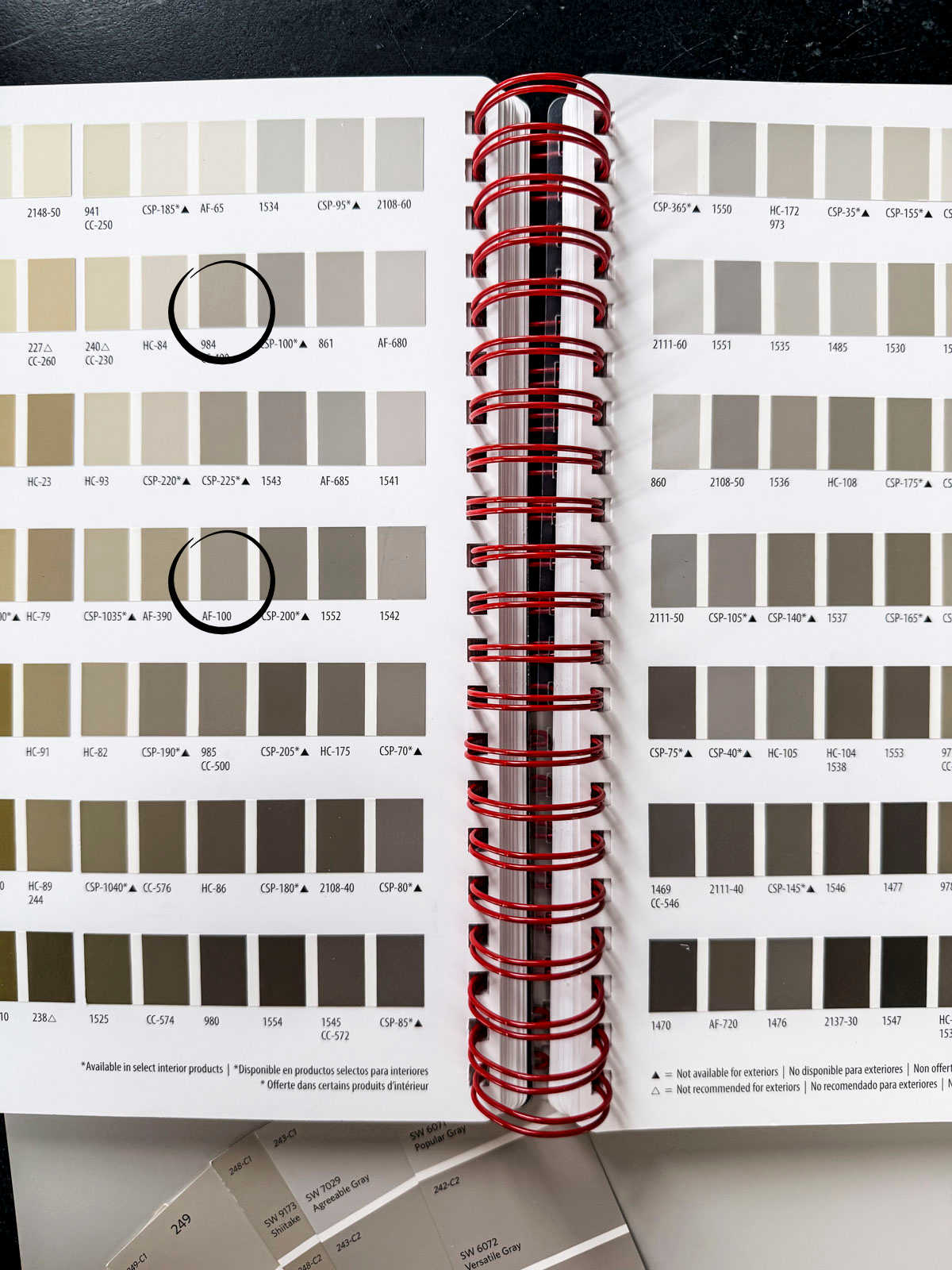
- Pashmina by Benjamin Moore AF-100, LRV 44.2
- Cole Stone CW-60, LRV 32.67
- Weimaraner AF-155, LRV 30.99
Complete The Scheme: You can pick another softer taupe from the above list for your trim color or go with a greige for a brighter contrast. These colors look great with a bronze roof and windows. They are also pretty with dark green, rusty reds or nearly black accents too. For more tips and pro-tricks on picking an exterior paint scheme, read my tutorial here.
Best White with taupe
When pairing white paint with taupe, undertone matters more than brightness.

If you like a crisp, clean contrast, I suggest a grayed white like Sherwin-Williams Pure White (LRV 84). It will not feel oddly stark or like a value-grade “white” that the handyman picked up.
If you prefer a subtle, tonal and more modern look (this is becoming increasingly popular) I tell my clients to choose a white with a darker LRV and low saturation, such as Sherwin-Williams White Duck (LRV 74). It is not too creamy so it won’t feel strong next to these dusty taupes. This pairing feels softened and frankly like when your friends come over, they might think you had a decorator pick out your paint colors!
Color Palette For Taupe
Most of my paint consultation clients who gravitate toward taupe opt to use it as their main neutral and then build a small supporting color palette around it. These are the accent colors I return when building out these schemes:
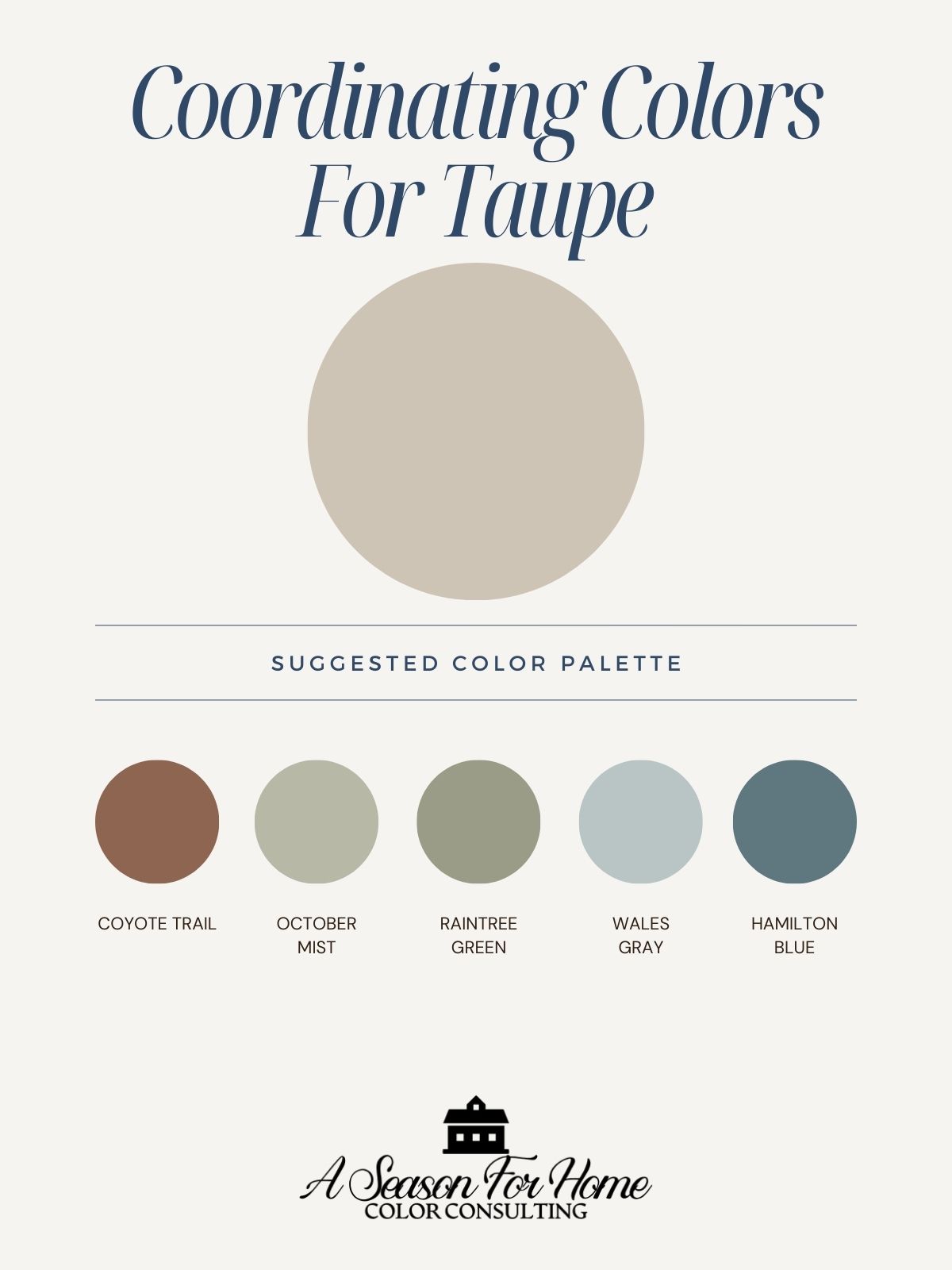
- Blue: From complex historic navy blues like Benjamin Moore Hamilton Blue HC-191 to softer blue-grays like Benjamin Moore Wales Gray 1585
- Green: Soft greens such as Benjamin Moore October Mist or Benjamin Moore Raintree Green
- Red: Deep, muted reds with a rusty or burgundy quality work best. For painted accents or furniture, look at colors like Benjamin Moore Coyote Trail or Benjamin Moore Chestnut
Taupe acts as a calm backdrop that lets these colors shine without competing.
Troubleshooting Taupe Paint
Here are the most common issues and questions that come up with regards to taupe paint colors.
How do I know which taupe is best?
Once you have taken this list to your paint store and looked at them on the paint strips, the next step is ordering large samples on Samplize or you can occasionally get them at the paint store! Then brush out large areas with your favorite(s) in a space where you can’t see the existing color underneath to throw off your perception.
Can I lighten a paint color, like Accessible Beige?
I don’t recommend it. Here’s why: Lightening a paint color at the store doesn’t just make it lighter; it changes the undertones and can throw off the balance, especially with soft neutrals like greige. Once a color is altered, it’s less predictable, harder to touch up later, and can look chalky or flat on the wall. That’s why it’s usually better to choose a lighter, intentionally formulated color in the same family rather than modifying the original.
Why does taupe look pink or purple?
Taupe can look pink or purple in low light because when light levels drop, your eye becomes more sensitive to red and blue wavelengths, which makes the subtle violet or red undertones in taupe suddenly stand out. At the same time, the yellow warmth that keeps taupe looking neutral needs strong light to read correctly. When that light disappears, the cooler pigments take over. The result is a color that felt balanced during the day but shifts noticeably at night or in shadowy rooms.
I brushed out a sample, but my paint sample feels off. What do I do?
There are probably two or more issues that you’ll need to determine in order to find a better taupe.
- Is it too dark? When your sample seems too dark, choose a different taupe paint that has a higher LRV rating. Look at one that is on the top of this list.
- Does it feel too cold? If it feels too cool or gray, pick one of those with a sandy quality to them (for example Moth Wing, Tony Taupe, Shiitake, or Minimalist.)
- Does it feel too beige? If it feels too warm, lean into one of the shades that is grayer or greener (Ranchwood, Stone Hearth, Gallery Buff, Smokey Taupe or Modern Gray.)
- I like it during the day but not at night. What now? If you are using your space at night, focus on finding the right shade at night in artificial light. If this is the case for you, consider using a more saturated shade from the above list (like Shiitake, Minimalist or Tony Taupe. I also like SW Bungalow Beige, which is more of a beige than a taupe so I didn’t include it here, but worth looking into.) These sandier shades will work better in artificial light. Also, try swapping out your light bulbs!
My Favorite Taupe Paint
I realize I’ve done it again. I have overwhelmend with too much info. If I had to give awards to these colors here’s what I would say:
- Best Crowd-Pleaser: Sherwin-Williams Accessible Beige
- Best For Cabinets: Cedar Key (lighter) or Shiitake (darker)
- Best For Color Drenching: Benjamin Moore Weimaraner
- Best For A Historic Home: Benjamin Moore Stone Hearth
- Best For A Home With Low Light: Sherwin Williams Minimalist
Personally, If I had to get dropped on a deserted island with one of these 16 paint colors I would probably go with Sherwin-Williams Shiitake. It has a good level of warmth and can work in all different lighting conditions without falling off into odd pink or too gray territory. It has plenty of darker depth to work on cabinets or to color-drench. It’s gorgeous for a bedroom or office or in a dining room.
Do you need help picking paint colors? I offer one-on-one paint color consultations. Read more here!
I’ve been trying to pick a paint color for my open concept home in taupe colors then doesn’t pull yellow or pink! So difficult! I find your reviews on the colors and undertones extremely helpful.