Benjamin Moore Creekside Green Review

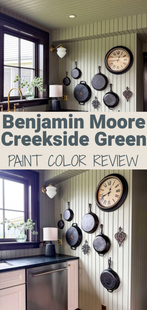
If Goldilocks was searching for a perfect green paint- she would say Benjamin Moore Creekside Green is Just Right! As a certified color expert (and someone who’s actually used this hue in my own home), I can tell you right up front that Benjamin Moore Creekside Green is hands down one of the best shades of green paint. It is not too dark, not too cool or warm, and not too saturated, but it still makes a statement in a room.

If you’ve been scrolling paint decks for the perfect gray green that isn’t too cold or too yellow, put this one on your list to test. In this post, I’ll break down everything you need to know about Creekside Green Benjamin Moore: its undertones, LRV, where to use it, what whites pair best, and even a few alternatives to check out. I’ll also give you my honest opinion about how it actually looks on the wall.

What Color Is Benjamin Moore Creekside Green (2141-40)?
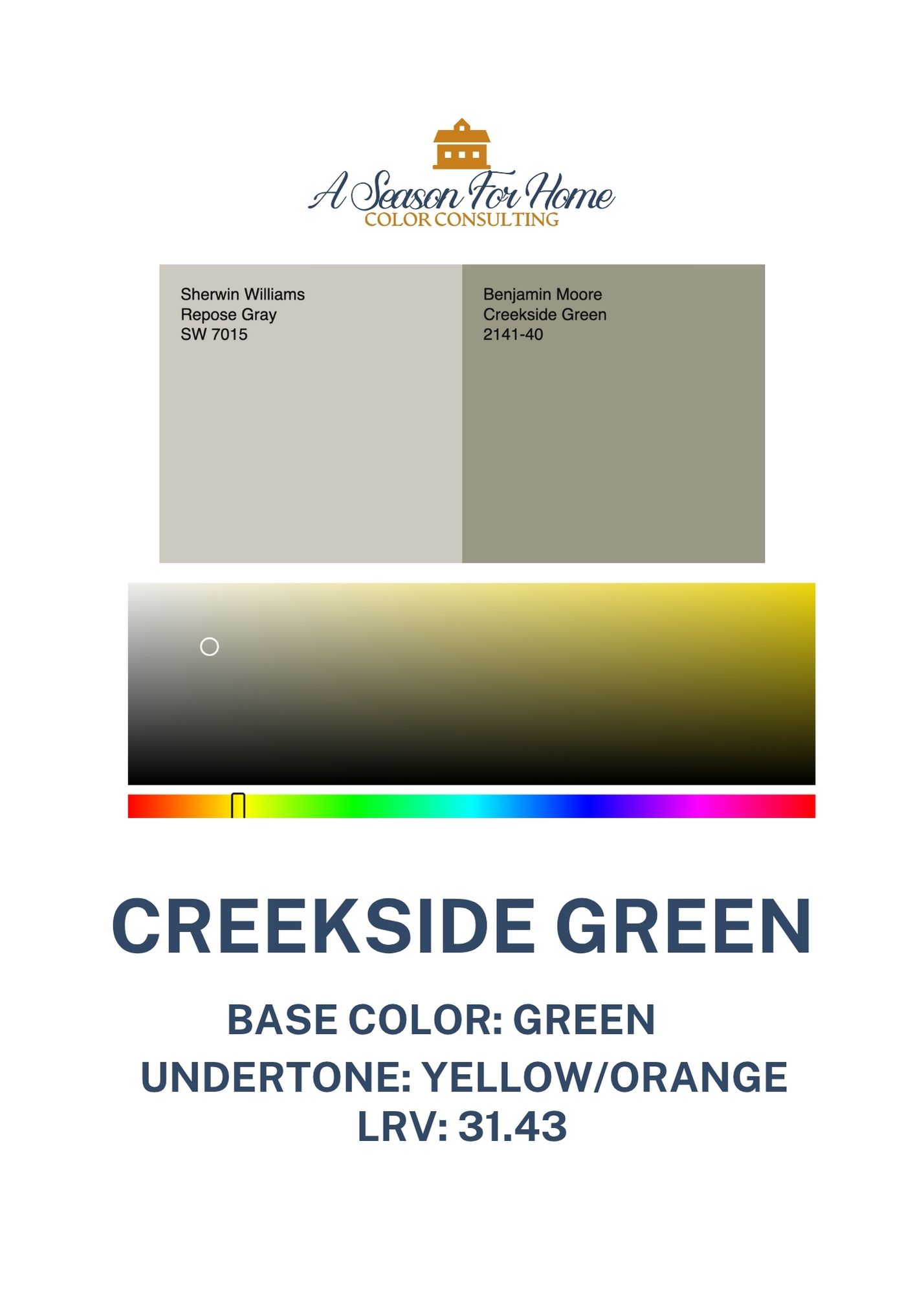
BM Creekside Green 2141-40(also sometimes referred to as Creek Side Green) is a medium-depth green gray paint color with a hint of warmth that keeps it from feeling too chilly. It lands somewhere between green and gray, leaning slightly sage but still neutral enough to work as a backdrop color.
It has loads of chalky white pigment and gray blended into it to make it feel soft and historical.

TREND ALERT: “Chalky” is a term that is popping up again and again in the paint world! Benjamin Moore’s color of the year 2026, Silouhette is the perfect example of this huge trend in paint right now. Basically, Silhouhette is to brown as charcoal is to black. If this analogy is working for you, then apply it to Creekside green! Creekside Green is to Green as Charcoal is to Black!
If all this talk of depth, warmth and chalky tones has your head swimming. What you need to know is that in real life, Creekside Green has that earthy subtlety for when you want a green that doesn’t scream my 8-year old helped me pick out this green. It’s muted and natural—with a silvery quality of garden fresh sage.
LRV of Creekside Green Benjamin Moore
The LRV (Light Reflectance Value) of Creekside Green is 31.43, which puts it in the darker midtone range. It absorbs a good deal of light instead of bouncing it around, so it feels more grounded and dimensional than a lighter gray green (like October Mist.)
In bright daylight, it shows more of its green side. In dimmer spaces, it leans deeper and moodier, almost like a weathered gray with a green cast. If you want a color that changes throughout the day, this one definitely does.
While an LRV of 31 sounds really dark, I want to reassure you it is not going to feel oppressive! I originally discovered Creekside Green because I was looking for a lighter version of Antique Pewter by Ben Moore.
Undertones of BM Creekside Green
Creekside Green is a gray green paint with a hidden orange undertone. Yes you read that right- orange! Undertone is where paint color gets tricky, and why I find paint so fascinating! When I analized Creekside Green’s base color on a digital value, I learned that it comes from a blend of orangish yellow and gray, not green at all.

Paint Color Nerd Note: Nantucket Gray, is another paint color with this odd hidden orange undertone. While I don’t have access to the acutal recipes from Ben Moore I do know that when I was studying painting in college I often made greens like this by blending yellow and black. My guess is, this is essentially the same thing. It is an interesting way the color pigments mix and interact- but with house paint pigments!
What this means in real life is, Creekside Green Benjamin Moore appears like a muted sage green paint color. And if you’ve read this far, you already are aware there are tons of green paint colors that can be called muted and sage. But Creekside Green will never feel sophmoric, brash, childish, garish or bright. It will always feel sophisticated, nuanced, complex and curated.
These qualities are what make this color so interesting. In my apartment kitchen the paint color looks entirely different on different surfaces. The light warms it up a bit in some areas and in others it looks much cooler. I like it because it never feels flat or one-dimensional. It shifts, but always stays tasteful.
Where to Use It in Your Home
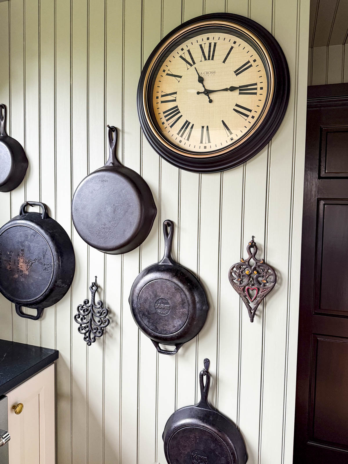
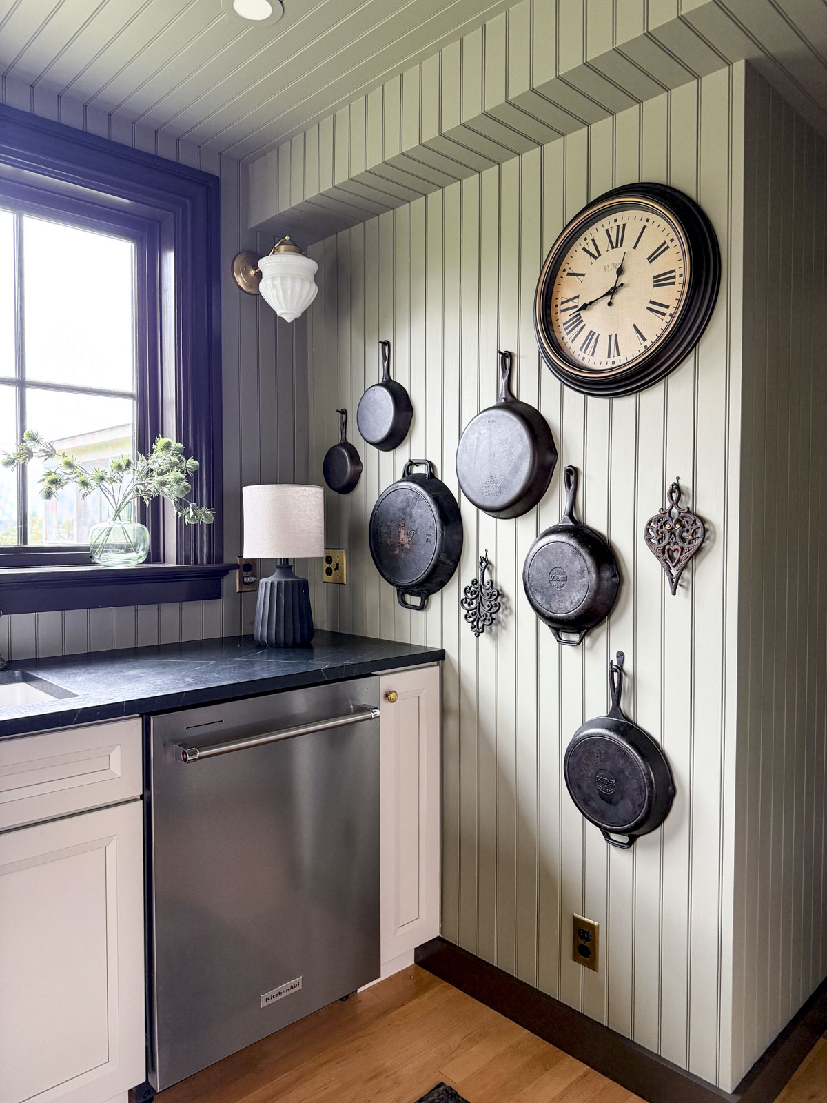
This color works best when you give it something to play off of. I used super dark brown trim and hung cast iron on the wall for contrast. Here are some other ways to consider using BM Creekside Green:
- Kitchen cabinets: This color looks amazing in our apartment kitchen paired with unlacquered brass and blackish green soapstone counters. We used it on the walls with taupe cabinets, but the reverse could easily work!
- Bedrooms: I love a deep green bedroom. Creekside will give a cozy, cocoon-like feel without going too dark. I’d love to see it with natural linen and oatmeal colored textiles.
- Bathrooms: BM Creekside Green pairs beautifully with warm marble or quartz, basic white tile, or mixed metals.
- Built-ins and millwork: I especially like darker mid-tone paint colors like this on millwork, bookshelves or a fireplace surround.
- Mudrooms or entryways – it hides dirt and adds character. Use it for your cubbies or built ins!
Whites to Pair with Creekside Green Benjamin Moore
Since Creekside Green is lacking saturation or what is sometimes called a dirty color, I like to put it together with warm off-whites without much saturation. These are safe bets:
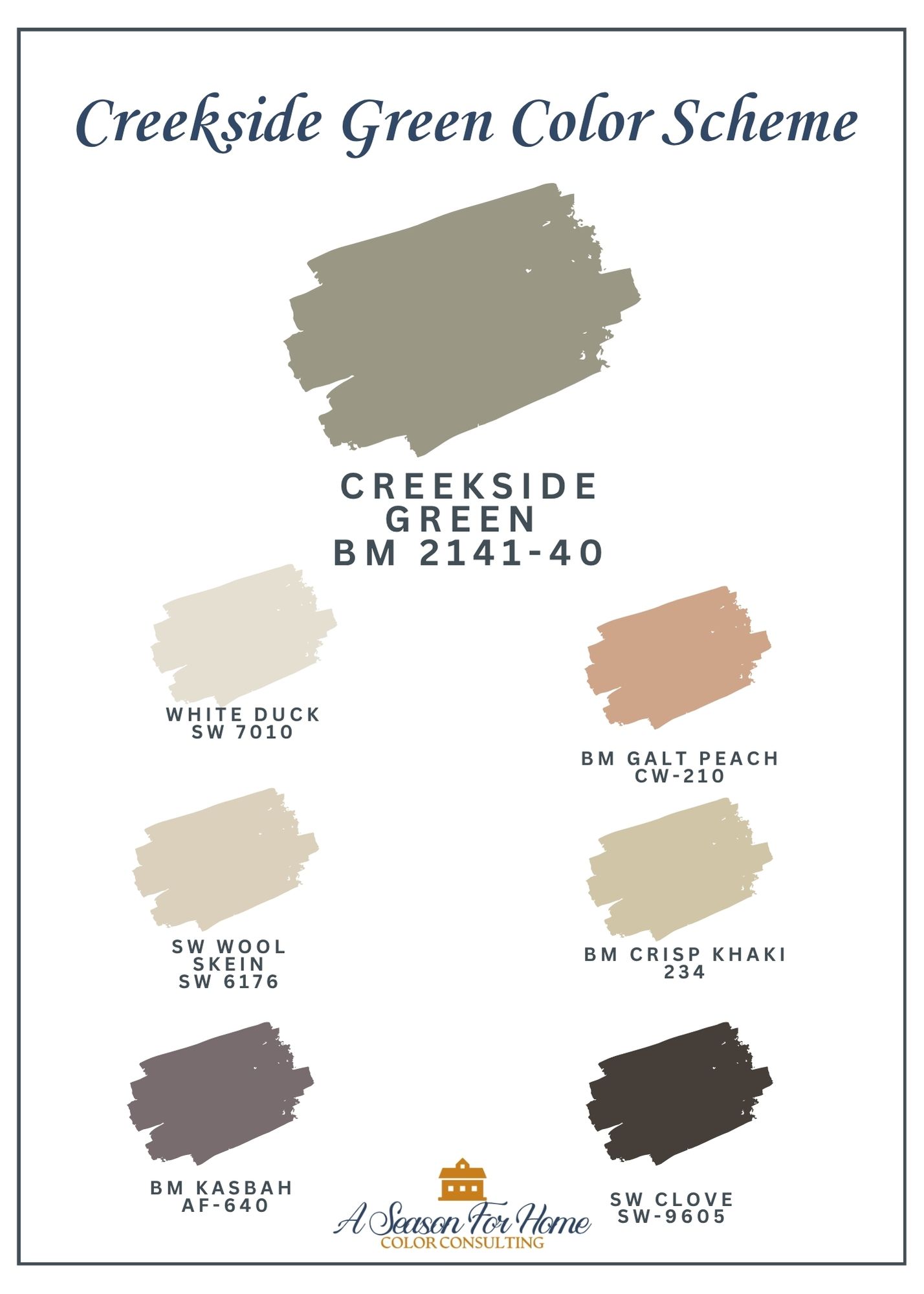
- Benjamin Moore White Dove (OC-17): My favorite all-purpose white. BM White Dove is not going to feel overly cool or stark. It has warmth and gray to mellow it out a bit. A much better bet than Chantilly Lace.
- Benjamin Moore Swiss Coffee: I used this as the white in our finished barn and it is super pretty with greens. The warmth feels velvety with Creekside Green.
- Sherwin-Williams Greek Villa: I verified this creamy classic white. It is a great default white, and is lovely with the muted complexity of Creekside.
- Sherwin-Williams White Duck: If you have been reading here for a while, you know I always push going with a darker white for trim. The best one for BM 2141-40 is White Duck. It feels warm, without being yellow, and has enough gray in it that the pairing feels fresh and of the current moment.
If you’re feeling bold, try color drenching which is painting the trim and walls the same color. It makes a small space feel intentional and dramatic in the best way.
What Colors Go With Creekside Green
Creekside Green is surprisingly flexible. It looks great with a mix of earthy and neutral colors. Stick with colors that have a similar level of chroma for most cohesive feel.
Neutrals To Pair With Creekside Green
Other than the whites I mentioned above, you have a lot of options with warm neutrals. While I love this green juxtaposed with a cooler greige like Revere Pewter, I feel like these colder neutrals are trending out, and you may regret using them in your home.
I love the way it looks with Benjamin Moore Crisp Khaki, which is one of my favorite Khaki Paint Colors. With Creekside Green, the golden undertones in Crisp Khaki look warm and buttery! I looked through a ton of options and this paint color hits a certain sweet spot. I think partly because its LRV 54.6 looks just right with the depth of this green. For a lighter khaki, you can use Wool Skein. If you want an alternative warm neutral that doesn’t pull yellow or gol,d you could use Minimalist from Sherwin Williams, a favorite for minimalist interiors, or Accessible Beige.
Coordinating Colors
The key to picking coordinating colors for this green paint color is that they all feel like they live in the same color world and create a lot of interesting energy together. I love the way a soft plum like Kasbah from Ben Moore AF-640 or vintage peach like Ben Moore Galt Peach CW-210 or pretty much any of my favorite Peach Paint Colors would look great with it. If you like softer yellows, I’d go with a butter yellow like Ivory Porcelain/Ivory Tusk.
Dark Colors and Alternatives To Black
I don’t recommend black paint, and instead call for nearly black hues instead. In this palette I used Sherwin-Williams Clove on my trim in the space with the Creekside Green in my kitchen and it is such a great alternative to black. It has richness, plenty of depth, but instead of harshness, there is a subtlety that I highly recommend. If you want a super dark with green undertones (like for your window trim) use Tavern Charcoal by Ben Moore. It is a great match.
Alternative Colors to Try
If you like the look of Creekside Green Benjamin Moore but want to compare a few others, here are some close cousins worth sampling:
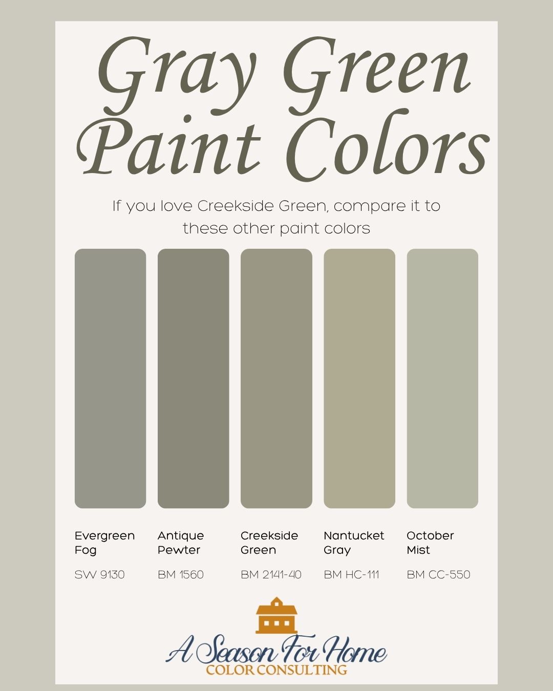
- Benjamin Moore October Mist (1495) – Way softer thank Creekside and delightfully silvery. If Creekside is too deep for you- this former color of the year is a trusted green. I’d love to see it in a sun-drenched breakfast room
- Sherwin-Williams Evergreen Fog (SW 9130) – A tried and true option (another COTY in fact) if you want a cooler green with stronger blue undertones.
- Benjamin Moore Nantucket Gray: This gray green paint color is a bit earthier and leans even more into that orange base. It is a shade lighter than Creekside. I have these two in adjacent spaces and they jive quite nicely.
- Benajamin Moore Antique Pewter: If you want to go darker than Creekside, Antique Pewter is your girl. I have this color on the other side of the Creekside, and it is a whisper more deep and in my opinion it looks legit gorgeous in darker rooms- for when you want to lean into the depth!
Final Thoughts
While I am not going to claim this paint color will work for everyone, in every situation, I do have a strong affinity for it. I’ve used it in our apartment kitchen and I love the darker value, because it is balanced by a white-washed quality that makes it feel like it is straight out of an antique farmhouse. So while it is on trend, it is also going to have staying power, and you won’t want to repaint in a few years.
If you have been on the hunt for a gray-green sage paint, then I highly recommend sampling Benjamin Moore Creekside Green 2141-40. In our farmhouse kitchen, it is balanced, interesting, and has just enough gray to make it feel grown-up. I’ve decorated the adjacent living space with off-white, taupe, chocolate and green textiles with pops of brick red for contrast. The overall look is timeless and welcoming.
I love watching this paint change throughtout the day. Every time the light shifts, it surprises me in a good way. It’s one of those colors that makes a space feel pulled together without looking overdesigned. Definitely one to sample, you might end up loving it as much as I do!
Need more help with your paint colors? Sign up for a Virtual Paint Color Consultation. I will help you select the perfect colors for your home.