Nantucket Gray Review Benjamin Moore HC-111
Every color forecasting expert agrees, green is in! An all-time favorite green paint colors is Nantucket Gray by Benjamin Moore. It is not too saturated, not too dark and just the right level of warmth. Below I will share all the details about Nantucket Gray, also known as Cheyenne Green 1502. You’ll find information about its LRV, undertones, where to use it, complimentary colors, whites to pair with it and of course lots of photos including how I used it in my own home!
Benjamin Moore Nantucket Gray
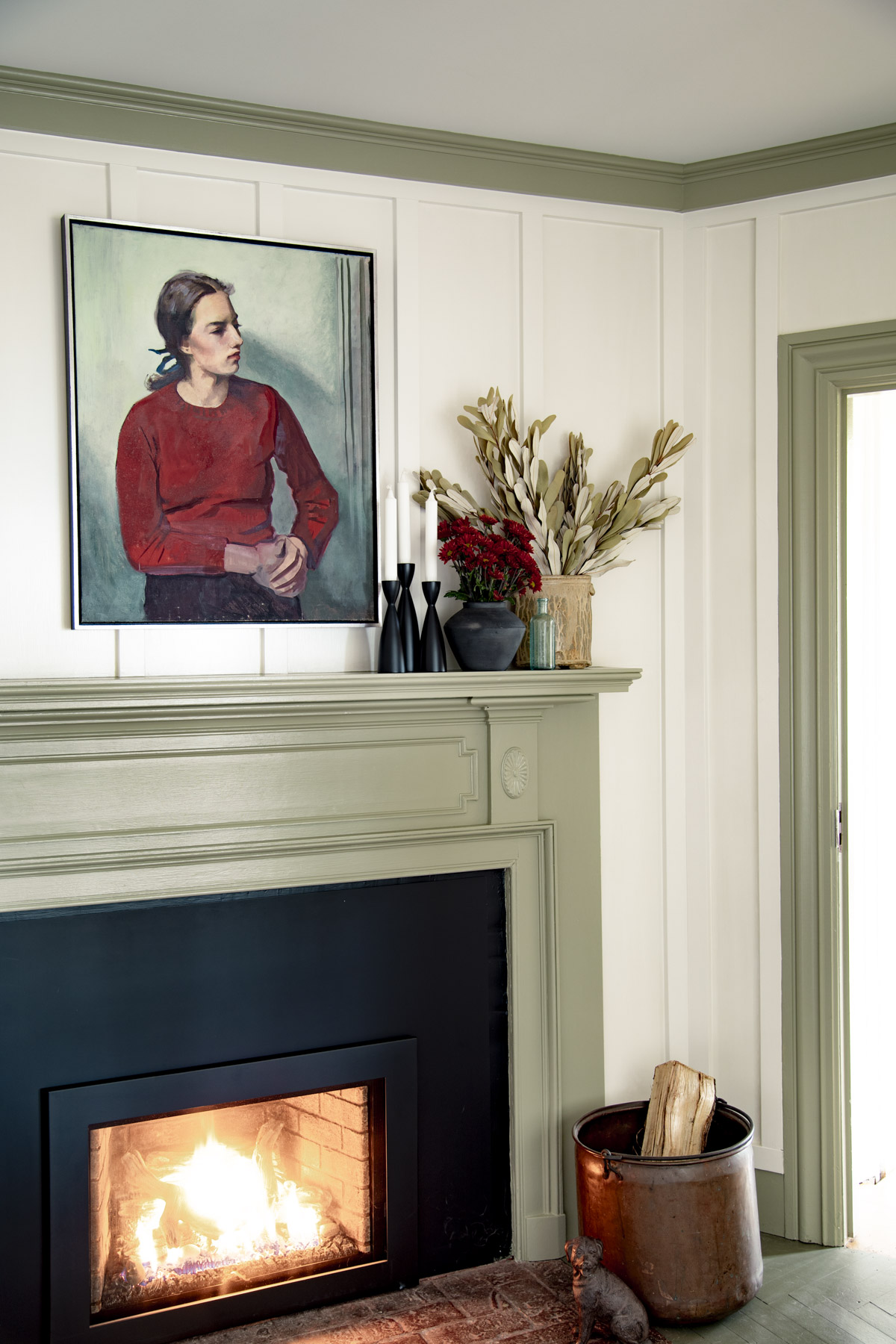
This tried and true paint color is one of my favorites of all time. In my husband’s building business, we have used this warm gray green paint color on the exterior of homes and in commercial spaces. At home, in our Vermont farmhouse, we have used it to highlight the millwork in my home office.
So if you are looking into whether or not this is the right muted green paint color for you, you are in the right place. Read on to learn all about it!
It is absolutely gorgeous on wainscoting and trim, but it can also work as a wall color too! While it is a darker paint color, the slight softened and chalky tones make it both currently on-trend and evocative of it’s Historical Collection roots!
BM Nantucket Gray Undertones
Don’t let the name fool you, Nantucket Gray is definitely not a gray paint color! It is a green paint color with relatively low saturation and warm olive tones.
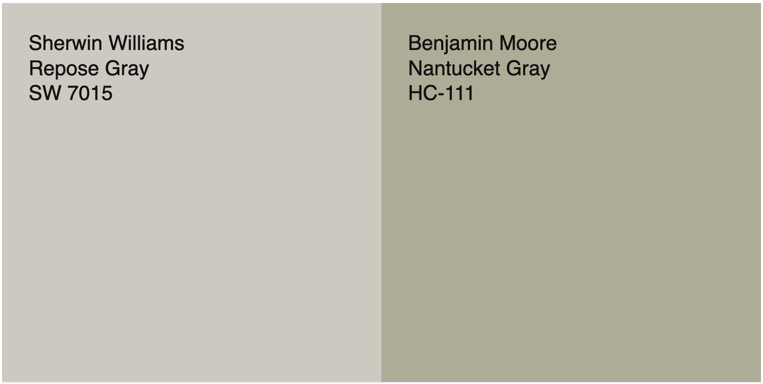
To understand a paint color’s undertone it is helpful to compare it to other colors. This process of comparison helps our eyes and brains understand color better. It is quite clear that Nantucket Gray is not a gray when comparing it side by side with Repose Gray which is a neutral gray paint color.
Next, look at the interesting thing that happens when you put Nantucket Gray next to a cooler green like Evergreen Fog. See them side by side in the image below.
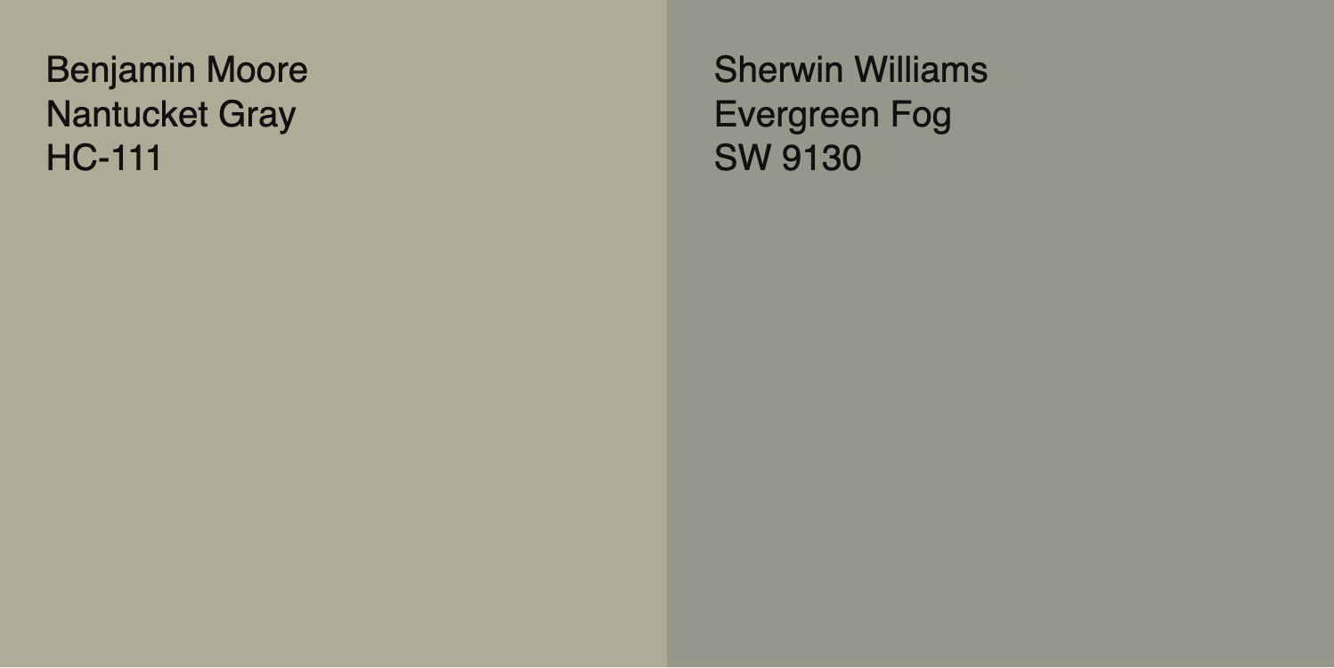
Comparing these two green paints allows us to see the subtle orange undertone in Nantucket Gray. This orange undertone secretly hides beneath its gray green surface and is what makes it so complex!
The last way we will come to fully understand the undertones of this enigmatic paint color is to compare it to a low-chroma tan like Greenbrier Beige.
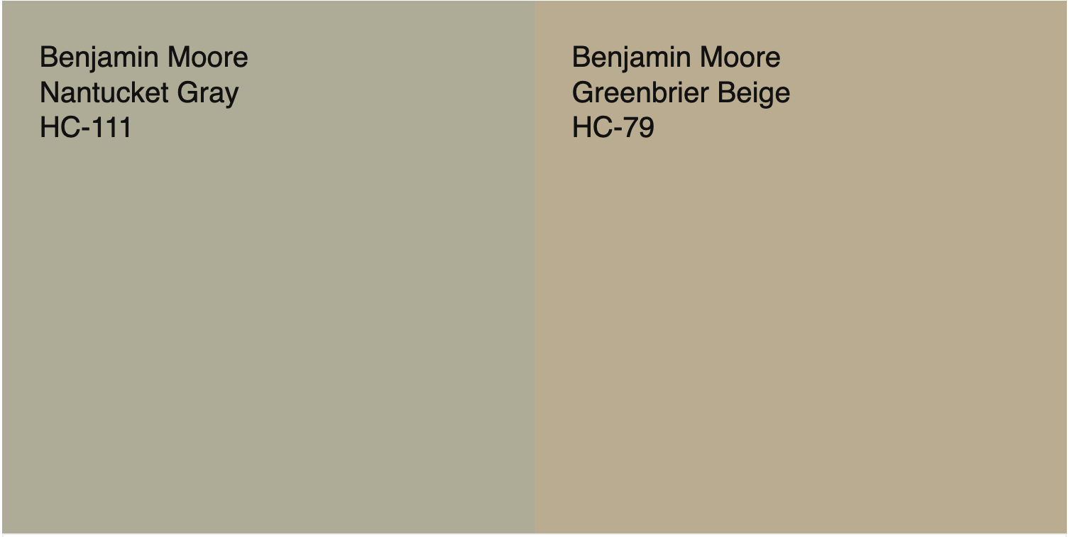
In this way we are back to seeing the green side of this color! But without any illusions! Next we’ll talk about the LRV of this color.
LRV of Nantucket Gray Benjamin Moore
First of all, if you are not sure what LRV is, you can read more about it here. Basically it is a scale from dark (0) to light (100) to define how dark or light a paint color is.
Nantucket Gray has an LRV of 39.83 which makes it a dark mid-tone color that’ll work for interiors and exteriors. The white pigment added to the formula makes it a little chalky and velvety looking without brightening it up too much.
I appreciate dark paint colors like this, because the above mentioned muted quality helps soften them for interior applications. Since it is darker, is a super pretty color for exteriors too. On exteriors, especially on sunny days, it can lean a little more into its orange undertones and appear more warm and less green. In low light or cloudy days, it will soften and look more green.
What colors Go With Nantucket Gray?
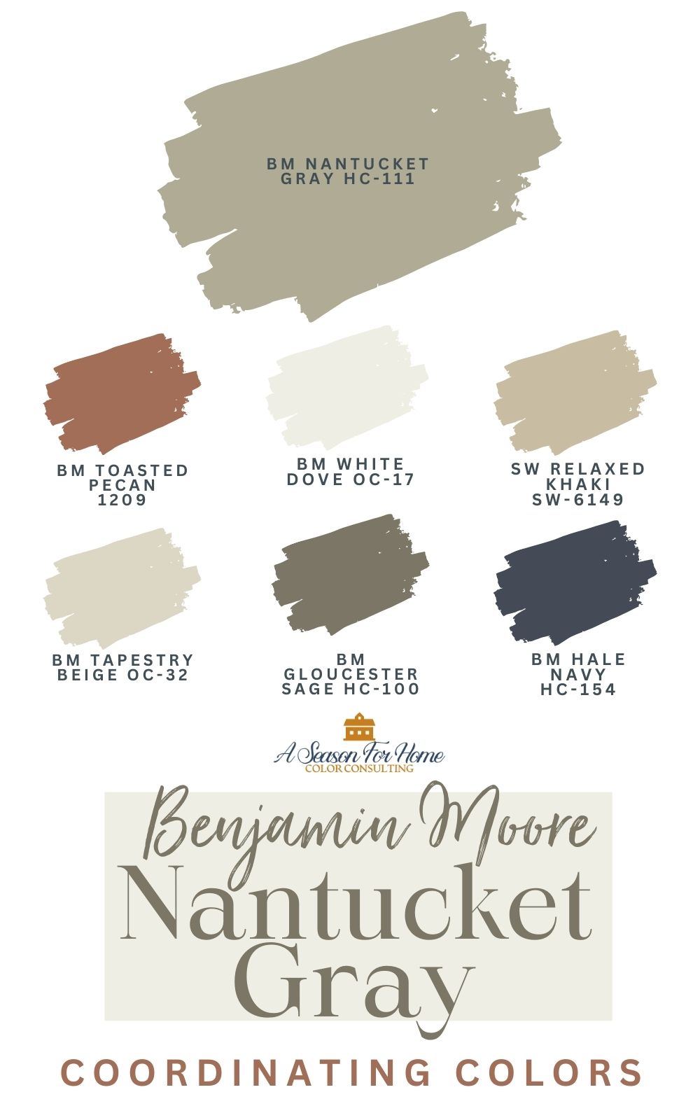
Nantucket Gray fits seamlessly into homes with New England Style. It’s part of my recommended Historic Paint Colors that work in 2026. This color looks excellent with khaki paint colors and creamy off-whites without too much yellow.
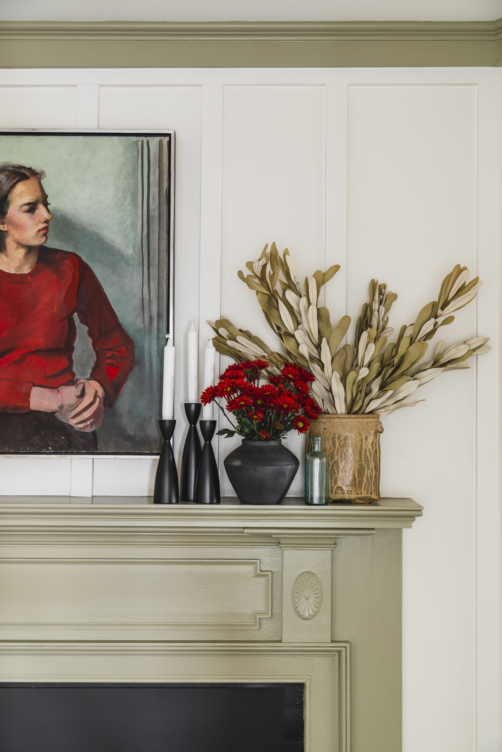
I also love the way Nantucket Gray looks with textiles in shades of russet red, brick and terracotta. Emily Starr paired it beautifully with a muted Prussian blue color on her mantle. Navy would also be really lovely with Nantucket Gray. Two of my favorite navy paints are Soot and Hale Navy by Benjamin Moore.
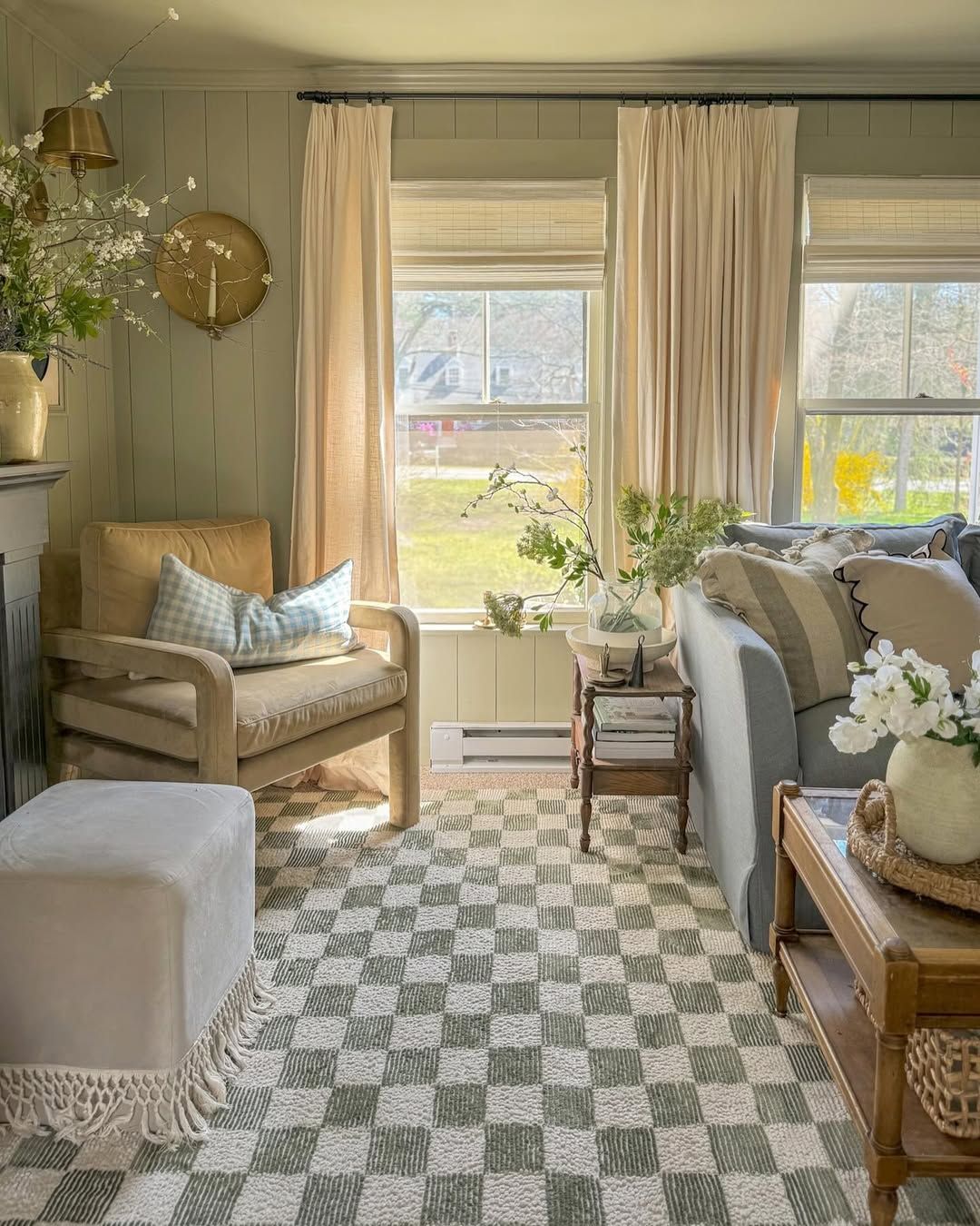
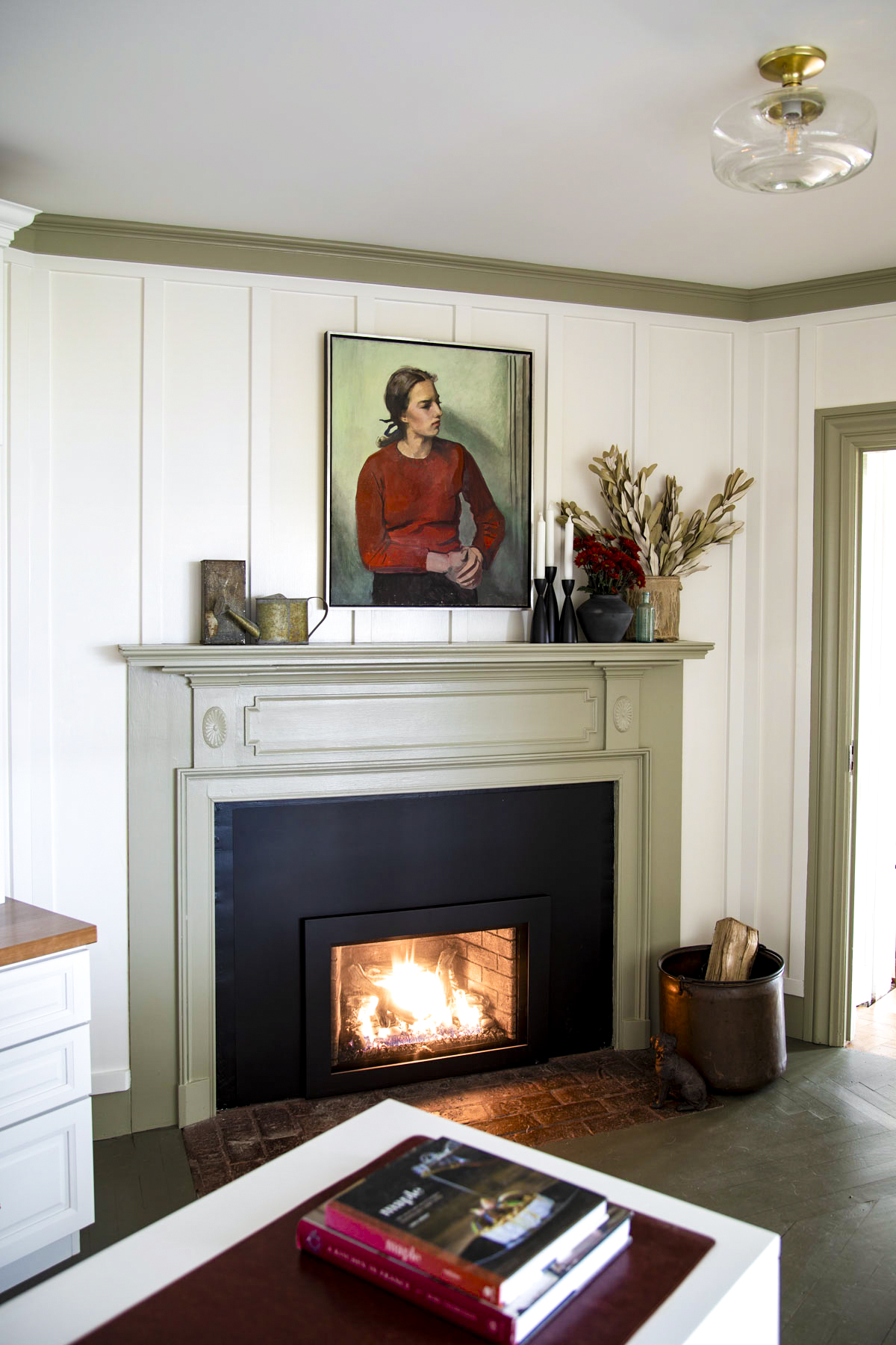
In my office, we painted the floor with Gloucester Sage from Benjamin Moore. It is almost like a deeper version of Nantucket Gray and the pairing looks great with the sisal area rug and White Dove paneling and cabinets.
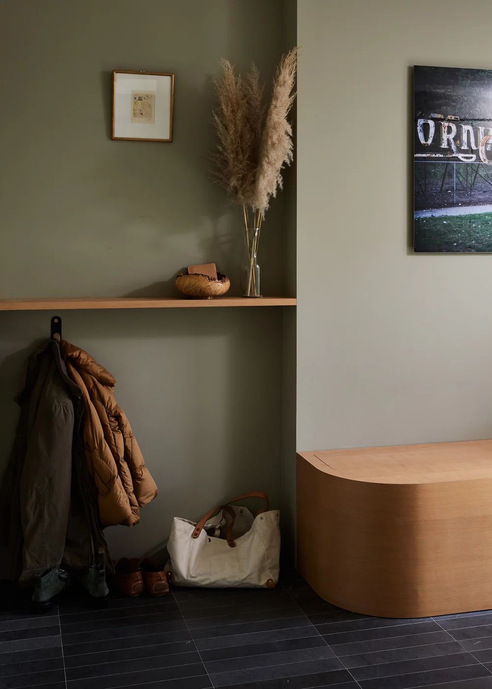
If using it for reverse trim like I did in my office, you could use Sherwin-Williams Wool Skein or Tapestry Beige by Benjamin Moore on the walls and the Nantucket gray on the trim, wainscoting and doors. For a contemporary look color drench your space with it and pair with White Oak like the below mudroom space from Shapeless Studio.
Where to Use Nantucket Gray HC-111 In Your Home
This color looks great in kitchens, living rooms and bedrooms. I also love it for a mudroom or hallway with shiplap or wainscotting! Due to it’s mid-dark LRV it is best paired with creamy off-whites and light khakis to keep spaces from becoming too dark.
Nantucket Gray Kitchen Cabinets
Can you use Nantucket Gray on kitchen cabinets? Yes! Nantucket Gray is a terrific choice for traditional kitchen cabinets, espically shaker front and inset style doors. Use brass drawer pulls for a warm classic feel. A black soapstone counter paired with it (look for a slab without a ton of green) or black slate would be lovely. Black granite would also be a timeless choice. I also love white marble-like quartz counters. That’s what we have in our kitchen and I love how durable they are! Do not do a brown granite, as this will look dated and evoke Tuscan kitchen vibes from the early 2000s!
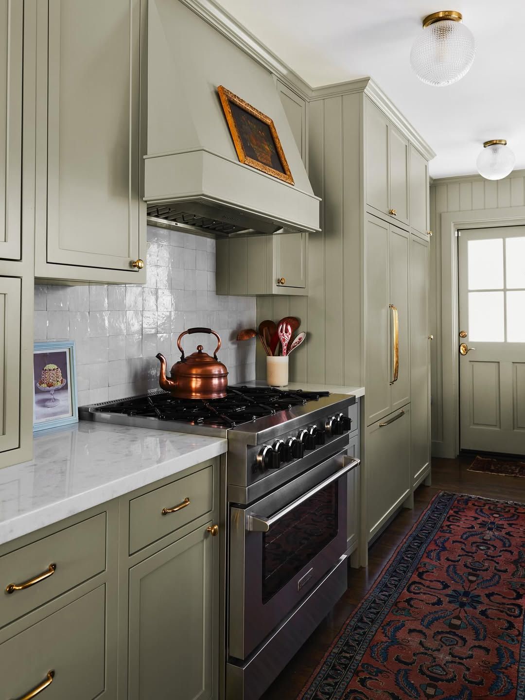
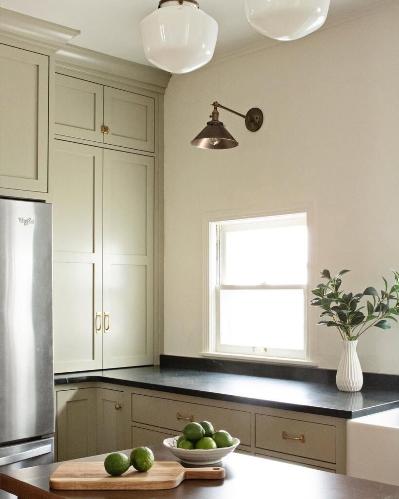
Image: Julia Chasman Design shows us a perfect example of Nantucket Gray on kitchen cabinets (left) and Caroline Meehan (right) shows how a creamy off-white looks with BM Nantucket Gray cabinets.
Nantucket Gray For Exterior
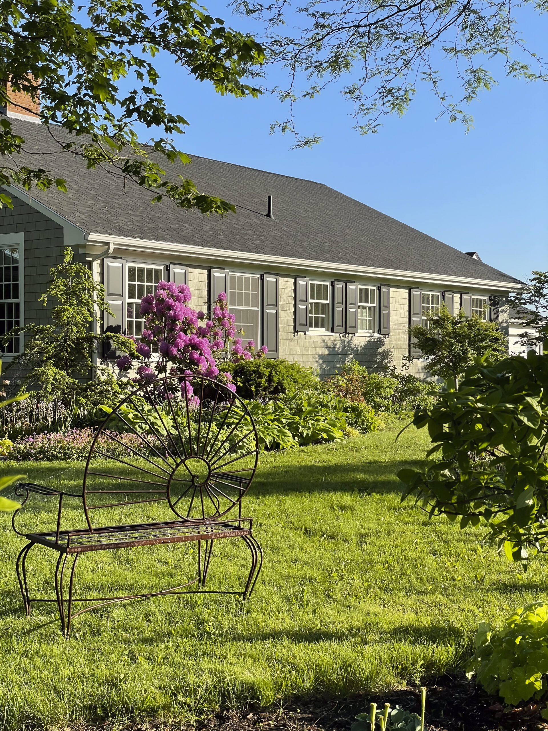
My mom’s house is painted Nantucket Gray (see image above) and it is timeless, cottagey (is that a word) and the perfect level green without too much saturation. Notice how she used a muted creamy trim color? I think this is key! Please, don’t go with a stark white on your trim.
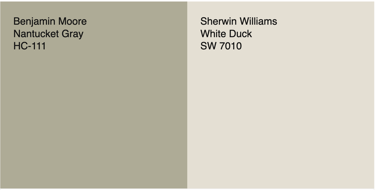
A good exterior trim color to go with Nantucket Gray is White Duck by Sherwin Williams (LRV 74.) This will give the impression of “white” trim without the harsh look of pure white.
PRO TIP: If you are replacing your windows, choose a non-white window with creamy neutral tones. I like Andersen Windows and Doors “Canvas” color. If you go with Canvas, Benjamin Moore makes a paint that matches it exactly. This way your trim matches your windows and the whole unit will read as one color. This detail can make the home look more expensive and it makes the windows look more elevated. Read more about picking exterior colors here.
I think this color is best for a coastal bungalo, on a traditional New England style homes like a high posted Cape or for a Colonial revival style home. If you want to compare some other greens for exteriors read this.
Similar Paint Colors
- Farrow and Ball French Gray: This is the best dupe for Cheyanne Green or Nantucket Gray. It is a couple of notches lighter (it has a LRV of 43 vs Nantucket Gray which is 39.)
- Svelte Sage by Sherwin-Williams: This is a favorite of mine that is very similar. I’ve recomended it in several homes for my color consulting clients. It is a very similar value and saturation, but slightly warmer.
- Benjamin Moore Victorian Garden: This is very close but a little more gray and less green. If you are looking for an exterior color that’ll pull a little less warm, try this one.
- Ben Moore Texas Sage: This is one notch darker, so if you brush it out on your exterior and feel that it could be a touch darker, try Texas Sage too.
Lighting Considerations
Ultimately we can talk about this paint color until we are blue in the face, but what matters is how it looks in your space with the lighting of the room. In warm light and rooms with Southern exposure the orange lurking below the surface will be more noticible. In North-facing rooms it will appear more cool and gray. In rooms wihtout much natural light it may look much less saturated.
How Do You Know If Benjamin Moore Cheyenne Green (aka Nantucket Gray) Is Right For You
Consider Whole House Color Scheme: The best way to know if this color is right for you is to look at your whole house color shceme and see if Cheyanne Green (aka Nantucket Gray) harmonizes or not. Ideally when you move from space to space in your home, you want the colors to flow and work together. The easiest way to do this is to pick up a paint chips at your local paint store, or purchase large scale samples from Samplize (that’s an affiliate link by the way) of each color in your home. Add Nantucket Gray to it and see if they go together.
Test It Out: Next, test this paint color on your wall! You can do this first, mess free with your large sample sheets. I always recomend to my Color Consulting clients to look at the sheets on different walls and at different times of day in varying light conditions. After you’re sure you like it, then buy a small can and test it out on the wall. Try to cover a large enough space so that you are not seeing the color underneath- which will influence your perception of the color.
Need More Paint Color Help? Sign up for a one on one paint color consultation —virtually! Our tried and true method using color correction accounts for the unique fixed elements in your space as well as your design vision! Simply click here to learn more about working together.