Tapestry Beige by Benjamin Moore Paint Color Review
When it comes to choosing the perfect neutral for your home, Benjamin Moore Tapestry Beige (OC-32) is a classic color that deserves attention. Known for its versatility and timeless appeal, Tapestry Beige is a warm, light tan that can work beautifully in a variety of spaces and lighting conditions. In this post, I’ll break down what makes this color so appealing, where it works best, and some tips for pairing it with other shades in your home.
Overview of Benjamin Moore Tapestry Beige
Benjamin Moore describes Tapestry Beige as a soft, muted beige with subtle warm undertones. While it leans slightly toward taupe or greige, its warm base keeps it from feeling too gray or cold. However, it’s important to note that Tapestry Beige does have faint green undertones, which can subtly emerge depending on the environment and lighting.
We used it in my husband’s home office, which is a North Facing room. In this space, it has a marked green undertone. In brighter lighting conditions, the undertone is less pronounced.
What is the Undertone of Tapestry Beige
Tapestry Beige is a neutral beige paint color with green undertones. You can see the undertones when you compare it to a neutral gray color like Sherwin Williams Repose Gray.
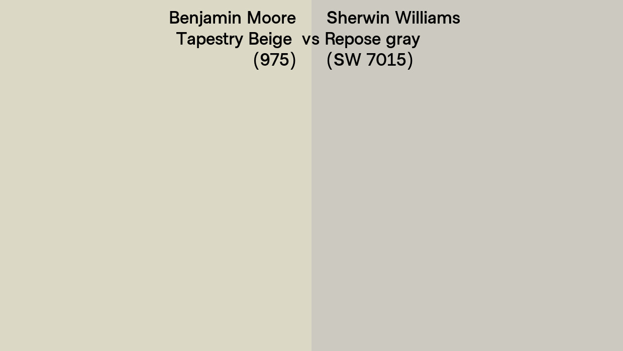
There are varying degrees of beige paint colors and this one has a cooler feeling than those with a slightly pink undertone. Compare Tapestry Beige to White Sand for example in the sample below and you can see the green pop in the Tapestry Beige, whereas White Sand (OC-10) has a rosy undertone.
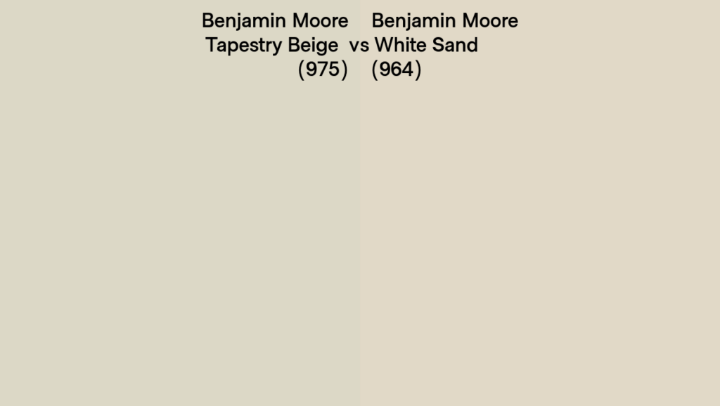
Tapestry beige will jive with other neutrals more easily than a pink beige like white sand. Pink-based beige paint colors tend to clash with any neutrals other than pink beige. They don’t play nice!
Where Tapestry Beige Works Best
This shade is highly versatile and can be used in:
- Living Rooms: The warmth of Tapestry Beige creates a welcoming atmosphere, pairing well with soft white trim and natural wood tones. Make sure you check your fixed elements before deciding on your neutral wall color. If you have reddish wood floors or cherry in the space Tapestry Beige will look more green.
- Bedrooms: Its calming undertones make it a great backdrop for a restful retreat. It looks excellent with white trim and ceiling paint. If you have white oak furniture or floor, this is a great color for a bedroom. I love it in rooms that are not open to other areas of the home so the undertones will not compete with one another.
- Hallways and Entryways: As a neutral that adapts well to different lighting, it’s a safe choice for transitional spaces if you like green or use greens and earth tones in your decorating.
When To Avoid Tapestry Beige
Clashing Fixed Elements: It is ultra-important to check your paint swatches with the fixed elements in your space such as tiles, countertops or a fireplace surround, before deciding on a neutral paint color for the walls in your home. If you have one or more fixed element with strong undertones, make sure they go with the undertones in your neutral paint color!
Open Concept Spaces: I do not recommend it for an all-house color or in entryways where there are other neutrals with pink undertones. Avoid painting it in the same viewshed with popular neutrals like Pashmina by Benjamin Moore, Sand Dollar by Sherwin Williams or Muslin By Benjamin Moore. The pink undertones in these beige colors will not play well with the greens in the Tapestry Beige!
Avoid Tapestry Beige in areas where there are other neutrals with contrasting undertones (such as pink beige.)
Need help with understanding your undertones? Make sure to Contact Me for an in person paint color consultation available in the Burlington area and all of Vermont.
LRV For Tapestry Beige
The Light Reflectance Value (LRV) of Benjamin Moore Tapestry Beige is 66 LRV is a measurement that indicates how much light a color reflects or absorbs, on a scale of 0 (pure black) to 100 (pure white). For Tapestry Beige, its mid-range LRV means it reflects a moderate amount of light—like it’s cooler and grayer cousin, Collingwood by Benjamin Moore, this mid 60’s LRV level is neither too dark nor overly bright.
Why LRV Matters When Choosing Tapestry Beige
- Interior Applications:
- Lighting Conditions: In spaces with lots of natural light, Tapestry Beige’s LRV ensures it won’t feel washed out or overly bright, maintaining its soft, warm character. However, in dimly lit rooms or north-facing spaces, its moderate reflectance might make the color appear darker, and its green undertones could become more noticeable.
- Room Size: For smaller rooms, a higher LRV color might make the space feel larger by reflecting more light. Tapestry Beige strikes a balance—cozy without being too dark.
- Exterior Applications:
- Sunlight Impact: When choosing an exterior paint color it is important for homeowners to know the amount of light will diminish the intensity of the hue of any paint color, so I always recommend going a little darker than you think when choosing an exterior color. In the case of Tapestry Beige, it is in the zone of paint colors to avoid because it is neither here nor there for exteriors and can come off as someone trying to pick a white and unintentionally end up with a pale green. You can read more about what I recommend for Tapestry Beige on exteriors here.
- Heat Retention: For homes in warmer climates, its mid-range LRV makes it a better choice than darker shades for reducing heat absorption, though it won’t reflect as much heat as lighter neutrals. If you are planning to use Tapestry Beige on your exterior, it can look lovely when the trim is painted the same color or you use a stark white like Chantilly Lace by Benjamin Moore or Extra White by Sherwin Williams.
How to Use LRV When Deciding on Tapestry Beige
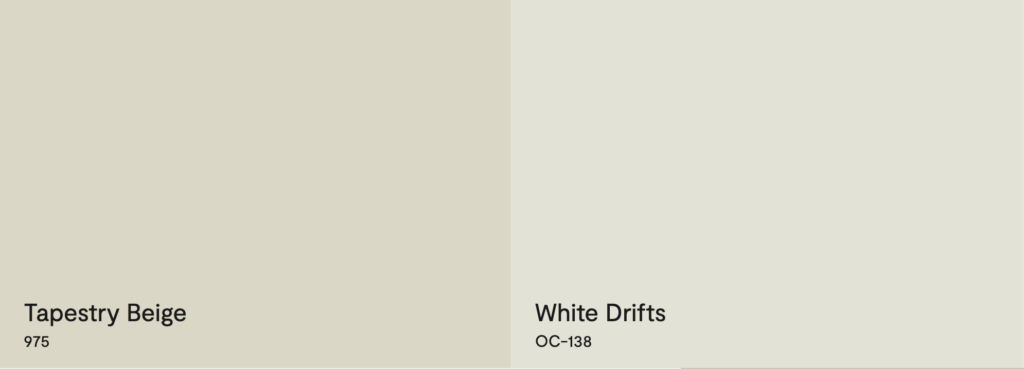
- I love a good tone-on-tone pairing, especially in historical homes and those with classic styling. If you do too, try it with an off white with about 10 degrees higher LRV. This will make it seem a little brighter because it is not a strong contrast. If you choose one with subtle green undertones (like BM White Drifts LRV 73) it’ll beautifully minimize its green undertone and give you that tone-on-tone quality.
- To make it appear crisp pair it with trim or accent colors that balance its mid-range reflectance, like crisp whites to brighten. This will make the Tapestry Beige appear darker by contrast.
- Outdoors, keep in mind that its appearance can shift depending on how much light hits the surface, so sampling on a larger scale is crucial. Test the color on large swatches or sample boards in your space to see how the LRV works with your lighting.
Ben Moore Tapestry Beige For Exterior
If you are wondering if Tapestry Beige is a good exterior paint color here’s what you need to know.
When choosing an exterior paint color it is important to know the large amount of light outdoors will diminish the intensity of the hue of any paint color compared to what it looks like when it is painted inside! That’s why I always recommend going a little darker than you think when choosing an exterior color.
In the case of Tapestry Beige, it is in the zone of paint colors (60 LRV to 70 LRV) to avoid because it is neither here nor there for exteriors and can come off as someone trying to pick a white and unintentionally end up with a greenish off white! See below the way it looks on an exterior paired with White Dove.
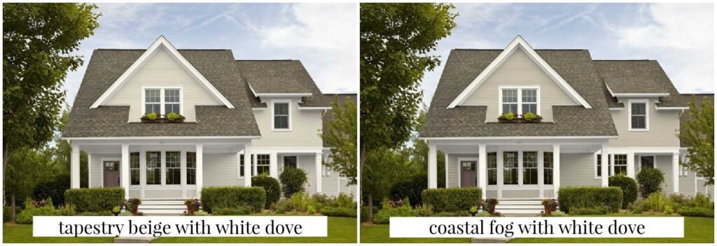
If you like this look, but want it to have more of an intentional look (not like a mistake) I would recommend using a darker version of this hue, such as Benjamin Moore’s Coastal Fog, which has a LRV of 52.
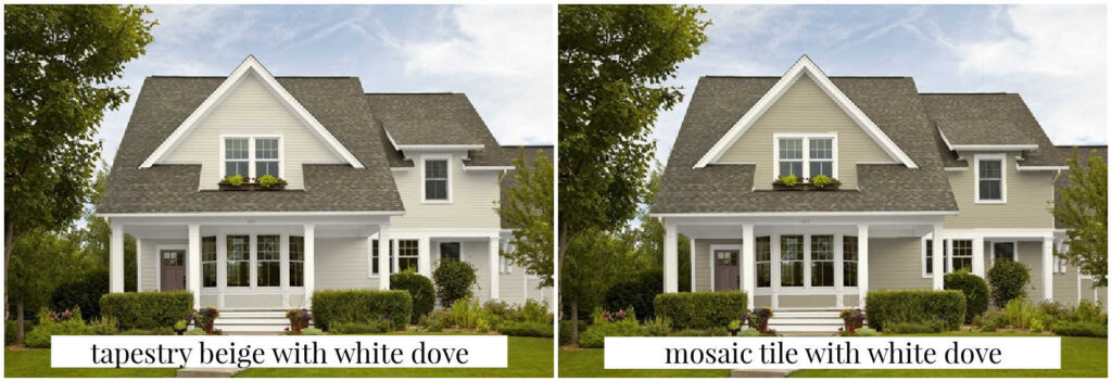
If you like the greenish undertones of Tapestry Beige and want that to come out in the exterior paint I would suggest going with Mosaic Tile instead of Tapestry Beige. This will have a nice crisp appearance with White Dove as a trim color. And if you want a fully green paint, check out our top green paints for exteriors.
When choosing exterior paint colors, make sure you are starting with your fixed elements before deciding. You’ll want to take the color of the roof and windows into consideration before deciding on the siding color!
If you need help picking out your exterior paint colors, make sure to let me know. I offer exterior paint color consultations in Vermont.
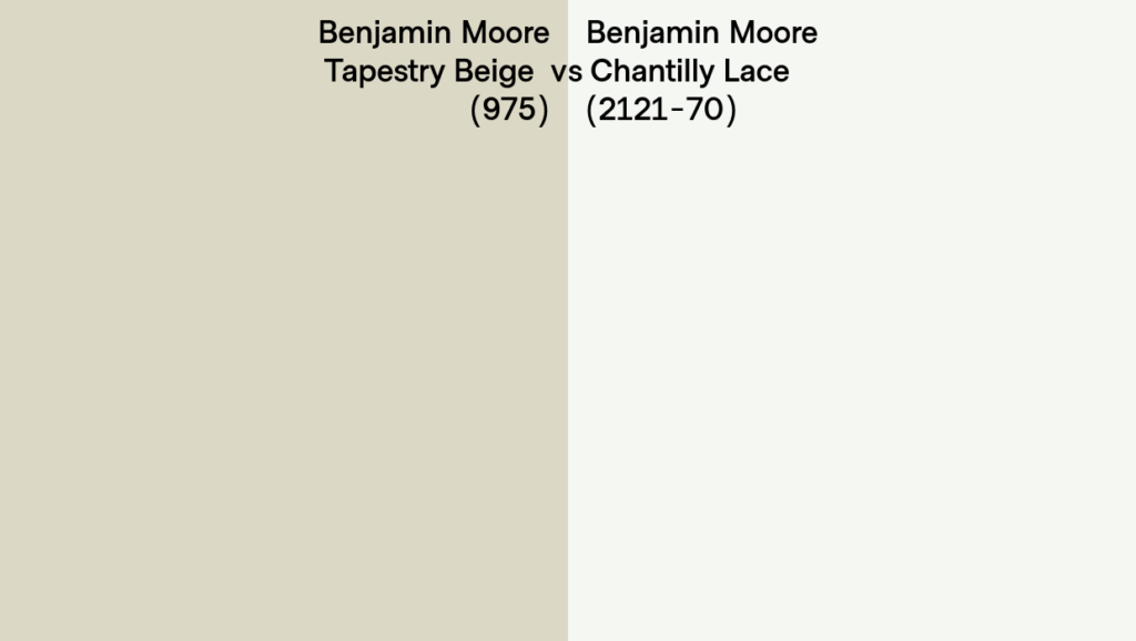
Heat Retention: For homes in warmer climates, its mid-range LRV makes it a better choice than darker shades for reducing heat absorption, though it won’t reflect as much heat as lighter neutrals. In this case you can make it pop a little more by going with a more stark white trim such as Chantilly Lace. This will make the Tapestry Beige pop more than the White Dove.
Lighting and Undertones
Like many neutrals, Tapestry Beige shifts depending on the light in your space. While it typically reads as a soft, creamy beige, there are a few scenarios to be aware of:
- North-Facing Rooms: In cooler, low-light settings such as north-facing rooms, the green undertones in Tapestry Beige can become more apparent. This can give the color a slightly cooler feel.
- Pairing with Red or Pink: When paired with shades that have strong red or pink undertones—think reddish woods or burgundy fabrics—those green undertones can stand out more in contrast.
- Bright Natural Light: In bright, warm light, the color leans back toward a balanced, warm beige, with the green undertones staying subtle and understated.
Testing a sample in your space is essential to understand how the color interacts with your specific lighting conditions and existing decor.
Which White Goes With Tapestry Beige?
If you are looking for a great white paint for trim, you have a few options. Pair it with crisp whites like Benjamin Moore Simply White (OC-117) or Chantilly Lace (OC-65) for a clean, modern look. I also like Sherwin Williams Extra White for when you need a big contrast and really want to maximize the undertones in Tapestry Beige.
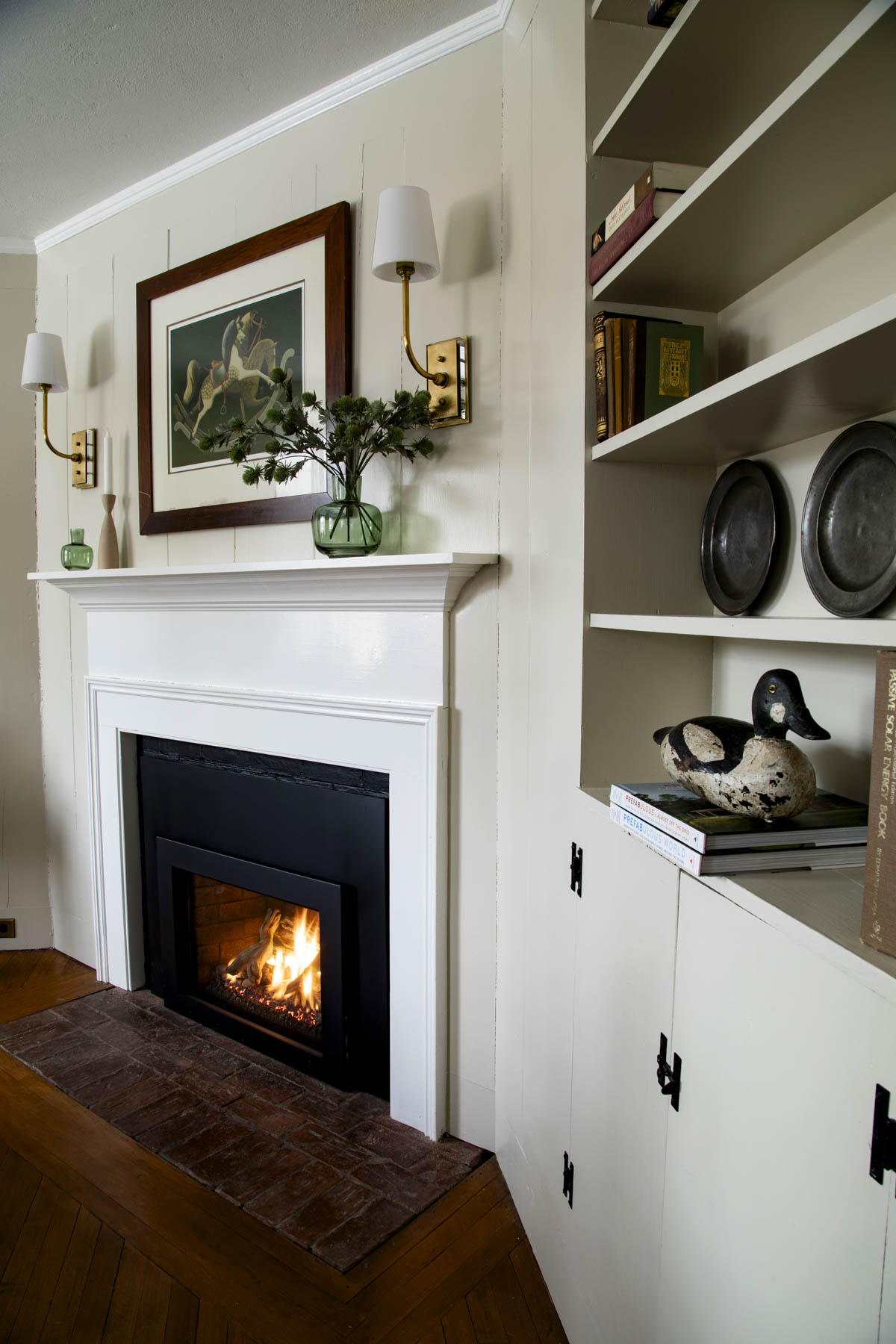
White Dove by Benjamin Moore is one of my favorite whites and is stunning with Tapestry Beige. You can see it here on the mantle with Tapestry Beige on the walls. You can see it offers plenty of contrast, while not coming off as stark or cold. It’s excellent with red brick and deep wooden floors with cherry undertones.

For a room with warm wood floors, like maple or counters or tiles that have a creamy yellow undertone, use Benjamin Moore Mascarpone (AF-20). And if your fixed elements have any orange undertones you can go with Sherwin Williams Dover White (SW-6385).
Pairing Suggestions
As a beige with green undertones, one of the best features of Tapestry Beige is its ability to play well in home color combinations with muted hues and a variety of earth tones. Here are a few ideas for complementary shades:
- Muted Peach and Historic Tan Colors: I love it with barely-there yet complex peach tones like Benjamin Moore Raleigh Tan (CW-190.)
- Deep Greens, Browns and Deeper Neutrals: Muted greens like Sage Mountain (2138-40) add a fresh, natural contrast. For a tonal palette, consider pairing it with darker beiges or browns with green undertones like Hampshire Gray (HC-101) or Victorian Garden(1531).
Featured Palette For Tapestry Beige
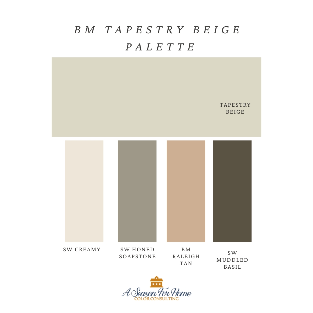
Here I’ve created a custom color palette for Tapestry Beige. I put it together with Sherwin Williams Honed Soapstone (SW 9126), a trendy but timeless green. Nantucket Gray would be a great green option instead. It also plays nicely with a rich chocolate-green color called Muddled Basil by Sherwin Williams (SW 7745). I’ve added in a contrasting peach (which sits across the color wheel from tapestry beige) called Raleigh Tan by Benjamin Moore. For our off-white I used SW Creamy which will offset the green in Tapestry Beige and provide plenty of contrast for crisp-looking trim and ceiling.
Final Thoughts
Benjamin Moore Tapestry Beige is a beautiful, versatile neutral that can bring complexity and elegance to any space. However, its subtle green undertones make it a nuanced choice, especially in rooms with cool lighting or when paired with contrasting colors.
If you love interior design with earth tones and greens you’ll love using this color as a neutral backdrop for pops of color with your other decor. I love it with flax-colored linens, off-white and earth tones in rooms with limited lighting. It has a complexity to it that exudes sophistication.
If you’re considering Tapestry Beige for your next project, I’d love to hear your thoughts or see how it turns out in your space! Leave a comment below or tag me on Instagram @seasonforhome. And if you’re needing more help with your colors, reach out for a Virtual Color Consultation!
MORE PAINT REVIEWS
- Benjamin Moore Natural Cream
- Benjamin Moore Muslin
- Benjamin Moore Navajo White
- Benjamin Moore Nantucket Gray
- Sherwin Williams Wool Skein
- Benjamin Moore Brewster Gray
Tapestry Beige is such a lovely color! We just painted the new cabinets in our basement laundry room this color. The room gets zero natural light so I had a hard time picking colors because everything looks different down there, but I am happy with my choice and it goes perfectly with the bronzy gold hardware we picked, the Raintree Green walls, and the recycled black granite countertops. Even the stark white appliances we have in that room look okay with it. Now I just need to work on my next idea for the room which is to paint a stencil mural inspired by the Sandberg Olof wallpaper and tile the backsplash.
That sounds lovely! I bet it looks so good with the Raintree Green! I’ll have to see the pics once you do your mural! Thank you for commenting Marisa!
Hi Katie,
What is the wall color behind you, is that Tapestry Beige? Thank you!
The wall color behind me in my headshot is Natural Cream. I wrote a review of it here on my blog. If you are looking at griege colors like it, I also recommend looking at Ben Moore Ballet White too. It is very similar but a whisper lighter.