Warm Colors Vs Cool Colors: What is The Difference?
As a certified color expert, the number one topic I get the most questions about is the difference between cool colors and warm colors. So if you are confused about this subject you are not alone! Read on! I’ll walk you through the basics and explain some deeper nuances on the subject too.

Understanding cool colors and warm colors
Cool vs warm colors are defined by their perceived color temperature which is based on a kelvin scale. In interior design we break colors into warm vs cool. We’ll cover more on this below, but first let’s review a little vocab lesson! First we need to define hue, saturation, value and chroma so we are all speaking the same language! Then we’ll talk more about temperature in a sec.
- Hue: This is the name of the color. For example red is a hue. While there are different reds out there, like firetruck red or brick red, the hue for both is red. Read more about color hue here.
- Saturation: This is the amount of pigment a color has. It goes from intense to faint. An unsaturated color will appear almost gray with a whisper of color added to it while a deeply saturated ones reflects its true intense hue.
- Value: Color value refers to the lightness or darkness of a color. Higher values appear lighter (closer to white), while lower values appear darker (closer to black.)
- Chroma: This describes the purity of a color’s hue. This concerns when a complimentary color is added to the hue to make it appear more dirty, muted or complex. Read more about clean colors vs dirty colors and color chroma here.

What is color temperature?
Color temperature describes the warmth or coolness of a color, based on its position on the spectrum of light. Warm colors (reds, oranges, yellows) have lower temperatures, while cool colors (blues, greens, purples) have higher temperatures, influencing the mood and ambiance of a space.
What Are Cool Colors?

Cool tone colors are any hues, tints or shades that fall on the cool side of the color wheel including green, blue, indigo, violet and purple. While true black and pure white do not have a color temperature, most “neutrals” do have an undertone that puts them on one side of the color temperature scale or other. In other words, there are cool grays and whites.
What Are Warm Colors?

Warm color comes from the side of the color wheel including red, orange and yellow and everything in between. Warm colors also include a variety of neutrals including brown, tan, taupe, beige and cream.
How Do I know if a color is warm or cool?

You can tell if a color is warm or cool by locating it on the color wheel. Divide the color wheel in half, red, yellow and orange are on the warm side and green, blue and purple is on the other side. Where does your color fall?

Sometimes, your color is more subtle, like when you are picking out a white trim color! That’s when it is not as easy to tell. This is when noticing the undertones is important. I find it helpful to see the undertones in subtle tints and shades when I compare them to either a neutral gray tone or another color of similar value.
When you have a more deeply saturated color, contrasting similar hues will often show which is warmer or cooler. You can also pick the most “primary” version of a color and place your color side by side with it. You’ll be able to tell if it is cooler or warmer.

The above image illustrates that the term warm or cool is all relative! Meaning, there are cool colors and warm colors that are determined by which side of the color wheel their hue is on. However, when you compare them to other shades of the same hue, one will appear more warm than the other.
FAQs For Warm Colors or Cool Colors
In interior design, gray is mostly used as a cool neutral, however, there are warm shades of gray too! While blue grays like Mineral Deposit by Sherwin Williams are clearly identifiable as cool colors, the difficulty is when considering grays with warm undertones. Popular warm gray colors, or greige as they’re sometimes called, are like desaturated beiges. I find ones with a little green to them to be the most difficult to define. Edgecomb Gray is the perfect example of a warm gray paint color that I would be considered a warm color. The best way to tell if your gray is warm or cool is to compare it to a natural gray like repose gray by Sherwin Williams.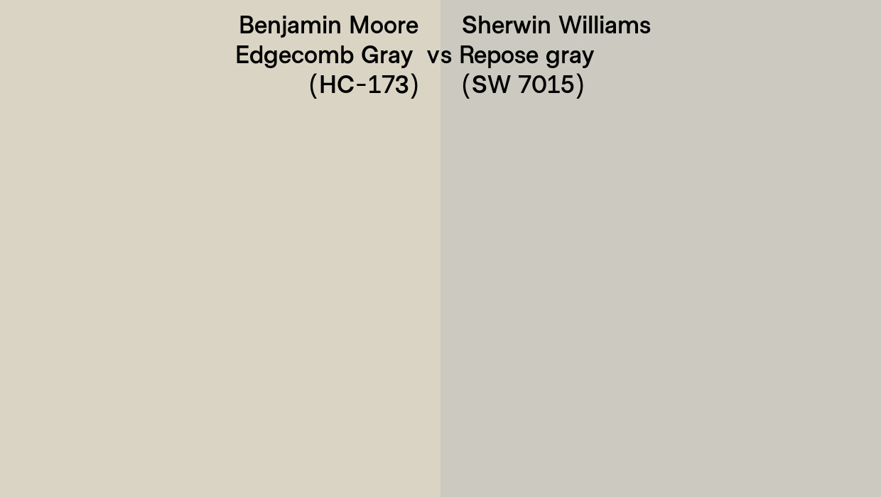
I don’t think warm is better than cool, but they do have their pluses and minutes. Warm colors visually come forward while cool colors recede. This characteristic can make spaces decorated in warm shades feel cozy, enveloping and cheerful. Brighter tones of warm colors can also be energizing so avoid them in places of rest like a bedroom. Cool colors can have a calming effect but they can also make a space feel stark and austere when not balanced with textures and grounding neutral shades.
Examples of warm colors include orange, peach, russet, sienna, cream, red, brick, terracotta, gold, yellow, taupe and brown to name a few! Earthtones are generally warm colors as are warm shades of beige, brown and tan.
Blue, green, teal, aqua, indigo, navy, violet, purple, gray, charcoal and slate are examples of cool colors. When measured in kelvin units, these cool hues are higher on the color temperature scale than warm colors.
Traditionally purple is considered to be a cold color. Purple is right at the cut-off between cool and warm on the color wheel spectrum, so there are warm shades of purple, like Cinnamon Slate by Benjamin Moore that are more closely related to red than blue. This same dichotomy is true of green, some yellow-tinted greens or olive greens, like Baby Turtle by Ben Moore, are so close to warm colors that it can be hard to call them cool.
Tips For Using Cool and Warm Colors In Interior Design
Warm tones can make a space feel more inviting and homey. This being the case they can make a large space feel more snug and inviting. Use cool tones to create a serene environment and to make a smaller room seem larger.

Using Warm Tones In Interiors
To create a warm color scheme for a cozy living room lean into warm neutrals and use a desaturated shade of brown for your wall color (like Castle Gate by Benjamin Moore.) Then furnish your room with a chocolate brown sofa and beige upholstered chairs. Choose terracotta pillows and a throw blanket for a few pops of color. Finish the scheme using an area rug with shades of brown, beige terracotta and warm gray to pull it all together.

Using Cool Tones In Interiors
Cool tones can make you feel calm and serene like being near the ocean or at the spa. Base your interior space using an accented neutral scheme using relaxed white slipcovered furnishings and light gray walls (like Collingwood By Benjamin Moore) and add a few pops of blues and green in textiles and artwork to add colorful dimension.
Can you mix Cool Tone Colors With Warm in Interior Decoration?
Yes you can mix cool and warm tones. In fact I highly recommend it! Below I’ll show you three ways to try mixing hot and cold colors in your home.

A common color scheme is known as a complementary scheme. This is where a primary hue (like blue, yellow or red) is paired with the color directly across from it on the color wheel (orange, purple or green, respectively.) Decorating with both warm and cool colors helps to balance out your space. If you are not sure how to do this, try using the 80/20 rule, decorate the space with 80% of one shade and add 20% of its complement!

Analogous color schemes are another simple way to mix warm and cool colors. Take Green and choose the colors on either side of it on the color wheel (blue and yellow) to create a three color palette.
Another way to mix cool tone colors and warm colors is to use a color triad. This is where three equally spaced colors are paired together. To make this work it is best to let one of the colors dominate and use the other two as accent colors.
The Best Way To Decorate With Warm And Cool Colors
Understanding the difference between warm and cool colors is an essential tool in creating a balanced and harmonious space. Warm colors can add energy, coziness, and a sense of welcome, while cool colors offer a calming and refreshing feel. By learning to recognize undertones and how colors interact with one another, you can confidently choose hues that align with the mood and function of your space. Whether you’re selecting paint colors, textiles, or décor, knowing how to distinguish between warm and cool tones will help you achieve a cohesive look.
Ultimately, color temperature is not just about aesthetics—it influences the way a space feels and functions. By experimenting with comparisons, lighting, and surrounding elements, you can fine-tune your choices and create a home that reflects your style and personality. If you’re still unsure about a particular color, try testing samples in different lighting conditions and alongside other colors in your space. The more you observe and compare, the more intuitive color selection will become!
Do you need help with your colors? I work with clients one on one in person during live color consultations. Sign up for a Virtual Color Consultation today to save your spot!