Benjamin Moore Natural Cream


Natural Cream by Benjamin Moore is a gorgeous complex cream greige paint color that I used in both my primary bedroom and living room. For today’s comprehensive paint color review, I will go over my personal experience with it plus all the details on this popular paint color including the LRV, Natural Cream’s undertones, similar color options and pairing suggestions. I will also go over when to avoid using it!

Is Benjamin Moore Natural Cream a Beige, Cream, Gray or Greige paint color?
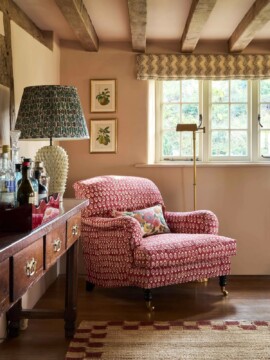
Natural Cream OC-14, also known as Nature’s Essentials 1521, is a greige or complex cream paint color with subtle undertones. Natural Cream can be a true chameleon! Depending on the sun exposure and natural light in the space it can look like an understated cream or a subtle greige tone. Our living room is north-facing and our bedroom is south-facing and it looks like two completely different paint colors!
LRV For Natural Cream by Benjamin Moore
Natural Cream is a bright cream paint with an LRV of 64.78. Natural Cream is what I would call a Light Tone. It is lighter than a Mid-tone paint (which I classify as 40 to 60 LRV) and it is slightly deeper than an off-white.
What is LRV?
LRV stands for light reflectance value which describes how bright or dark a paint is. Pure white would be a 100 on this scale and true black would be 0.
- Pure White 100
- White Paints 94 to 80
- Off Whites 81 to 73
- Light Tones 72 to 61
- Mid Tones 60 to 40
- Dark and Medium Dark 39 to 13
- Blackish and Darkest 12 to 4
- Black 0

What Are The Undertones?

Natural Cream is a subtly warm greige that has minimal orange undertones. As far as cream colors go, it has very little saturation. To see a neutral paint color’s undertone, I always start by comparing it to Repose Gray by Sherwin Williams, which doesn’t lean warm or cool. When I do this with Natural Cream (aka Nature’s Essentials) you can see its warmth.

I have found on gray days (especially when it is raining or snowing) this paint color really leans into its the gray part of its greige personality and shows cool or green undertones. And as I mentioned, our Living Room is North-facing, so I see the blue gray green undertones in this room much more than our sunny bedroom.

As a paint color consultant, I have access to the above book of all of Benjamin Moore’s catalog which is mathematically arranged. I love using this book when I am trying to find a slight adjustment to a color scheme. Using this book is super helpful in seeing the true nature of Natural Cream with the subtle nuances of whites next to it.
When you see where Natural Cream falls as part of the off-white color collection it is clear that it is a warm gray (aka a griege.) Almost all of the saturation is pulled out of this color and it is left with only a bit of warmth. This is why Natural Cream looks creamy without being yellow.
How To Use Natural Cream In Your Home
Why did I use Natural Cream? When we bought our house I needed to pick out paint colors that would work with our existing furniture, rejuggled to fit our new spaces. That means I was looking at a lot of shades from the off-white collection. While I used Collingwood as more of a Whole House Color in spaces like our grand foyer, hallway and kitchen, I knew I wanted a creamier warmer tone to cozy up our living spaces. That’s where Natural Cream came into play.
It worked perfectly to warm up the walls (compared to Collingwood) but it was not so colorful that I would be forced into any specific color palette. I’ve found that it goes with a lot of colors. Blues in particular play well with its undertones.

When To Avoid Natural Cream
Natural Cream is a good all-around off-white paint but there are a few circumstances where I would avoid it:
- If your room is lacking in visual interest like a powder room without millwork or drapery Natural Cream is not your paint color. It is too boring to do much for a space like this.
- Avoid clashing with neutrals with different undertones. I find that it looks awesome with off-whites and neutrals with similar undertones. However, I had a greige rug with a rose undertone and it looked terrible with the undertones of Natural Cream.
- I know I said this paint sometimes has a cool undertone, but do not use it if you want a greenish beige. If you want a beige that has noticeable green undertones Tapestry Beige is a much better choice.
- Do not use if you are looking for a statement wall color. You will be disappointed because it is not a noticeable color.
- While I call it a greige, do not use if you are hoping for a beige. This paint is more gray than beige.
- Do not use it as your white paint for a trim color. With a LRV in the mid-sixties is too dark. Use our guide to picking a trim color instead.
- Do not pair with blue-tinted whites like Decorator’s White or Carerra marble. It will look grungy! Opt for Calacatta marble or a warm Quartz instead.
What Are The Best Benjamin Moore Natural Cream Coordinating Colors
Like Edgecomb Gray, this neutral looks best with low chroma colors. However if you like brighter colors you can use this paint too. It is desaturated enough that you can pair it with Clean Colors or high chroma colors especially in South-facing rooms where it will be washed out.
Use our Natural Cream color palette for inspiration to paint your home.
- Use OC-14 in your open concept in your living room and entry hall and any open areas and use the other shades in this palette in enclosed spaces.
- Save the darker tones for moodier rooms (like Virtual Taupe or Wynwood in an office, Vanderberg Blue in a bathroom or color drench your dining room in Tavern Charcoal.)
- Then use the lighter colors like Creekside Green and Brewster Gray for bedrooms and Nutmeg in your kitchen.


How do you know it is right for you?
- If you want a creamy paint that isn’t yellow this is a great color.
- Use it when you want a paint color that is happy to play second fiddle. Benjamin Moore Natural Cream is one of those paint colors that flies under the radar and lets all the other furnishings, colors and decorations do all the talking. It won’t clash or steal the limelight!
- Use BM Natural Cream to give a fresh look to your space when you want to decorate with an accented neutral scheme and its neutral color will effortlessly act as a backdrop for your accents and decor.
- It is the ideal neutral to use as a Whole House Color when you’re coming up with your home color combination. It works especially in older homes with small windows or those lacking a lot of natural light.
- Because the undertones are so subtle you can get away with using it as an off white paint when you want to make a space feel a little more cozy. And thankfully it goes with both warm and cool colors!
- I’ve seen it used on kitchen cabinets and this look is stunning! It’s nice and creamy but doesn’t look yellow at all! Pair with brass pulls for a timeless look.
I always recommend testing a paint out before you commit to painting the whole room. When I work with clients for a color consultation, we look at large scale paint samples, and you can do this too! Test Natural Cream with a large scale peel-and-stick sample in your space to make sure you love it. (That’s an affiliate link by the way.) The samples from Samplize are made with two coats of real paint for 100% color accuracy, offering a no-mess, quick way to decide if this is the right paint color for you!
FAQs for BM Natural Cream
Natural Cream is a warm color. When analyzed it comes from a highly desaturated shade of orange which is on the warm side of the color wheel.
Yes this cream colored paint works well for exteriors. It’s sophisticated when used all over on both trim and sidings, especially on a Cape or Saltbox-style home. I like it as an exterior trim color for a warm gray paint for a classic historical tone-on-tone look. It’s also great as trim with green paint on exteriors.
Use a creamy white or off-white like Whitetail by Sherwin Williams or Swiss Coffee by Benjamin Moore. White Dove by Benjamin Moore is another great choice. If you like a crisp high-contrast look try it with Chantilly Lace.
Yes, yes and yes! I have tried all three and it looks great with blue especially. I have white trim with it in both rooms and that’s what I would recommend to clients. Red as an accent works well. I had a rug with red in our bedroom for several months and it looks super classic and pretty.
No it doesn’t look yellow, and in fact this is why I chose it for our bedroom. Even in warm South-facing light the walls look creamy, but not too warm. If you are looking for a warm creamy paint for your kitchen cabinets and don’t want them to look too yellow- this is your color!
More Colors Like Natural Cream
If you’re like me, when you’re making a big decision, you like to have comparisons and other options so you know that you’re making the right choice. That’s why in my color consultations I usually have clients look at similar colors before settling on one in particular. The following is a list of other colors I would recommend that you consider before settling on Natural Cream.

- Ballet White By Benjamin Moore: I used this in the hallway and walk-in closet in our Primary suite where it gets less natural light, and you really can’t tell that they are a shade off from the Natural Cream in the bedroom. The Ballet White is just a hair brighter with a tiny whisper more pink- so if you like Natural Cream but want a slightly lighter paint color, go with Ballet!
- Baby Fawn, Wind’s Breath, Ashwood: Consider these three Benjmain Moore off-whites too. Baby Fawn is a similar color as far as saturation/gray but it is a hair darker in value. Whereas Wind’s Breath and Ashwood have slightly varying undertones. Ashwood reads a little green and Wind’s Breath is a little creamier by comparison.
- Sherwin Williams Oat Milk: This is a nice light cream color to compare it to. It is slightly lighter and has a bit more pink than orange as far as undertone.
- Farrow and Ball Shadow White: This beauty of a color is one to look at too. It is more expensive than the Benjamin Moore, but certainly worth considering especially for a high-priced expense like kitchen cabinets.
Are you trying to find the perfect paint color? Download our 5 Free Color Palettes for your home or sign up for a one hour Virtual Color Consultation and we will work together to find the perfect paint!