Edgecomb Gray Color Palette


Edgecomb Gray (HC-173) by Benjamin Moore is a best-selling paint color and all-time favorite neutral shade. As a soft greige, it bridges the gap between gray and beige, making it adaptable to modern and traditional spaces. Its subtle undertones also make it an excellent base for various coordinating colors.
This post contains affiliate links.
How to Coordinate Colors with Edgecomb Gray by Benjamin Moore
Whether you’re aiming for a neutral monochromatic look or want to bring in accents that add depth and personality, Edgecomb Gray pairs beautifully with an array of shades. Here’s a guide to selecting greens, neutrals, blues, and earth tones that harmonize perfectly with this versatile color.
What is the Undertone of Edgecomb Gray by Benjamin Moore?
Edgecomb gray is one of the most versatile warm neutrals because the undertone is virtually neutral. Depending on the light, the undertones can appear either slightly green or a tiny bit pink.
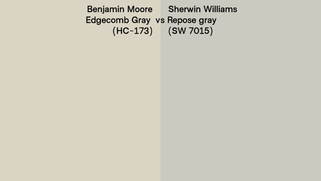
The best way to see the undertones of your neutral paint color is to compare it to one without an undertone. See here I have set Ben Moore Edgecomb Gray next to Sherwin WilliamsRepose Gray, our go-to neutral gray to help identify the undertones.
Edgecomb Gray vs Accessible Beige
You may be wondering if you should paint your space with Sherwin-Williams Accessible Beige or Edgecomb Gray, both of which are very popular neutrals. This topic deserves its own blog post entirely, but essentially, what you need to know is: these two paints will mostly go with the same colors.

Use my above visual comparison to see how they compare. Edgecomb is lighter, brighter and a tiny bit less pink. Accessible beige is a light taupe whereas Edgecomb Gray is a griege. Neither are warm enough or saturated enough to be considered a true beige. Read this if you are wondering what the difference between taupe and beige are.
These two popular warm neutrals are both eminently adaptable and I can’t think of a single color in this below palette for Edgecomb Gray that wouldn’t go with Accessible Beige too, but for good measure you can read my favorite suggestions in this Accessible Beige palette.
Order large scale samples of all of these colors on Samplize.
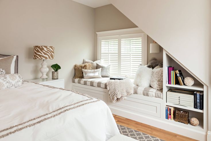
Interior Paint Colors To Go With Edgecomb Gray
Edgecomb gray has a good deal of warmth to it and loads of complexity. That means, for interior spaces, it goes with other colors with warmth and complexity! I love this paint color for:
- Whole-house color
- Open concepts
- Hallways
- Stairwells
- Entryways
It will go with the colors in adjacent spaces without clashing. If you are in the process of picking the perfect home color scheme, make sure to read our tips for how to pick a whole house color combination.
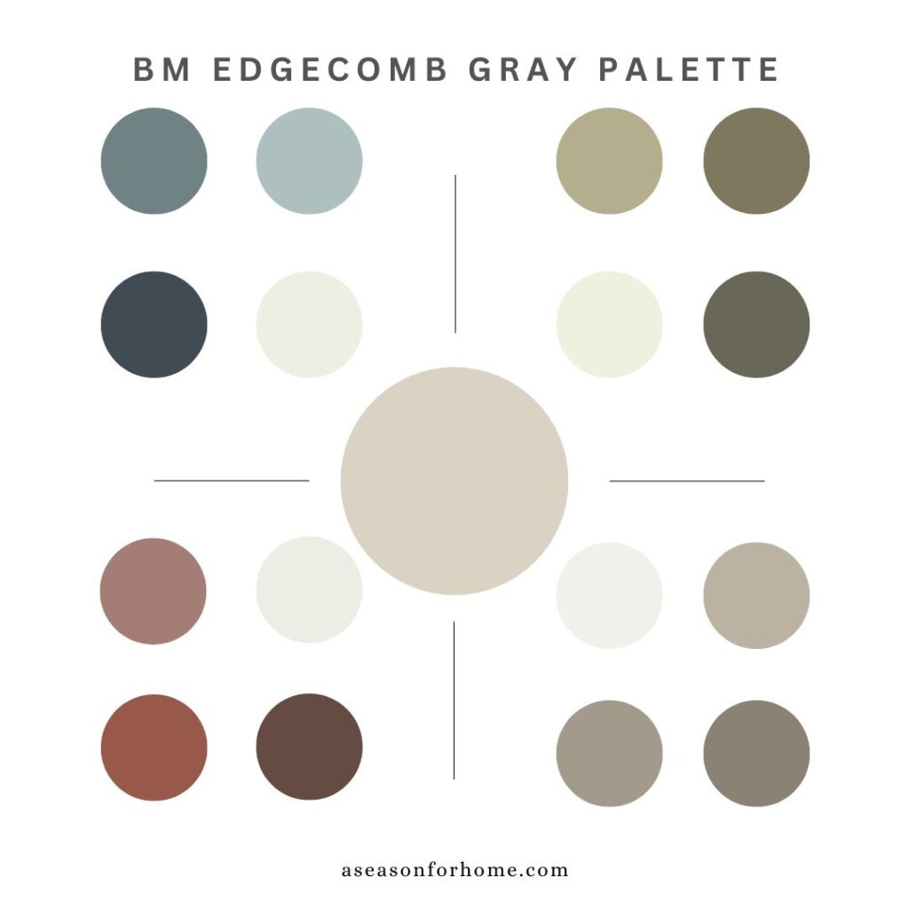
It’s the perfect greige neutral to paint your walls for an accented neutral color palette. Below I will go over some colors to use with Edgecomb Gray.
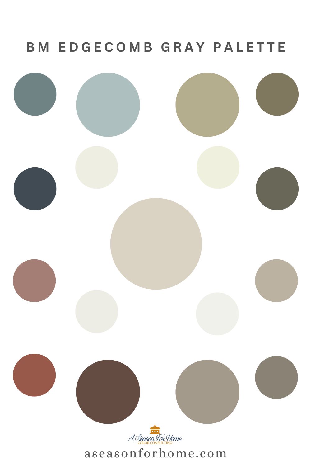
Please sign up for my email list to get my free PDF of the Edgecomb Gray Paint Color Palette with 16 coordinating colors!
Coordinating Greens For Edgecomb Gray
Green is having a moment and we are here for it. And so is Edgecomb Gray! This paint color goes beautifully with greens. As I mentioned above, it has a little green in the undertones as well as pink (which is the compliment of green) so it is a match made in heaven! Here are our picks:
- Lapland (AF-410): A deep, earthy green that feels grounded and sophisticated. This shade is ideal for accent walls or cabinetry, bringing richness and warmth to the space. This gorgeous color works with brass, linen, sisal and woven textures.
- Pining For You (1513): A deeper hue but still muted with complexity. It is a warm green that’s perfect for a kitchen or dining room.
- Castle Peak Gray (1561): A dark green that leans toward gray, adding a serene, elegant touch to accent furniture a bathroom vanity or custom millwork.
Neutral Paint Colors That Balance
For a monochromatic look that feels cohesive and elegant, pair BM Edgecomb Gray with deeper, richer neutrals. It is super important to match undertones when pairing neutrals. These are my top picks:
- Ashley Gray (HC-87): A darker mid-tone taupe with warm undertones, perfect for South-facing adjacent rooms or as an accent wall wintin the same space to add depth without overpowering.
- Pashmina (AF-100): A pop-star in the paint world, this sophisticated greige has a hint of warmth. Because their undertones go so well together it’ll offer a seamless flow when paired with Edgecomb Gray in open-concept spaces.
- Iron Gate (1545): A dramatic, deep charcoal gray with a wee-bit of green. Iron Gate adds striking contrast while maintaining a warm, inviting feel. You could use this on furniture or millwork for a great contrast and cohesive vibe.
Earth Tones To Go With Edgecomb Gray
Earthy reds with hints of brick and peach are excellent with Edgecomb. I also think browns will bring richness and warmth to spaces with Edgecomb Gray and keep it from veering to gray! This helps create a grounded and inviting palette for bedrooms and spaces with natural wood. These colors work particularly well in rooms with natural materials or as accents to add depth:
- Almond Beige (2101-40): A soft, warm beige with reddish undertones that complements Edgecomb Gray’s warmth, perfect for upholstery, rugs, or accent walls.
- Georgian Brick (HC-50): A classic, muted red that adds a touch of boldness without overwhelming the space, ideal for exterior doors, accent walls, or statement pieces.
- Hasbrouck Brown (HC-71): A deep, chocolatey brown with a hint of warmth, bringing a cozy, sophisticated feel to cabinetry or built-ins.
Blues Paints to Go with Edgecomb Gray
Edgecomb Gray’s versatility shines when paired with muted or rich blues, which can create a serene, coastal-inspired feel or add bold contrast.
- Wedgewood Gray (HC-146): A soft, dusty blue that feels calm and elegant, perfect for bedrooms or bathrooms.
- Wetherburn’s Blue (CW-580): Like Brewster Gray, Wetherburn’s Blue is a favorite deep, moody blue with a subtle hint of green. Inspired by historical color palettes, it carries a timeless elegance while feeling fresh and modern in contemporary spaces. This shade pairs beautifully with BM Edgecomb Gray, creating a striking yet balanced contrast. Use Wetherburn’s Blue for accent walls, cabinetry, or even smaller details like furniture to bring depth and character to your design. Its versatility and understated complexity make it a perfect choice for both traditional and transitional interiors.
- Blue Note (2129-30): A deep, moody navy blue that creates a dramatic yet balanced pairing with Edgecomb Gray. If you like Hale Navy, try this color! It is slightly less saturated but has a deep rich value to provide plenty of contrast.
Make sure to add white trim and ceiling paint to set off these looks. I love Moonlight White (OC-125) with any of these blues when paired with Edgecomb Gray.
Tips for a Perfect Palette
- Test Before You Commit: Always test Edgecomb Gray and its coordinating colors on your walls and observe how they look in different lighting conditions throughout the day.
- Mind the Undertones: Since Edgecomb Gray has pink and green undertones, aim for coordinating colors and neutrals with similar warmth for a harmonious look.
- Cool or Warm: It goes with cool colors and warm colors, but it is important to pair it with dirty colors, as clean colors will be too bright next to such a complex neutral.
- Think Beyond Walls: Use these shades not only on walls but also for trim, cabinetry, furniture, and accessories to tie the space together. Or use similar colors in this palette to pick out your area rugs, textiles and accessories!
- Pick The Perfect Trim For Edgecomb Gray: Use our three-step process to learn how to pick trim color. Use a creamy white for a tonal look or a bright white for a crisp contrast.
Free Download: Edgecomb Gray Color Palette
For an easy starting point, I’ve created a downloadable custom palette for all my email subscribers, featuring these coordinating colors, tailored to enhance Edgecomb Gray by Benjamin Moore. Sign up and download it here.
With the right color pairings, Edgecomb Gray becomes the perfect foundation for a beautiful, cohesive space. Which coordinating shade will you try first?
More Favorite Neutral Paint Colors
If you are picking the perfect neutral paint color for your home, make sure you read about our favorites here first:
- Natural Cream Benjamin Moore is a soft greige with warmth without yellow
- Muslin by Ben Moore is a popular neutral paint color I classify as a slightly peach beige
- Navajo White is a creamy, warm off-white to pair with dirty colors and warm neutrals
- The slight green undertone in Tapestry Beige may be just what you are looking for
- Smokey Taupe is one of our top picks for Minimalist paint colors
Need more help? Sign up for one of my custom color consultations today!