Historic New England Paint Colors That Just Feel Right For 2026

How to Use Classic Colors in a Modern Home Without Feeling Stuffy or Stuck in the Past
If you’ve been scrolling lately and thinking, I just want colors that won’t look dated next year, you’re not alone. There’s a reason historic New England paint colors are suddenly everywhere—they’re the ultimate tried-and-true shades. They’ve already stood the test of time, and somehow they still feel totally on trend.
Maybe it’s because so many of us are craving warmth again. Maybe we’ve been bingeing too many episodes of For The Love Of Kitchens (guilty). Or maybe we’re finally over the stark grays that made every room feel a little… chilly. Whatever the reason, these classic hues (creamy whites, slate blues, sage greens, barn reds, and those earthy gray-greens) hit that perfect sweet spot between nostalgic and modern. You get character without feeling like you’re decorating a museum.

After renovating our 230-year-old Vermont farmhouse and working with clients who want timeless color with a fresh, current vibe, I can confidently say: these historic palettes are the ones that just work.
I put together mood boards for each color collection so you can see exactly how they play together in real life.
Let’s jump in.
What Makes a New England Paint Color ‘Historic’?
Historic colors tend to be:
- Rooted in natural pigments (think iron oxides, lamp black, milk paint)
- Softer, earthier, and less “manufactured” than modern trend colors
- Low-chroma, meaning they don’t shout, they whisper
- Grounded in architecture, landscape, and climate
They’re basically the opposite of colors that scream at you from across the room. Instead, they bring warmth, patina, and that magical lived-in feeling.
I think there is something truly sublime about a low chroma shade of paint.{ Read more about clean colors vs dirty colors to learn more about chroma.} These colors quietly say, I know what I am doing, and I don’t have anything to prove to you. They make a visual statement, but in a Mona Lisa smile kind of way.
Now let’s get into the fun part, my curated historic New England color collections. I created mood board collages for each one so you can visualize how these palettes feel in real life.
1. Creamy Whites & Soft Historic Off-Whites
Let’s start with the hardest-working colors in New England: warm whites that never look stark or sterile.
Paint Colors in This Collection
- Benjamin Moore Linen White
- Sherwin-Williams White Duck
- Sherwin-Williams Dover White
- Sherwin-Williams Greek Villa
- Sherwin-Williams Creamy

These whites have a softness to them, like filtered sunlight. They flatter old homes and new builds, and they look incredible paired with aged wood, antiques, or even modern light fixtures.
Use these creamy white paint colors in:
- Living rooms
- Trim and millwork
- Bedrooms
- Kitchens where you want warmth

Pro Tip: If you’ve checked out my Top Five New England Paint Colors, then you know the key to hitting the sweet spot for homes in the Northeast means going with a warm yellow-based white, not a stark or cool one. While cool or bright whites (even White Dove) can look a little sad in a New England home, creamier whites can look lit-from-within!
2. Barn Reds & Weathered Farmhouse Browns
These rich, earthy reds and brownish reds are straight out of New England’s agricultural history. They feel nostalgic in the best way, but when used thoughtfully, they also translate beautifully into modern spaces.

Paint Colors in This Collection
- BM Clydesdale Brown
- BM Warm Brownie
- BM Boston Brick
- BM Walnut
- BM Audubon Russet

Use them for:
- Exterior doors
- Built ins, cabinetry and millwork
- Accent walls where you want to create a mood
- Furniture- especially vintage finds that need a fresh look
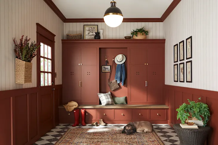
Pro Tip: I am loving this embrace of rich red tones, but I have been discouraging my clients from going full 1990’s and painting their dining rooms red. Instead of painting an entire room with this color, use it in smaller doses, like for pops of contrast. I love seeing it on stair risers for a refreshing surprise, or to paint a furniture piece.
In 2025 I used Walnut by Benjamin Moore on the legs of our table in our breakfast nook, and I painted our firewood box on our new porch with it. It looks like it has always been there!
Want My Free Edgecomb Gray Palette? If you’d love a quick cheat sheet to one of the most beloved New England neutrals, sign up for my email list and I’ll send you my Edgecomb Gray Mini Palette, free! Sign up here!
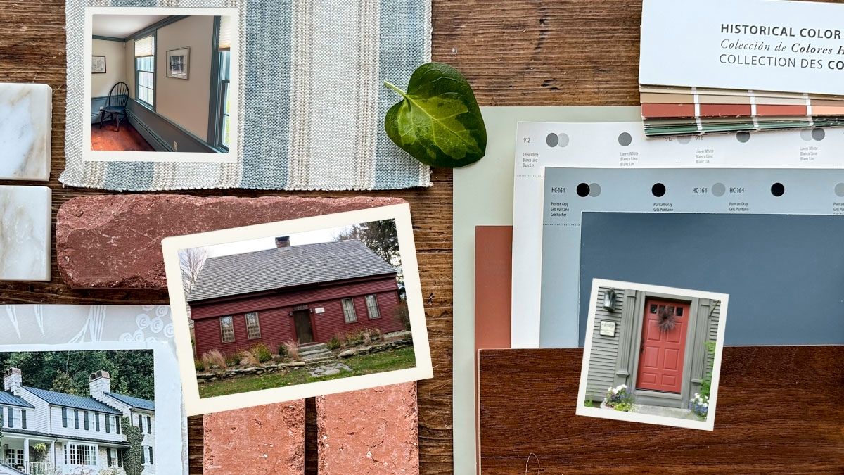
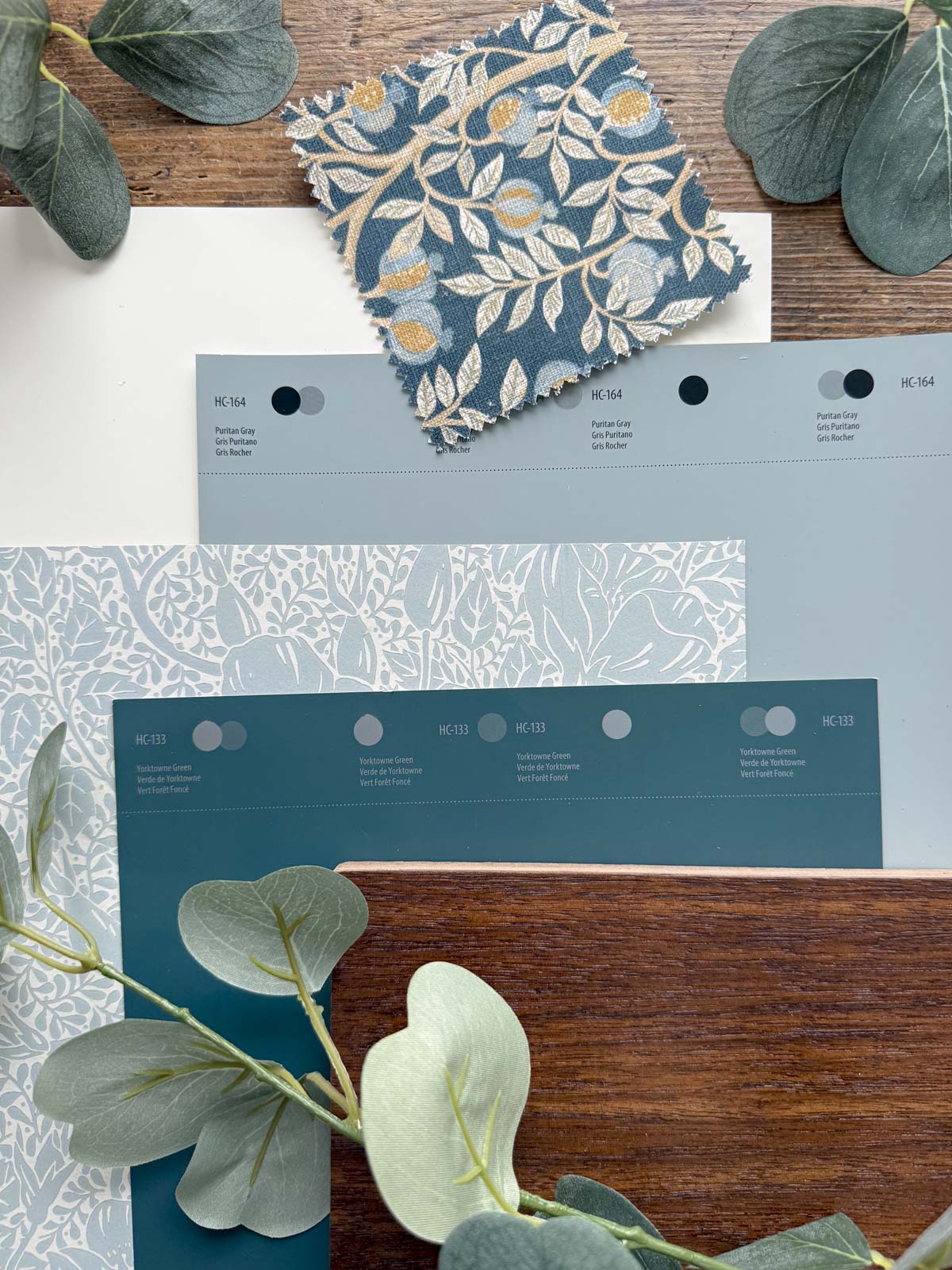
3. New England Coastal Blues & Slate Tones
If New England had a signature color, it would be this: The soft, misty, slightly stormy blues that echo the coastline.

Paint Colors in This Collection
- BM Gibraltar Cliffs
- BM Wickham Gray
- BM Puritan Gray
- SW Slate Tile
- BM Vermont Slate

These are not bright cobalt or royal blues, they’re elegant, grounded, and versatile. They pair beautifully with warm woods, brass or nickel hardware, creamy whites, and classic New England architecture.
Use them on:
- Bathroom or bedroom walls
- Shaker cabinetry
- Mudrooms
- Exterior accents
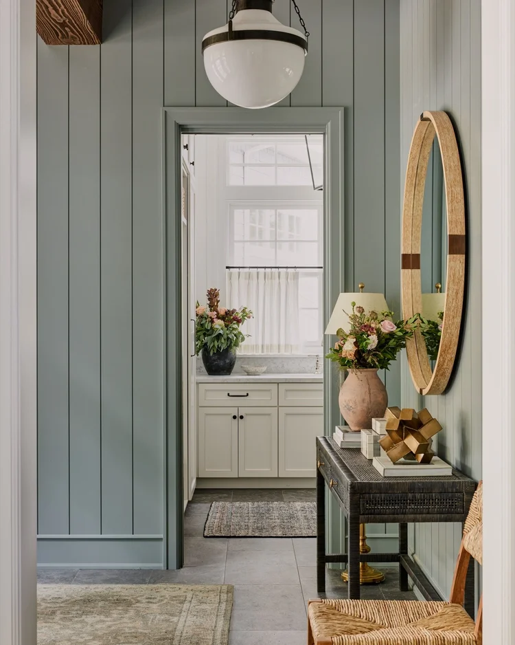
Image source and Design by Lexi Westergard
To be completely honest, I feel like a one-trick pony going back to these gray blues over and over again, but there is something so right about blue for adding color to your space, but keeping the space livable and calming.
Pro Tip: The key is picking those that border on the edge of gray. I like those that tend toward the green side of blue, not the purple side. These greenish gray-blues have a distinctly Cape Cod Cottage vibe that instantly makes a home feel soft, lived-in and homey.
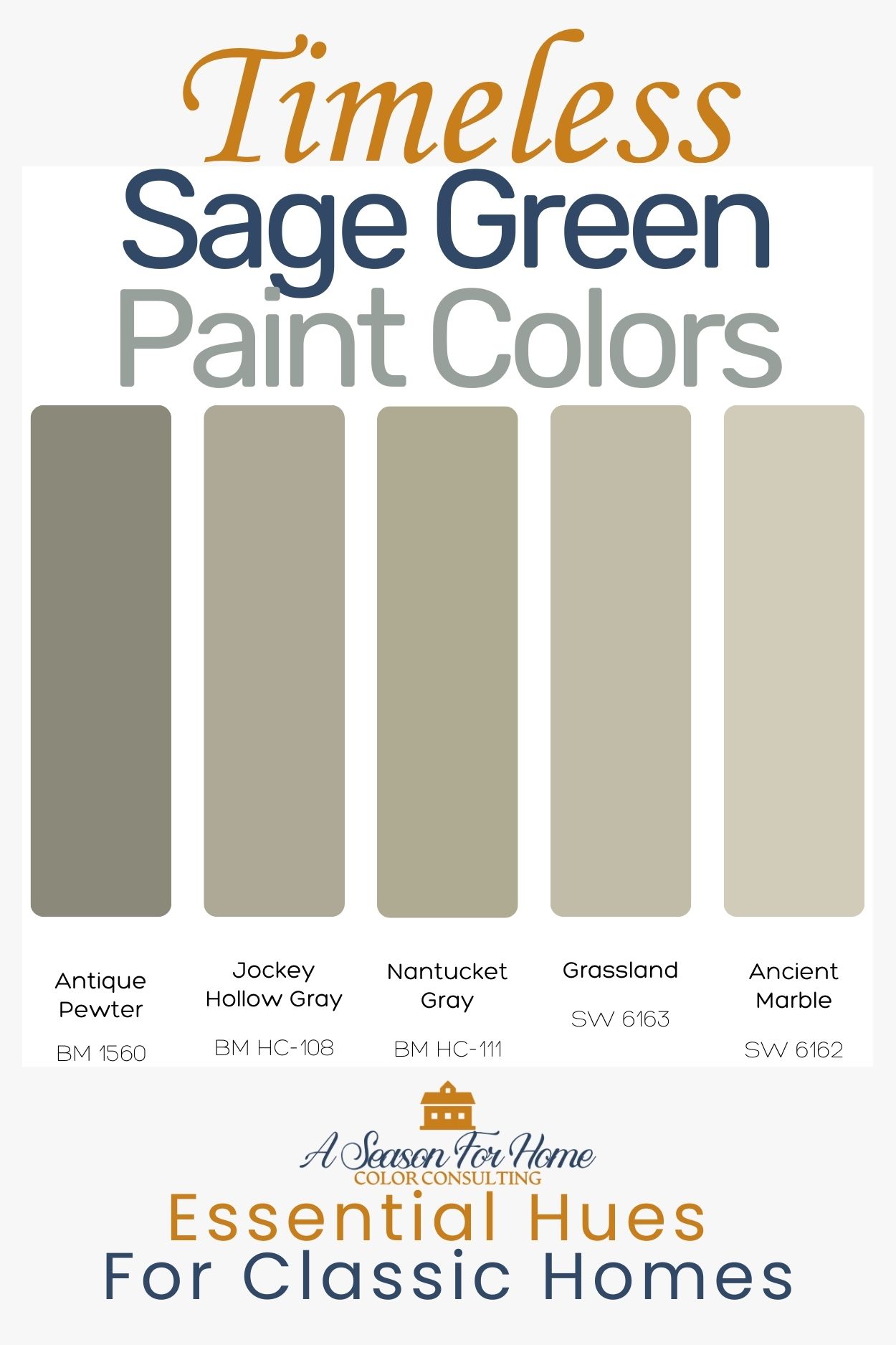
4. Sage Greens & Soft Woodland Tones
These soft dusty greens are evocative of New England woodlands in September, subtle, cozy and grounded. They add instant calm to any space and have withstood the test of time.

Paint Colors in This Collection
- BM Nantucket Gray
- SW Sage
- SW Ancient Marble
- BM Antique Pewter
- BM Jockey Hollow Gray
Use them for:
- Mudrooms
- Kitchens
- Bedrooms
- Exteriors in historic districts

Pro Tip: In homes with wooden ceilings or dormered bedrooms and irregular vaulted ceilings, I have found that reflections and low lighting can cause certain neutral paint colors to look different from one area to the next. Even two adjacent walls can look like they are painted two different colors. This is especially true in Northern climates and cloudier areas of the US. I have found sage greens to be essential problem-solving hues to use in these spaces. They look gorgeous in low light and minimize the odd reflections caused by wood ceilings and vaulted rooms.
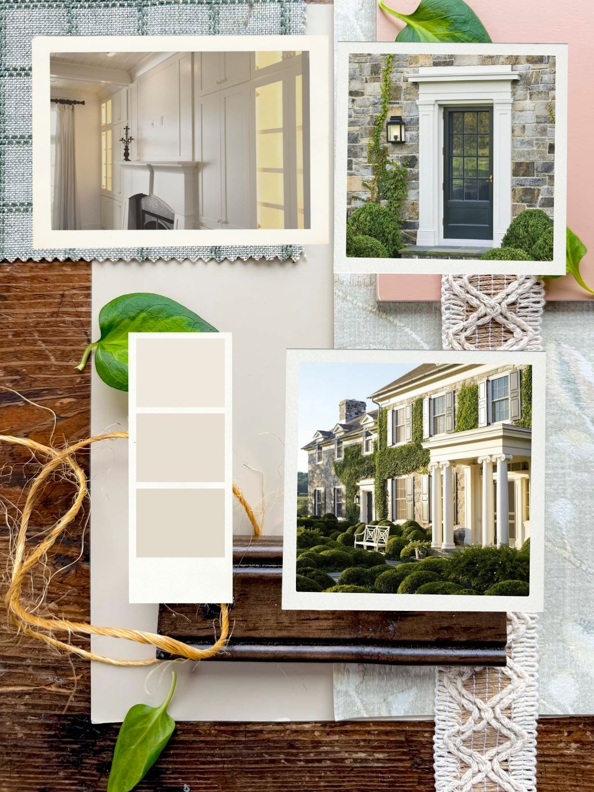
5. Putty and Charcoal-inspired Neutrals
This catch-all section is devoted to a range of warm, desaturated neutrals that would be equally at home in Independence Hall in Philadelphia or the living room of an Instagram influencer in 2026. These putty, greige and charcoal paint colors are desaturated almost-grays. But they’re not icy or blue, like the flat grays that took over Pinterest during the gray trend. They’re more like taupe paint with just a touch of warmth and inviting touches of green that make them relevant today.

Paint Colors in This Collection
- BM Kendall Charcoal
- BM Dragon’s Breath
- BM Finnie Gray
- BM Edgecomb Gray
- BM Ballet White

They’re perfect for homeowners who like gray in theory, but want something softer, warmer, and more timeless.

Use them on:
- Living rooms and family rooms
- Exteriors
- Hallways
- Bathrooms
- Kitchens that need warmth without beige

Pro Tip: When you have a big decision (like painting a 230-year-old home), and you don’t want the neighbors to think you went off the deep end (speaking from experience here, cough cough), choosing time-honored colors in this realm will always feel right. We painted our house with Dragon’s Breath and Finnie Gray, and the results are both timeless and relevant.
Mistakes To Avoid
These heritage paint colors can go a bit museum-ish when not balanced with fresh styling. Here are some ways I use colonial-inspired colors in my 1790’s farmhouse without it looking like I’m trying too hard:
- I try to use fabrics with a modern feel on furniture pieces with traditional lines. The juxtaposition is fresh and exciting in a historic home.
- I play with scale, like choosing a chandelier with an oversized drum shade for our breakfast nook. The surprising shift of proportions keeps it from feeling too sweet.
- While my house is popping with antiques, I make sure to incorporate modern abstract art too. The contrast is an important way to balance the museum-quality!
- Use these traditional colors in unexpected ways. Instead of going with the expected “white trim and colored walls” approach to using these colors, try color-drenching the whole space, ceiling and all!

Make It Work For your Home: Old Colors, New Mood
Historic colors aren’t about recreating the past, they’re about borrowing the best parts of it. These palettes bring character and warmth into homes that sometimes feel too new, too plain, or too modern.
And honestly? There’s something magical about finding a color that feels like it’s always been there.
Ready for a Color Plan That Feels Like Your Home?
Wanting a bit more direction? I’d love to help you choose the perfect historic New England palette for your space.
👉 Book a virtual color consultation with me, and we’ll build a color plan that feels warm, personal, and unmistakably you.
I can’t wait to help you make your home feel like a place you never want to leave.