8 Common Color Mistakes to Avoid in Traditional New England Homes

Traditional New England homes have a lot going for them: character, history, charm, and usually at least one room that has you standing there thinking, I know this doesn’t feel right, but I cannot put my finger on why. So you stand there, trapped in a mental stalemate, because every option feels like it could make things worse. I know this feeling well. I have lived it. More than once.
Color plays a huge role in whether traditional homes feel warm and inviting or dark and heavy, but it is also one of the easiest things to get wrong.
These color mistakes happen during a renovation, when decision fatigue sets in and choosing a paint color feels like the one thing you can do quickly. (Been there!) Sometimes it happens after a move, when you bring all your old furniture into a new house and try to make it work by painting the walls a color you once saved on Pinterest. (I am looking at you, Collingwood!) And sometimes it happens simply because you have lived somewhere so long that you can no longer see it clearly anymore, like being nose blind to your own house. (Guilty!)
If you are reading this thinking, uh oh, relax. I’ve made these mistakes too. I’ll walk you through how to spot them, show you real-life dos and don’ts, explain why they happen, and most importantly, tell you exactly what to do if you realize you’ve already made one.
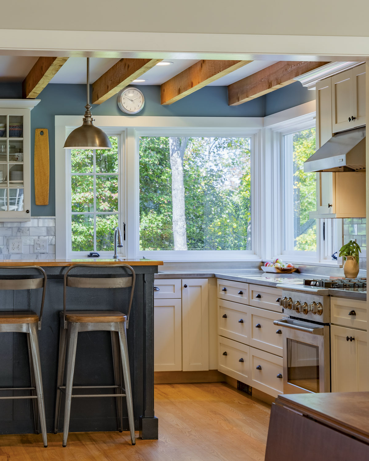
1. Going Too Dark in an Already Low-Light Home
With wooded surroundings, mountain shadows, smaller windows, lower ceilings, and plenty of gray days, many traditional New England homes already have less natural light to work with. Add a deep wall color, and suddenly the space feels heavier than intended. That’s when understanding how much light a color reflects becomes especially important.
What tends to backfire is when paint is used as the main way to “decorate” a space, especially in homes that already struggle with light.
I’m not anti–dark paint. I love a moody room when the light is right and the vibe is meant to be cozy. What tends to backfire is when paint is used as the main way to “decorate” a space, especially in homes that already struggle with light.

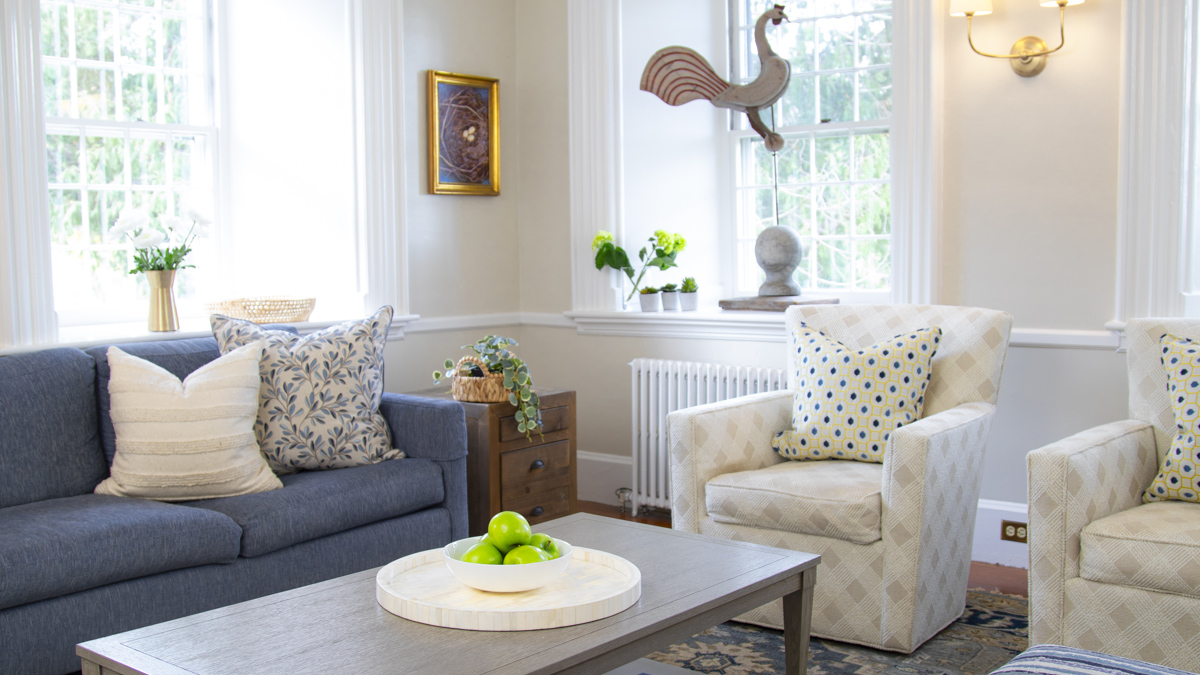
Color doesn’t have to live only on the walls. You can bring in just as much personality through rugs, art, upholstery, and accessories without darkening the entire room. It’s often the easier way to get depth without sacrificing light.
This is where understanding LRV, or Light Reflectance Value, really matters. You can find this helpful number on the websites of the major paint brands and often on the paint chips or fan-decks.
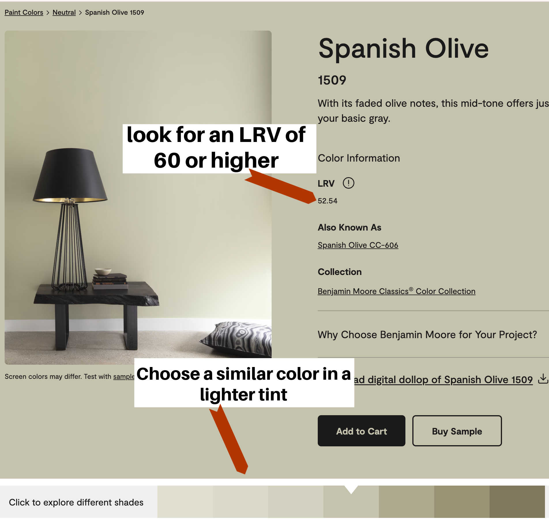
Use the LRV as your guide! In homes with limited natural light, I often look for wall colors in the 60s to low 70s. That range keeps spaces feeling bright without pushing them into sterile territory.
If you’ve fallen in love with a specific color, use the resources on the paint brand’s website to choose a slightly softer tint of the same hue. Your space will feel considered and have personality without feeling like you tried too hard.
PRO TIP: Not all paint chips are arranged mathematically! The Sherwin-Williams fan deck is arranged by value, but Benjamin Moore’s are not all done this way (including the Historic Deck!) So going one shade above or below will not always give expected results.
2. Relying on the White Trim and Colored Wall Formula
Here is where it is worth rethinking the default formula of white trim and colored walls. In many traditional and lower-light homes, that combination can feel flat or dated, especially when paired with medium-toned wall colors. It often reads less historic and more early-2000s builder standard than most homeowners intend.
Reversing the relationship by using a soft off-white on the walls and a deeper, more saturated color on the trim is one way to add character without sacrificing light. This approach keeps rooms feeling open and bright while still introducing depth, contrast, and visual interest. The trim becomes a design feature rather than just an outline.
For homeowners drawn to color-drenching but not ready to commit to fully enveloping a room in one shade, reverse trim offers a more approachable alternative. It brings in the same sense of intention and personality while still allowing the walls to breathe. In traditional homes, especially, this technique can feel more aligned with the architecture and less like a generic paint formula.
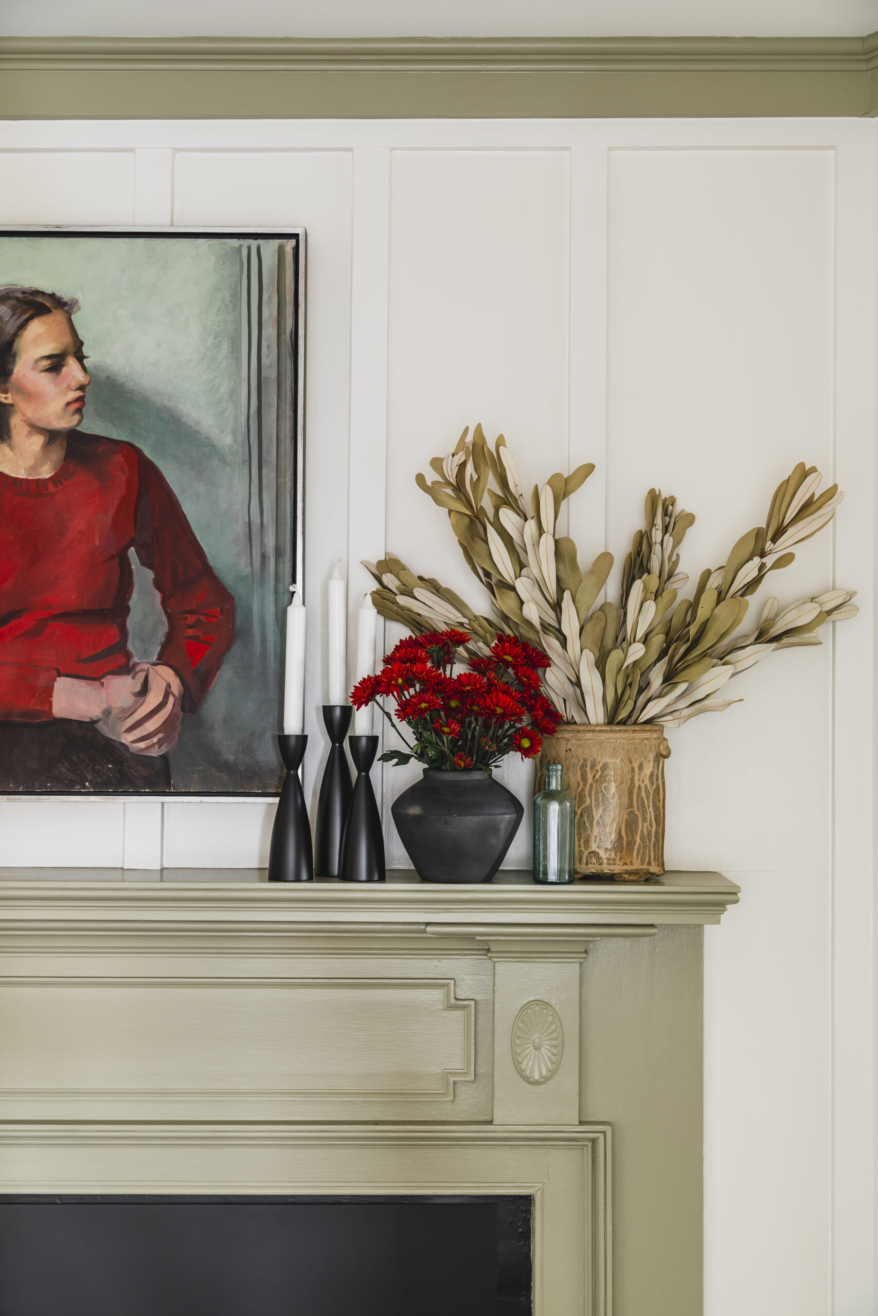
Used thoughtfully, reverse trim helps a home feel layered, considered, and distinctly itself rather than locked into a default paint strategy that may not suit the house at all.
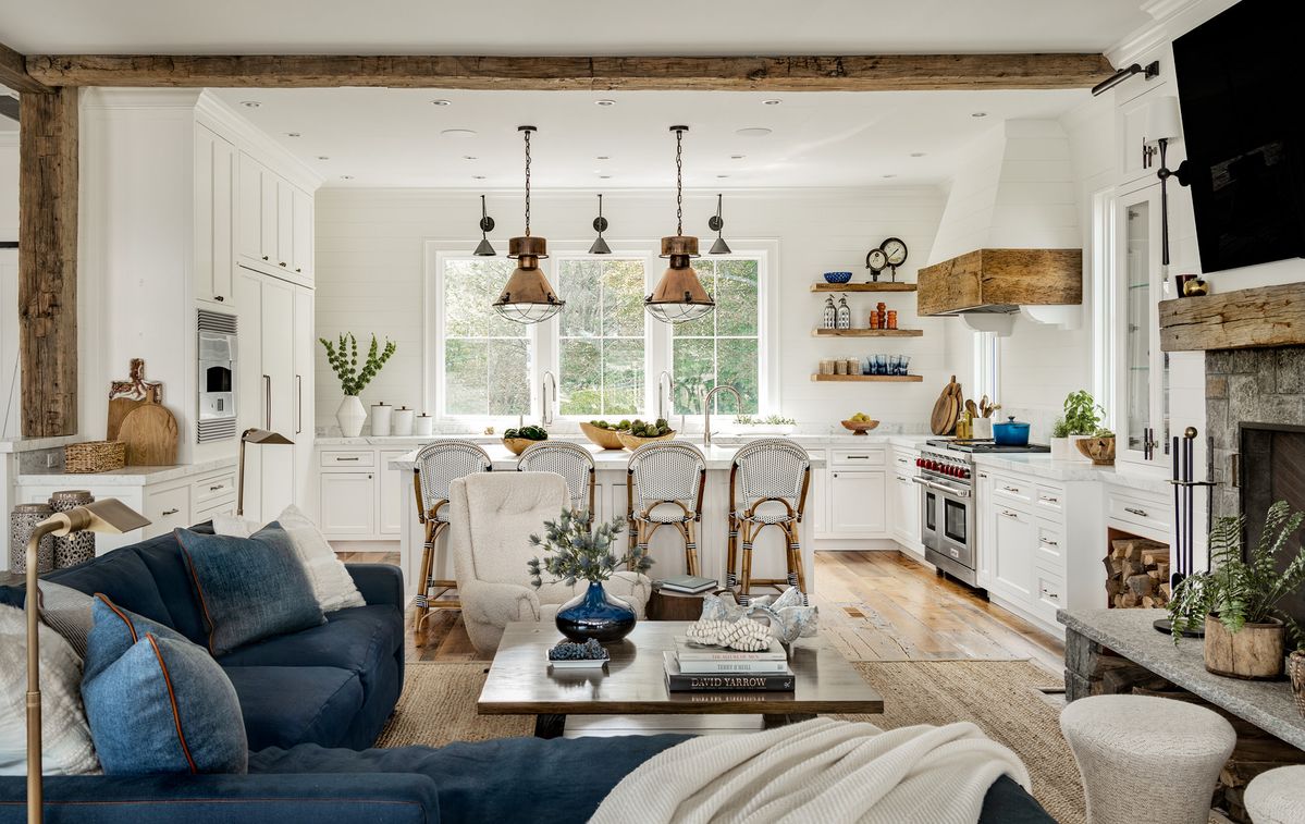
3. Using Stark White Paint in Low-Light Houses
Bright, crisp white paint has become the default in many homes, but it is rarely the best choice for traditional New England spaces.
Stark whites can sometimes read less “classic” and more like your contractor grabbed a can of any-old-white for a quick fix.
I understand the temptation to paint a dark house with bright white walls, but this will backfire! White paint on walls and trim looks surprisingly budget-friendly and dingy in older New England homes. Rather than lightening the space, cooler stark whites look terrible in dark houses.
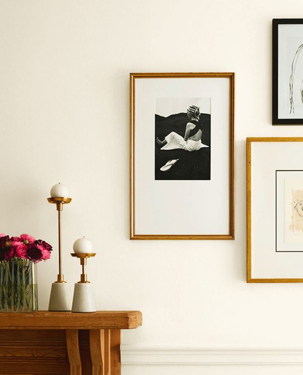
The key is to choose a bright white (with a high LRV) that has plenty of creamy yellow undertones. Like Dover White by Sherwin-Williams with an LRV of 83. This type of paint looks gorgeous in a traditional home and will keep your space bright and add contrast when used on trim work.

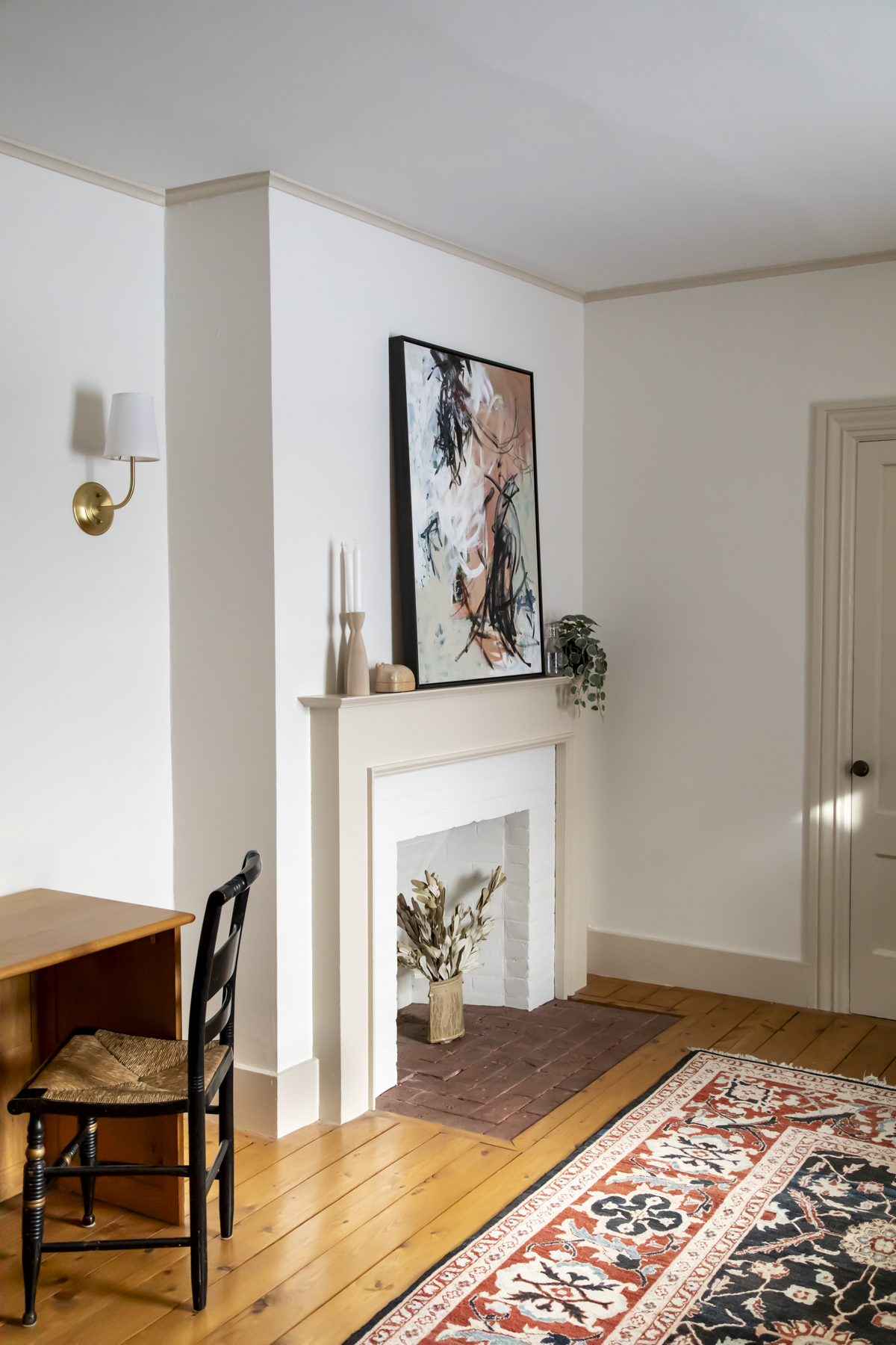
Creamy whites are almost always a better fit because they compensate for lower light levels and work in harmony with traditional materials. They soften transitions between rooms, feel more natural alongside wood and stone, and age far more gracefully over time.
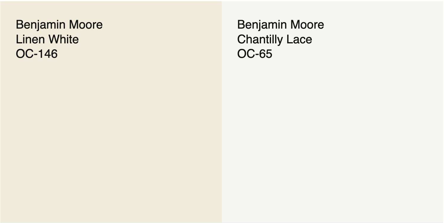
Colors like Linen White or Navajo White by Benjamin Moore and Creamy by Sherwin-Williams are creamy whites I return to again and again because they bring warmth without looking yellow or dated.
Rarely do I recommend stark whites, like Benjamin Moore’s super-popular Chantilly Lace, to my clients here in Vermont. Stark whites can sometimes read less “classic” and more like your contractor grabbed a can of any-old-white for a quick fix. I find this is especially true in traditional homes where warmth and nuance matter.
4. Ignoring Fixed Elements When Choosing Color
Color decisions do not happen in isolation. Traditional New England homes often include fixed elements that strongly influence how color reads, things like brick fireplaces, stone, slate, tile, floors, and existing cabinetry.
When those elements are ignored, even a beautiful paint color can feel completely wrong once it is on the wall.
The goal is not to perfectly match everything. The goal is to make sure undertones are working together instead of competing. This is especially important in older homes where natural materials play a big role in the overall palette.

This is also where many homeowners get stuck, because it requires looking at the whole picture, not just a paint chip. Even when you dislike a fixed element, like an outdated countertop, tile, or fireplace surround, it still needs to be acknowledged.
Ignoring it and choosing colors that clash will only make it stand out more. When colors fight what is already there, the eye is drawn straight to the problem area instead of away from it. Working with existing materials, even temporarily, creates harmony and allows those elements to visually recede rather than demand attention.
This is key: The goal is not to celebrate every finish in your home, but to choose colors that calm the space until larger changes are possible.
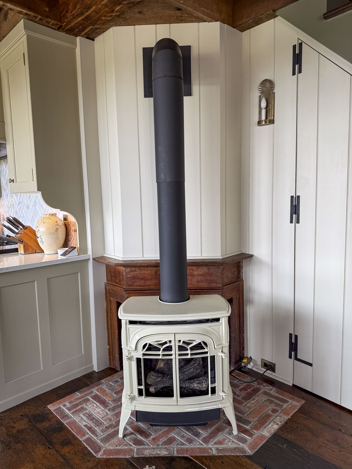
5. Keeping Wood Trim and Ceilings That Feel More 1990s Than 1790s
This one comes up a lot.
Many homeowners feel pressure to preserve all woodwork, even when it was added decades later and does not actually reflect the age or style of the home. I have been in plenty of beautiful traditional houses where heavy stained oak trim, cabinets or ceilings from the 1980s or 1990s are making the entire space feel dark or dated.
Just because something is wood does not automatically make it historic or worth saving.
If the wood feels more 1990s than 1790s, painting it can actually bring the home closer to its original spirit. A thoughtful color choice can lighten the space, calm the visual noise, and let the architecture speak again.
If the wood feels more 1990s than 1790s, painting it can actually bring the home closer to its original spirit.
I repeat, if you do not love it, you are not obligated to design around it forever.

6. Letting Trends Override the Home’s Character
Trends move fast. Traditional homes do not. Part of my job as a color consultant is to follow these trends and to steer my clients to decisions they won’t regret.
I get it! Trendy materials like white oak flooring or Champagne Bronze hardware can feel exciting in the moment.

Take it from me, someone who used white-washed flooring and gray shiplap in a 2018 reno. I regretted it within a few years. These trendy materials often timestamp a renovation even quicker in an older New England home.
7. Using High Chroma Colors in Traditional homes
Overly bold, highly saturated colors often work against traditional homes instead of enhancing them. When a color fights the home’s natural palette, it pulls attention away from the architecture rather than supporting it. In older houses, that usually feels wrong even if the color itself is beautiful.

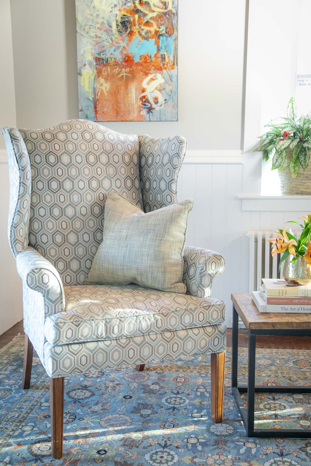
Traditional homes tend to look their best in softer, more nuanced, low-chroma colors. These are sometimes called “dirty” colors, not because they are dull, but because they contain subtle undertones that give them depth and complexity. These muted shades allow architectural details like crown molding, millwork, and ceiling height to remain the focus instead of being visually chopped up by color.

High-chroma colors can overwhelm a space very quickly. When used on walls in traditional rooms, they often exaggerate transitions between walls and ceilings, flatten details, and make even beautiful trim disappear. A softer, lower-chroma version of the same hue, such as a muted green or blue instead of a bright one, almost always feels more intentional and far more livable.

Choosing low-chroma color does not mean playing it safe or boring. It means selecting colors with depth, richness, and staying power. This is where historic and New England-inspired palettes really shine, offering interest without competing with the home itself.
How do you know if you have made this mistake? Trust your gut. If a color feels loud, unnatural, or disconnected from the house, it probably is. And chances are good it will not age well either.
8. Thinking Paint Is Magic
This list of mistakes wouldn’t be complete without talking about knowing when paint has reached its limits.
Instead of feeling refreshed, the surface pulls attention and often ends up feeling like a landlord special.
Paint is incredibly transformative, but it is not magic! When I see people painting things like popcorn ceilings, dated tile backsplashes, or heavily textured surfaces, it’s often a sign that paint is being asked to solve a bigger problem.
In most cases, the issue usually isn’t the color — it’s the surface itself.

Using paint to mask something you fundamentally dislike rarely delivers the result you’re hoping for. Instead of feeling refreshed, the surface pulls attention and often ends up feeling like a landlord special.
Knowing when paint can elevate a room, and when it’s being pushed beyond what it can realistically do, is an important part of making thoughtful color decisions.
Most color problems are not fatal. They just need editing.
What If You Made One Of These Mistakes
First of all, know you are not alone! And you have plenty of ways of fixing or hiding these mistakes that won’t break the bank.
Here are some fast fixes:
- Repaint walls: This is fast and relatively inexpensive and it makes the biggest impact on the space.
- Repeat colors: Repetition of colors pulls everything together and helps guide your eye through the space to make it feel pulled together and cohesive.
- Decorate: Distraction of the eyes does wonders. You can put off renovating and instead use rugs, art, and upholstery to redistribute color thoughtfully.
- Add lighting: If you house is dark, brighten it up! Add lamps to soften shadows and corners.
- Check Your Kelvin: This is one of my favorite cheap fixes that can transform a room. Swap light bulbs to adjust warmth and brightness. While I love a warmer bulb, sometimes they do funky things to colors at night and a slightly cleaner bulb will help to make things right.
- Get Fresh Eyes: Sometimes all it takes is phoning a trusted friend or expert to help you see a simple solution. Most color problems are not fatal. They just need editing. I am always a click away!
Need help choosing the right color?
If you’re feeling stuck or want a second set of eyes, I offer Virtual Color Consultations to help you make confident, intentional choices for your home, wherever you’re located.