Best Khaki Paint Colors
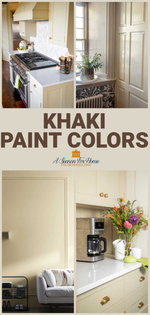
If you are looking for a paint color to warm up your interior, look no further than this collection of khaki paint colors. As a certified color expert, you are in good hands as I walk you through the most popular khaki paints and some of my favorite hidden gems too! Hi I’m Katie, and paint color is my thing. Read on to learn all about my favorite shades of khaki paint.
What is Khaki?
Khaki is beige with a subtle green undertone. At its core, khaki is a warm, earthy neutral but there is a spectrum of variations of this sandy neutral color. Some versions are light in value, some are more golden or gray, and the green undertone can vary from all-there to barely noticeable.
Unlike a pink beige (like Muslin by Benjamin Moore) Kakhi’s distinguishing factor is a hint of green. The word “khaki” comes from the Persian word for “dust,” which is a perfect description of the soft, natural look these shades bring to walls. It came to our common language when khaki clothing, heavy-duty camouflage army wear, was invented in the mid to late 1800s.
Today, the word khaki can be used to describe heavy canvas clothing in varying shades of sandy tan(specifically pants) or it can mean a specific shade of beige. We’re talking about the latter today, and specifically paint colors!
Why is Khaki so Popular Right Now?
Khaki is having a moment because we are undergoing a warming trend of neutrals. Additionally interior design is having a (seemingly unending) love affair with green. According to color expert Sue Wadden of Sherwin-Williams, this khaki upsurge has been coming for about five years. In her color forecasting podcast, she recently said, “I have not seen khaki in such a long time, it’s so good to see. But it’s obvious to me, like of course there’s gonna be khaki. We’ve been talking about green and green influences neutral. So, when you put green into a beige, it’s khaki. That was an inevitable conclusion to kind of where we’ve been over the last five years.“
Her reasoning makes sense! After years of cool grays dominating the paint world, homeowners are craving warmer neutrals that pair well with wood tones, natural textures, and earthy accents. Khaki fits right in with the modern organic trend, while still being flexible enough to complement traditional and transitional styles. It’s one of those colors that instantly makes a space feel comfortable and inviting.
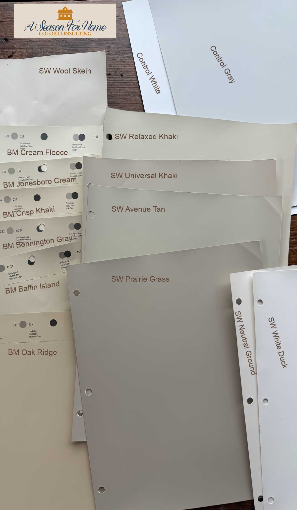
Best Khaki Paint Colors
If you’re considering bringing khaki into your home, here are some of the best paint color options to sample from Benjamin Moore and Sherwin-Williams:
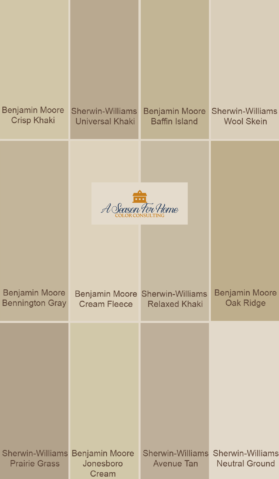
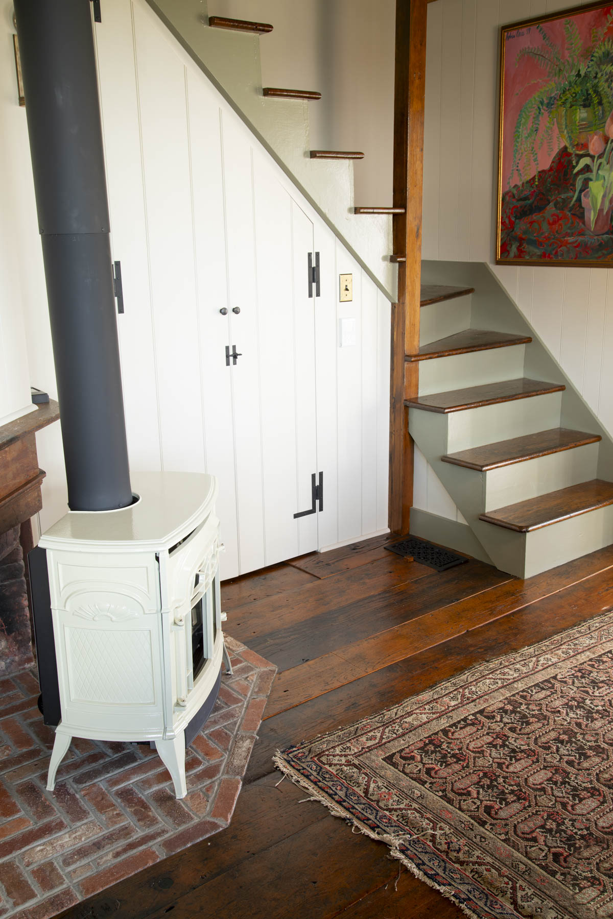
Sherwin-Williams Wool Skein
Sherwin-Williams Wool Skein is one of my new favorite neutral paint colors. I personally think this paint color should give ever-popular Accessible Beige a run for its money.
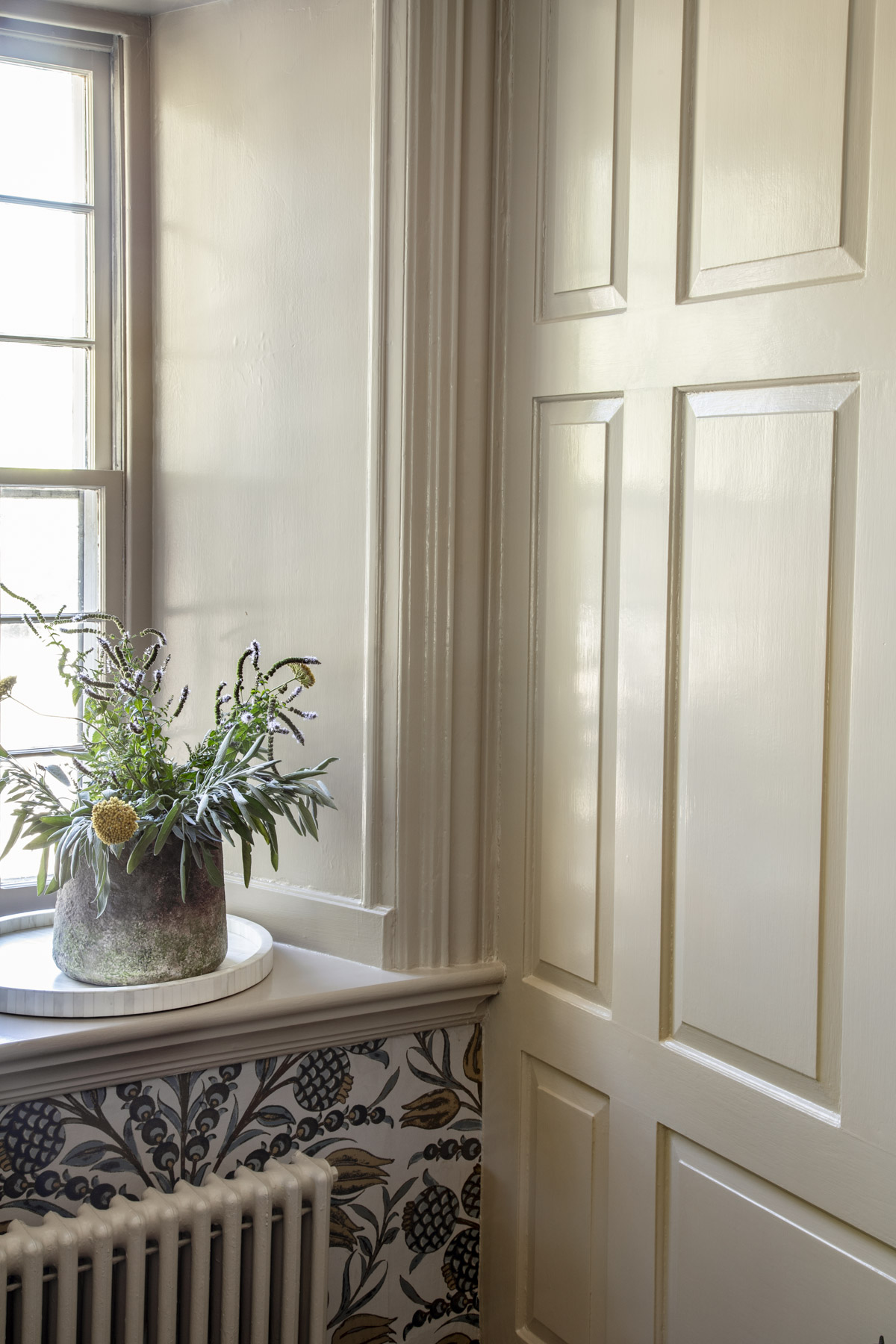
It is the lightest shade in the lineup. You can drench a space with it or pair it with Benjamin Moore Swiss Coffee on the trim for subtle warmth and barely there green undertones.
Another way to use it, is as your “white” like I did with green contrasting trim (see below photo.) With an LRV in the low 60s it looks rich and historical without being too saturated.
Benjamin Moore Cream Fleece
Creamy and approachable, this color has a touch of golden warmth. It is similar in value to Wool Skein but has a touch more saturation. It is a slightly more peach shade of khaki and has less greenish underbelly. I’d say the Swiss Coffee for trim and ceiling paint is your best bet since Cream Fleece is on the lighter side. If you love a sophisticated tone-on-tone look, go with one of these darker trim colors.
Benjamin Moore Jonesboro Cream
Jonesboro Cream is a favorite from Benjamin Moore’s Classics Collection. I’d call it a soft khaki-beige with a sophisticated, understated vibe. Unlike some of the more golden hues in this collection, Benjamin Moore Jonesboro Cream is a true khaki because it has a discernible green undertone.
Jonesboro Cream rendering from Ben Moore SOURCE
If you are looking for a lighter shade, go for Jonesboro Cream. It is light and airy and a good choice if you like khaki but don’t want dark walls or too much depth and contrast. It’s a good option for north-facing rooms or small spaces with limited windows because it is a lighter value.
Brush it out and compare it to Bennington Gray and Baffin Island if you want to have an easier time deciding. I always recommend having something to compare your paint color to. A clear favorite will emerge!
Benjamin Moore Crisp Khaki

Crisp Khaki rendering SOURCE
This is a brighter valued shade in our lineup but can read a little gold in some lights. It is not terribly green so if you love the greener hues this is not your color. That said, if you have green upholstery or elements in this space I love the way Crisp Khaki looks with deep sage green velvet and chenille.
Benjamin Moore Bennington Gray
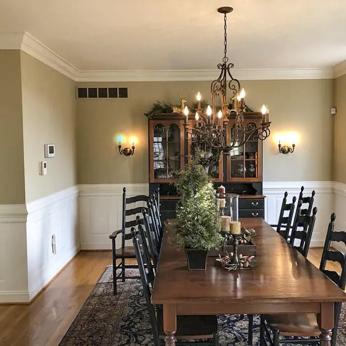
Bennington Gray Dining room SOURCE
Depending on the exposure, this khaki can appear more like a faded pair of taupe chinos than some of our more golden khakis. In warmer morning light, the yellowish undertones can come out more forcefully so make sure to brush it out in your space and look at it in all light conditions.

It has a definite green undertone so watch out with other neutrals. Other cool green-tinged greige colors are great with Bennington Gray but pink beige is a no-no so be careful with natural stones and tiles in your kitchen or bathroom. Bennington Gray a great color for kitchen cabinets, but stick with a white quartz counter to stay safe.
Benjamin Moore Baffin Island
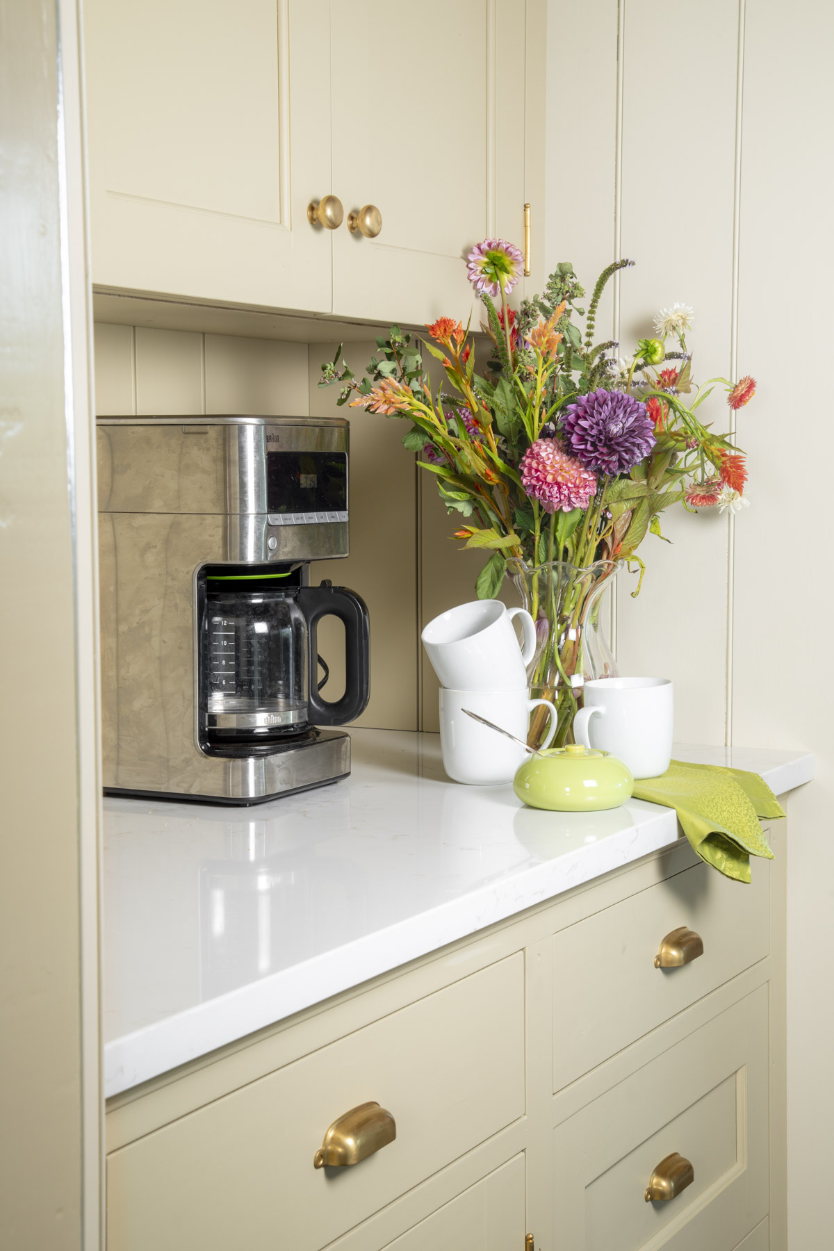
I cannot count the ways I love this paint color. There are too many. It toes the line between a creamy bronze and khaki. I used it in our dining room on the trim with our wallpaper and in our kitchen on the cabinetry. It gives historical vibes without the commitment of vibrant gold tones that were popular in the late 90s.

Make sure you love a green undertone if you are going with Baffin Island, because in some lights it is definitely green. And it goes without saying, it looks awesome with green.
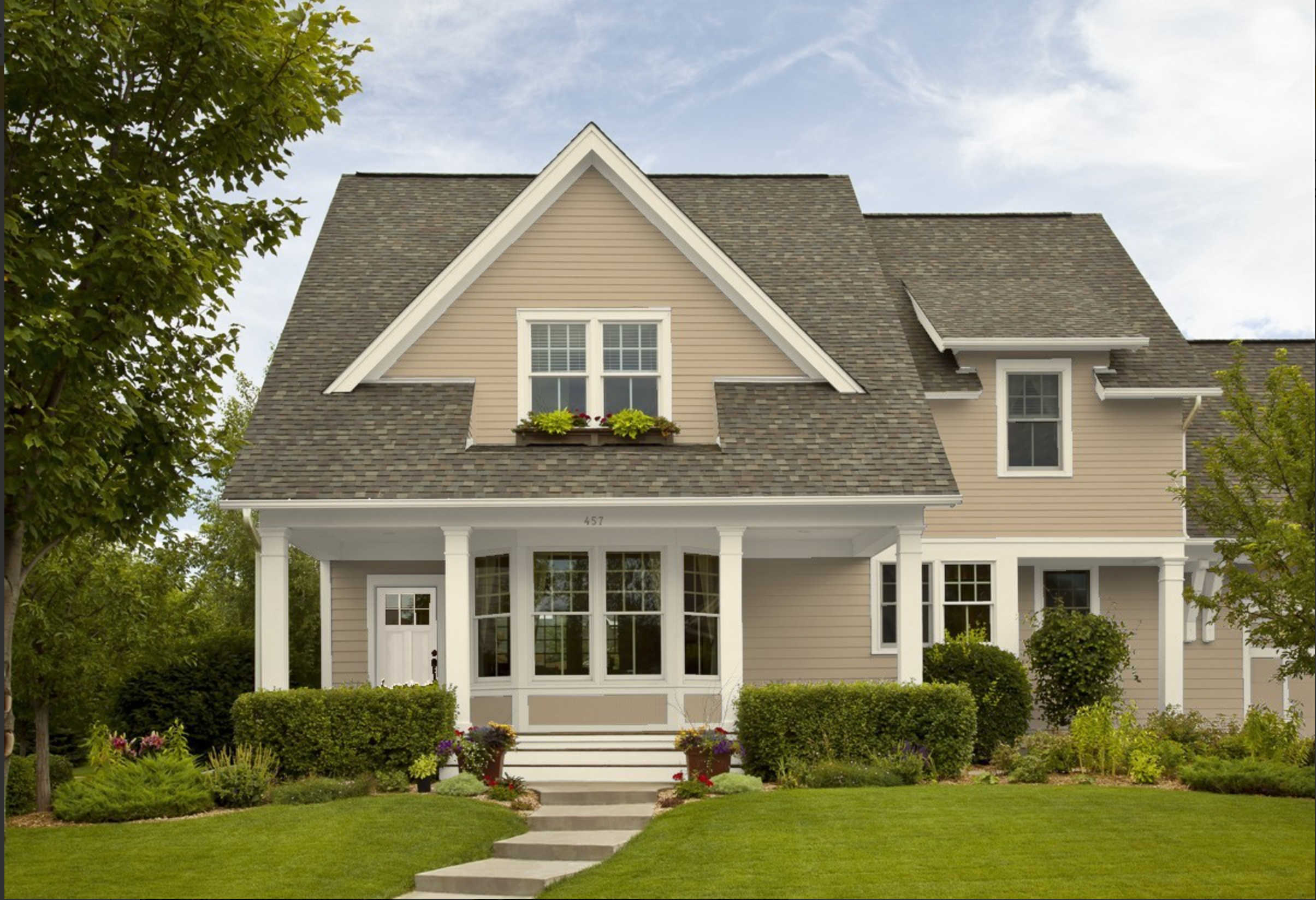
Benjamin Moore Quincy Tan or Oak Ridge
Benjamin Moore Oak Ridge, also known as Quincy Tan is almost too gold to include in this post, but I did so because I wanted to represent a range. To see its greens, you have to compare it to another gold like Shelburne Buff. When you do so the greens are easier to pick out.
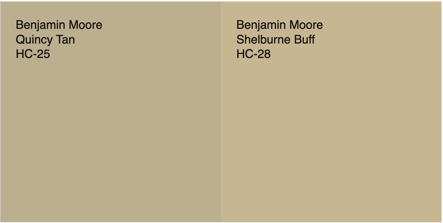
Quincy Tan (or Oak Ridge) has an LRV in the low fourties, add to that a healthy amount of saturation, and you have yourself a gorgeous khaki paint for an exterior. Note that it will be warmer looking on a south-facing exposure, so if this is the front facade of your house, I’d avoid this unless you want it to pull gold. If that’s your quandary, look at Bennington instead (see above.) Read more tips about choosing exterior paint colors.
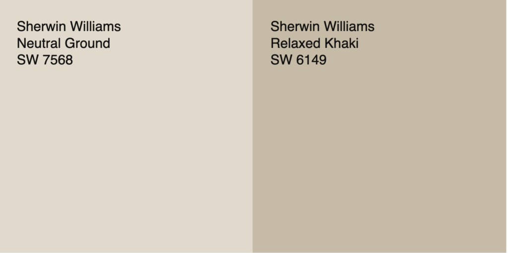
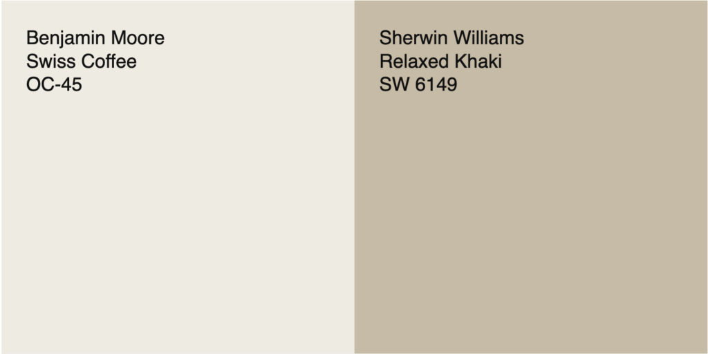
Sherwin-Williams Relaxed Khaki
Friends, if your eyes have glazed over, and you just want to know what the safest choice is when it comes to khakis, I’ll spare you the research… Relaxed Khaki is the way to go. It is a real crowd pleaser! It is not too saturated, but has more personality than a Minimalist Paint Color.
It looks gorgeous with blues, reds, greens and earth tones. Layer creamy off-white textiles for a subtle look. You could use Sherwin-Williams Relaxed Khaki for cabinets or wall color. It is also a great color to do reverse trim color scheme especially if you have interesting millwork and paneling you want to highlight.
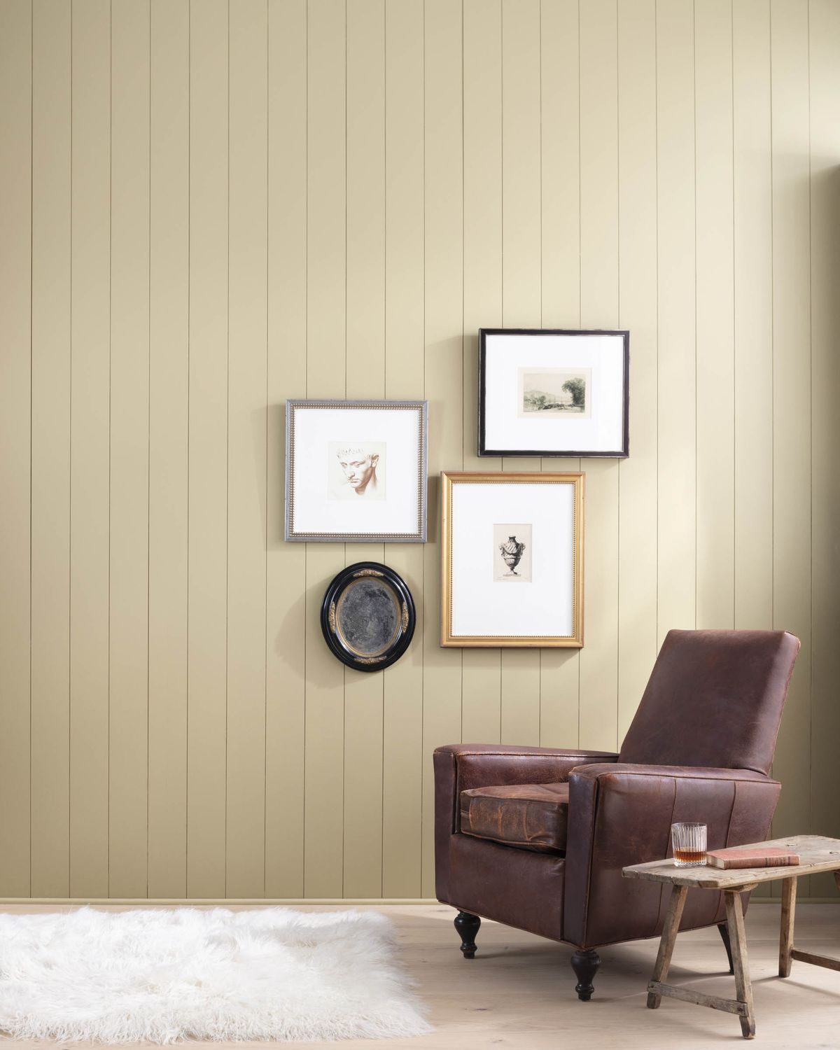
Sherwin-Williams Universal Khaki
I used Sherwin-Williams Universal Khaki to warm up my blue and white living room. I wanted to pull the bronze tones out of the Oriental carpet, and chose this color to coordinate with it and the wallpaper. It is quite bold and not for everyone but Sherwin-Williams named it Color Of The Year 2026. So it is worth checking out.
While Universal Khaki is one shade deeper on the fan deck than Relaxed Khaki, I find these two paint colors to be pretty different. Universal is not for the faint of heart because it is so dark. Look at Accessible Beige if Universal is too dark for you. On an exterior, Universal Khaki would be stunning!
Sherwin-Williams Avenue Tan
I love this color. If you like Jockey Hollow from Ben Moore but want something a little warmer, this or Prairie Grass are good alternatives.
Avenue Tan Living Room rendering
Avenue Tan is on the greener scale of things as far as this paint collection goes, but doesn’t go in the green section of my sample book. It is still definitely a warm neutral. It is also a gorgeous exterior color. Use this color for living room walls or in a finished basement for a cozy den-like feel.
Sherwin-Williams Prairie Grass
If you are considering Avenue Tan, look at Prairie Grass too. These are lovely green khakis, on the darker end of our scale. Prairie Grass would be great as a moody dining room or bedroom or home office.
I love the depth in SW Prairie Grass for spaces decorated with cream and deep chocolate. Stay away from pairing it with overly bright, splashy hues. In darker spaces or with bluer lightbulbs, it can appear more army green than khaki, so make sure you brush it out first.
Khaki Paint Color Schemes
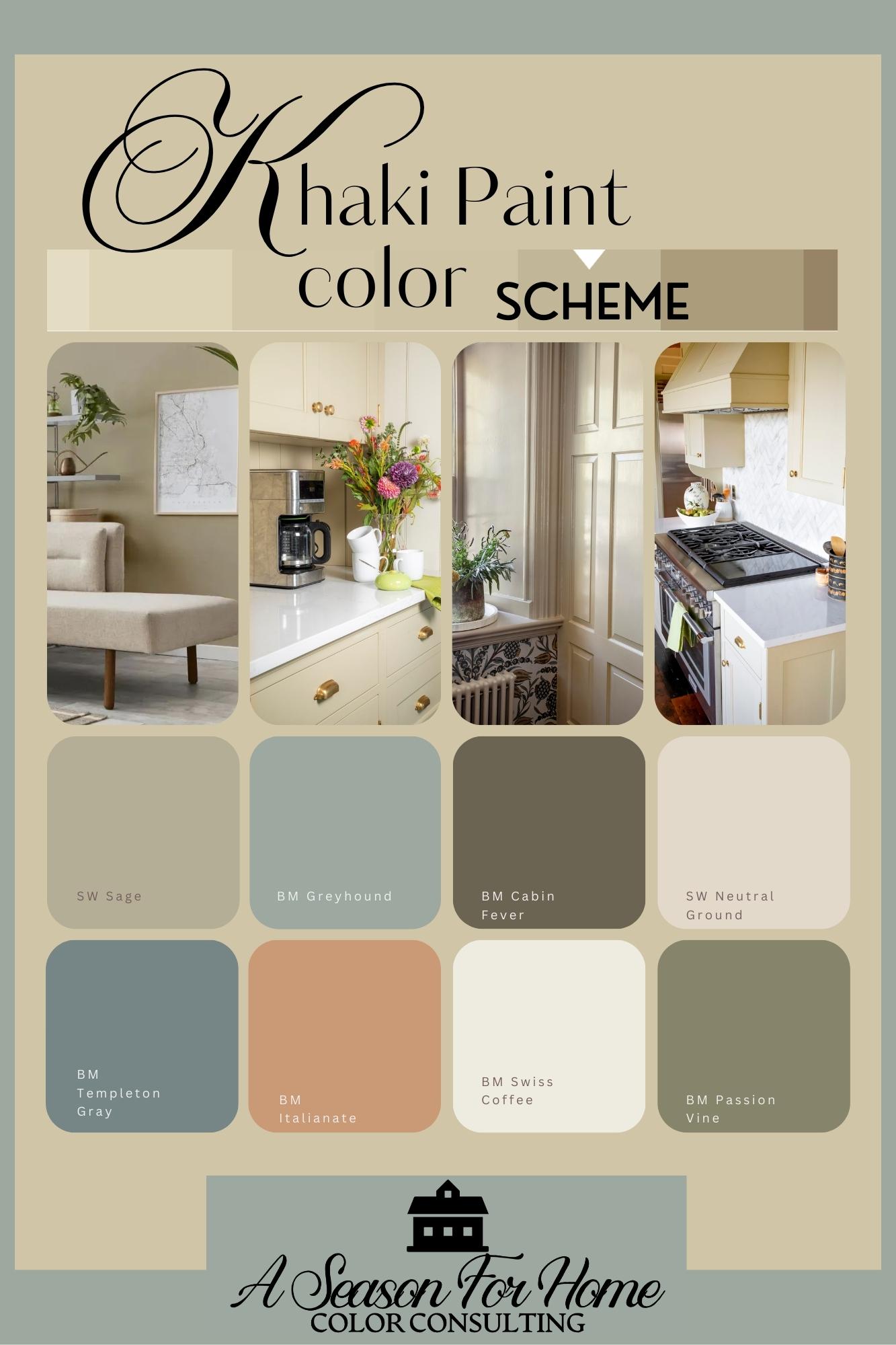
One of the best things about khaki is how easily it plays with other colors. Here are some tried-and-true combinations:
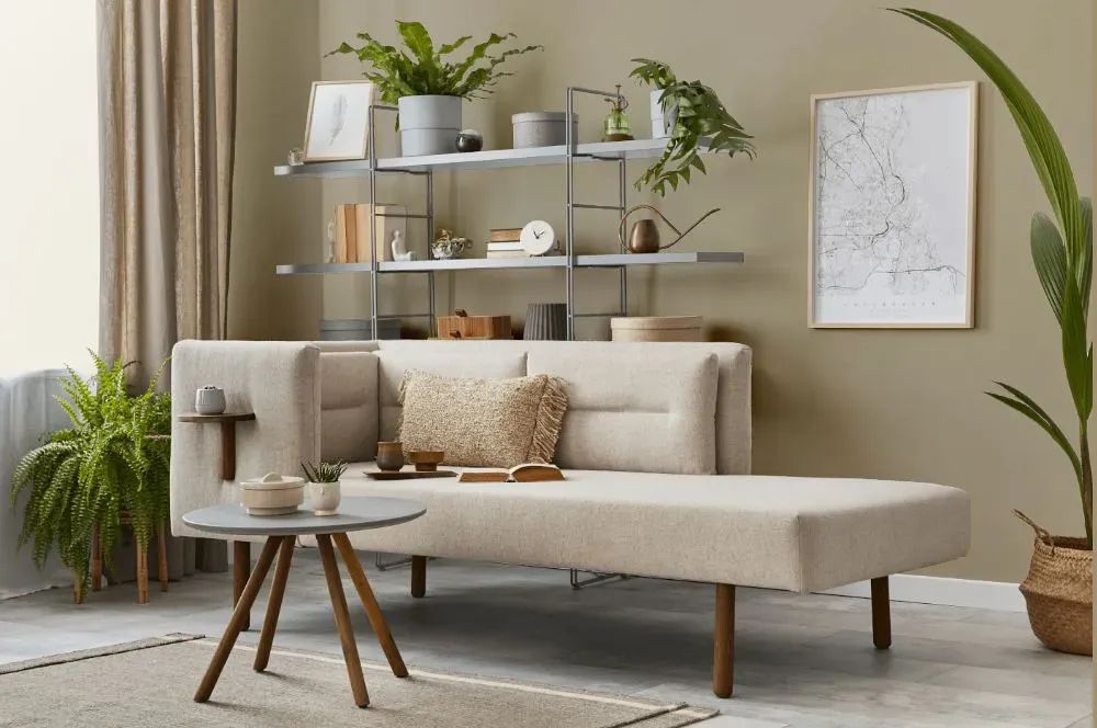
- Low Chroma Greens – Soft sage or olive greens highlight khaki’s earthy side. Consider using Sherwin-Williams Sage in an adjacent space or Benjamin Moore Passion Vine for a painted accent with the khaki. I love BM Nantucket Gray with Khaki too.
- Rusty Reds and Peach – Warm terracotta or peach accents bring out khaki’s golden undertones. I like Benjamin Moore Italianate, Winthrop Peach, Warm Brownie and Audubon Russet to name a few.
- Blues and Navy Blue – I like grayed out (low-chroma) blues with a touch of green in them such as Greyhound by BM or Brewster Gray. You can also pair khaki with navy paint colors and textiles. Navy provides a nice crisp contrast with the benefit of being timeless and classic.
- Cream and White – When in doubt, whites, off-whites and creams look fan-freakin-tastic with khaki. Layering your neutrals in your furnishings and textiles keep things airy and sophisticated.
- Black(ish) and Brown – Dark accents add depth and modern edge. I also like the way greenish blacks look with khaki because it is less stark than true black. Instead of a pure black, go with Soot or Cabin Fever by Benjamin Moore or Clove by Sherwin-Williams.
What Fixed Elements Go With Khaki Wall Color?
Since khaki is so versatile, it pairs well with a range of fixed elements you may already have in your home:
- Marble – I love the way the warmth of the creamy earth tones in Calacatta marble pairs with Khaki walls. Avoid the blue tones in Cararera marble- it is too cold and will feel disparate. Travertine with gold undertones could work but make sure you look at a lot sample with your paint color as some can pull pink.
- Granite – Earthy granite countertops pair beautifully with khaki without competing.
- Brick – The warm russet color of exposed brick looks great with khaki. They are both low-chroma (aka dirty colors) so they can go together well!
- Dark wood– Walnut and other deep chocolate brown wood looks great with it.
- Pale Oak – White oak is all over the place and has been for years. While I personally think this trend is going to have to end at some point (and I fear will date your reno to 2021-2025) I do have to admit that Khaki looks stellar with it! It has a certain kind of harmony and a few carefully chosen furniture pieces in pale oak with khaki walls can easily help create neutral bones for an organic minimalist palette.
Which White Paints Go With Khaki?
Here’s the thing, if you read my post about how to pick a trim color, then you know I really, really, super-duper want to encourage you to go with a darker trim color than you think you want. In the case of khaki with a bright white trim (like Chantilly Lace) you can easily veer into the Tuscan Trend a la 2006. To avoid that, and to make your space look expensive, contemporary and intentional use a cream paint with khaki undertones for your white. My two favorites are:
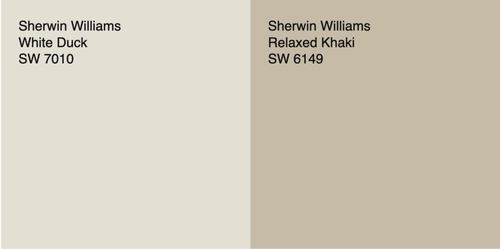
- Sherwin-Williams White Duck – A soft, creamy white that blends effortlessly. It has an LRV of 74 which is 9 points darker than popular trim paint colors like White Dove by Benjamin Moore.
- Sherwin-Williams Neutral Ground – Warm and neutral, ideal for trims or adjacent walls. This has as LRV of 70 so it’s going to read “white” against the khaki.
Now if you really want a crisp look then my top choice for a higher contrast look is:
- Benjamin Moore Swiss Coffee – I like the yellowish greenish undertone in this paint a lot and in my opinion it is your best white ceiling or trim color to complement to khaki.
What to Watch Out For
Khaki is forgiving, but it does come with a few considerations.
- Saturation and Value: I suggest using caution with some of the more deeply saturated tones in this collection. If you are a minimalist, go with Relaxed Khaki or Wool Skein.
- If you love green, favor Baffin Island, Avenue Tan or Prarie Grass.
- If gold and yellow are not your thing, stay away from the more warm flavors here like Oak Ridge and Crisp Khaki.
- Lighting Matters – North-facing rooms can make khaki look more gray, while southern light brings out warmth.
- Undertones Shift – Some khakis lean green, others golden—always sample on your wall before committing.
- Balance is Key – Too much khaki without contrast can look flat; pair it with crisp accents or layered textures.
Conclusion
Khaki paint colors are trending, but they’re also a versatile, timeless choice. If you’re looking to bring warmth and a little color into your home this is a great way of using a neutral with a bit of personality to make your space feel unique and homey.
If you’re still struggling to choose the perfect khaki paint color—or just want an expert eye to help you land on the right paint colors for your home—I’m here to help! Sign up for a virtual paint color consultation and let’s find your perfect shade.