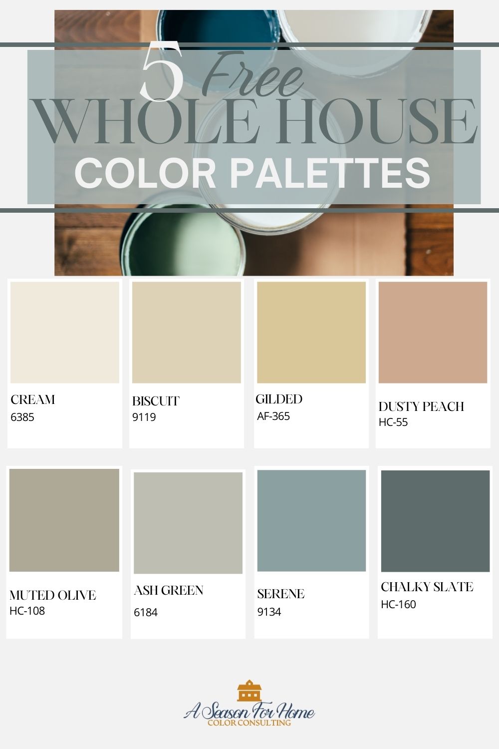
Whole House Color Palette: 5 Free Paint Color Schemes


If you are looking for a whole house color palette then you are in luck. Today I am sharing 5 stunning color schemes for your home’s interior. Read on to find out how to use these colors in your space to customize the look you want!
Pin this Post to save it for later!
This post contains affiliate links. I will earn a small commision at no extra cost to you when you make a purchase.
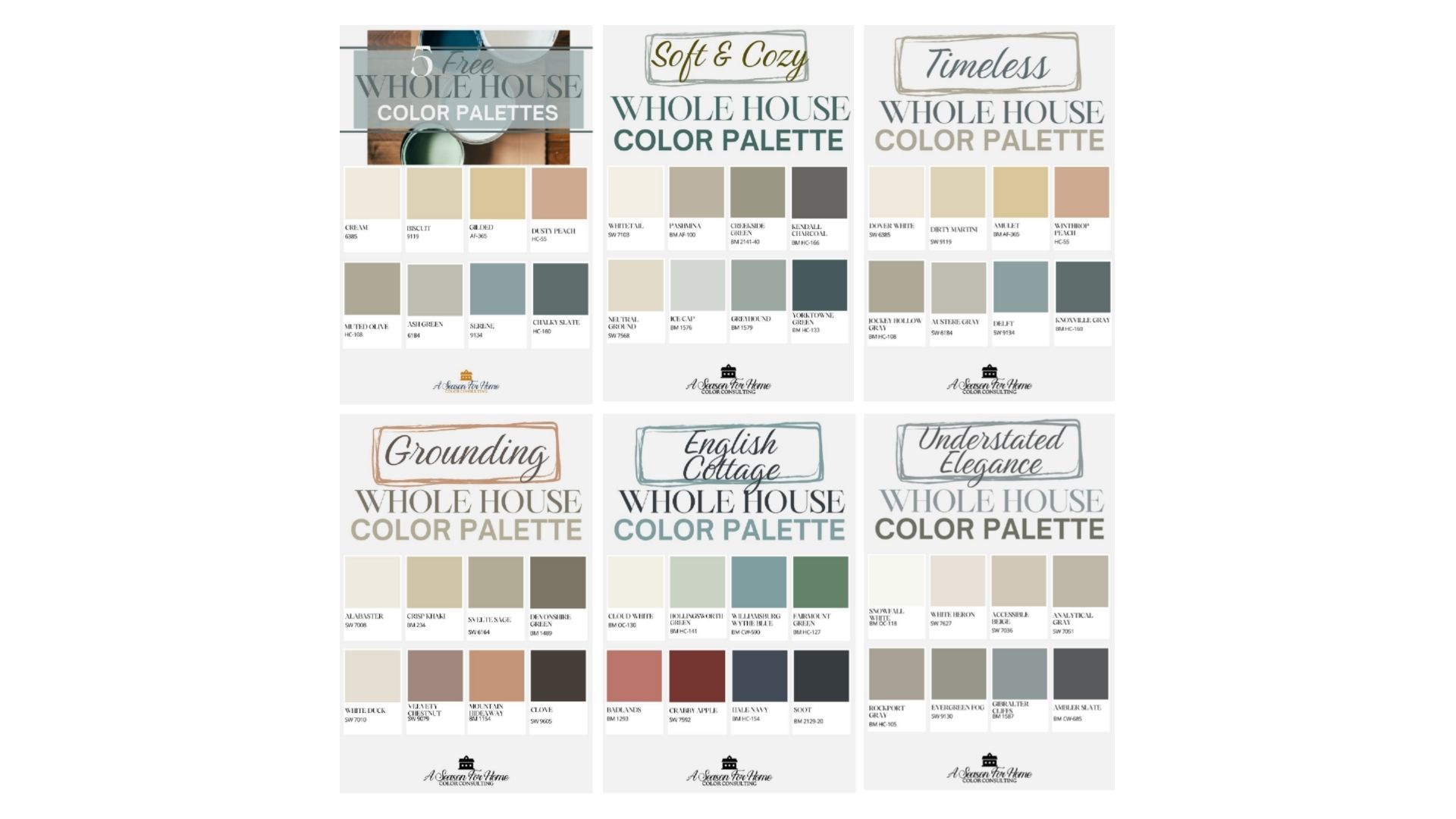
I have included five distinct paint color schemes to suit your individual style. The hardest part will be picking which one you like best! This collection includes:
- Soft and Cozy Whole-House Color Palette: These muted beachy tones are selected for those who want to embrace light, warm neutrals and ocean-inspired hues for a enveloping yet calming vibe.
- Timeless Color Palette: Perfect for busy families and homeowners who want a cohesive color palette to help make the home feel effortlessly put together without feeling trendy!
- English Cottage Color Palette: If you like a bit of personality and energy use this British Country-inspired color scheme to plan out your home’s interior design plan.
- Understated Elegance Color Palette: If you want a tried and true color palette that you know won’t feel tiresome lean into these softer shades.
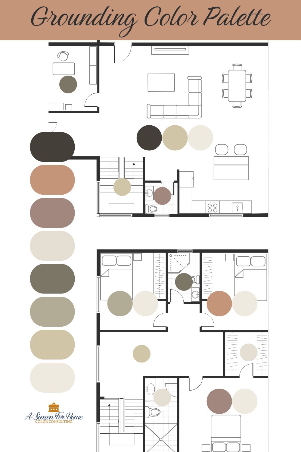
- Grounding Color Palette: Based on earthy warm tones this grounding palette is perfect if you want to evoke a calming and centered feel in your home.
Why Use A Color Palette For Your Home?
Having a limited color palette of colors that work together is the best way to make your house feel cohesive and put-together. When you move from space to space there will be a consistant vibe.
Establishing a palette at the begining of the design and decorating process makes decision making easy! But you can create one anytime to start making changes to your homes interior design. I have done this with my Color Consulting clients, and it is such a satisfying process. You can take a home that has spaces that feel disjointed, random and disconnected and pull them together with a color!
How To Pick A Whole House Color Scheme
If you have read our guide how to pick your home color combination then you know creating a color scheme cannot happen in a vaccum! And that’s a good thing, considering there are 5,000+ premium paint colors to choose from! You can start to narrow your process of picking a whole-house color palette by considering these key considerations
- Start with fixed elements: Fixed elements are any feature of the home like tiles, counters and flooring that are not changing. Warm-toned fixed elements, like travertine or brown granite counters, look best with warm neutrals and low-chroma colors, whereas cool fixed elements (like gray flooring) look better with off-whites, whites and clean colors.
- Consider light: If your home is awash with natural light and high ceilings you can lean into a light and airy feel, while historic homes with lower ceilings and limited windows may feel more at home with cozier cottage-inspired colors, bright warm cream tones and earth-toned paint palettes.
- Use neutrals wisely: Neutrals are great for open concept spaces or homes without cased openings or rooms with clear demarcations. They’re also a great way to simplify decorating by using an accented neutral color scheme.
- Create color harmony: If using color theory, complimentary schemes, analogous color pairings and monochromatic values makes your head spin, there’s good news! These five paint color schemes use tried and tested methods of color pairing to make this process as easy as can be!
FAQs For Choosing A Color Palette
Keep these three key points in mind when choosing a paint scheme for your home. First, if you want to lighten a room make sure to choose paints with an LRV (Light reflective value) of 65 or higher. Second, you don’t have to swear off darker paint colors alltogether. Though it can seem counter-intuitive, sometimes leaning into a darker feeling in a room can create a moody den-like feel that works well for dining rooms, finished basements and TV rooms. Third, don’t paint your dark room with bright white paint! Dim lighting in a dark room can make bright whites, like Chantilly Lace from Benjamin Moore, look dingy. Instead opt for a warm off-white with plenty of creamy undertones. I love Dover White and White Duck from Sherwin Williams to brighten a dark room.
If your furniture includes both antiques and contemporary forms, your home can have a more transitional feel if you want to try the Soft and Cozy or Understated Elegance palettes. If you want to warm up your space and give it a welcoming feel, go with the Grounding Palette or Timeless Hues color schemes no matter your style. And of course an English Cottage scheme was meant for homes filled with antiques but the brighter colors will keep the mood fresh and of the moment!
You can easily swap in another color, but make sure they pair well. The best way to do this is to go to your paint store and get paint chips for all the colors in the scheme. Remove the color you don’t like. Then spread them out with your new choice and make sure there is no disharmony. If you need a refresher, make sure to read up on color chroma and remember not to mix dirty and clean colors.
Test them out! You can start by ordering large scale samples. Move them from room to room and look at them at different times of the day. Once you are ready, test the colors out with small cans of paint. Try to brush the paint over a large enough area where you can really get a feel for it. I try to find a spot where I can isolate the paint between two architectural elements so that the underlaying paint colors don’t affect my perception of the colors. Do two coats and let them dry before deciding.
How To Use a Whole-House Color Scheme
Having an established color scheme is like having a road map for decorating your whole home. The key is knowing which paint color will work best in which room. Follow these four key tips to apply the color schemes to your unique home!
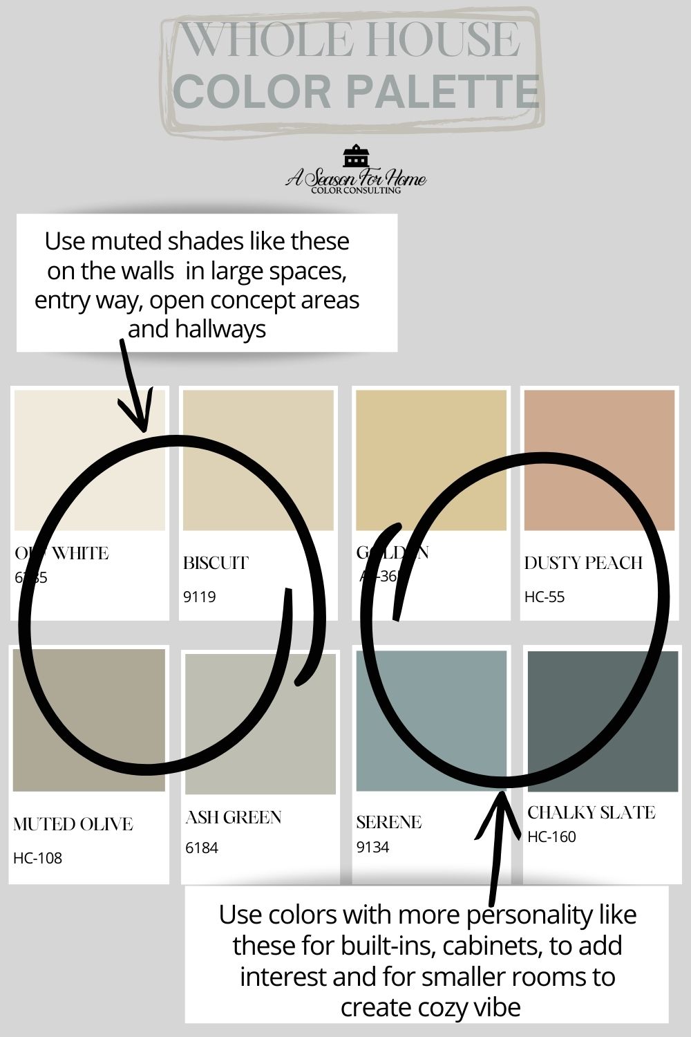
- Pick One Or Two Main Colors: In each of these five color schemes you will notice I have included at least one soft neutral color. This is meant to be used for the main living areas and any spaces that flow from one area to the next. Commonly these include the foyer or entryway, main living room, stairwells and hallways. Painting these main spaces with your neutrals will allow you tons of flexibilty.
- Use Darkest Colors For Accents: Use the darkest shades in the palette for cabinets, built-ins and accents. You can also use these colors to paint your woodwork and wainscoting.
- Use More Vibrant Colors For Smaller Rooms: Bedrooms, home offices and bathrooms can take a bit of color. This works well when you have a door that can be closed or cased opening to demark where one paint color will end and another will begin.
- Think Beyond Paint: The key to success is to repeat your colors throughout the space. Use your paint palette to pick out tiles, fabrics, art and furnishings and more! I take my paint chips with me when I shop to make sure everything goes together! Since all of your colors work together you can repeat the colors in other rooms and the whole house will feel collected!
Download The Free Paint Schemes
Now the hardest part: Deciding which paint scheme you want to use!
Here’s the link to download the free paint schemes. Once you decide which scheme you like best, you can order the large samples from Samplize to see how they will look in your space (see links below to each collection.) Don’t forget to test the paints in your space. And leave a comment below if you have any questions! I love hearing from you.
Order each collection on Samplize:
Soft and Cozy: Buy large scale sample sheets here
Timeless Hues: Buy large scale sample sheets here
English Cottage: Buy large scale sample sheets here
Understated Elegance: Buy large scale sample sheets here
Grounding: Buy large scale sample sheets here