Best Peach Paint Colors

You heard it here first: Peach paint colors are cool again! Not only am I seeing these hues pop up in design journals and color trend forecasts from Sherwin-Williams and Benjamin Moore, but I’ve also noticed this trend in my Color Consultations. People are asking for peach paint colors, and if that’s why you’re here, you are in luck! I am sharing my favorite peach paint colors and the number one thing to avoid.
If you’re new here, welcome. I’m Katie, a Certified Color Expert and professional color consultant. Here at A Season For Home my work is rooted in historic New England color palettes, which is why I love seeing peach make a comeback. The secret is picking a shade with enough depth and balance so it reads complex, muted, livable and timeless, not like a scoop of sherbet on the wall.

Is Peach A Trendy Paint Color?
Blame it on the English Country Trend that swept us off our feet in 2025. Perhaps it is backlash from the millennial gray era, or the starkness of the black-and-white trend, now homeowners are craving comfort in their interiors. Peach is roaring back to the limelight!

Wait, if the idea of choosing a “trendy” color makes you nervous, here’s the good news. When you choose a historically inspired shade of peach, you are far less likely to wake up one day wondering how you got swept into a Pinterest vortex. These versions of peach have been used for generations, which gives them staying power even when they feel newly rediscovered. If you’re considering adding peach to your home, you can feel confident that the right shade will read as both rooted in history and refreshingly current.
What colors make peach paint?
Peach is created by combining red and yellow, then it is lightened with white. Or another way to put it: you can make peach by mixing a bit of yellow into pink. The ingredients are the same! In other words, peach is a warm pink or a soft pastel orange.
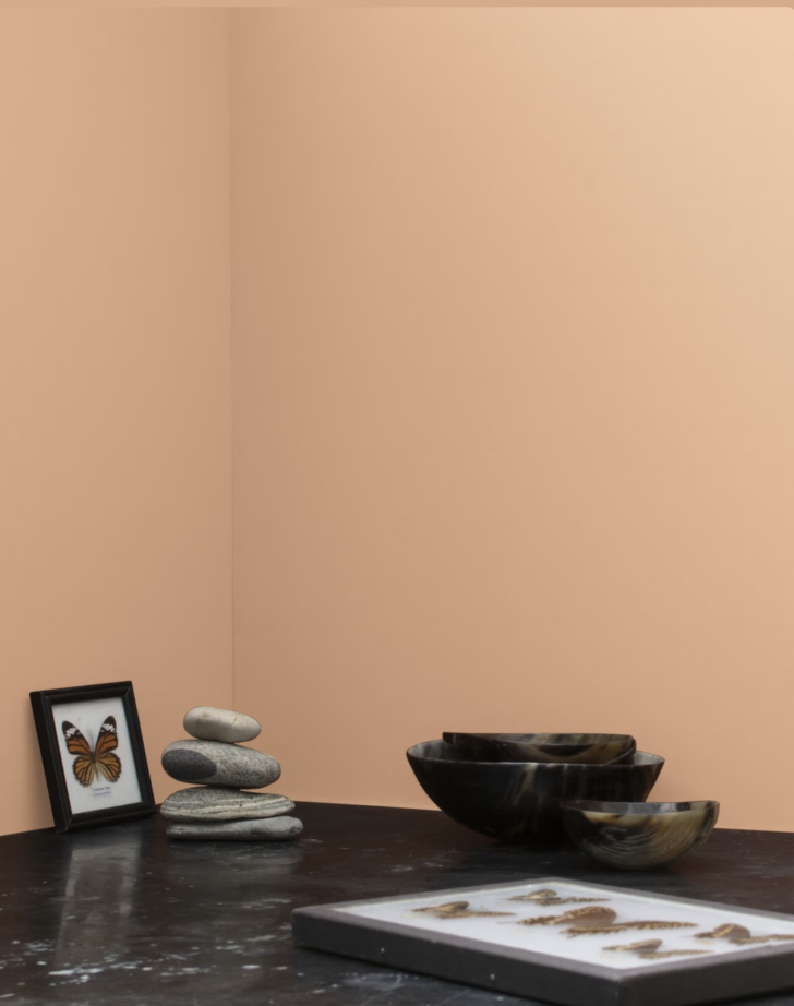
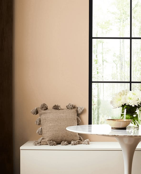
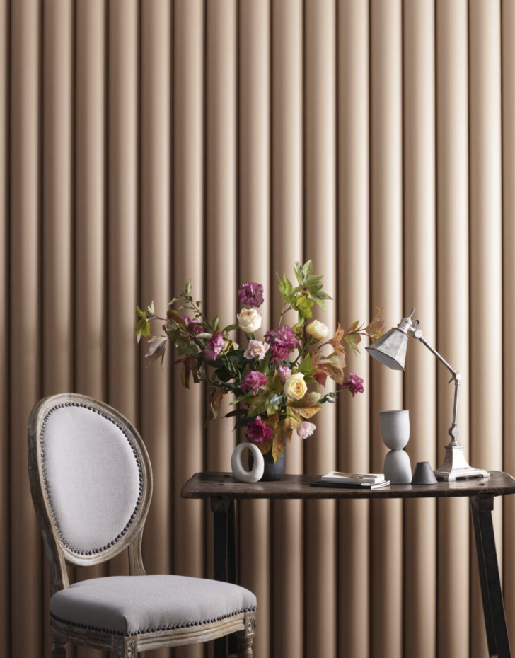
There is a spectrum of hues that range from the above mentioned sherbet-like peach tones (I am looking at you Peach Fuzz- Pantone’s heinous shade of peach that they picked for 2024) on one end. And this spectrum softly melds to gorgeous shades with more complex characteristics (aka low chroma) that feel almost neutral. These lower-chroma peach paint colors often look more tan or beige on the paint chip, but create a subtle, sophisticated backdrop when painted throughout an entire room.
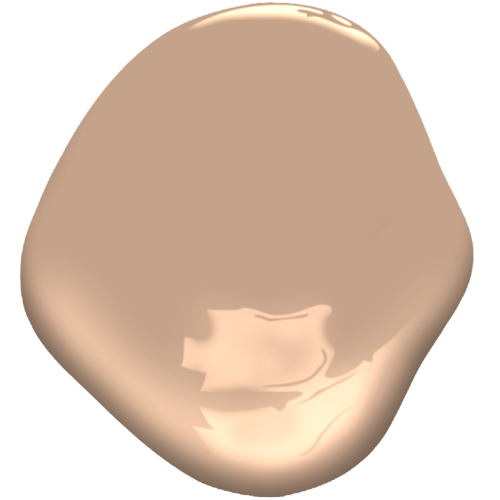
The Best Peach Paint Colors
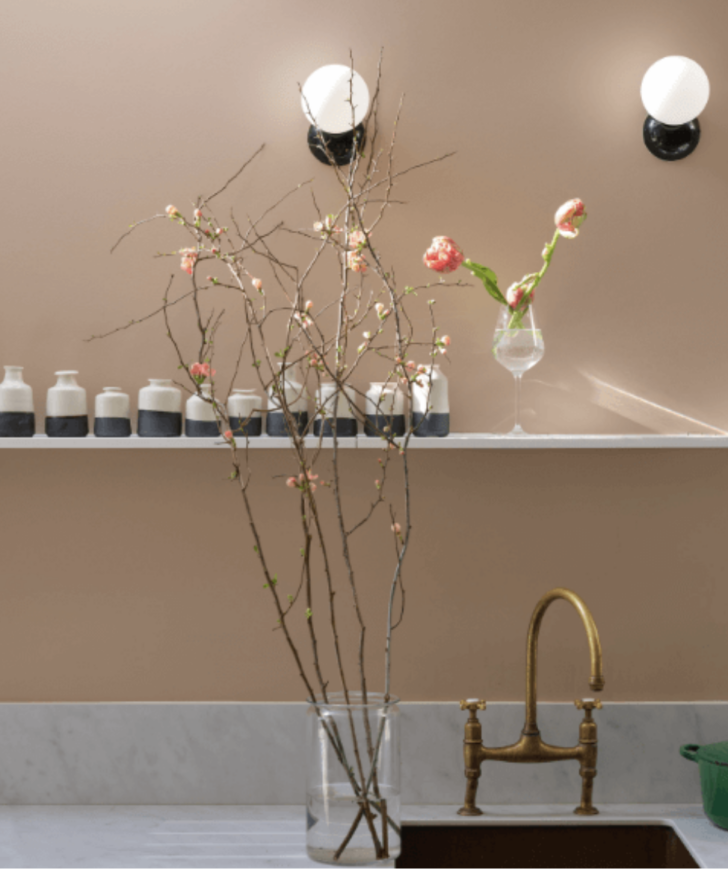
Below, I’ll share my favorite selections of peach paint colors, all of which live on a sliding scale, from softly saturated hues to colors that feel more tan (or beige) but have just enough warm pink to soften and liven. These more complex shades of peach aren’t just red, yellow and white. They also have a bit of black added into the mixture to knock back the sweetness. This is a key point I want to make to you dear readers! Depending on how clean or dirty the tint or tone you pick is, peach can act as a true color moment or function almost like a warm neutral, depending on the shade.

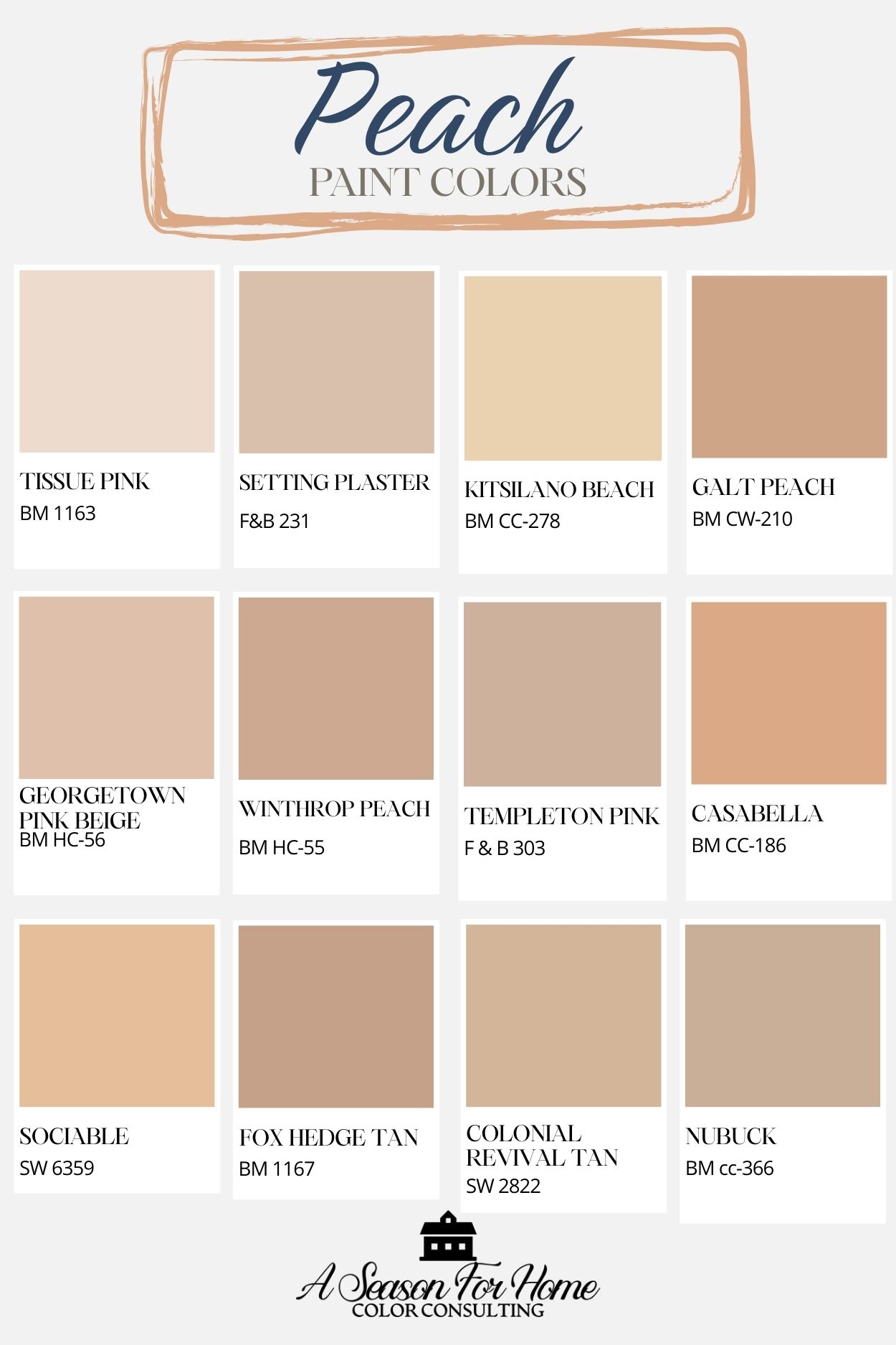
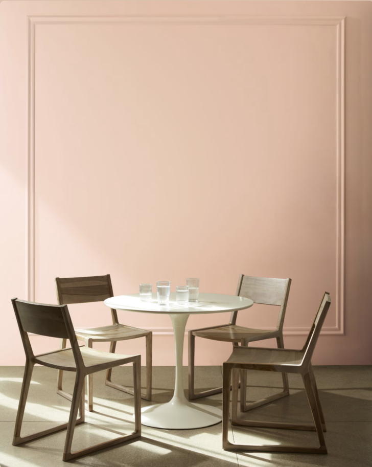
Benjamin Moore Tissue Pink
Soft, pale, and light-reflective, Tissue Pink is one of the most delicate peach-pink options. It’s highly sensitive to light and is one of the few peach tones calm enough for bedroom use.
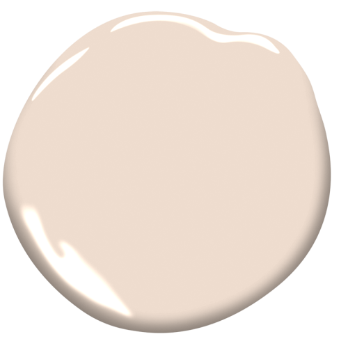
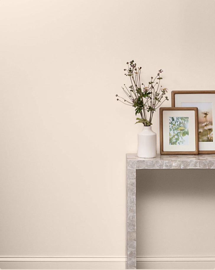
Farrow & Ball Setting Plaster
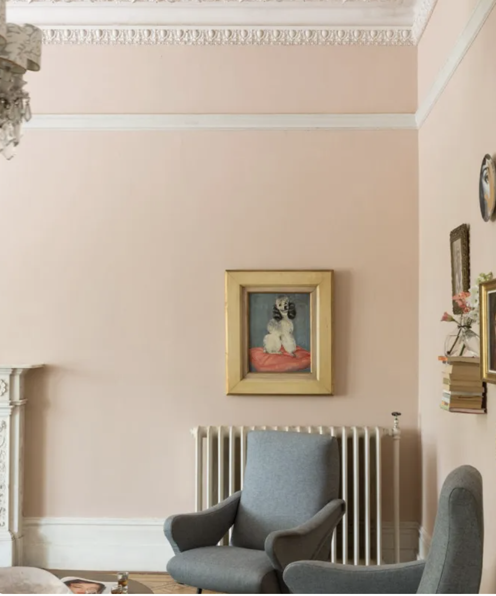
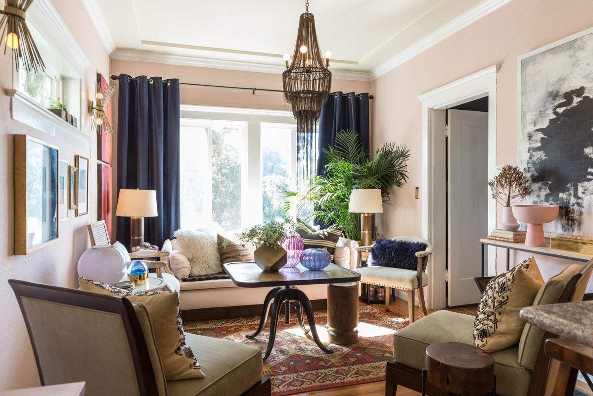
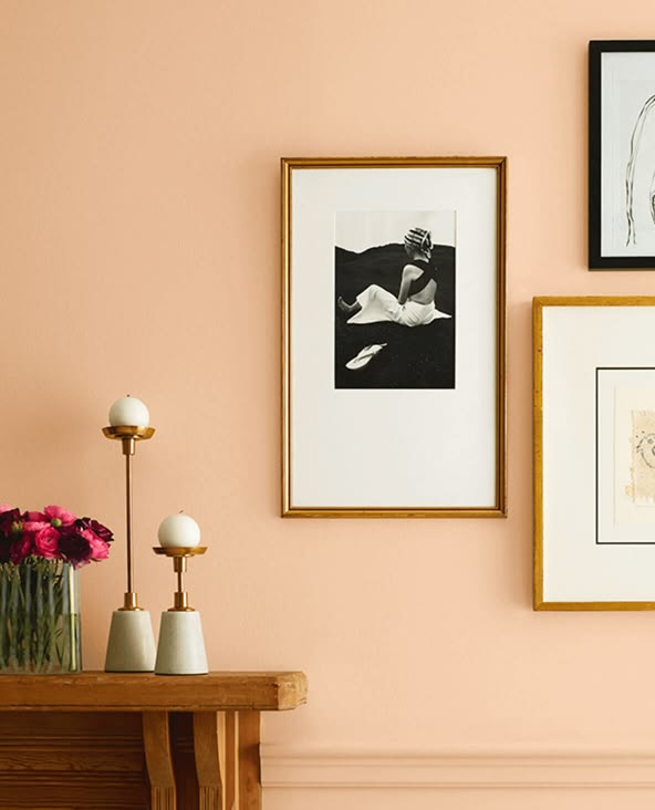
This soft, light peach paint shade from high-end English paint company Farrow & Ball is enormously popular with the influencer set. It’s light in value but deeply complex, so is a great pick for darker spaces. I love it for a vaulted foyer with creamy millwork. It can also work in a bedroom with higher ceilings to help make the space feel more cozy.
Benjamin Moore Kitsilano Beach
This apricot-hued paint color is a sun-washed peach tint with enough complexity to give it a relaxed, cottage feel. The yellow undertones in Kitsilano Beach work beautifully in high-energy family spaces like mudrooms, kitchens, breakfast nooks, and high-traffic informal living spaces. This shade of peach is a little too cheerful for dens or living rooms, and too sweet for dining rooms or offices.
Benjamin Moore Galt Peach
Galt Peach is a true peach classic. I used this color inside the hutch in my own kitchen, where it adds a pop of personality without overwhelming the space, a perfect example of how peach can be used thoughtfully as an accent. It’s from the Benjamin Moore Williamsburg Collection and thanks to its roots in historical pigments it isn’t too bright or overly saturated.
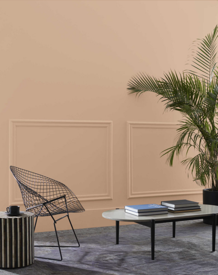
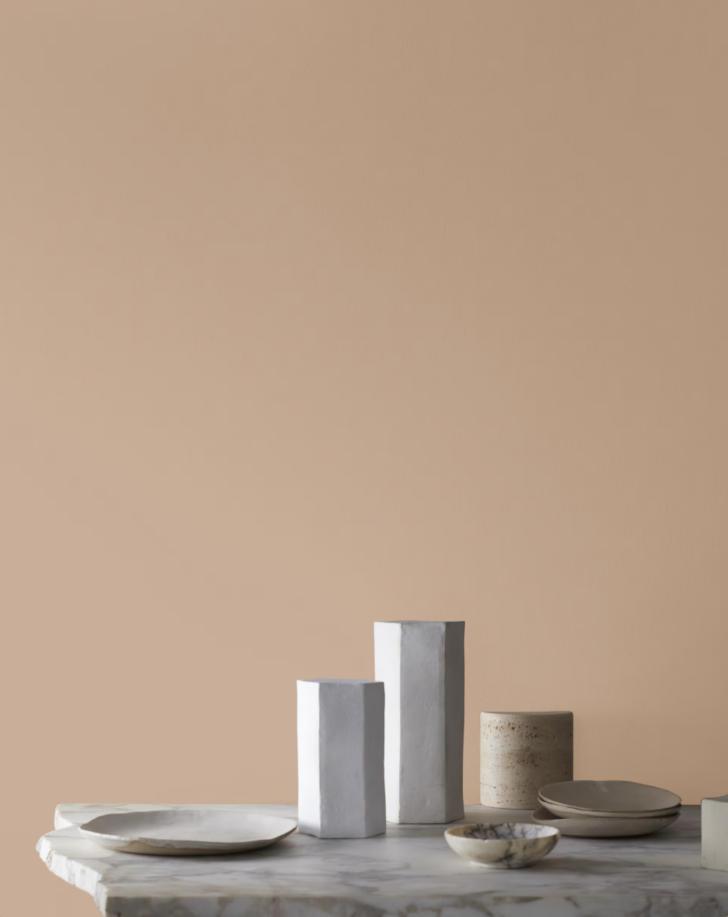
Benjamin Moore Georgetown Pink Beige
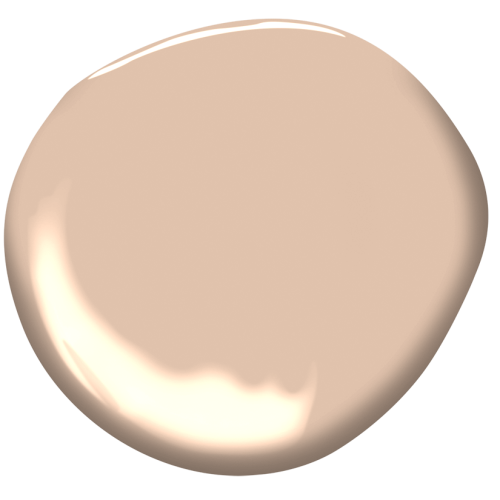
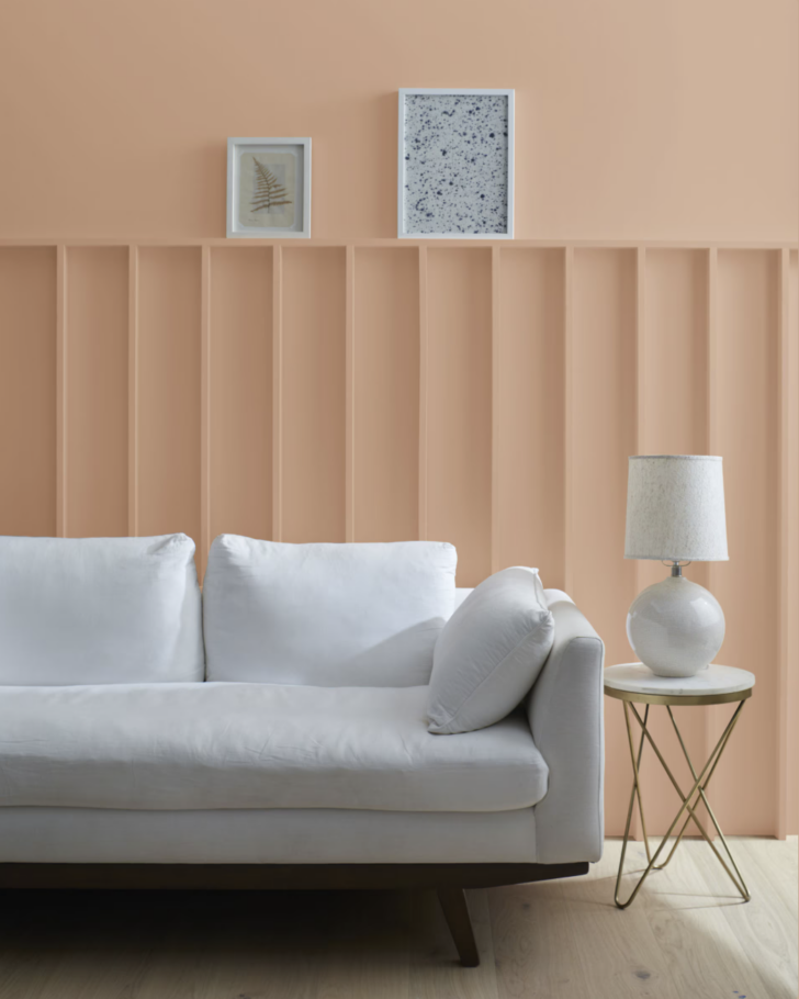
If you were to ask me to pick a favorite peach paint color, this would be my pick! From the Benjamin Moore historical deck, it firmly rests on it’s laurels of having historic cred, yet feels fresh and a little edgy today! It has an LRV of 55, which is moderately dark and will give your space an enveloping feel without feeling like a drenched statement. I love it for living rooms, dens and dining rooms. Try it lightened 50% on the ceiling if you want to try the hot new color-capping trend!
Benjamin Moore Winthrop Peach
This is one of the go-to samples I take on color consultations. It is also from the historic fan deck. Winthrop Peach works best in rooms with warm light and pairs well with darker, creamy trim (like White Duck by Sherwin-Williams) and traditional details. One caveat: I’ve noticed that this paint color falls flat in artificial light and reads almost brown with the warmer lightbulbs. My recommendation is to paint spaces that you use mostly during the day with Winthrop Peach.
Farrow & Ball Templeton Pink
Muted, chalky, and complex, Templeton Pink reads more architectural than sweet. I added it to this mix because I wanted a cooler peach from which to choose. It is one of those shades of peach that feels like a neutral because it is barely saturated. It’s especially well-suited to older homes, plaster walls, and spaces where you want subtle color with depth.
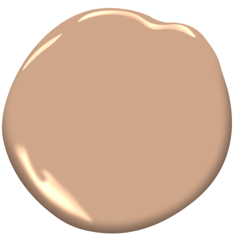
Benjamin Moore Casabella
This peach is all there! It’s a rich, earthy peach with depth and warmth. Casabella (formerly Indian Summer) leans toward terracotta without going orange, making it a top choice for painting a furniture piece. I wouldn’t select it as a wall color necessarily, unless you really want to make a bold statement, but this gorgeous paint has its uses for more refined interiors too! It was a strong contender for our sunny mudroom to paint our hall tree with cubbies because it has enough playfulness to give English Country vibes without feeling like a hue from a candy shop.
Sherwin-Williams Sociable
Sociable is a higher-chroma peach tint that feels cheerful compared to some of these other more muted shades I’ve identified. It hails from the 2026 Colormix Forecast from Sherwin-Williams, and I’ve added it here with caution as a higher chroma option for spaces that do not get much natural light like back hallways, stairwells in older homes or powder rooms. It will still read peach even with artificial light. I love how warm and pigmented it feels and think it would look gorgeous in a flat finish with creamy trim. Try it with SW Dover White or Creamy. However note that it can feel too childish if used for a wall color a larger space with big windows. In bright indirect light this paint color will be too much of a good thing.
Benjamin Moore Foxhedge Tan
Foxhedge Tan is a darker peach with a tan personality. It’s also good in smaller spaces- like in a home office and looks amazing with dark wood (like walnut) or medium-dark hardwood floors. It is a natural pairing with blues (particularly navy) and I love it with old brick. Like Winthrop Peach, it can feel brownish in artificial light, so make sure to test it in your space and look at it at different times of day before committing.
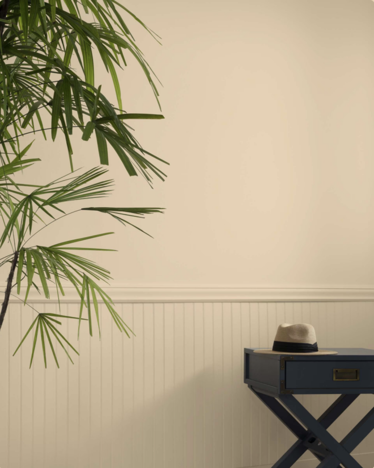
Sherwin-Williams Colonial Revival Tan
This historic shade of peach is an excellent choice for homeowners who want peach influence without obvious color. It has a bit more warmth than Benjamin Moore Nubuck (below) so it will work a little better in rooms without a lot of natural light. This is a great choice if you are sifting through pink beige paint colors, but want more depth and cozy warmth.
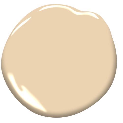
Benjamin Moore Nubuck
I am obsessed with this paint color from the Designer Series by Benjamin Moore. Nubuck is also known as Cream Soda and has a warm beige vibe. It is the perfect all-purpose peach. Like Georgetown Pink Beige it works in pretty much any space, but be wary of the fact that it will feel like a brown or tan in artificial light. That’s kind of what I love about it! It feels like a neutral-but with more personality! It works well in a study, dining room or as part of a layered neutral palette.

How to Use Peach Paint in Your Home
1. Choose the right shade of peach for your space based on the lighting
As I mentioned in several of the above descriptions, peach does some unexpected things depending on the light, so choose the right shade for your lighting conditions. If you want the color to feel peach and are going to use the space mostly at night, go with a more saturated shade that will read with artificial light. If you prefer a more brownish tone, knowing this can be an asset!
2. Use Peach Instead of Red
Consider this color if you think you want to go with red walls. I’ve been pointing my clients toward peach as an alternative wall color to the red trend that is surging. Peach brings intensity and visual weight that has more longevity to red which can be agitating and difficult to live with long term. Peach offers warmth without the same level of stimulation.
3. Placement Matters: When to Use it on Walls Vs Other Surfaces
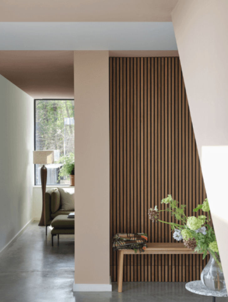
Peach is flexible, but placement matters. Years ago I used to have peach throughout my mudroom, kitchen and living room, which I’ll admit was A LOT! Today, I don’t really recommend it as a whole-house color. Instead here are some time-tested places to use peach in your home:
Accent Color: Use peach as an accent color on furniture and built ins in a mudroom, on a kitchen island or bookshelves and built-ins. You can also use it above creamy off-white wainscotting for a less intense impact.
Best rooms for peach walls: In general large rooms and those with vaulted ceilings feel cozier when they have peach walls. In rooms where you want to feel enclosed like a dining room or den, go for it with peach walls. Bathrooms are alwaus a great place to add personality- without disturbing the peace!
Where Not To Use Peach:
Peach brings energy and warmth, which makes it less suitable for bedrooms in most cases. The exception is are the lighter tints such as Tissue Pink and Setting Plaster which are both light and soft enough to create a calming, serene atmosphere appropriate for sleep.
I also wouldn’t suggest it for kitchen cabinets. Instead use it on the island or as an accent color for a pop of color that feels fresh and cheerful- not exhausting.
Avoid peach as a transitional color in hallways, stairwells or wide open floorplans. It’s too much of a good thing!
What is a good peach paint color for a home’s exterior?

For exteriors, I recommend Benjamin Moore Frontenac Brick (CC-182). This color works beautifully with dark bronze windows and shutters, or paired with deep forest green for a classic, grounded palette. Use it as an accent color in costal homes or as part of a Victorian home’s colorway.
What colors go with peach?

Peach pairs especially well with:
- Green (from sage to deep forest tones.) I love muted greens like Creekside Green.
- Blue, particularly navy, indigo or admiral blue. I’ve added Brewster Gray to the above palette and love the soft low-chroma look it adds.
- Soft beige and khaki paint colors
- Cream and warm off-whites like Navajo White by Bm or Sherwin-Williams Creamy, White Duck and Dover White.
- Chocolate and dark browns, even nearly black paint colors like Silhouette
These combinations keep peach feeling sophisticated and balanced.
Is Peach The Right Color For You?
Peach can be a great addition to your home if you know which shade to use and you apply it appropriately. It can veer from colorful and give all the English Country Vibes to stately and nearly neutral depending on which paint color you choose and which room you paint.
Softer, more complex peaches with brownish tan undertones give grown-up vibes and are surprisingly versatile. And punchier peach tones (like Casabella or Kitsilano Beach) are also useful shades in the right applications (like a mudroom or breakfast room.)
In my opinion, peach does not need to be loud to be interesting. I like it best when becomes one of those colors that you stop noticing. And that is usually the sign that you picked the right one
If you love the idea of peach but want help choosing the right shade for your home, this is exactly what I do in my color consultations. We look at light, architecture, existing finishes, and how a color will actually behave in your space so you can move forward without second-guessing or repainting. You can learn more about my virtual and in-person color consultations here.