Best White Paint for Trim
You’re looking for white paint for trim. Good news: You’re in the right place! Here’s my 3 step method for knowing (not guessing) what the best white paint for trim is.
This Post Contains Affiliate Links
Picking The Best Paint For White Trim
If you clicked on a blog post about the best white paint for trim and baseboards, my guess is you’re either color curious (which if you are you should sign up for my email list because-color nerds unite!) or you fall into one of these categories:
- You are moving
- You are doing a home renovation project
- You are doing a new build
- You are redecorating
If so, pick up your to-do list and cross off “choose white trim paint” because in this post I’ll show you how to know which white is best for your trim. My three step process will take the number of white paints from the hundreds to one.
3 Steps How To Pick Trim Paint Color
- Analyze fixed elements and read their color undertones
- Learn why chroma is key to choosing the perfect white
- Acess why LRV is important for choosing a trim color
I will also share with you a HOT TIP about why you may want to go with a darker off-white instead of a crisp white.
Step 1: Assess Fixed Elements Before Picking White Trim Paint
If you are renovating, doing a new build, or redecorating a room in your house, you have some elements in your space that can’t be changed. With my clients, whether it is a virtual meeting or a color consultation here in Vermont, this is always where we start!
And with hundreds of whites to choose from this can seem daunting at first. BUT… good news: This first step will cut the list in half!
Why Access Undertones in Fixed Elements?
Warm fixed elements, like travertine or brown grainte will have to be paired with a warmer white, whereas gray flooring or carerra marble with blue undertones has to be be paired with a clear or bright white.
If your windows are vinyl and cannot be painted you should also look at them too. If your “white” windows are on the gray side, like Andersen’s white, you’ll have to choose a gray toned white for your trim.
This step is also important if you have “white” counter or tiles in a kitchen or bathroom, sometimes choosing a bright white trim paint will make your fixed elements look terrible. Unless they are a good match the tiles and counters will look dingy next to a bright white paint.
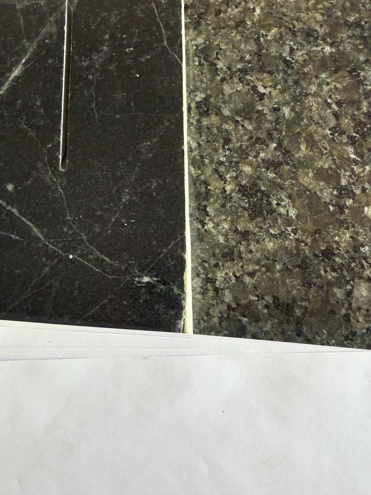
How To Acess Undertones in Fixed Elements
The best way to know the undertones in your fixed elements is to compare them to a neutral white and/or neutral gray. Just like in getting the perfect exposure in my food photography, I use a gray card to do this. In your own home, use a few sheets of printer paper to assess your fixed elements to see what their undertone is.
For acessing the undertones in neutrals (like natural stone that are beige or gray) it’s really helpful to use a mid tone gray instead of white. If you have a fan deck you can use Apparition from Ben Moore, or Repose Gray from Sherwin Williams. This will tell you if your fixed elements have a warmer or cooler undertone. Or if they’re slightly green or pink!
- Warmer neutrals, like beige, pair best with warmer whites, off-whites and creams.
- Cool neutrals, like gray, look better with pure whites and those with cooler tints. Collingwood is a favorite!
Once you are able to discern the undertones in your unchangeable elements you can narrow the scope of the white paints for trim. And just like that, that list of 100+ whites went down to half the size!
Step 2: Do you prefer Clean or Dirty Colors?
At this point in selecting your paint colors, you won’t know what the walls will be, but you’ll probably know what kind of colors you like. Which brings us to step two: choose between a clean or dirty color scheme.
Here I go again talking about clean vs dirty colors! But hear me out.

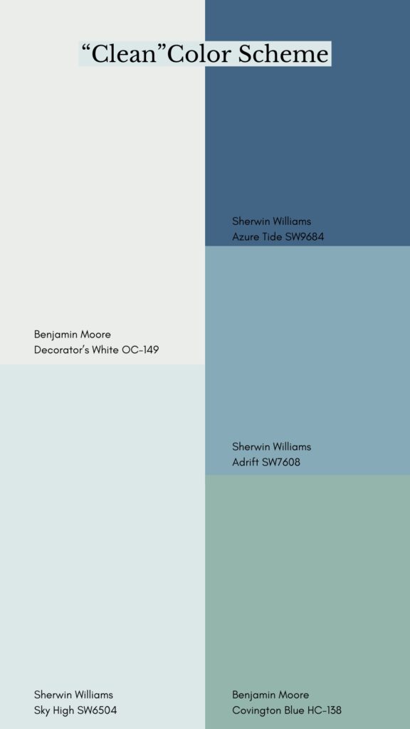
Do you like softer, more muted colors, or do you like brighter hues? Take a look at the two similar color palettes above. Left is dirty and low chroma and Right is clean high chroma.
Ask yourself, which do you prefer for decorating your house? By the way, there is no wrong answer!! This is a matter of personal preference.

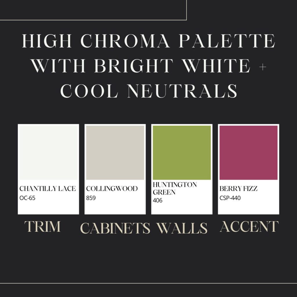
The chroma is super important to consider when choosing your white trim paint. I touched on this last week when we talked about how to pick a home color combination.
- High Chroma: If you like to surround yourself with clear chroma colors (clean) you should use a bright white trim paint (like Chantilly Lace by Ben Moore or Extra White by Sherwin Williams.)
- Low Chroma: If you like lower chroma colors (dirty) then you should use off-whites like Benjamin Moore’s White Dove, Swiss Coffee by Benjamin Moore or Greek Villa from Sherwin Williams.
Step 3: Use LRV To Choose White Trim Color
The third step in my three-step process for choosing trim paint is to look up the LRV, or Light Reflectance Value of your wall color.

If you are not familiar with LRV, this is a standard unit of measure for paints that describes the value or tone of the paint color and how bright or dark it is. It is a 1 to 100 scale that shows how much light it’ll bounce back into the space.
White paints have a high LRV, meaning they reflect almost all of the light, whereas dark colors or black paints reflect little light and have a low LRV. Every paint company provides the LRV for your paint colors and you can use this to help you pick out your trim color.
Why do we do this? Knowing the wall color’s LRV is important in choosing your trim because it will affect the amount of contrast you get between the trim and walls and how much the trim pops.

For example, take a look at the example above. If you have a light neutral wall color like Ballet White (LRV 71.97) and use a vibrant white trim like Chantilly Lace (LRV of 90.04) you will have a differential of 18.07.
This 18 point variance will make the walls appear more deeply colored and make the white millwork pop. If you have historical trim that you want to show off, or want to create a cleaner traditional feel (even with a light paint color like Ballet White) you should choose a differential of 15 points to 30 points.
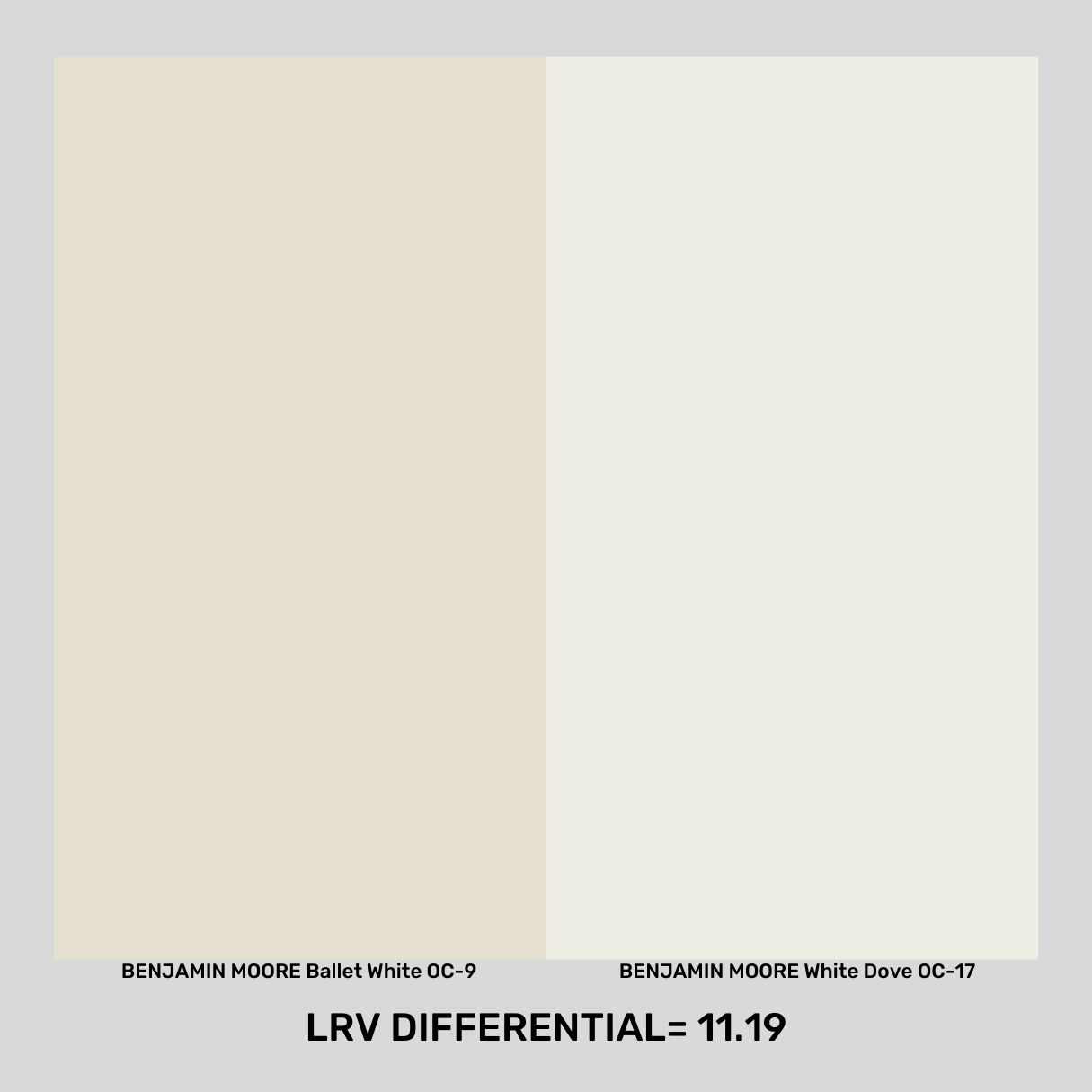
Conversely, a slightly more creamy, muted white paint will provide a different feel more consistant with today’s trends in interiors. In the example above, White Dove (LRV 83.16)makes a lower contrast with the Ballet White. With this paint color pairing, the LRV differential comes down to 11.19 points.
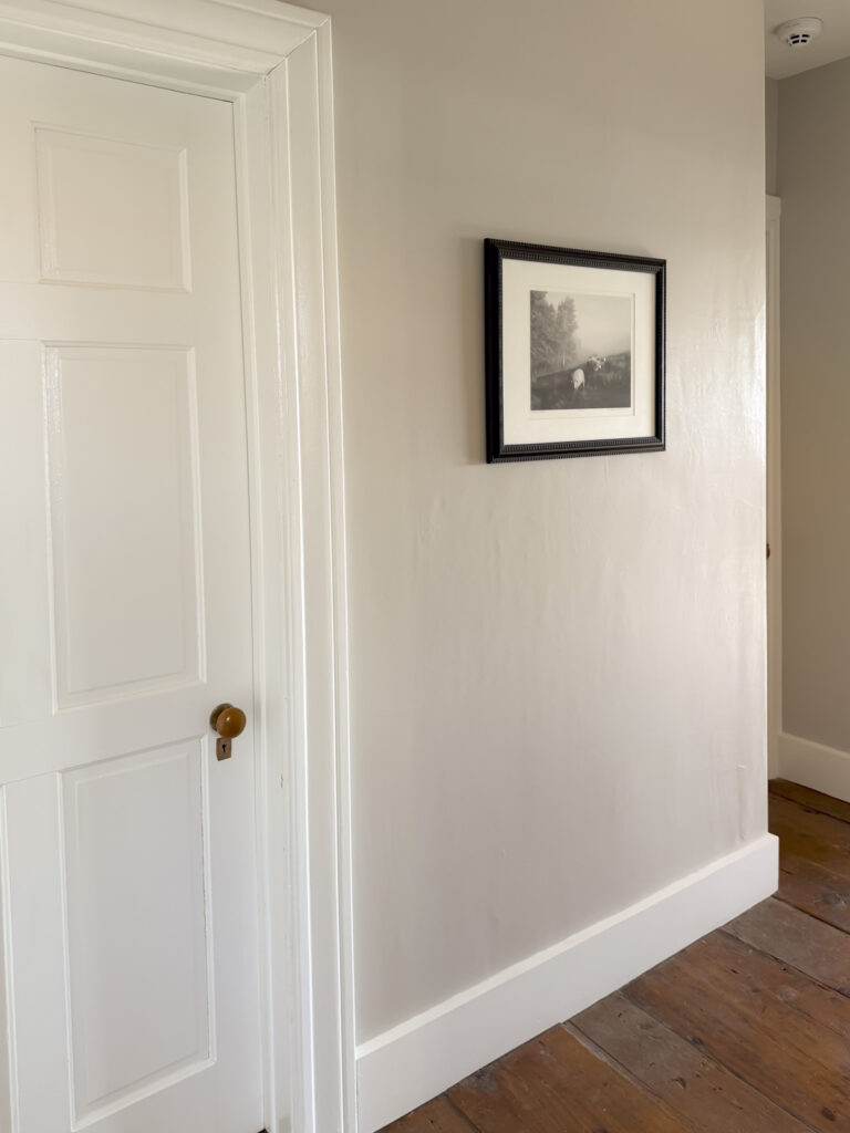

- LEFT PHOTO: You can see in an example photo on the left above of a hallway in my house where there is low contrast between Ballet White (LRV 71.97) and White Dove (LRV 83.16). This 11.19 differential gives a muted cozy ethereal feel to the paint combination.
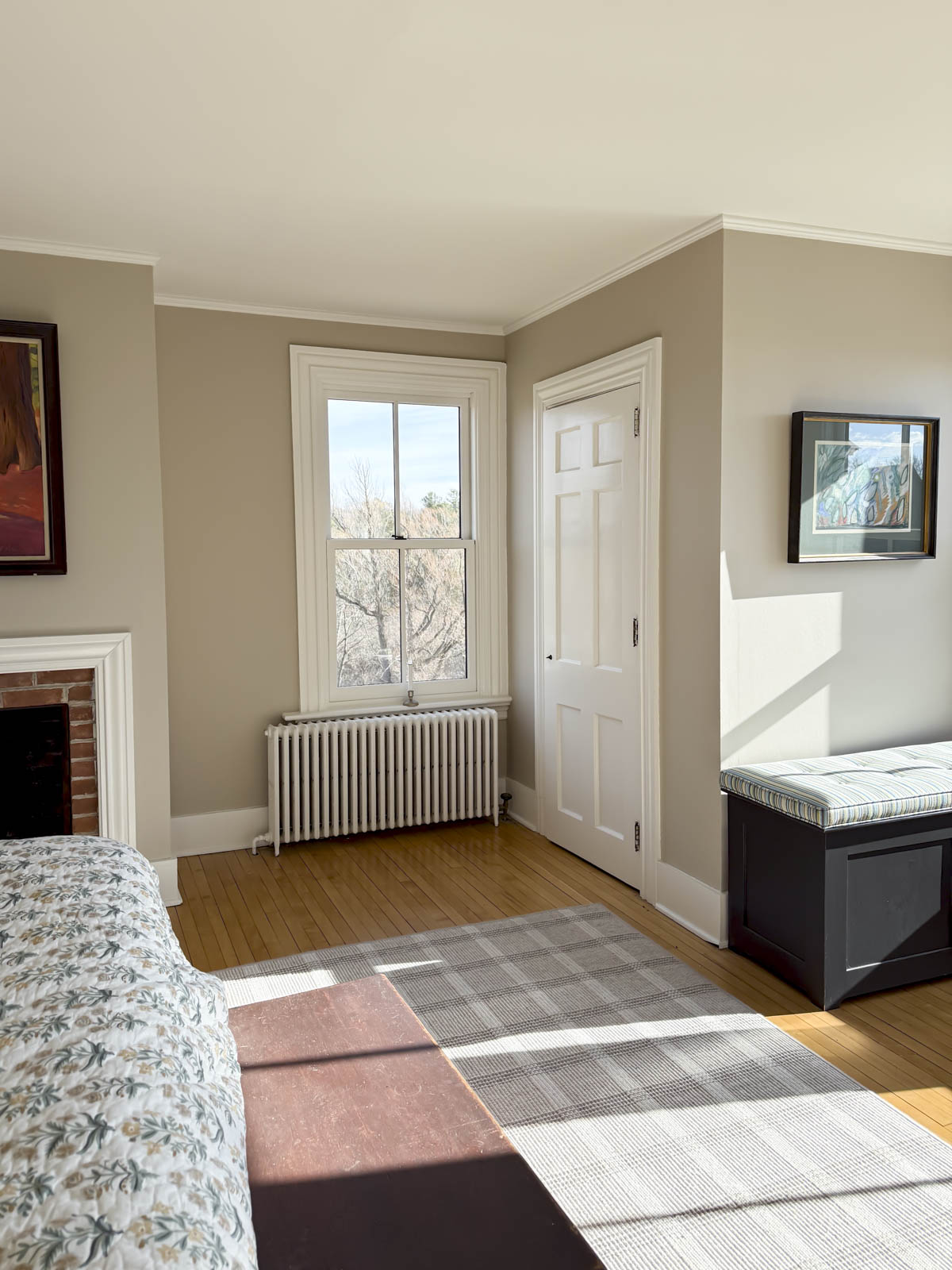
- RIGHT PHOTO: By comparison, on the right our guest room walls are painted Smokey Taupe (LRV 54.53) and the trim is White Dove (LRV 83.16). This creates a LRV differential of 28.63.
OUTCOME: By the end of this step you will be able to take your list of the remaining whites, and narrow them down even farther. If you prefer a moodier, muted, softer look you’ll want to choose a white paint with a slightly duller LRV (lower number.) Go with a higher LRV if you like a bold crisp look.
How To Choose Trim Color
To recap these are the three steps you’ll need to take to find the perfect white paint:
- First you’ll figure out the undertones in the fixed elements in your space.
- Then decide if you want to use clean or dirty colors to decorate.
- Then decide if you want a softer look or a high contrast look.
After these three steps, you’ll be left with only a small handful of whites. From there the last thing to do is use a large scale paint chip and sample paint to test these white trim paints in your space.
What are the Best White Paints For Trim?
If you want to make this process even faster. Take this curated list below to start your three step process. Here is a cheat sheet below of my personal favorites.
Favorite Warm Whites For Trim
This list is goes with warm fixed elements or low chroma colors. Click to order all of my favorite Warm Whites For Trim from Samplize.
- Benjamin Moore Simply White* OC-117 (LRV 89.52)
- Sherwin Williams Whitetail SW 7103 (LRV 86)
- Benjamin Moore Cloud White 967 (LRV 85.05)
- Sherwin Williams Greek Villa SW 7551 (LRV 84)
- Benjamin Moore White Dove OC-17 (LRV 83.16)
- Sherwin Williams Alabaster SW 7008 (LRV 82)
- Sherwin Williams Marshmallow SW 7001 (LRV 82)
- Benjamin Moore Swiss Coffee OC-45 (LRV 81.91)
- Sherwin Williams Creamy SW 7012 (LRV 81)
- Benjamin Moore Linen White 912 (LRV 80.94)
Bright Cool White Paint Colors
These are the best white paints to pair with cool toned fixed elements and high chroma colors. Click here for large samples of these whites.
- Benjamin Moore Chantilly Lace OC-65 (LRV 90.04)
- Benjamin Moore Snowfall White* OC-118 (LRV 89.72)
- Benjamin Moore Oxford White 869 (LRV 86.69)
- Sherwin Williams Extra White SW 7006 (LRV 86)
- Sherwin Williams Pure White SW 7005 (LRV 84)
- Sherwin Williams Ceiling Bright White SW 7007 (LRV 83)
- Benjamin Moore Decorator’s White OC-149 (LRV 82.68)
- Sherwin Williams Snowbound* SW 7004 (LRV 83)
What if My House Is Dark?
I live in northern New England in a 200 plus year old house with small windows, so trust me when I say I know all about paint colors for New England houses. The key when choosing a white trim for a dark room is to go with a warm yellow-based off-white like Creamy from Sherwin Williams or Dover White from Sherwin-Williams. I adore Linen White from Benjamin Moore too. It truly glows in darker houses.
Is White Trim Outdated?
Yes. You heard it here first, my paint-loving friends! Stark white trim is quickly going out of fashion.
Now I know I just wrote an entire guide to picking a white trim color, because I know not every person cares what’s in fashion vs what they like. However, I am currently warning my clients against brighter white trim, especially with the trend of darker wall colors and mid-tone paint colors because bright white trim is evocative of the early 2000s when paired with today’s trending paints.
What to do instead? A lot of people are avoiding this altogether by color drenching or doing reverse or contrast trim. These days I encourage clients to either use reverse trim or use softer off-whites and creams instead. Consider using a darker color like:
- White Duck by Sherwin-Williams (LRV 74)
- Shoji White by Sherwin-Williams (LRV 74)
- Gray Mist by Benjamin Moore (LRV 73)
- Muskoka Trail by Benjamin Moore (LRV 72)
What if I like High Chroma Colors and Have Warm Fixed Elements or Vice Versa?
In my Color Certification course this quandry is known as a show stopper- when you have a fixed element that you want to ditch but can’t. In this case you can do two things:
- Mix Trim Paints: Use a bright or cool white trim in the rooms without the warm fixed elements, and use a warmer trim color only in the rooms with your warmer tiles and surfaces that cannot change.
- Choose An All-Purpose White: Go with a versatile white that plays nice on either side of the warm/cool scale like Sherwin Williams Snowbound (LRV 83) and Sherwin Williams Pure White (LRV 84). Benjamin Moore Snowfall (LRV 89) or Benjamin Moore Simply White (LRV 89) are two other options to test if you’re in this situation.
Should All The Trim in The House Match?
If you want to make life easy, yes! When we moved a year ago and I needed to pick out the colors for our entire house, I made life easier for myself (and the painters) and chose one color for all of the trim in the house. With the exception of the rooms where I used a contrast trim, I went with, White Dove OC-17 by Benjamin Moore.
There is only one bedroom in the house where I used Decorator’s White (LRV 82.68) and that’s because I was using it with Classic Gray (LRV 73.67) for the main wall color and White Dove didn’t have the right temperature.
What White Paint color should I use on the ceiling?
In general, you can always keep it simple and use the same white paint color on the ceiling as the trim. Just make sure to use flat or matte on the ceiling to hide any blemishes. Ceilings reflect the most light and our eyes pick up flaws in the ceiling really easily.
The fact that ceilings naturally reflect more light also means the white paint will look brighter on the ceiling.
20+ years ago it was common to use a brighter ceiling color. You can still do this to make the walls appear darker. However, this works best if your trim color doesn’t have a strong tint to it or the ceiling has the same tint, just a lighter LRV. For example, I would not use a bright white like Benjamin Moore Super White OC-125 on the ceiling with Benjamin Moore Navajo White on the walls, unless I wanted to play up the peachy undertones of the Navajo White.
I personally think using a brighter ceiling paint can look a little dated, circa 1998, and recommend using the same paint color for the ceiling as the white trim.
What is the best sheen to use for trim?
I like to use Semi-Gloss on trim, doors and baseboards. These higher traffic surfaces get scuffed and dinged more easily and semi gloss is best for resisting this!
It is customary to use a higher gloss paint because semi-gloss is more resilient and easier to clean than eggshell, flat or matte.
If you want a slightly less shiny look, but more durability, you can use pearl or satin. When in doubt, ask at the paint store or your professional painter for your recommendations.
Can I use a color other than white on the trim?
Yes! As I said above, crisp white trim is going out of fashion, so you can always go with a darker off white (with an LRV in the 70s.) And there are a three other times when I recommend using a color other than white for your trim. Of course, there is also color drenching, but that is another matter entirely so that doesn’t count!
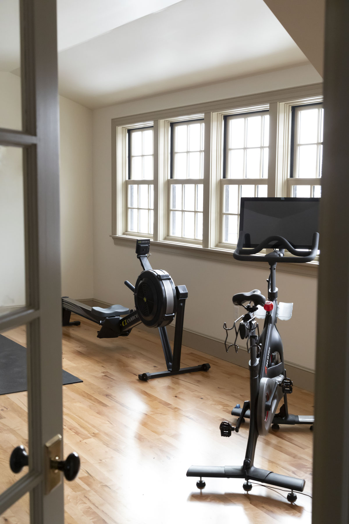
One is when you are going for a contrast trim look, of which I am a giant fan. This is where the walls are white and the trim, baseboards, crown moulding and doors are darker. We did Benjamin Moore Muslin Paint on the trim with white walls in our spare room. Below you can see it in our home gym.
This look is very popular at the moment and looks fabulous with historical trimwork and custom millwork.
The second time I love seeing a non-white trim is with wallpaper! I do not like white trim with wallpaper if the wallpaper doesn’t have white in it. In this case I suggest pulling one of the lighter tones out of the wallpaper pattern and using this as your trim color. See above a beautiful example from Painted Paper.

Lastly is when you use a dark brown or black trim with a colored wall. I am obsessed with this look from The Green Rabbit House and copied it in my guest apartment.
