Collingwood by Benjamin Moore Paint Color Review
Below I’ll be sharing my thoughts, both negative and positive about Benjamin Moore Collingwood OC-28 in today’s paint color review. I have this color in several rooms in my house and there are some things I love about it, and others you should know before you add it to your home.
Benjamin Moore Collingwood (OC-28) is a best-selling warm gray paint color that can be used in a wide range of spaces. Its soft, understated hue makes it a popular choice in both traditional and modern interiors. However, like all paint colors, it has unique characteristics that make it better suited to certain environments than others. In this review, we’ll explore Collingwood’s undertones, how it reacts to other colors, and its best applications.
Color Overview
- Color Name and Code: Collingwood (OC-28)
- Color Family: Gray
- Light Reflectance Value (LRV): 62.14
Should You Use Collingwood In Your Home?
When we bought our home, everything needed a fresh coat of paint before we moved in, and I had so many paint colors to choose for the various spaces. It was a difficult task because I had all of our furniture from our old home, and needed to figure out how to make it all work in the spaces in our new house, and tie it together with paint!
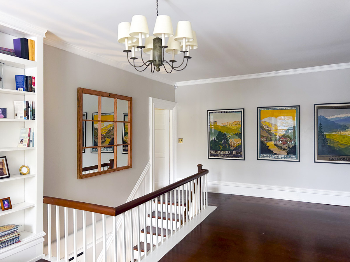
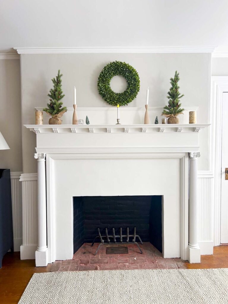
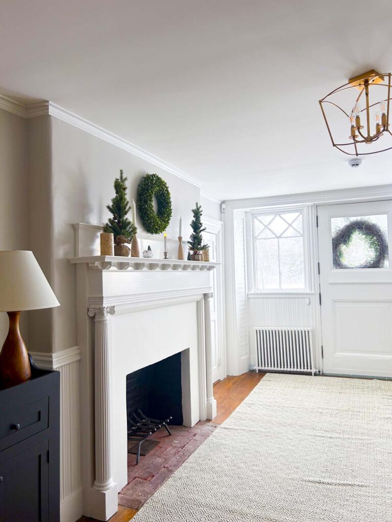
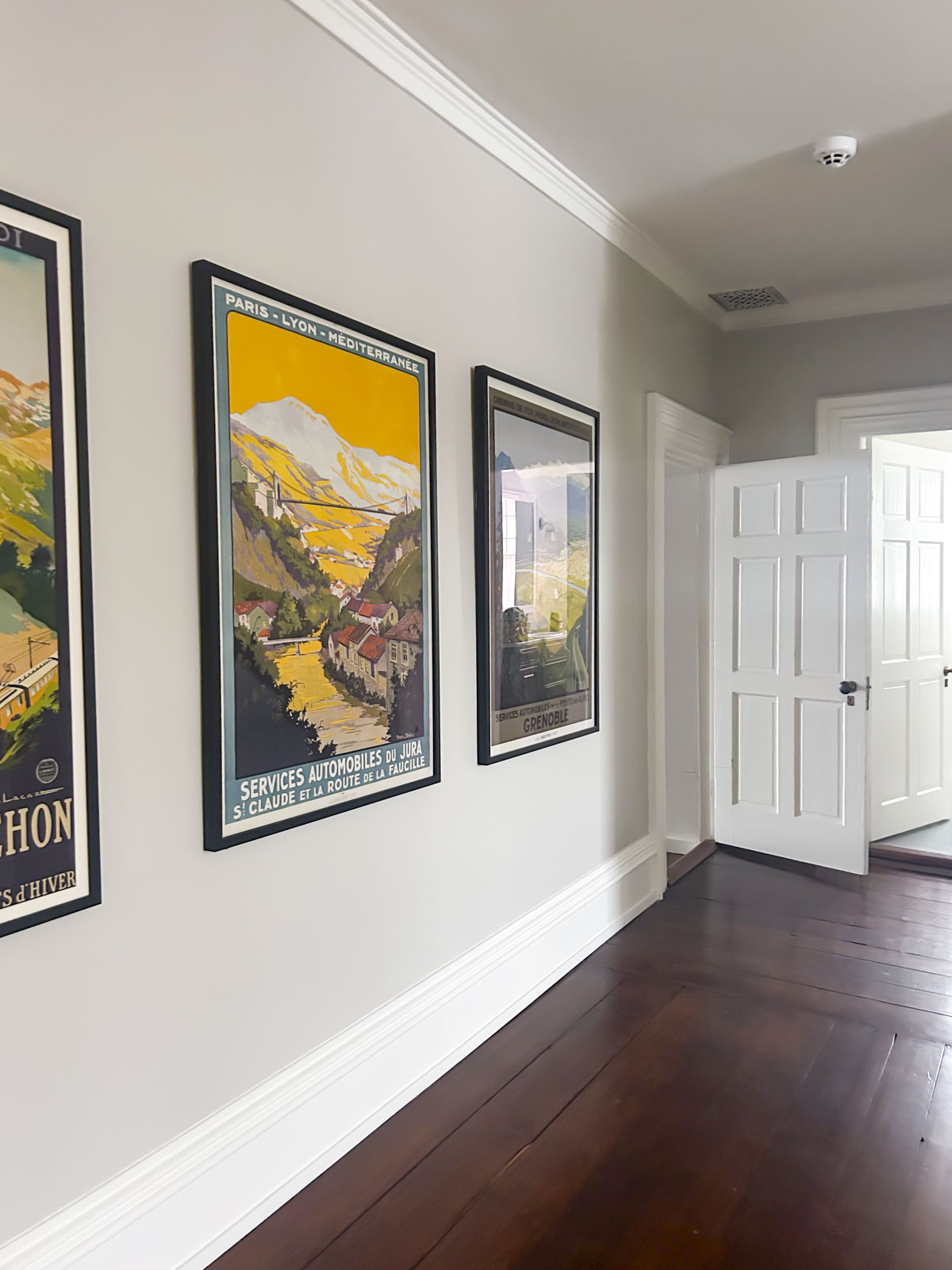
That’s where Collingwood came in. I picked this paint color for our kitchen, the small seating area in it, and in our main foyer, stairwell and upper hallway. I chose it because it was very light and had no bright or dominant hue that could clash with adjacent color palettes. I also have a lot of really colorful artwork and wanted a paint color that would let the art do all the talking.
So should you use Collingwood Benjamin Moore in your house? I’m going to be honest, I have mixed feelings about this paint color having lived with it for a year now. Below, I am sharing my opinions on when it works well and when you should avoid it.
Style Considerations
While grays have fallen out of fashion in favor of beige and warm neutrals, Collingwood can still be a timeless choice as far as grays go. It’s important to style it thoughtfully to avoid a space feeling outdated or overly cool.
It can be used for a whole-house paint color or an option for open-concept floor plans. This is especially true if you have existing furnishings or fixed elements with grays and need a wall color to tie everything together. Collingwood can help you create cohesion with these fixed elements when choosing your home color scheme.
This is not the color for you if you are looking for a beige or warm natural. It is a warm gray, but still much cooler than the trends today.
LRV For Collingwood
With an LRV of 62.14, Collingwood is a mid-range light color that reflects a moderate amount of light. LRV stands for Light Reflectance Value, which measures how much light a paint color reflects or absorbs on a scale from 0 (completely black, no reflection) to 100 (pure white, full reflection). It helps you understand how light or dark a color will appear in a space, affecting how bright or cozy the room feels.
To give you an idea of what this means, Benjamin Moore’s most popular paint color is White Dove- a beautiful, versatile white paint. It has an LRV of 83.16 so you can rest assured Collingwood, with an LRV in the low 60s, will not feel overly bright in well-lit rooms and has enough depth to avoid looking washed out in spaces with lower light levels.
That said, it appears in the “whites” section of the Benjamin Moore fan deck, which means that it is quite bright. I used this paint color as a “whole house” color in our main entry hall, foyer, staircase and upper hallway, all of which are north-facing, and it is bright and airy.
What are the Undertones of Ben Moore Collingwood?
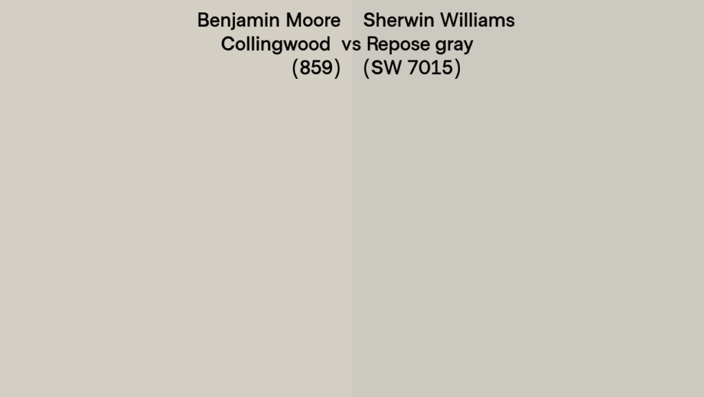
Collingwood is a warm gray with subtle violet undertones. Below you can see that Collingwood has a warmth to it when compared to a neutral gray paint color like Sherwin Williams Repose Gray (SW 7015.)
Now let’s look at it next to Revere Pewter, another very popular gray color from Benjamin Moore.
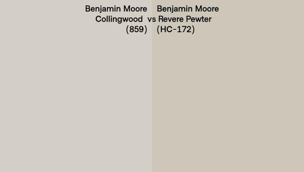
Notice how comparing our review color with other gray paint colors really helps to identify the undertones? This helps illustrate how Benjamin Moore Collingwood has a subtle violet undertone and the Revere Pewter has a green undertone.
In my own home, which is in Vermont, I have found these warmer undertones can shift depending on the lighting and decor. While the violet is generally soft, in north-facing rooms and low winter light can make it more noticeable.
To the vast majority of people, they probably won’t notice the undertones in Collingwood. But my guess is, if you are here reading this blog post, you are sensitive to color and will pick up on the undertones. That said, the amount of violet is minimal, which is why it is a good choice if you are looking for a warm gray with neutral undertones.
Which White Goes With Collingwood?
My Choice: All of the photos I have shared in my house are paired with White Dove and it is the white paint color I would suggest pairing with Collingwood. It is a mildly warm white without a ton of strong undertones.
I also love the way it looks with Sherwin Williams Greek Villa (SW 7551.) This is a warm white with a tiny touch of pink in it which helps make the greens in Collingwood paint pop. This white is less stark and creates less contrast with the Collingwood with a differential of 22 LRVs.
To make the warm tones in Collingwood pop, and make the value of it appear deeper and more rich, pair it with a bright clean white like Chantilly Lace by Benjamin Moore.
Chantilly Lace is not as warm as White Dove or Greek Villa so it’ll make Collingwood appear deeper and warmer. I know it sounds counterintuitive to use a less creamy white to make the Collingwood appear warmer, but it is all about contrasts!
Not only that, pairing Collingwood with Chantilly Lace will give you a 28-degree differential in LRVs, so you’ll really notice a big contrast.
If you don’t really want such a big contrast in value but like the idea of using a cooler white to make Collingwood pull warmer, I recommend pairing a slightly cool white like Decorator’s White by Ben Moore, especially if you are trying to create a backdrop for existing elements like gray flooring, tile or furniture.
If you love a tone-on-tone look (with a smaller differential of 12) pair Collingwood with Classic Gray by Benjamin Moore.
THE TAKEAWAY: Use a bright white to allow the warmth and depth of Collingwood paint to stand out. Or go with a warmer white like White Dove (my personal recommendation) to seamlessly blend into your interior decor. To learn more, read How To Pick White Trim Color.
Where Collingwood Works Best
- South-Facing Rooms: In a south-facing room or other spaces with warm, consistent sunlight, Collingwood leans into its greige character, appearing warm and inviting.
- Open Concept Layouts: Its neutrality makes it an excellent unifying color for large, connected spaces.
- With Gray Finishes: If you are trying to work with existing finishes, this may be the color for you!
- Homes in Southern Climates: With more abundant natural light, Collingwood tends to appear balanced and warm, making it a great choice for sunnier regions.
- Paired with Bright Hues and Clean Colors: It goes great in well-lit rooms with colorful artwork in saturated colors. Due to its warmth, it works well with cool colors and warm colors alike. I love the way it lets the art do all the talking!
- A great Benjamin Moore paint for furniture: On furniture or cabinetry Collingwood can give colonial vibes in all the best ways! Pair with antique brass pulls or hardware to complete the look. (That’s an affiliate link, btw.)
Use With Caution In These Cases:
- North-Facing Rooms: In low-light or north-facing spaces, Collingwood’s gray tones dominate, and its violet undertones become more pronounced, making the space feel cooler. This is definitely going to be accentuated by the white you pair with it, so make sure you test your samples!
- Northern Climates: In regions with long winters and limited sunlight, Collingwood may feel too cold or stark. If you are hoping for a warm vibe, and do not have to try to match other grays in your space- don’t use Collingwood.
- Low-Light Spaces: Without sufficient natural or artificial light, Collingwood can appear flat and lacking nuance. So this is not the color to use if you are hoping for people to say “Wow what is this paint color?” In other words, Collingwood in low light will never get noticed! And that can be a good or bad thing, depending on your objectives!
How to Use Collingwood in Your Home
- Sample First: Test Collingwood in your space using paint samples to see how it reacts to your lighting conditions throughout the day. You can start with large-scale samples which your Benjamin Moore paint store can loan you. You can order from Sampilize or buy a small pot of the sample paint and brush on a piece of card stock.
- Which Paint To Buy and Prep First: When you’re ready to paint, I suggest using BM’s Aura Paint or Regal Paint for great depth of color. Of course, make sure your walls are prepped before you start to diminish uneven textures and any less-than-perfect surfaces!
- Which Finish To Use: Check with your painter, but in general you’ll choose the sheen based on the use and room. For a luxurious matte finish choose “Matte” or go with “Eggshell” for a smooth flat coating that hides any imperfections. For more shine on trim, casings and cabinets use “Satin” or “Semi-gloss”. This creates an easy-to-clean surface and works great in bathrooms with high moisture.
- Layer Lighting: Use a combination of warm-toned bulbs and layered light sources to offset any coolness.
- Decorate: Use Collingwood paint as your neutral wall color and then decorate with textiles, throw pillows, and furnishings using a single color or two richer hues. This is called an accented neutral color scheme. With a neutral paint color like Collingwood on your walls you can easily, and inexpensively, create a fresh look by swapping out colorful accessories.
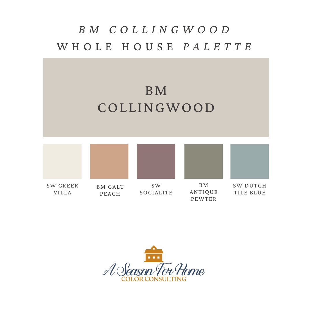
Featured Color Palette
Use our Collingwood whole hose palette for inspiration! This is the perfect whole-house color palette if you are planning to paint your main areas BM OC-28.
- Use Collingwood in the central hallway and these other paint colors in the adjacent rooms.
- Choose one of the below paint colors or similar to suit the needs of the lighting in your house. For example, if Dutch Tile Blue seems too washed out in a North-facing room, go with a moodier blue like Brewster Gray instead.
- Use BM Collingwood as the neutral wall color and pair with any of these colors in your textiles, fabrics, artwork and furniture. Stick with one or two coordinating colors per room.
- Sign up for a Virtual Color Consultation to have me pick a custom palette for you!
My Opinion On Collingwood
Pros: On the plus side I love the way this paint color acts as a barely noticeable background color for colorful artwork. Its LRV of 62.14 gives it enough flexibility to suit many spaces and provide plenty of light even in North Facing rooms. It is a good warm gray paint color if you already have gray elements in your space that are fixed, and cannot be changed. The undertones are very limited so it pairs with a variety of other paint colors that can be seen in adjacent spaces.
Cons: On the negative side, the gray trend in interior decoration has already passed by and spaces using gray are seeming more and more dated as time goes by. Furthermore, in low light conditions, the violet undertones in the paint color can come out and may not work as intended with your decor. In these cases, I suggest you try another popular greige with a touch more warmth, like BM Natural Cream or Ballet White instead. Or check out my recommendations for paint colors for minimalists.
Have you used BM Collingwood in your home? Let us know your thoughts on this Collingwood review, and how this warm gray paint color worked for your space in the comments!