Brewster Gray by Benjamin Moore: The perfect Blue Gray Paint Color
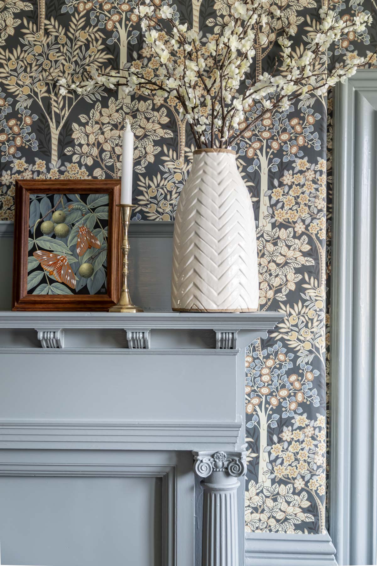
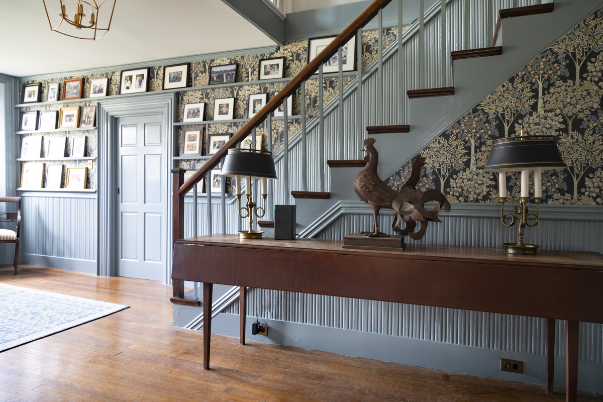
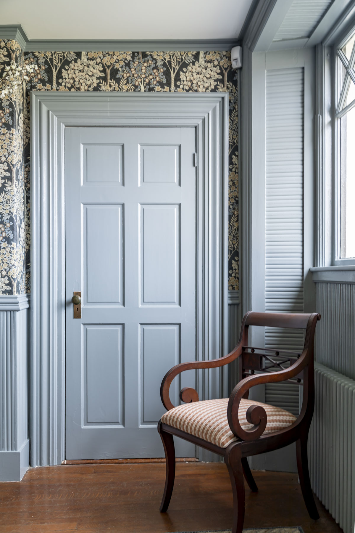
If giving paint colors a star rating were a thing, I would give Brewster Gray five stars. We recently painted our foyer this gorgeous historical blue gray paint color by Benjamin Moore, and I am utterly in love with it! Along with our fun wallpaper, this paint color took this space went from blah to fantastic!
In today’s paint color review, I will cover all you need to know about Benjamin Moore Brewster Gray HC-162, including
- LRV
- Undertones and Chroma
- Where and how to use it in your house
- White ceiling or trim colors to pair it + a full house palette
- Alternative blue-gray paint colors to try
If you are looking for a deep blue paint color with plenty of complexity and Colonial vibes, this Brewster Gray by Benjamin Moore is it!

LRV of Benjamin Moore Brewster Gray
Brewster Gray HC-162 has an LRV of 29.97. [Don’t know what LRV means? Read more here.] An LRV of about 30 means rooms painted in this shade will be moody and rich while not completely drawing the light out of the space.
Our foyer is north-facing and doesn’t receive any direct sunlight, even still this paint color isn’t too dark. Instead, it helps to create interesting shadows that really help detail all of the beautiful moldings.
For exteriors, this LRV level is perfect for accents like doors and shutters. Read more about exterior paint selection here.
undertone and Chroma of Brewster Gray
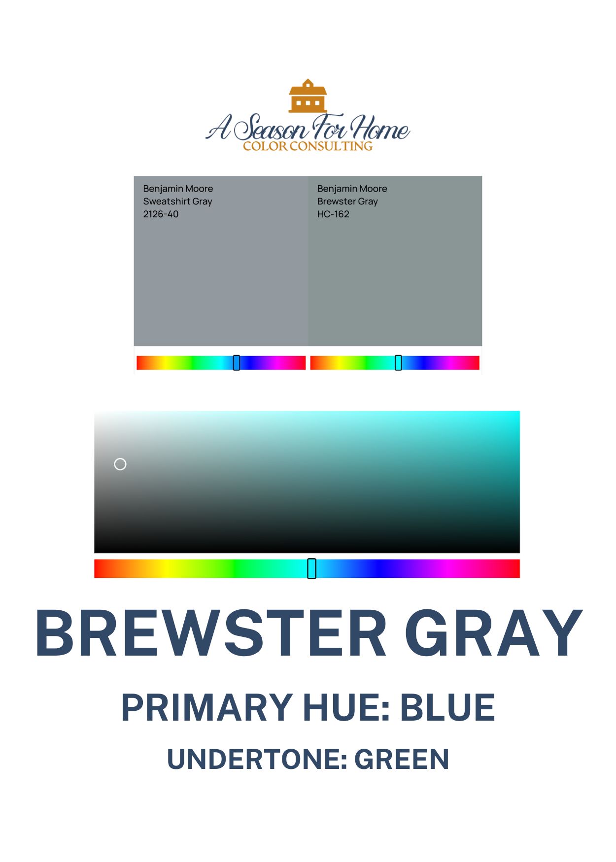
Brewster Gray is a medium blue paint with a low chroma level and a green undertone. Chroma refers to how pure the hue of a paint color is.
Brewster Gray has a primary hue of blue. It diverges from this primary hue in two ways, one it is grayed out considerably (see above where it falls on the color chart) and two, it is slightly green. The results are that this paint color isn’t garish or childish, and has complex leanings connoting historical pigments and colonial roots.
When I compared paint colors for our foyer, I narrowed it down to several shades of blue-gray and ended up on Brewster because it was decidedly blue (NOT gray) and yet it has such a low chroma level, it would fit perfectly with the vibe of our antique woodwork.
Where To Use BM Brewster Gray In Your Home
Brewster gray is one of those rare birds of a paint color that can work virtually anywhere. Somehow it is able to work on walls, trim, exteriors and details! Heck I could even see using it as a decking color on a porch! Here are some ways I recommend it:
- Trim Work: This is how I’ve used it. In our home our white trim went from boring to “hello gorgeous” once it was painted in this shade of blue. The light and shadow this moody blue creates is simply stunning!
- Walls: Trends are moving toward color and Brewster Gray is here for it! This color is simply stunning for a peaceful bedroom wall color or for a very grown-up spa-like bathroom with marble tiles and counters.
- Furniture and Cabinets: If you have a furniture piece that needs a serious makeover, try this paint instead of stripping and refinishing. It would be great on a pair of bedside tables in a blue and white bedroom for the coastal grandmother aesthetic. You can also use it to paint your kitchen or bath cabinets. Try it on your kitchen island for a pop of classic color in a mostly white and neutral kitchen.
- Exteriors: This blue paint is a deep enough shade to hold up to direct sunlight without getting washed out. Try it on clapboards for a cottage look or use it on a front door or accents (like shutters, lattice and railings.)
- Color Drenching: This color is practically begging you to color drench a room ceiling to baseboard. It is the perfect LRV for color drenching which works best in dark tones. Try it in a small bathroom and add brass accents for warmth.
What White To Pair With Brewster Gray Benjamin Moore
This paint color is one where you can use a cool white, warm white, or pure white and you will be happy with whatever you choose!
Off Whites To Pair With HC-162
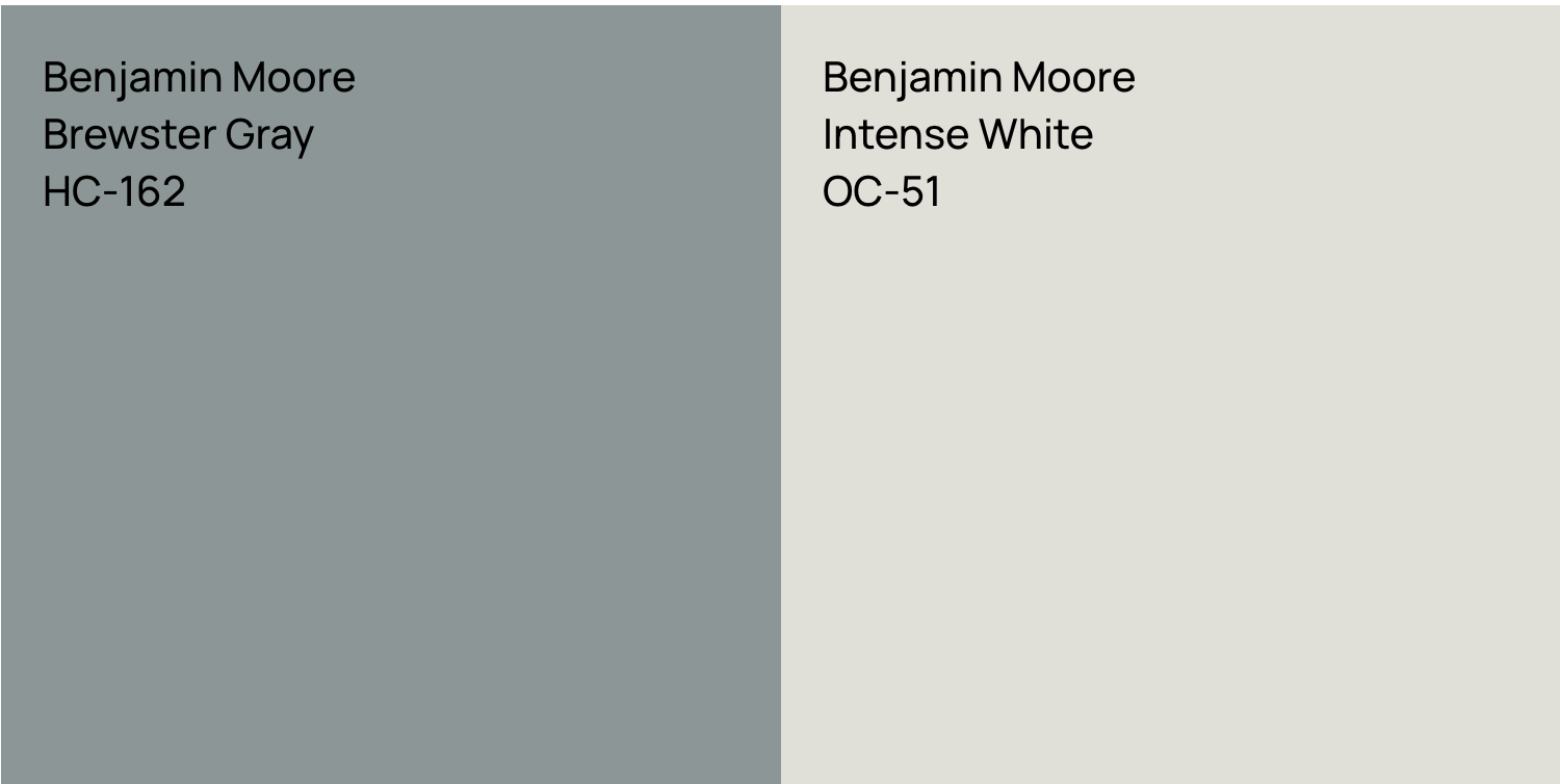
Brewster Gray is a low chroma color so it goes great with offwhite paint colors like Whitetail by Sherwin Williams (my current white paint color obsession.) I also like it with a grayed white like Grandma’s China CSP-365 or Intense White OC-51 which is muted and sophisticated.
Cool or Bright Whites With Brewster Gray
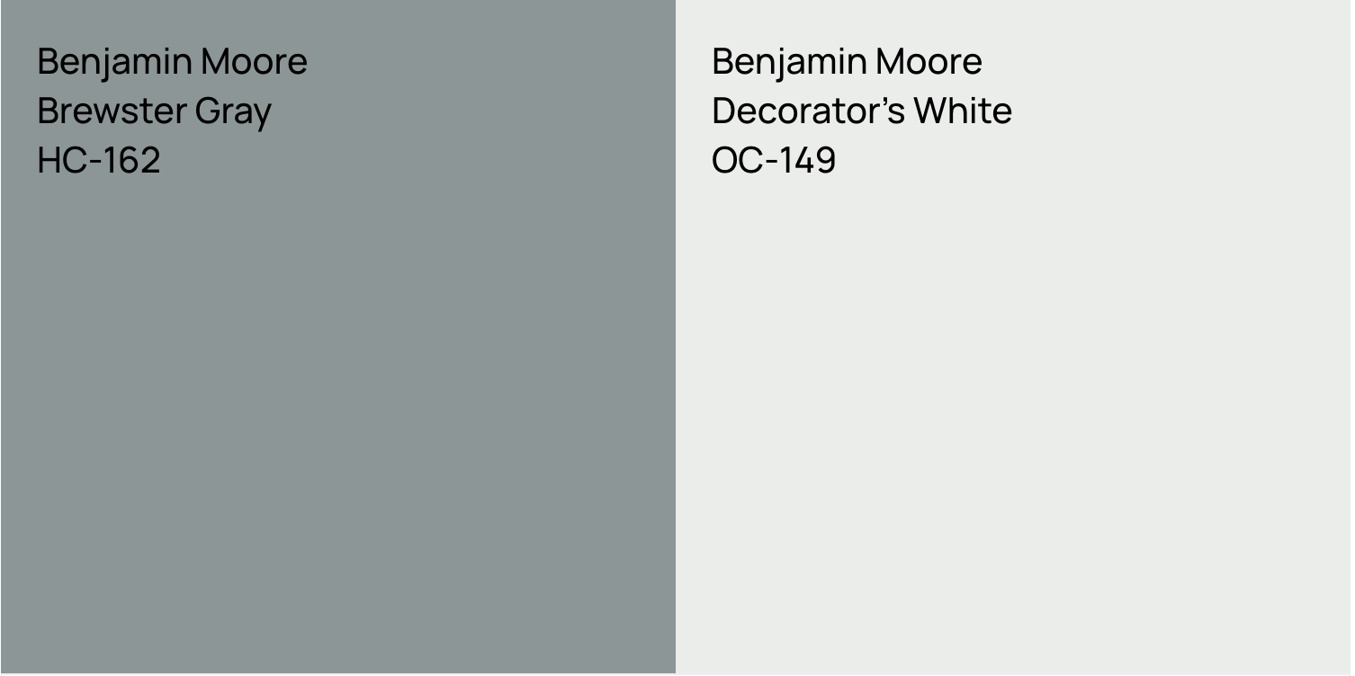
You can also pair it with a blue-toned white like Decorator’s White by Benjamin Moore, because it is a blue paint! You can also go with a more stark white like Chantilly Lace. Both of these are great option for modern interiors and for those of you who want a strong contrast and a crisp look. Try samples of my favorite cool and bright whites from Samplize (affiliate link.)
Warm Whites For Brewster Gray
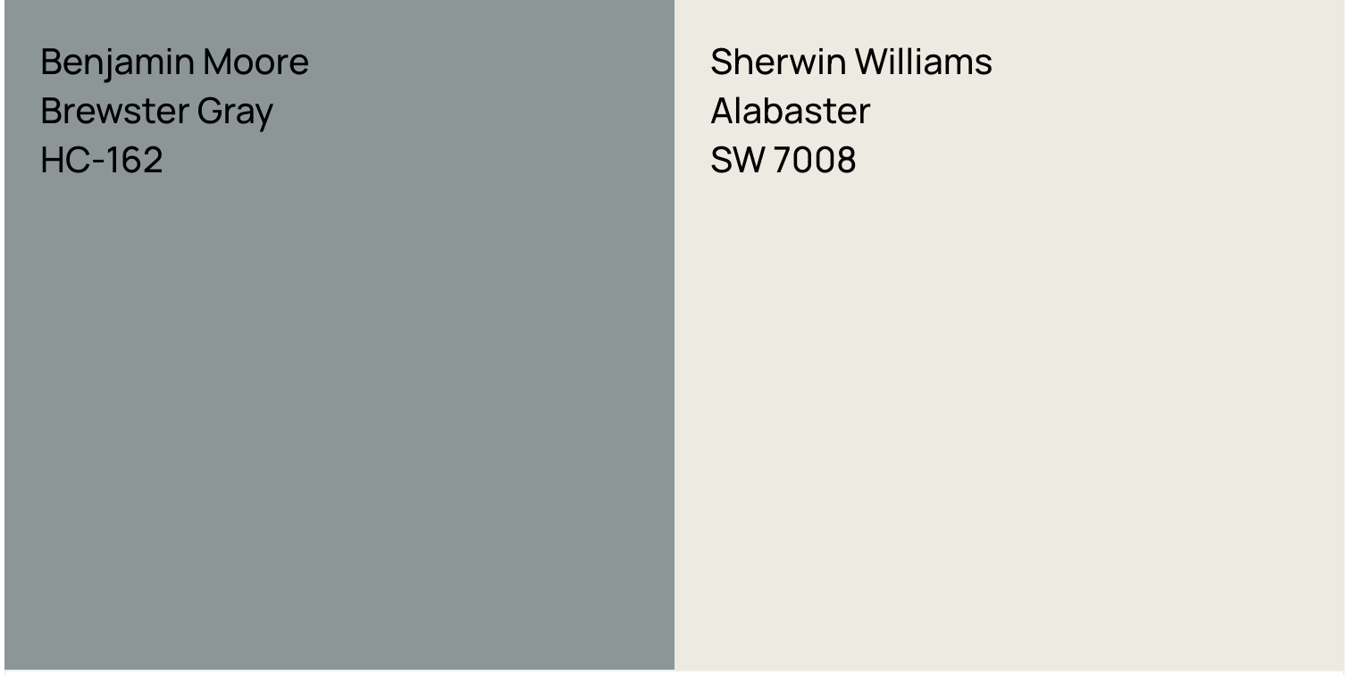
Since this paint is low chroma and does have a touch of green, it can also go with warm whites for trim and ceilings. This is helpful if you’ve chosen a whole house white for all your trim and ceilings like Alabaster from Sherwin Williams or Benjamin Moore White Dove OC017 (which is what I have on my ceiling.) Or try one of my favorite warm whites(also an affiliate link.)
Read more about pairing whites for trim and ceiling here.
Other Blue Gray Paint Colors To Consider

While Brewster Gray was the color I landed on for our first floor foyer and grand entry hall, I had to rule out several other gray blue paints first. And I recommend you do the same. Lighting and the fixed elements in your space will influence the way this paint looks for your home. Below are some other Benjamin Moore Gray Blue Paints to try and how they compare to Brewster Gray:
- Gibraltar Cliffs: Almost identical but has a whisper more white pigment in it and has an LRV of 31 (two shades lighter.)
- Puritan Gray: Less saturated than Brewster, this paint will appear more gray. It also has a bit more green in it and will look nice with warmer fixed elements like brick or warm stone.
- Cloudy Sky: For someone who wants a bluer feel than Brewster look at Cloudy Sky. This is a more saturated blue hue and slightly lighter so will appear more classically blue. I think this is a slightly more contemporary look which somewhat limits the diversity of applications where it would be appropriate.
- Templeton Gray: A gorgeous alternative with stronger depth and saturation. It is more deeply blue, but is darker too, so it doesn’t come off as too sweetly blue. This color is simply stunning for exteriors, cabinetry, millwork and furniture.
- Stonybrook: This is like Puritan Grays sister just slightly darker. It is greener than Brewster Gray and a bit less saturated but almost the same LRV (half a shade off.)
- Whale Gray: This blue is cooler and less saturated at the same time. Meaning it is further toward a true blue, but it is not deeply pigmented. It is also several shades darker. I like this paint a lot for classically styled homes, contrast trim and moody millwork.
- Water’s Edge: Also known as Van Courtland Blue, this tone is more blue (decidedly so), lighter and more saturated so if you do not have much natural light, you may prefer this shade over Brewster Gray.
- Sweatshirt Gray: This blue pulls further on the scale toward true blue yet is less saturated so if you want a slightly cooler shade than Brewster Gray, try Sweatshirt Gray instead.
SAMPLE THESE BLUE GRAY COLORS NOW– Click here to buy large samples on Samplize. As a Samplize affiliate, I earn a small commission at no extra cost to you.
I recommend buying large-scale samples of the colors you try to look at them in your space before heading to the paint store. You can move the samples around the room and and see how the light reacts with the paint color on different walls. From there you can purchase small containers of one or two favorites to brush out.
Coordinating Colors For Brewster Gray
Exterior Color Pairing
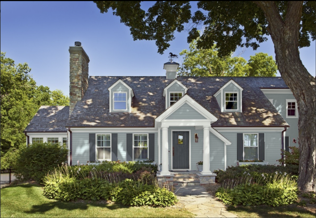
For an exterior, use Brewster Gray as the main color. Use a white with a touch of blue in it like Benjamin Moore Wickham Gray HC-171 on the trim. For the shutters and doors a black with blue undertones like Witching Hour 2120-30 from Benjamin Moore. See my mockup below of how that combo comes out.
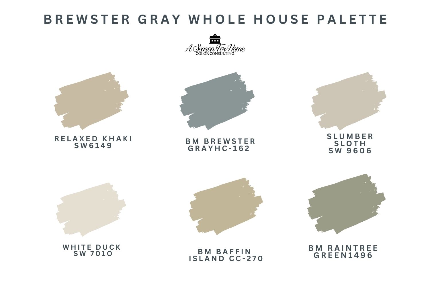
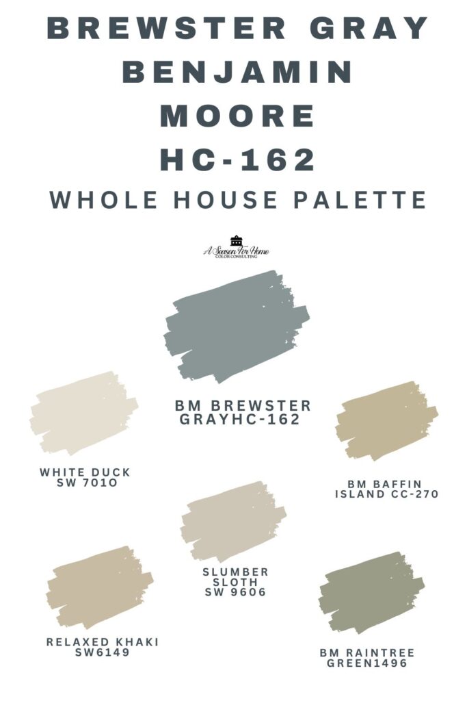
brewster Gray Whole House Palette
For interior spaces, this color can be part of a gorgeous, earthy, low-chroma palette like the one I created here. This is just a sampling, and it is also really great with burnt rusty oranges and peaches as well!
- Slumber Sloth: I’d choose this Sherwin-Williams color for any large open concept spaces as it goes with everything and is a great team player. It is part of my favorite Minimalist Color Collection of neutral paint colors. Likewise, Brewster Gray could easily fit into this color palette for Accessible Beige which has a similar warmth without yellow.
- Relaxed Khaki and Baffin Island: Brewster Gray looks so good with golden khaki colors with a touch of green in them. Two favorites of mine are Relaxed Khaki by Sherwin-Williams and Baffin Island by Benjamin Moore. Both of these have a touch of green in their undertone which goes well with the warm green tones in Brewster! Look at Wool Skein if you need a lighter khaki option.
- Raintree Green: Blues and greens are so good together. The key is finding one with a similar value and chroma so they stay in harmony. I use Benjamin Moore Raintree Green with Brewster Gray for this effect.
- White Duck: Off-whites with a good amount of gray and cream go so well with this paint. It is an absolutely classic timeless look. White Duck from Sherwin Williams is one of my go-to off white paint colors. I use it over and over again! Natural Cream is another greige to look at too.
Why I love Brewster Gray
This color is such a good one for so many reasons. Here are my top three reasons I love Brewster Gray by Benjamin Moore:
- It is dirty. I love low chroma colors (ones that are grayed out and have a touch of their complements added to give them muddy complexity and nuance.) Despite its name, this isn’t a gray paint color—it’s undeniably blue. Its complex pigmentation has grown-up class.
- Adds Sophistication and Depth: Brewster Gray Benjamin Moore is dark enough that it isn’t baby blue or pastel. Too often gray blues read either gray or baby, and miss the mark. Brewster has neither of these problems! It reads deep and intentional, and not like it was meant for a baby nursery.
- Brings out architectural details: I love the way the shadows play with this paint color. In the above photograph, you can see how warm it is in the light and cooler in the shade. This characteristic of changeability makes it an excellent paint for detailed woodwork, picture molding and feature walls.
What is that wallpaper? Please and thank you.
I got it on Wayfair. https://www.wayfair.com/decor-pillows/pdp/red-barrel-studio-adeanna-floral-roll-w110596602.html?piid=317945469#z4y0ci3nt5h-2