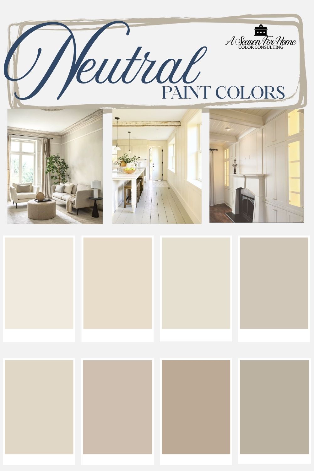
What’s The Best Neutral Paint Color For Walls
In this post, we will discuss how to pick the best Neutral Wall Color for your home. Should you use a greige or a taupe, and whatever happened to gray? What about white walls?
Hi, my name is Katie and I am a certified color expert. I help people pick the right paint colors for their home. And I’ll cut to the chase, the answer to all of these questions is: “it depends!” There are many factors to consider when picking a neutral paint color for your walls and there is no one-size-fits-all paint color that goes in every space. Read on to read the step-by-step process to figuring out which color is best for you!
But first, what does neutral even mean? Or let’s cut to the chase, simply skip ahead to the steps to picking the best neutral paint color.
How Do You Define Neutral in Paint Colors?
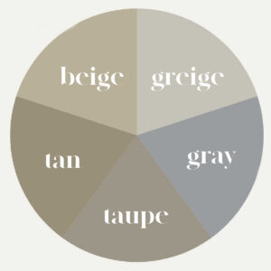
Here are the main neutral paint color categories:
White and black are technically neutrals, and the shades and tints in between that lack any significant saturation are considered neutrals. Those would be greige, taupe, gray, beige, tan and brown. There are additional variations of these categories, such as khaki, which is a subcategory of beige.
- White: True white paints are those without any discernible undertone and are very bright with an LRV over 90. These are colors like Sherwin Williams Pure White, Extra White or High Reflective White, Behr Ultra Pure White or Benjamin Moore Chantilly Lace or Super White.
- Off-White and Cream: These are slightly darker than pure whites with LRVS in the 70s and 80s. Creams are warm whites with complex undertones that keep them from entering “pale yellow” territory.
- Gray: No longer in fashion, gray is still undeniably a neutral because it doesn’t have a distinguishing hue. Gray ranges from off white to deep charcoal and everywhere in between. There are also warm grays that lean toward greige and cool grays with blue undertones.
- Greige and Taupe: Greige (pronounced gray-zh) is an in-between category of neturals that encapsulates those lighter taupes and colors between gray and beige. These are generally a touch warmer than gray but still have very little saturation. Taupe is like dark greige and often has a little green undertone that can feel like putty or mushroom.
- Beige: Beige is a light tan or very pale grayed out brown color that is not discernibly any hue. Beige has a range of undertones from pink to yellow.
- Tan and Brown: These are darker in value than greige and beige. Where they differ is in their parent hues. Tan is essentially dark beige. Brown is also in this category and can range in value from tan to nearly black. Brown can have red or purple undertones.
- Black: Don’t forget that black is also a neutral color.
What all of these colors have in common is that they are not highly pigmented and only offer a small amount of warmth or cool without a strongly colored undertone.
What is the difference between taupe and beige? <<Find out here.
What Neutral Paint Color is In?
While cool gray tones were the popular neutrals over the last decade, followed by an obsession with all-white, we are now in the middle of a warm neutral trend cycle. These macro trends tend to last about 10 years and are enormously influential on building materials and decor. So even if you don’t think you will be affected by them, you will, simply by an availability standpoint.
Will gray come back? I cannot tell you how many of my Color Consulting clients tell me they never want to see another scrap of gray anywhere again. But, it wasn’t that long ago the word “beige” was a bad word! Now Accessible Beige is one of the most popular paint colors sold! I know that the pendulum will swing back in a while, but currently warm neutrals are very much in.
Step 1: Analyze The Fixed Elements
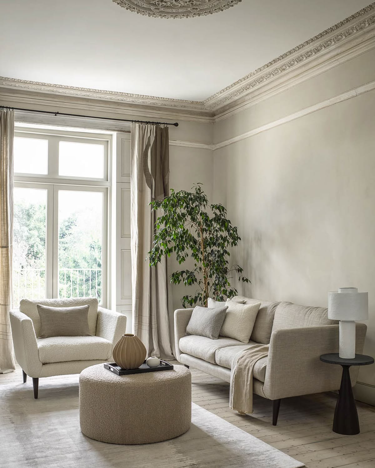
The first step in picking a neutral is determining the temperature and undertone of the fixed elements in your space. This will be key for making your color scheme feel cohesive.

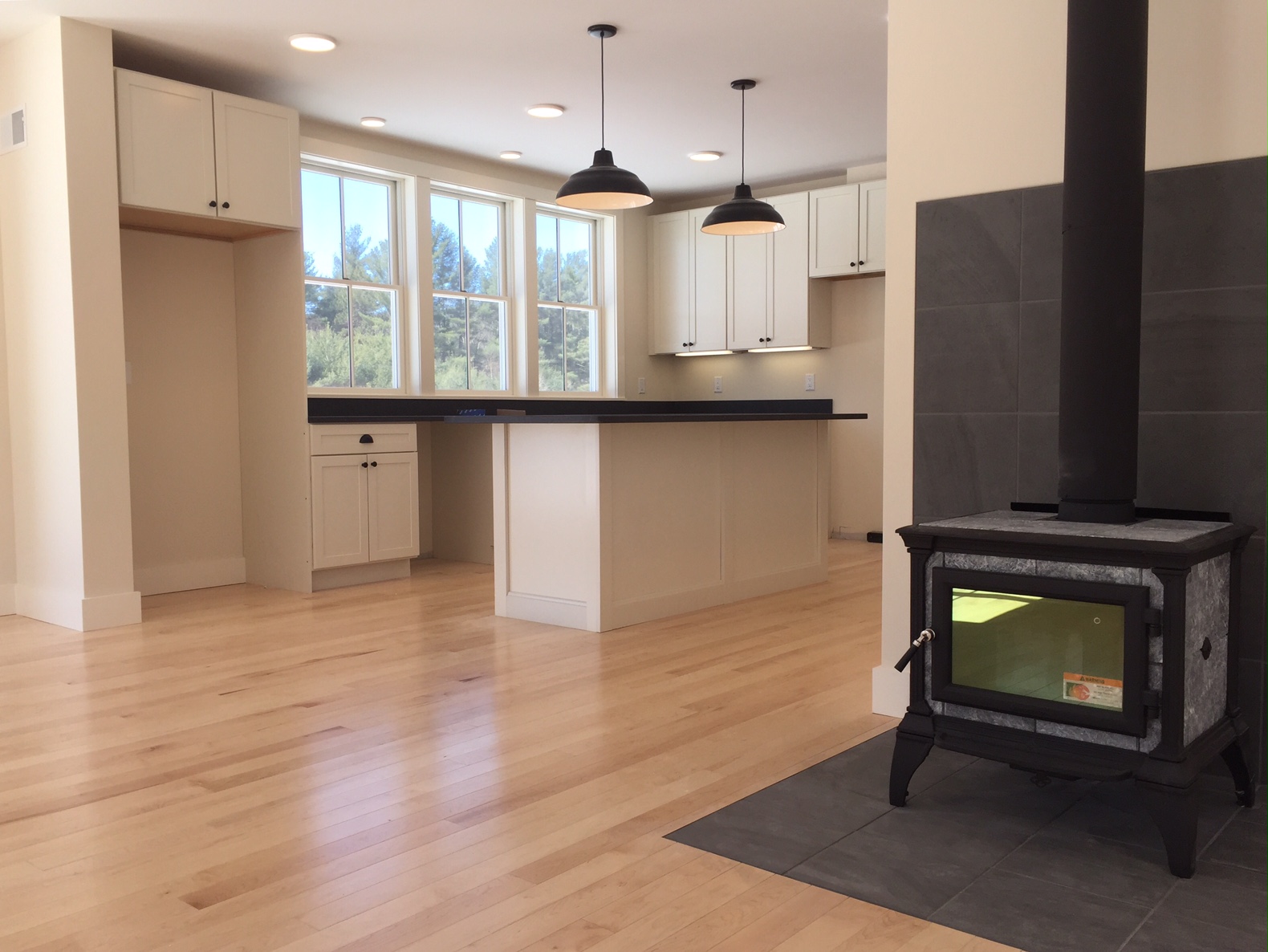
Before you can pick your neutral wall color, you need to analyze your fixed elements in your space. These are surfaces in your interior you are not going to change, like tile or flooring. For example, if your backsplash looks like the above Calacatta marble, you may notice some subtle yellow or green undertones. Conversely if you have Caraerra marble, you will notice cool undertones.
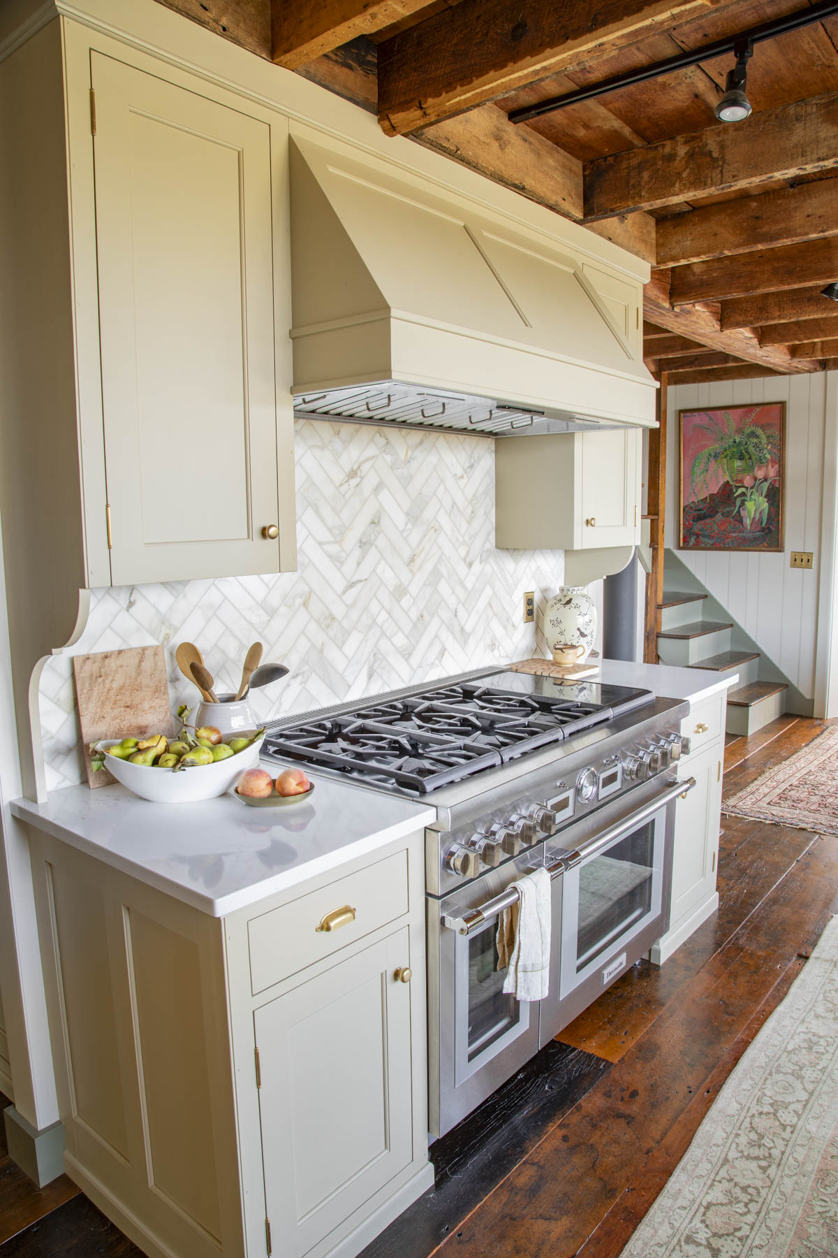
Here you can see how seamlessly the green and yellow undertones in the backsplash marble tile pairs with the khaki cabinets and creamy Wool Skein walls.
If you have a brown granite countertop, you will be better choosing a warm natural like cream, beige or tan. The main rules to remember are:
- Warm neturals go better with warm fixed elements
- Cool neturals go best with other cool fixed elements
- Don’t mix neutrals with different undertones (like a pink beige with a green gray for example)
What is the difference between warm and cool colors?
Step 2: Consider Chroma Preference
Next, you’ll need to narrow down the neutral based on your style for decorating.
Do you like to decorate with neutral wall paint and then accent with bright, splashy colors? If so, this means you prefer clean colors. Clean colors go best with white, black, grey, taupe and greige. Stay away from beige as it can look dirty, dingy or “off” next to brighter hues.
Do you like muted earthy colors? If you like low chroma colors, which are typical in the New England Style Homes I often work in, you have much more leeway and can use any of the neutrals. These softer and less saturated colors look great with beige, tan, brown, greige, taupe, cream, white and black! Aka they get along with everyone!
Step 3: Pick The Right Category of Neutrals
At this point, you have analyzed your fixed elements and chroma. So you are ready to choose a category of neutrals.
- Greige or Taupe: Best for minimalists, people who don’t like yellow undertones and folks who are hoping to warm up gray fixed elements. These are on the cooler end of the spectrum. Greige is lighter in value than taupe. Often taupes have a discernible greenish undertone. These can also be called putty or mushroom. These do not do a lot of heavy lifting in terms of warming up a space. So if you like a warm feel- this may feel too cool for you.
- Cream, Beige or Tan: In my consulting appointments, I have found the majority of people are looking for these colors for their neutrals. Cream is warm off-white. Beige usually has a yellow or orange undertone, though sometimes it can lean pink or green if it veers into khaki territory. Tan is like a light brown basically.
- Gray: There are a surprising number of gray paint colors, and they too range from cool (blue) to warm (bordering on taupe.)
Step 4: Pick a Value (Light To Dark) Depending On Your Lighting
Once you have decided on which type of neutral, you’ll need to analyze the light in your room. Darker rooms will need bright LRVs above 60 to 80. Rooms with moderate to bright light can be 45 to 60. If your room is very dark you’ll want to read my tips below in the FAQ section.
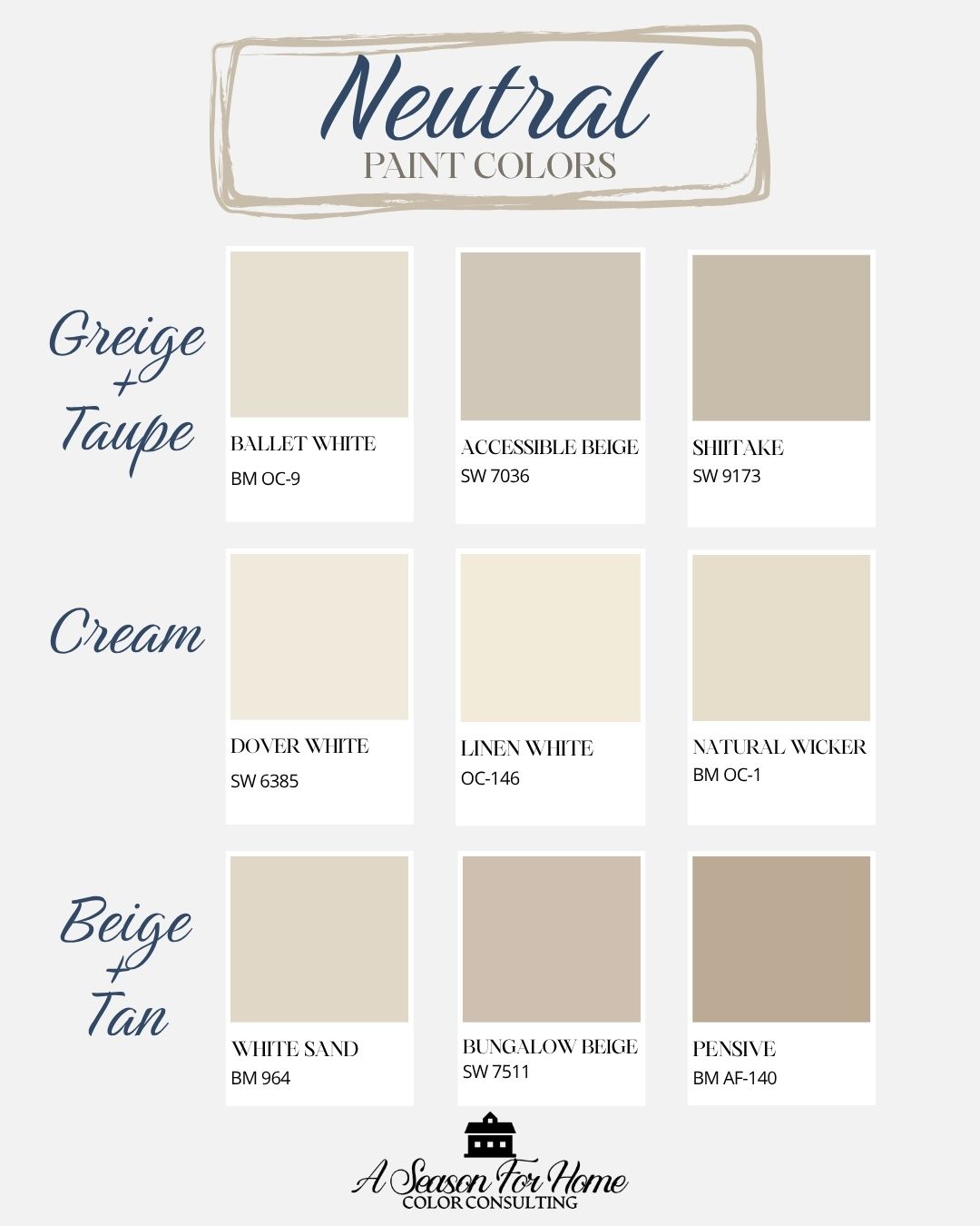
Best Greige and Taupe Paint Colors:
- Dark: I adore Shiitake by Sherwin-Williams (LRV 51) or Pashmina by Benjamin Moore (LRV 44)
- Medium: I love Sherwin-Williams’ Accessible Beige (LRV 58) and Smoky Taupe (LRV 54)by Benjamin Moore both of which are soft and relaxed and not yellow at all
- Light: I love Benjamin Moore Ballet White (LRV 71)for its versatility and lack of bossy undertones
Best Cream Paint Colors:
- Dark: Neutral Ground (LRV 70) by Sherwin-Williams or Ben Moore’s Natural Wicker (LRV of 71) are both tried and true cream colored neutrals that works in pretty much every house
- Medium: BM Linen White (LRV 81) and Sherwin-Williams Creamy (LRV 81) are two of the best creamy paints to brighten even the darkest spaces
- Light: Dover White (LRV 83) and Whitetail (LRV 86) both by Sherwin-Williams are two workhorse cream paint colors I use over and over again.
Best Beige and Tan Paint Colors:
- Dark: Pensive by Benjamin Moore (LRV 42) would provide tons of moodiness without a lot of bossy pigmentation
- Medium: Bungalow Beige by Sherwin Williams (LRV 53) or Bleeker Beige (LRV 51.66)
- Light: White Sand by Ben Moore (LRV 66) is a great catch-all beige that doesn’t pull too yellow for modern sensibilites.
FAQs and Troubleshooting Neutral Colors For Walls
What about dark rooms?
Dark rooms are tricky! In these you can use cream with a good amount of yellow undertone (not white because it looks dingy) or a soft warm beige or you can lean into your situation and go dark and moody- which is counter intuitive!
Go-to paints for dark rooms: Sherwin-Williams Creamy, Dover White or Neutral Ground.
What about gray flooring and other gray fixed elements?
One common issue I see in Color Consultations is how to deal with leftover fixed elements (like counters, tiles and flooring) from the previous trend cycle. This is an important consideration! A lot of people want to warm up their grays. But mixing neutrals can often look off. So, if you have gray flooring, you will want to choose a white, off-white, gray or greige neutral wall color. You can often warm up gray fixed elements with decorations that include warm and cool neutrals like this rug from pottery barn. (That’s an affliate link, BTW.)
Need help choosing the right color?
If you’re feeling stuck or want a second set of eyes, I offer Virtual Color Consultations to help you make confident, intentional choices for your home, wherever you’re located.