Cottagecore Color Palette
You’ve probably noticed that the Cottagecore aesthetic has been all the rage in interior design. The look comes together with playful patterns and fabrics, country-inspired wallpapers, and carefully chosen paint colors. Today’s blog is all about the last item in that list: Cottage Core paint colors! Get out your moodboards and fan decks and welcome to your guide to the essential cottagecore colors.
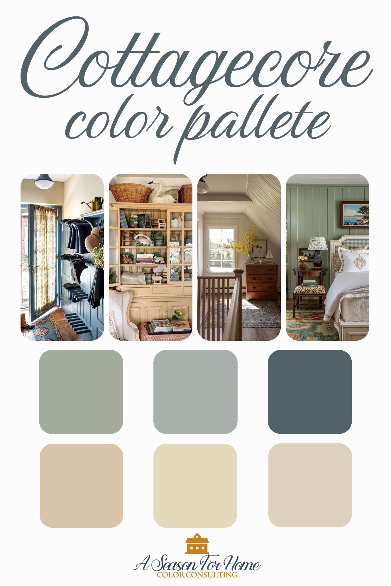
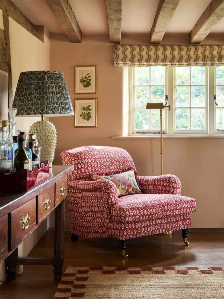
What holds this country-cottage color palette together is its soft, earthy quality and muted vibe. But unlike a cool coastal palette or a traditional New England color scheme, this country-inspired cottage look has a charming whimsy thanks to a touch more chromatic saturation.
Cottagecore Color Scheme
I’ve broken the palette into eight paint colors, starting with two flexible neutrals, a soft creamy off-white and a transitional beige. Next we come to the warm tones, which include a soft and airy light peach and softened yellow-gold. In the cooler tones, we have a couple of lovely nature-inspired greens and two chalky blues.

These paint colors can be used throughout the home for a cohesive feel when you move from space to space while allowing room for creativity and allowing each room to have its own personality. Complete the look with patern-on-pattern and textural elements.
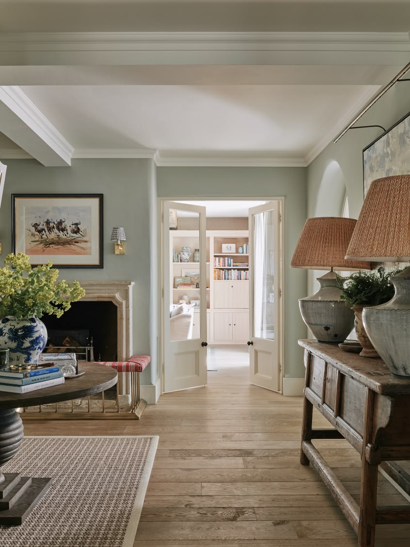
Cottagecore Neutral Paint Colors
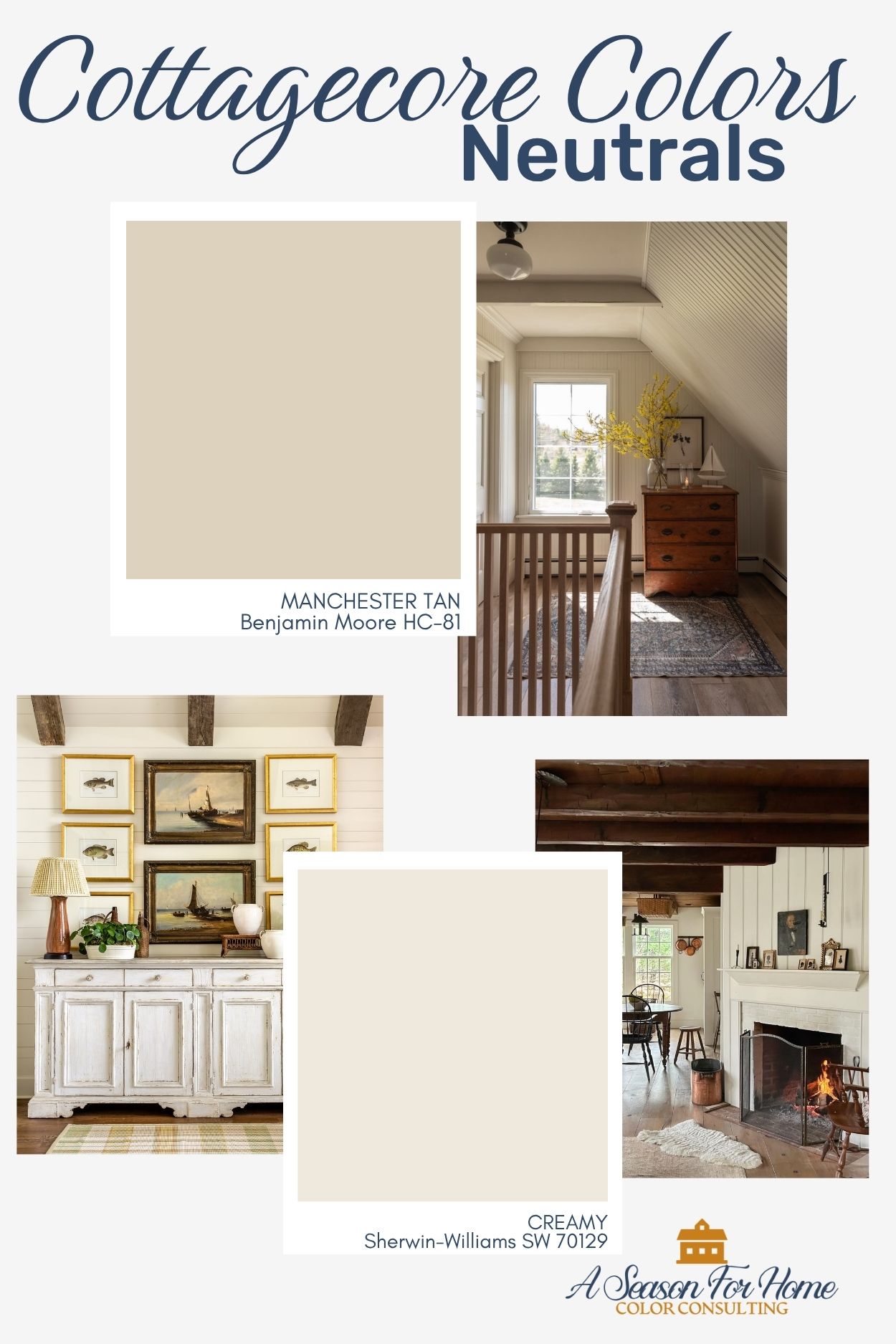
- Creamy by Sherwin-Williams: This warm and complex cream paint color is much softer and more relaxed than the stark whites of 5 to 10 years ago (I am looking at you Chantilly Lace.) Creamy has a buttery undertone and a LRV of 81, which gives it a nostalgic cottage vibe. It looks amazing on exposed rafters and shiplap.
- Manchester Tan by Benjamin Moore: This neutral paint color from Benjamin Moore’s historical deck is a Goldilocks beige, because it is not too gray not too yellow. It sits comfortably in the middle of the beige zone but is light enough to feel modern. Use it for transitional spaces like halls and entryways.
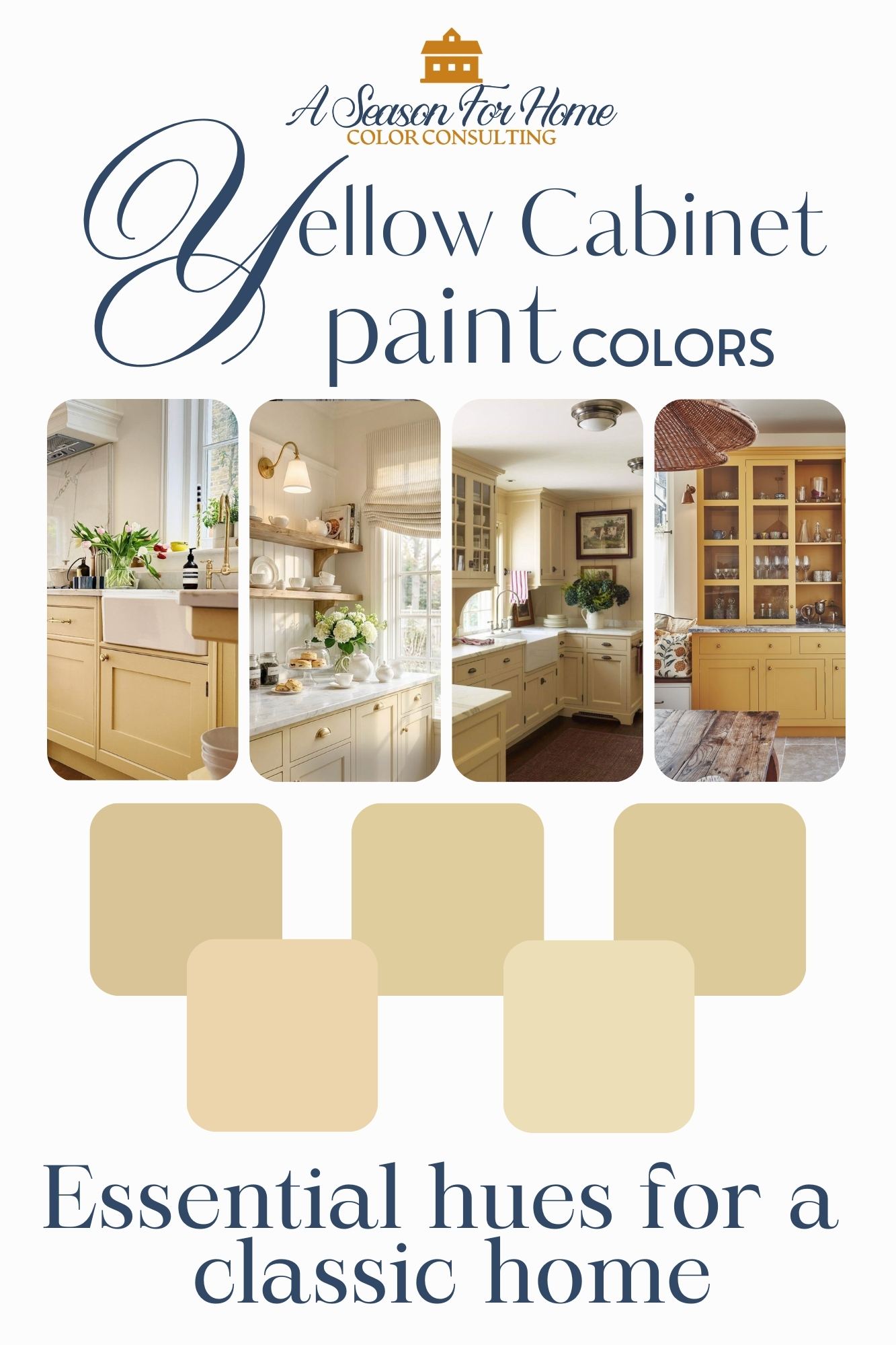
Cottagecore Yellow Paint Color
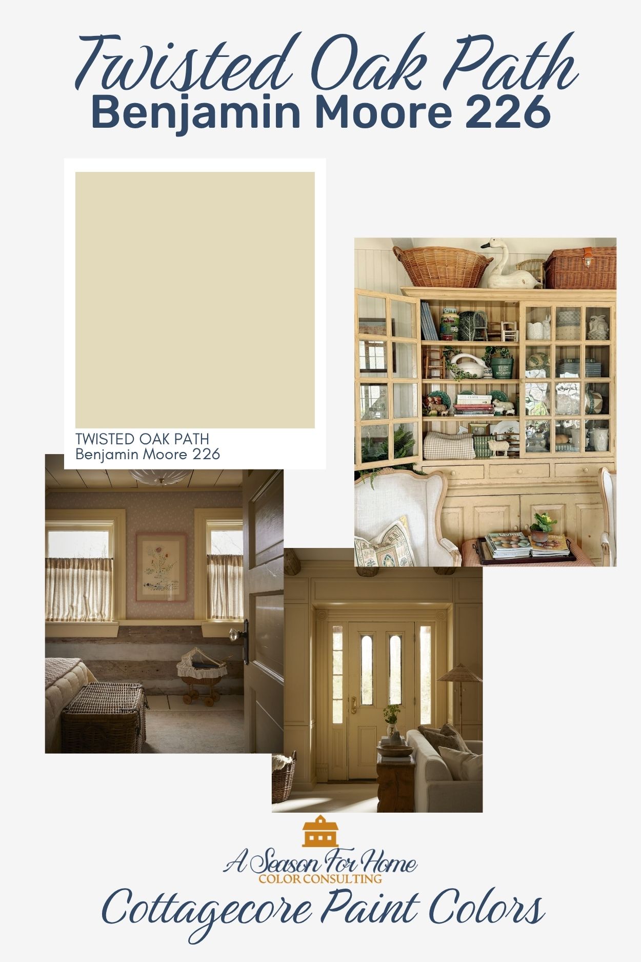
Benjamin Moore Twisted Oak Path: There are dozens of yellows I could have chosen to feature (many of which I mentioned in my Yellow Kitchen Paint Color round up recently.) But I landed on Twisted Oak Path for its light LRV of 67 and its complexity. It is not too pastel (like the butter yellows of fashion fame) because it has earthy complexity. Use it for millwork, color capping and reverse trim.
Peach Paint Cottage Core Color Scheme
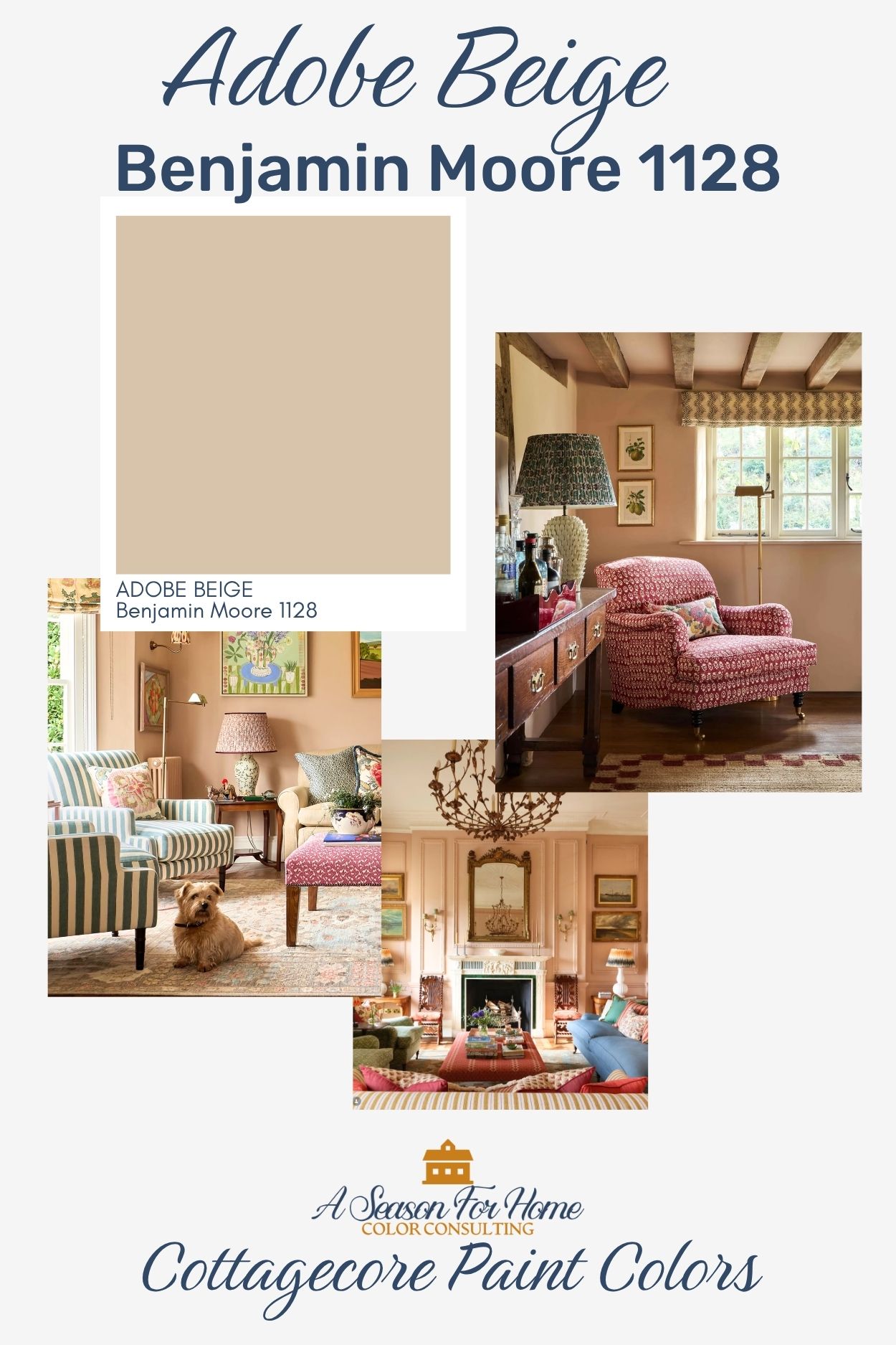
Adobe Beige by Benjamin Moore: While the name may make you think this is a beige paint color, don’t let that fool you. This selection is most definitely a peach paint color, and it is just perfect for a cottage core interior! It shares a muted softened quality with the other colors in this palette that helps it blend cohesively together. It is the perfect warm and welcoming shade to use for a living room, three-season room or breakfast room.
Do you love peach? Check out my complete line-up of peach paint colors.
Green Cottagecore Colors
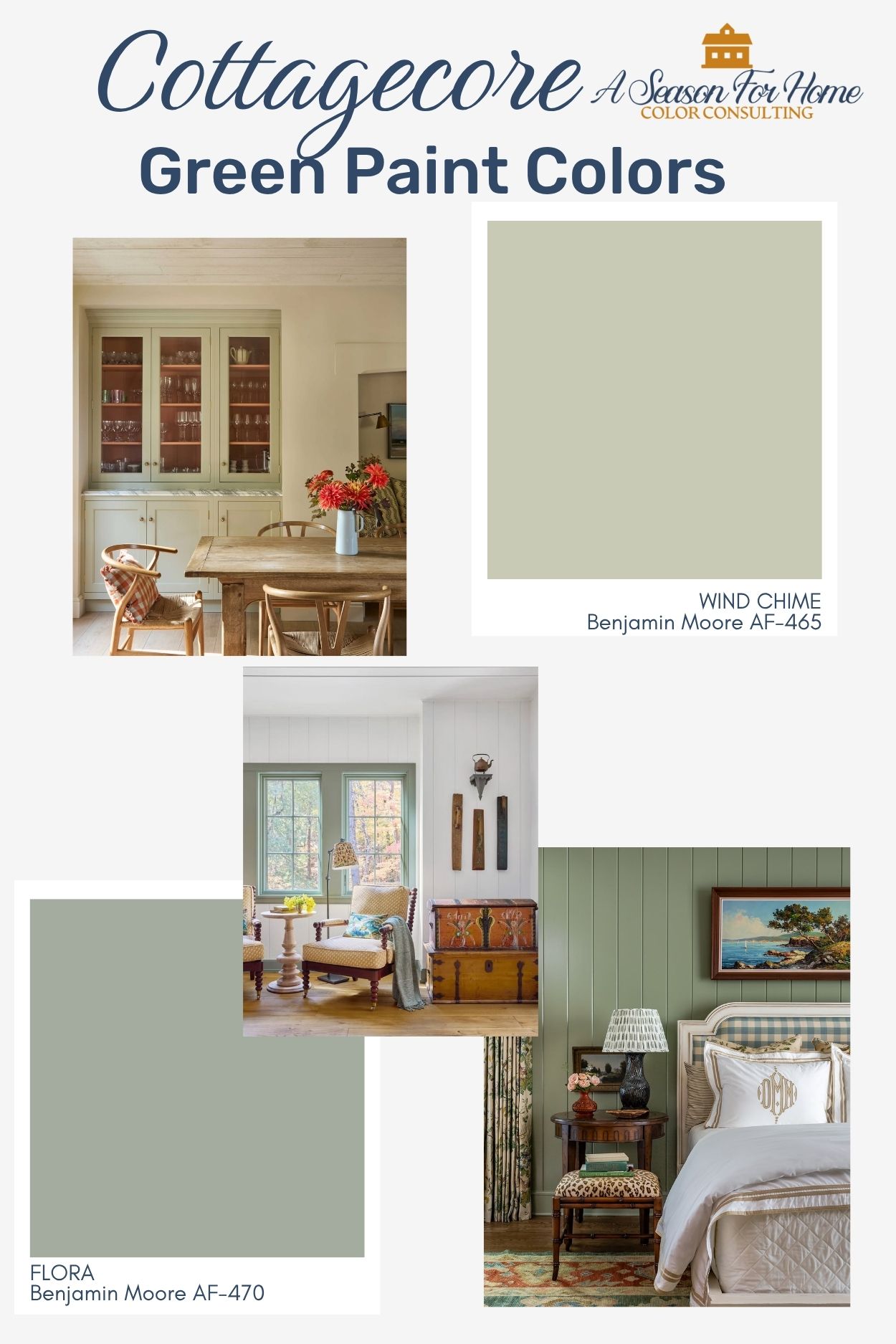
- Benjamin Moore Windchime: This popular green paint color from Benjamin Moore’s Affinity deck is a light and nearly-neutral green to add into your cottage interoior. Use it for reverse trim or kitchen cabinetry and pair it with a creamy white for a soft relaxed vibe.
- Benjamin Moore Flora: This nature-inspired hue is a touch more watery green with a blue undertone to keep it cooler and less apple or olive. This shade of green is stunning on woodwork or walls. Layer lots of patterns and texture into the space to complete the look.
Blue Cottagecore Paint Colors
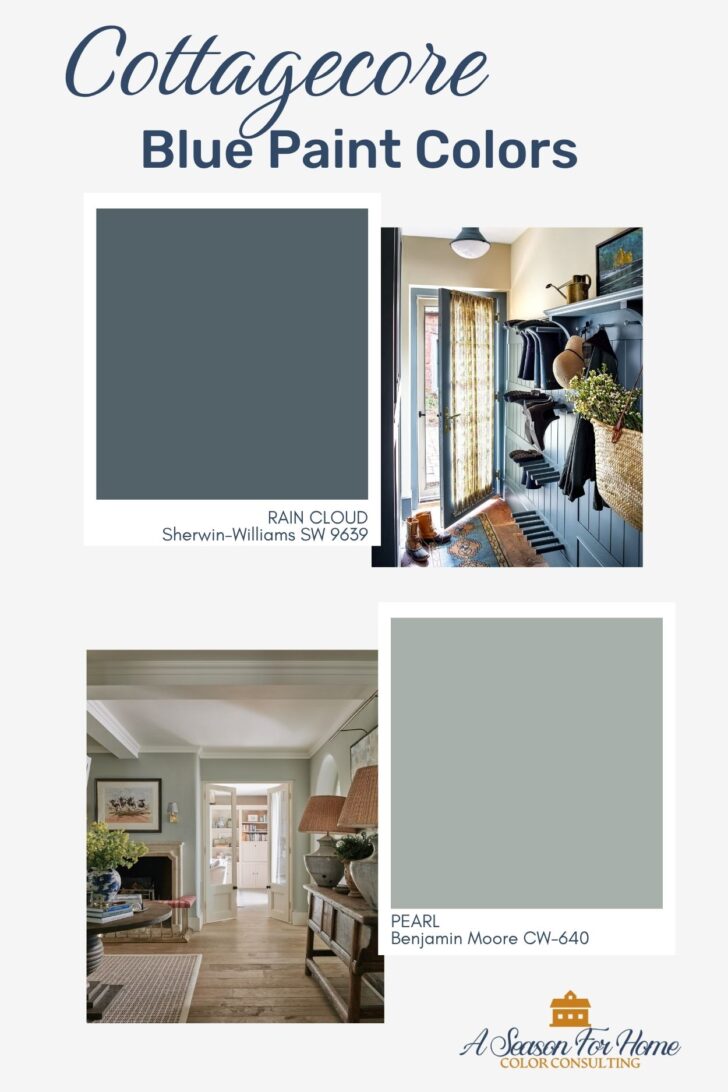
- Benjamin Moore Pearl: This gray-blue color from the Williamsburg collection has a green undertone which gives it a slightly more English country vibe than a cooler, more coastal blue. It is a great wall color or could be used for kitchen cabinetry. I think it would also be great color capped with another shade of blue.
- Sherwin-Williams Rain Cloud: This is the deepest valued paint color in the palette and offers a welcomed bit of contrast. It can be used as an accent color for furniture or to drench a space for a moody feel.
What is the difference between Cottagecore and English Country colors?
The main difference between the colors for cottgecore and English country interior design is in the saturation. English Country colors are brighter and have more playful intensity. Cottagecore as an aesthetic puts a strong emphasis on simplicity and a lifestyle rooted in nature. How this translates to color is the paint colors will feel more naturally pigmented than English country colors. Get my favorite English Country Color Scheme on Samplize.
How do you create the Cottage Core Aesthetic in Interior Design?
While the above paint colors are a great place to start, they are only part of the formula.
- Pattern: To complete the look, layer textiles with pattern throughout the home. When pairing patterns together, vary the scale and type of pattern, such as geometric vs organic shapes.
- Historic Details: Exposed beams, brick, stone and other building materials with rustic texture are a hallmark of cottage core. Mixing unique salvaged building materials and decorative items with patina into newer homes helps to create the feel of cottagecore too!
- Natural Texture: Decorating with natural fibers, like woven jute or sisal area rugs, hanging baskets or wicker furniture is a great way to add visual interest and add another cottagecore element to a space. Bringing nature indoors with fresh or dried floral arrangements and houseplants are another layer to consider adding.
- Antiques and Vintage: Antiques and vintage furniture are a key component in cottagecore interiors. Making sure that things aren’t too perfect or matchy-matchy comes naturally in interiors with antiques. New to antiquing? My friend Ann is a pro and can help teach you her vintage-finding ways!
- Wallpaper: Wallpaper even in small amounts (like in powder room or home office) helps to give the home a country cottage vibe. Look for patterns with historic charm and a soft vintage look.
Need help choosing the right color?
If you’re feeling stuck or want a second set of eyes, I offer Virtual Color Consultations to help you make confident, intentional choices for your home, wherever you’re located.