Accessible Beige Color Palette
Sherwin-Williams is the largest paint company in the world, and one of its most popular colors is Accessible Beige. So if you haven’t gotten to know this color already, then get ready to meet this gorgeous neutral paint color. Today I am sharing all my favorite coordinating colors for SW Accessible Beige and three free whole-house color combinations to choose for your home. We’ve taken the guesswork out of creating an accessible beige color palette! Plus I am throwing in my top whites to pair with it, so you can complete the look! Read on for all the details.
Why We Love Accessible Beige by Sherwin-Williams
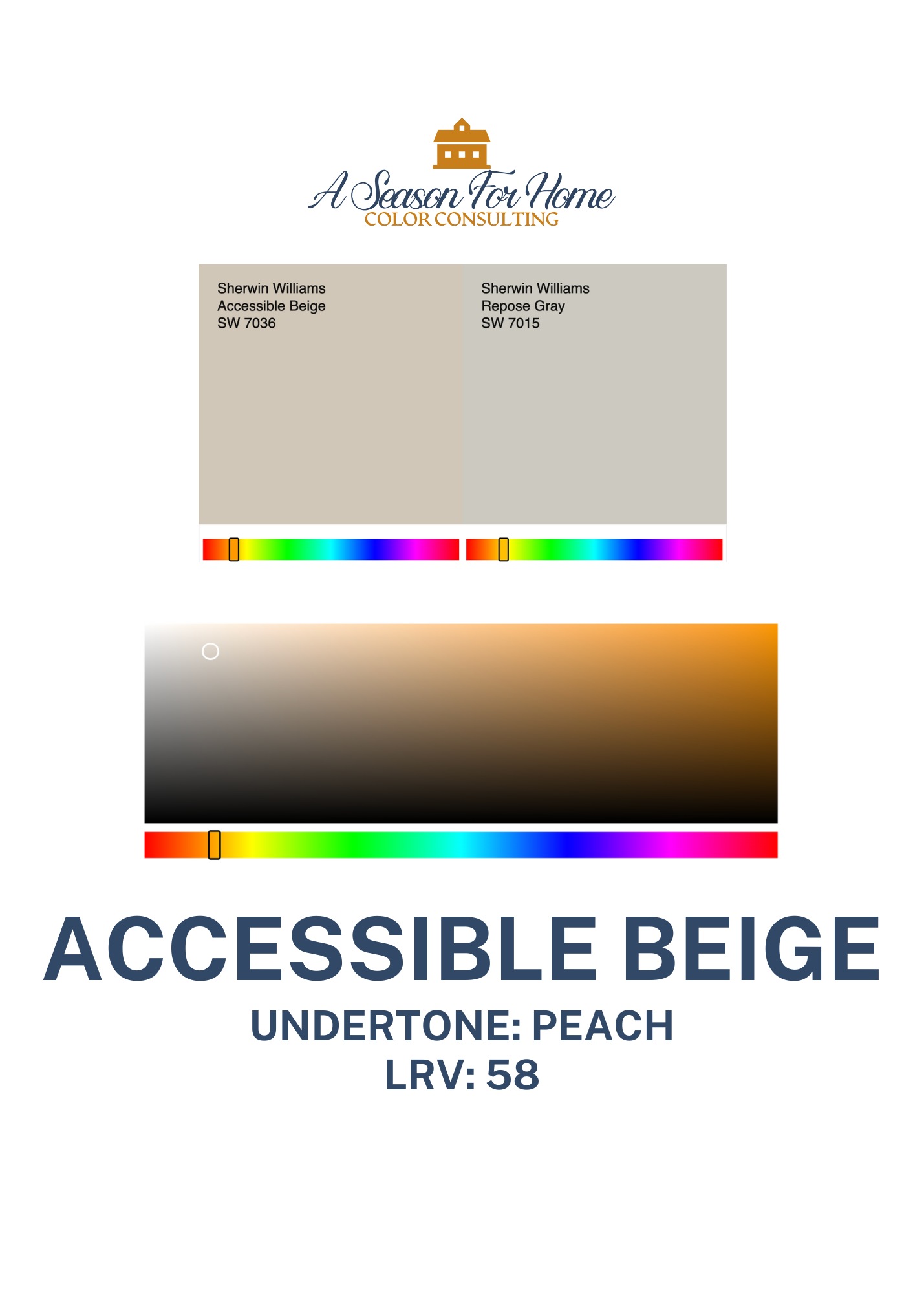
Undeniably, Accessible Beige is a real crowd pleaser! I’ve specified it in many of my professional Color Consultations and my clients have loved the way it looks in their home. Like Smokey Taupe, it is one of my go-to neutrals because it adds just the right amount of warmth, without feeling overtly so or yellow.
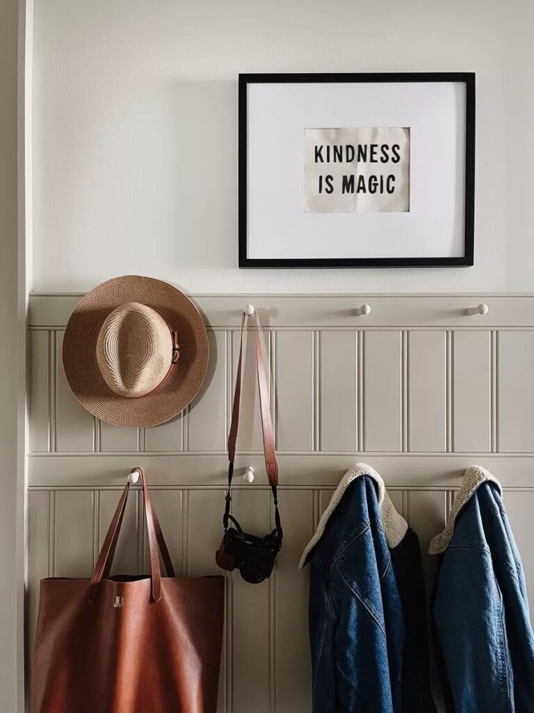
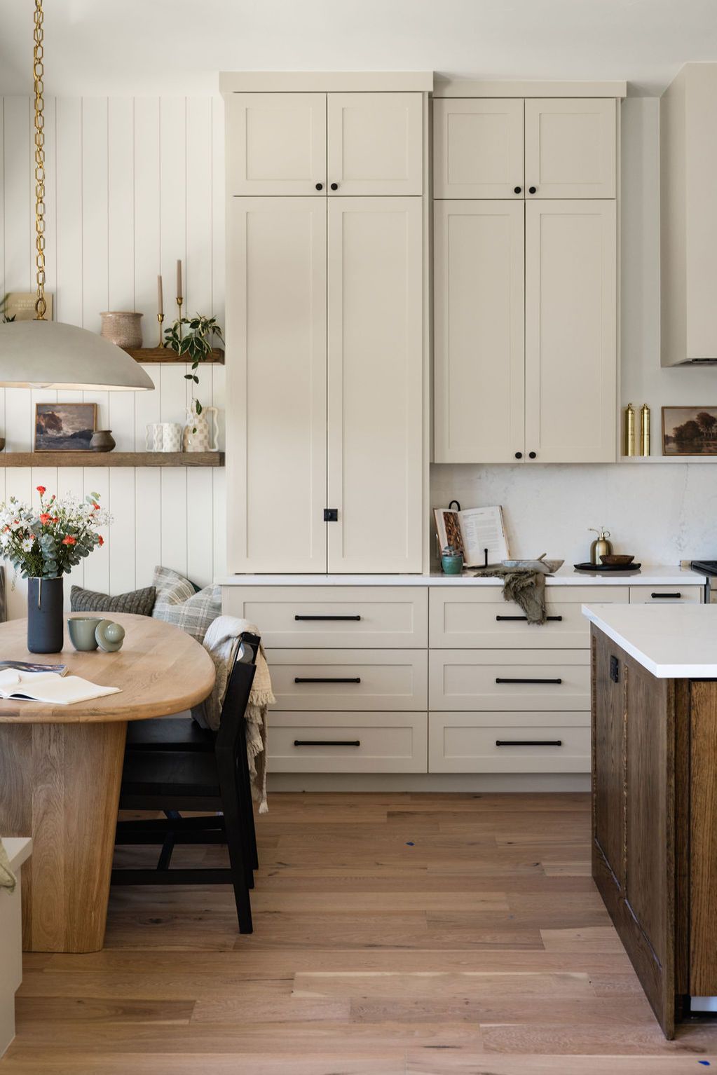
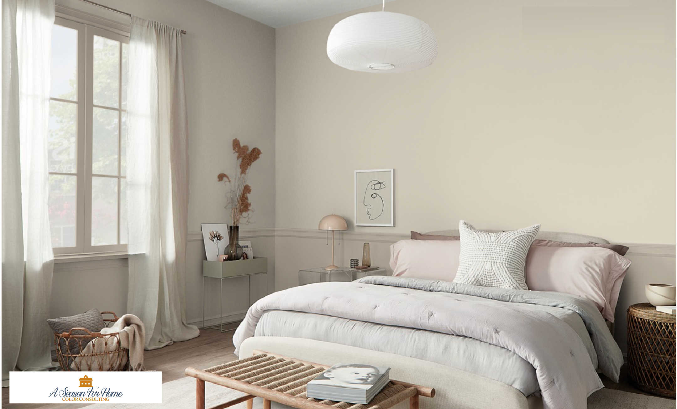
This paint color is a great one to use as a whole house color, especially if you have an open floor plan. With an LRV of 58 it is just under the cusp of light neutrals, but due to its lack of saturation, it doesn’t feel heavy or oppressive. This being the case, it’s on my list of Minimalist Paint Colors because even color phobes love it! It’s a no-briner IMO. It is also a great choice for wainscotting or cabinetry, as shown in the below image by Oak Haven. Pair it with a creamy white like Swiss Coffee by Benjamin Moore or Alabaster or Greek Villa by Sherwin-Williams.
PRO TIP: If you are not sure what the difference between beige, taupe and greige are make sure to read my post to learn more. While Accessible Beige has beige in the name, it actually falls more in to the taupe category due to its lack of saturation and lower chroma personality!
Coordinating Whites For Accessible Beige SW 7036
The key to picking a white for Accessible Beige is knowing the look you are after. If you like a crisp stark look, you can use a brighter white, like Whitetail by Sherwin-Williams (LRV 86) or if you prefer a muted and subtle look it is beautiful with warm creamy off-whites like Swiss Coffee by Benjamin Moore (LRV 81.9). You can sample all my favorite warm whites here. (That’s an affiliate link, by the way.) Here are more details on some favorites:
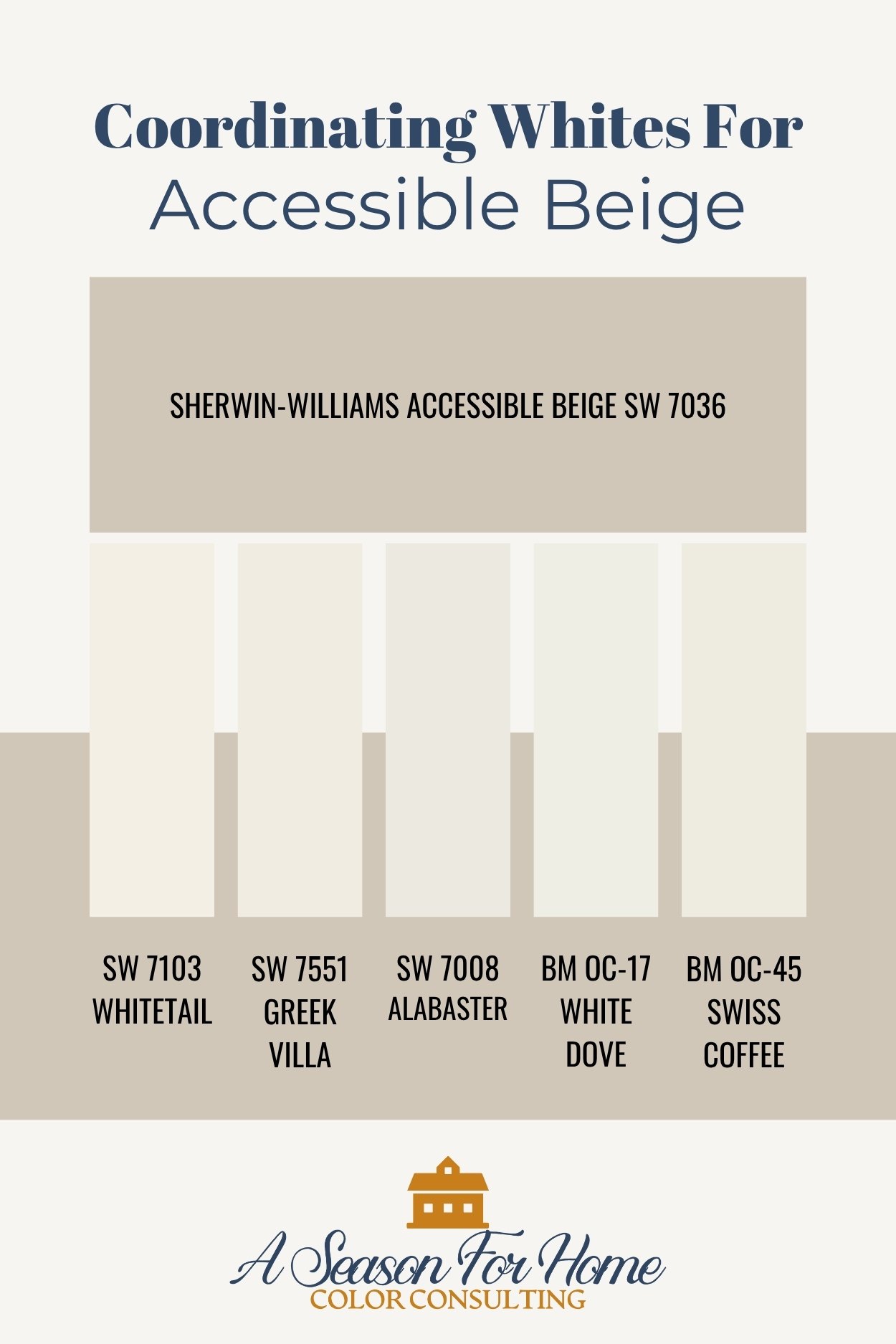
- Sherwin-Williams Whitetail: My favorite white paint of the moment. I’m literally in love with this paint color. It is bright and lustrous with a delicious peachiness my eyeballs cannot get enough of. Who knew someone could get so excited about a white paint? As I mentioned it has an LRV of 86 but it looks so good with Accessible Beige because they have the same base hue (peach.) This makes them feel completely harmonious together.
- Sherwin-Williams Greek Villa: This has an LRV of 84 which means it will provide plenty of contrast without feeling stark. Like Whitetail it also has the same undertones of Accessible Beige (peach) so it will feel like it has less contrast than another white of the same LRV without the peachiness (like BM White Dove.) Go with Greek Villa if you want a little less contrast than Whitetail.
- Sherwin-Williams Alabaster: If I did’t include it, I knew it would be asked: Yes of course, this all-around white would be beautiful too. So if you are doing a whole house palette and want to have a single white paint in all the rooms, Alabaster is a great option. It has a muted grayed quality that helps it jive with whatever you pair it with. If you have decision fatigue, use SW Alabaster for all your ceilings and trim and forget about it!
- White Dove: This is “my” white in my entire house. All of our ceilings and white-painted trim is White Dove. It is the most popular color Benjamin Moore sells, and there’s a reason for it. It goes with everything! Like Sherwin’s Alabaster, it is an unbeatable white to go with a variety of colors. While it is not a textbook pairing for Acessible Beige, it certainly goes well with it and as I said above will give you nice contrast (LRV 83.16).
- Swiss Coffee: Creamy dreamy Swiss Coffee by Benjamin Moore is simply stunning with Accessible Beige. It has yellow undertones and looks appropriately warm and inviting with Accessible Beige. With a darker LRV than the other picks here (81.6) it is what I would recommend if you are using Accessible Beige on your millwork and white walls. In this case an off-white like Swiss Coffee is just perfect for your walls with the depth of Accessible Beige on contrasting trim and doors, wainscoting or cabinetry.
What Kind Of Colors Go With SW 7036?
Accessible Beige is a warm neutral with very low saturation. This means it is going to work best with low chroma colors. Read our primer on the difference between clean and dirty colors to learn more about color chroma.
Essentially, low chroma colors, or dirty colors, are low-saturation colors and have a grayed out appearance. These muted shades can range from dark to light in value however, they are not garish, splashy, clear, bright or jewel-toned. They look best with warm neutrals. Given the taupe-like nature of Accessible Beige, I recommend opting for color pairings without much saturation. Brighter hues will look garish and childish next to this paint color. Low-chroma colors will feel like they are meant to paired with it.
In general it looks great with warm whites. More on that in our white pairing section.
It has an affinity for earth tones like darker taupes and cool browns, navy and green. I also love it with warm brick reds (with an orange undertone.) It can be tricky to pair with yellow and gold.
Pairing it with other neutrals can be very tricky because you have to make sure to match the undertones. Avoid neutrals with green or violet undertones as they can make the orange undertones in Accessible Beige really pop (in a bad way.) Make sure to opt for low saturation golds like Ivory Porcelain and Greenbrier Beige. These are beiges with a gold undertone, but both are not very saturated so they look good with this neutral.
Colors To Pair With Accessible Beige
If you need no further convincing and you’ve decided your go-to neutral is Accessible Beige, and you’ve also picked your coordinating white from the above list, then you’re ready to narrow down the rest of your color palette. Below are coordinating paint colors that go with Sherwin-Williams Accessible Beige that you can use to make a paint schedule for your whole house! Here are three palettes, each with a distinct vibe!
Color Palette #1: Contemporary Classics
Use Sherwin-Williams in your main entry hall and great room and any space you want a overall warmth without a lot of bold color. Use the below colors for smaller spaces like bathrooms, bedrooms and dining room. You can also use these color swatches as inspiration for choosing your textiles, upholstery and other furnishings.
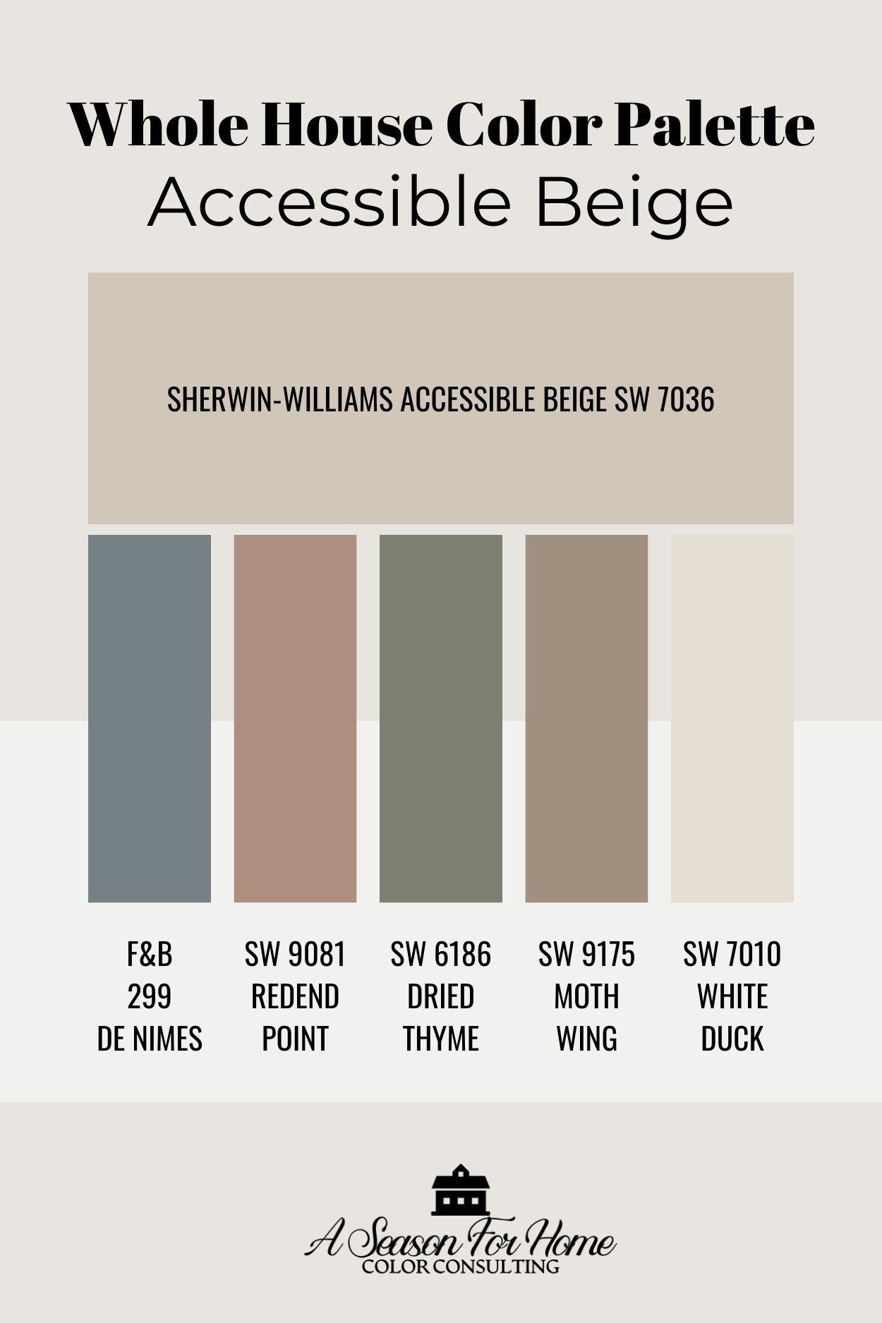
- Farrow & Ball De Nimes: A chalky mid-tone blue from the popular British paint company. This blue would be appropriate in a dining room or primary suite. You could also use this blue as an inspiration for fabrics and furniture in a room painted with Accessible Beige. Use Ben Moore Templeton Gray if you’re looking for a major brand alternative.
- Sherwin-Williams Redend Point: A former color of the year, this dusty brick pink is stunning in smaller spaces, especially with pale oak flooring or deeper wood tones and antiques.
- Sherwin-Williams Dried Thyme: An all-there green for my fellow green lovers. This one is simply stunning in spaces adjacent to Accessible Beige, especially with a creamy off-white like White Duck. Try painting your cabinets in your kitchen in Dried Thyme and use White Duck on the walls. With Accessible Beige in the next room over, the effect would be smooth and cohesive.
- Sherwin-Williams Moth Wing: This moody taupe paint color is like an older sibling to Accessible Beige. You don’t have to worry about clashing undertones. These two paints are mathematically paired by Sherwin-Williams so you know they go together! I’d love to see this on the walls in a first-floor bathroom right off the main living space.
- Sherwin-Williams White Duck: This color is a little darker than my suggested whites (LRV 74) but you can certainly use it like a white and your brain won’t know the difference if you don’t put any other white in the room. If you are using Accessible Beige on your millwork, go for White Duck on the walls and you will have a beautiful look on your hands! See my above featured photo to see how it will come out!
Earth Tone Color Pairings For Accessible Beige
This color palette is rich and earthy and perfect if you are transitioning away from a stark black and white farmhouse look and looking to incorporate some colors into your home. All of these colors look great with minimalist interiors and existing black and white finishes. You can easily mix in any or all of them to create your personalized palette!
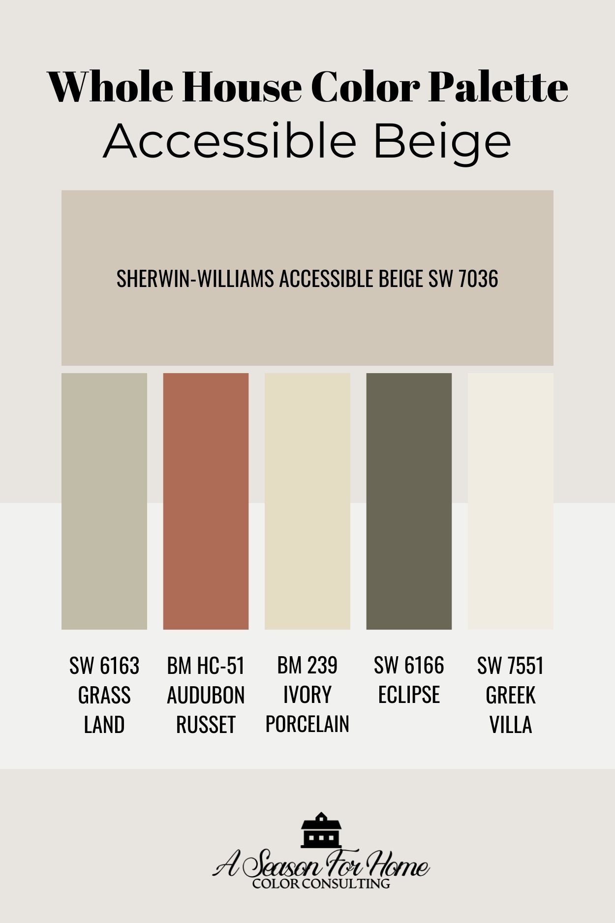
- Sherwin-Williams Grassland: A favorite soft sage green. This paint color has just the right amount of warmth without the depth of a true olive. I’ve recommended this color for bedrooms in the past but it would also be lovely in a home office off the main living area painted in Accessible Beige.
- Benjamin Moore Audubon Russet: I’ve loved this color for more than 20 years and I continually recommend it in my paint consultations. Because it just works! Its from Ben Moore’s historical collection so automatically know it is relatively low-chroma (see above why Accessible Beige has an affinity for low chroma colors.) Use this color for a contrasting pop of color on your kitchen island or paint it on a feature wall for big energy! It’s also super on built-ins (especially with dark wood tops.)
- Benjamin Moore Ivory Porcelain: Here is one of the only “yellow” paints I have pulled for these palettes. It is cheerful and will satisfy a yellow lover without clashing with the undertones and the taupe-like qualities of Accessible Beige.
- Sherwin-Williams Eclipse: I played with blue-based blacks and green ones, and ultimately I opted for this supremely dark olive paint color which comes from the same paint strip as Grassland. This will give you a big powerful drama moment in your interior. You can use Eclipse on vertical shiplap on a fireplace or to really make cabinetry pop.
- Sherwin-Williams Greek Villa: For this color palette I went with super popular SW Greek Villa, though any of the above whites would work. You could also go with White Duck from the previous palette. The light peachiness in the undertones is a great match for the main house color.
Color Palette #3: Trend Setting & Timeless
I have read the trend reports and listened to all the color forecasts and I can assure you this fashion-forward palette is simultaneously on trend and timeless. I’ve included Benjamin Moore’s color of the year, Cinnamon Slate as well as some soft and chalky neutrals to make your spaces quiet and calming. Plus I popped in two historically inspired, yet up-and-coming colors (a medium-toned gold-based beige and deep dark teal.) Go with this palette and you can thank me later when everyone wants to know what your paint colors are!
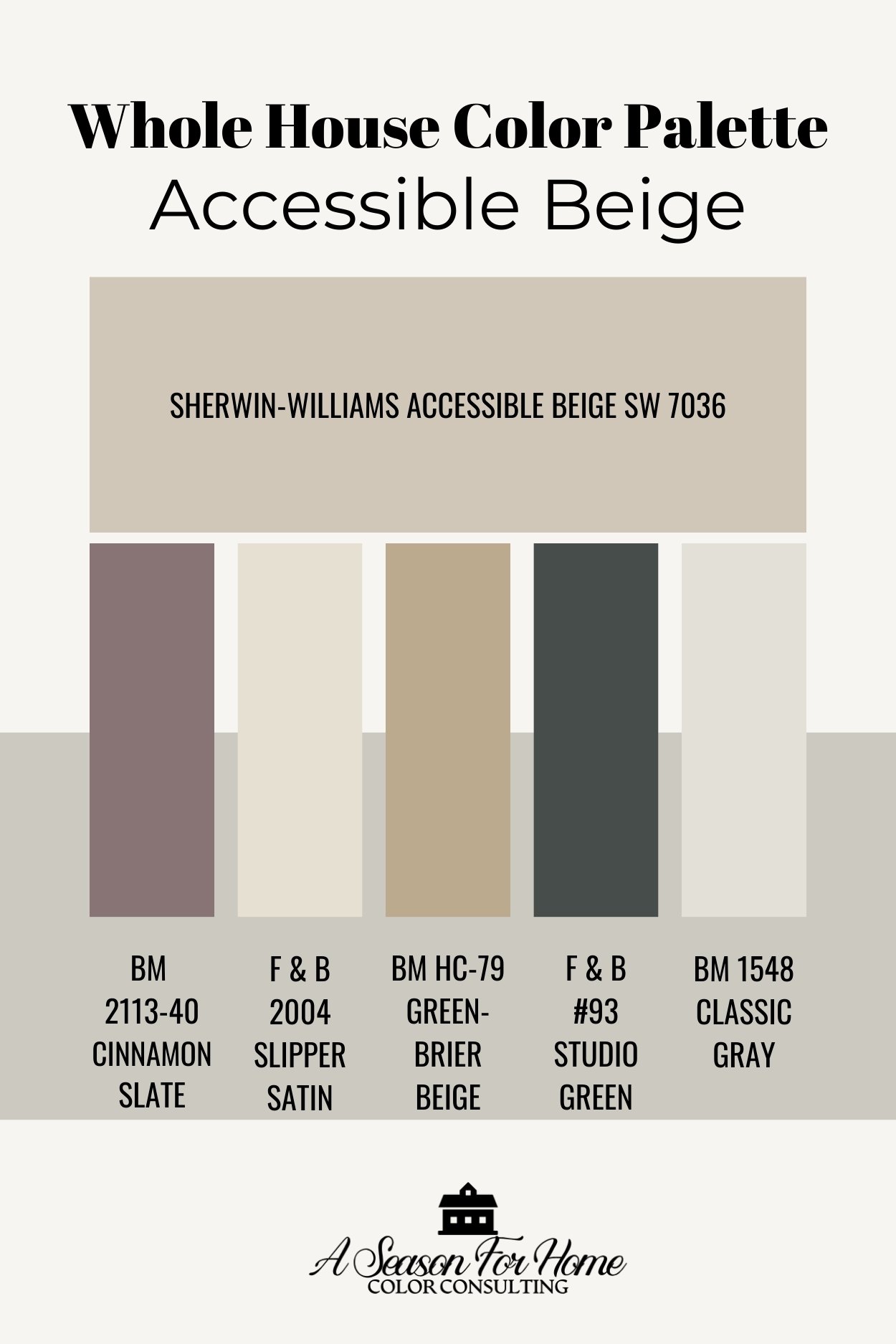
- Benjamin Moore Cinnamon Slate: This color is nearly impossible to describe because it is a blend of puce, mauve and brown. It has a touch of pink, a dab of purple, a lot of gray and a smidge of brown. Does that clear it up? I am sure it doesn’t but rest your eyeballs on this color and you’re going to want to paint a room with it asap! Pair it with calming lighter neutrals like Accessible Beige, and some of the lighter tones in this palette along with rich wood tones.
- Farrow & Ball Slipper Satin: Here is an off-white option for darker rooms or if one of the family members wants their personal space “painted white.” It has just enough pigment that it won’t look blank. It can also be used as your white for the walls and ceiling if you are using Accessible Beige as the contrasting trim or on the woodwork in your space.
- Benjamin Moore Greenbrier Beige: This warm sandy beige paint color is a favorite of mine. I used it in our home gym on our trim and baseboards. It is one of the few gold-based colors that works well with Accessible Beige. It happily goes in this palette because it is not overly saturated. I like it for built-ins in an entryway or on cabinetry.
- Farrow & Ball Studio Green: While Dark Teal paint colors are having a moment, they have always been classic and will remain that way. Indoors this paint color appears almost black. It has enough inky green pigment so as not to come off as harsh (like a true black paint would.) You can use this on furniture, millwork or cabinets instead of black.
- Benjamin Moore Classic Gray: Go for BM Classic Gray if you want a lighter paint color for dark spaces. It is a little cooler than Accessible Beige and can handle furnishings with higher chroma. So if you have colorful artwork or upholstered furniture that won’t go with the Accessible Beige, opt for Classic Gray in these spaces. Like White Duck it can also be swapped in as your “white” for the walls if you are using Accessible Beige on your millwork.
Tips For Picking Your Paint Schedule
- Consider Lighting and Test First: Make sure to test your paints before committing to them. The lighting in your home may call for a lighter or darker value. Brushing paint onto the walls is the best way to do this. Or you can order large samples from Samplize.
- Strategize Darker Colors: Keep darker colors in confined spaces: Use darker colors to enhance the cozy feelings in smaller spaces. These colors can add drama and have a settling quality. If you have a lower level rec-room, don’t be afraid to go with one of the darker hues in these palettes.
- Use Colors Throughout The Space: Remember these colors aren’t just for walls. You can use these color schemes as a guide to pick all your furnishings. You can also use them to paint furniture! So don’t feel constrained by the four walls around you. And don’t forget repetition is an important part of creating a whole house color combination.
- Get Help: If you need help, just ask! I am a click away. Sign up for one of my virtual paint color consultations and I can help you customize your whole house!
More Paint Colors To Read About
Accessible Beige is just one of the many taupe paint colors I love, so if it isn’t quite right for you, check out my line-up of best taupe paint colors too. If you are still wanting MORE information about popular neutral paint colors, then check out some more of the paint color reviews we have shared here at Season For Home:
- Tapestry Beige by Benjamin Moore
- Smokey Taupe by Benjamin Moore
- Wool Skein by Sherwin-Williams
- Muslin by Benjamin Moore
- Natural Cream by Benjamin Moore
- Navajo White by Benjamin Moore
- Check out these Khaki paint colors too
And if you are still deciding what you want to do in your space I am a click away! Sign up for a virtual color consultation and I can help you pick the perfect paint palette!
Accessible beige and Swiss coffee combo. I need to paint the ceiling, walls and cabinets. what goes where? please help and thank you Katie.
Without seeing your space it is hard to say. But typically the Accessible Beige would be the cabinet color and the walls and ceiling would be Swiss Coffee. If your home has high ceilings and tons of light and you like a “white kitchen”, you could also use Accessible Beige on the walls and use Swiss Coffee for the cabinets, trim and ceiling. I also love the color SW Dumpling, and I will throw that in there since this tone-on-tone look is currently trending and would be a very sophisticated way to play with these paint colors. You could add Dumpling into your scheme. Say for example: Accessible Beige on the cabinets (the darkest color), SW Dumpling on the walls (the middle tone), and Swiss Coffee (brightest) on the trim and ceiling.