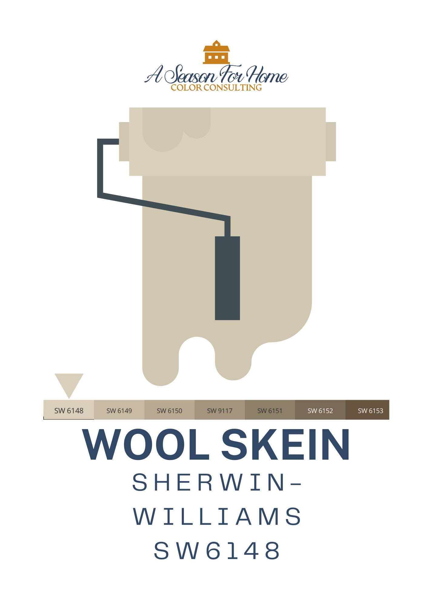
Sherwin Williams Wool Skein Review

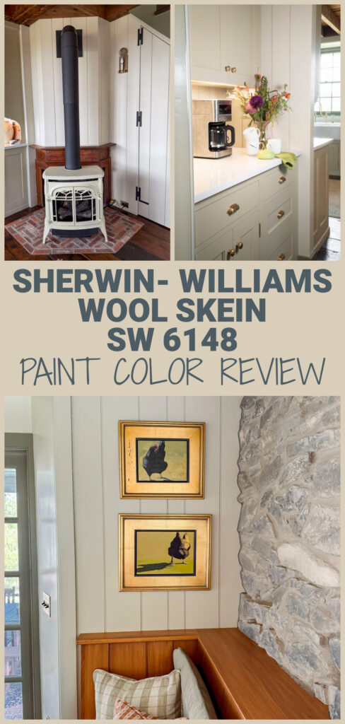

I’ve recently used Sherwin-Williams Wool Skein in my home kitchen renovation, and it is a truly gorgeous warm neutral paint color! If you’ve been noticing the warming shift in home design lately, you’re not imagining it. For the last decade or so, cool gray paint colors dominated interiors everywhere. But now? The macro trend is shifting back to warmer neutrals, and Sherwin-Williams Wool Skein is an emerging paint color to watch.
Below you can read more about why I love this paint color, where it will work for you and colors to coordinate with it. As a certified paint color expert, I try to stay neutral (pun totally intended) and not pick favorites. But I cannot lie, Wool Skein is such a dreamy color I cannot help but gush about it.
What Color Is Wool Skein, and what are its undertones?
Think of Wool Skein by Sherwin-Williams as a soft, warm neutral that sits comfortably between beige and greige. It’s a lot like Accessible Beige, but without the cooler taupe tonality. What I love about it is that it doesn’t skew overly yellow thanks to low saturation levels.

Sherwin-Williams Wool Skein (SW 6148) is a light khaki paint color with very little saturation. Its base color is orange but it has a subtle green undertone that makes it a great neutral to pair with green furnishings and accents.

The green undertone is so very soft so don’t worry if you have a hard time seeing it. It can best be picked up when comparing it side by side with a pink beige like Muslin by Benjamin Moore or Kilim Beige by Sherwin-Williams.
LRV For Wool Skein
Wool Skein has a LRV of 63. This is the way we measure a paint’s color value. It means on a scale of 0 (pure black) to 100 (pure white) it falls in the lighter realm. It has the perfect depth (LRV of 63) makes it a dependable choice if you want warmth without going too bold.
Wool Skein brings just enough warmth to soften a space, while still reading as neutral. It can feel airy in a room with lots of natural light, but it also has enough body not to wash out in lower light conditions.
Why We Love SW 6148 Wool Skein

As homeowners move away from cooler grays and start craving more warmth, colors like Wool Skein are stepping into the spotlight. Khaki is one of the colors of the moment, according to color trend forecasting experts, and Wool Skein fits squarely into the mold of khaki. Here’s what Sherwin-WIlliams says about this color: “A beige with khaki undertones, this full-bodied neutral will warm up your space and pair excellently with nature-inspired hues…”
Pause here if you are not sure what warm vs cool colors are, read my explanation and then jump back over!
What sets Wool Skein apart is its low saturation. In fact, in certain lights it looks like a greige paint! So while it follows the trend toward warmer neutrals, it doesn’t carry the risk of looking yellow. This is exactly why I am reaching for this color when creating custom color schemes for my Color Consulting Clients. Learn more about my custom color consultations here.
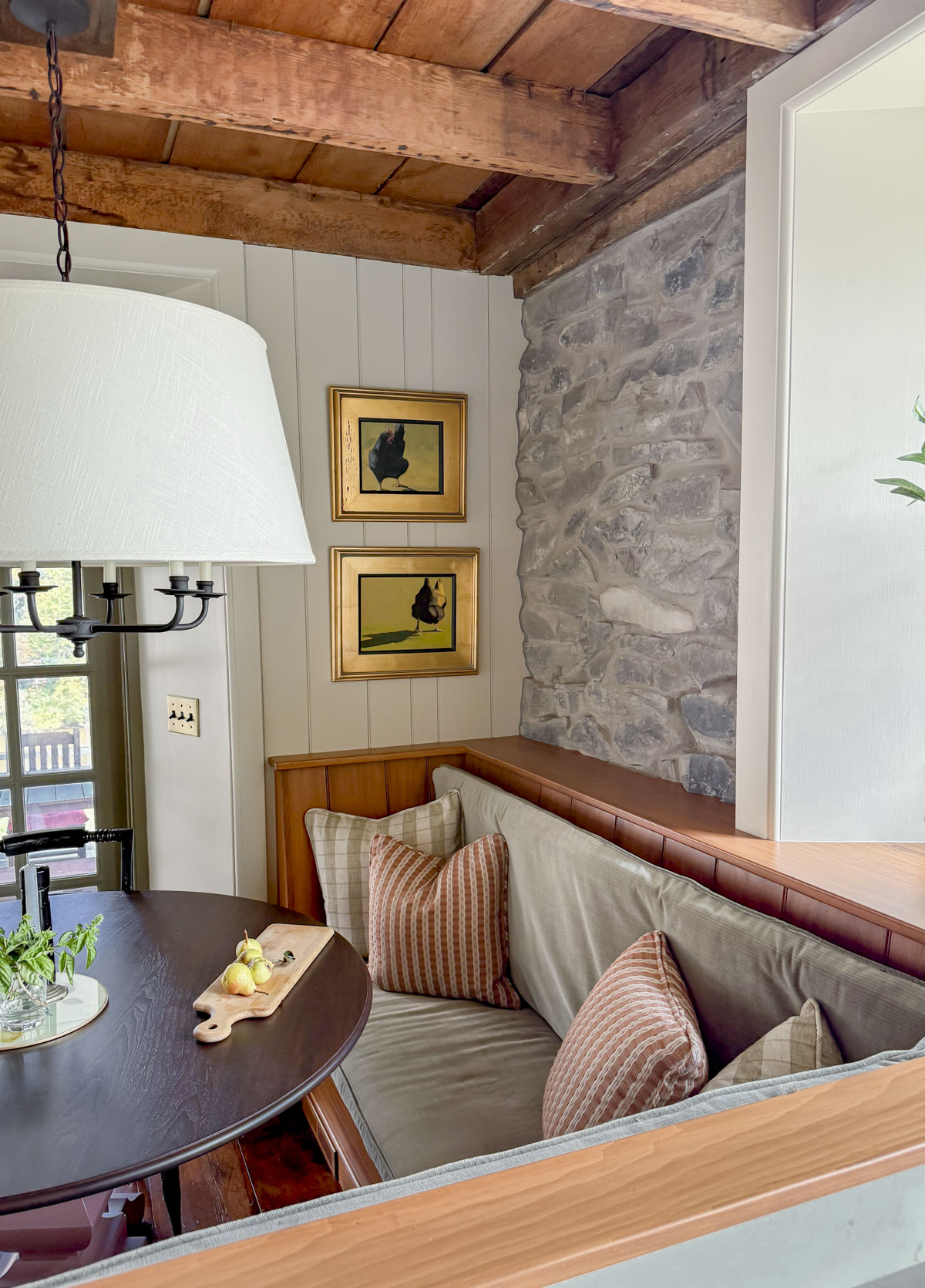
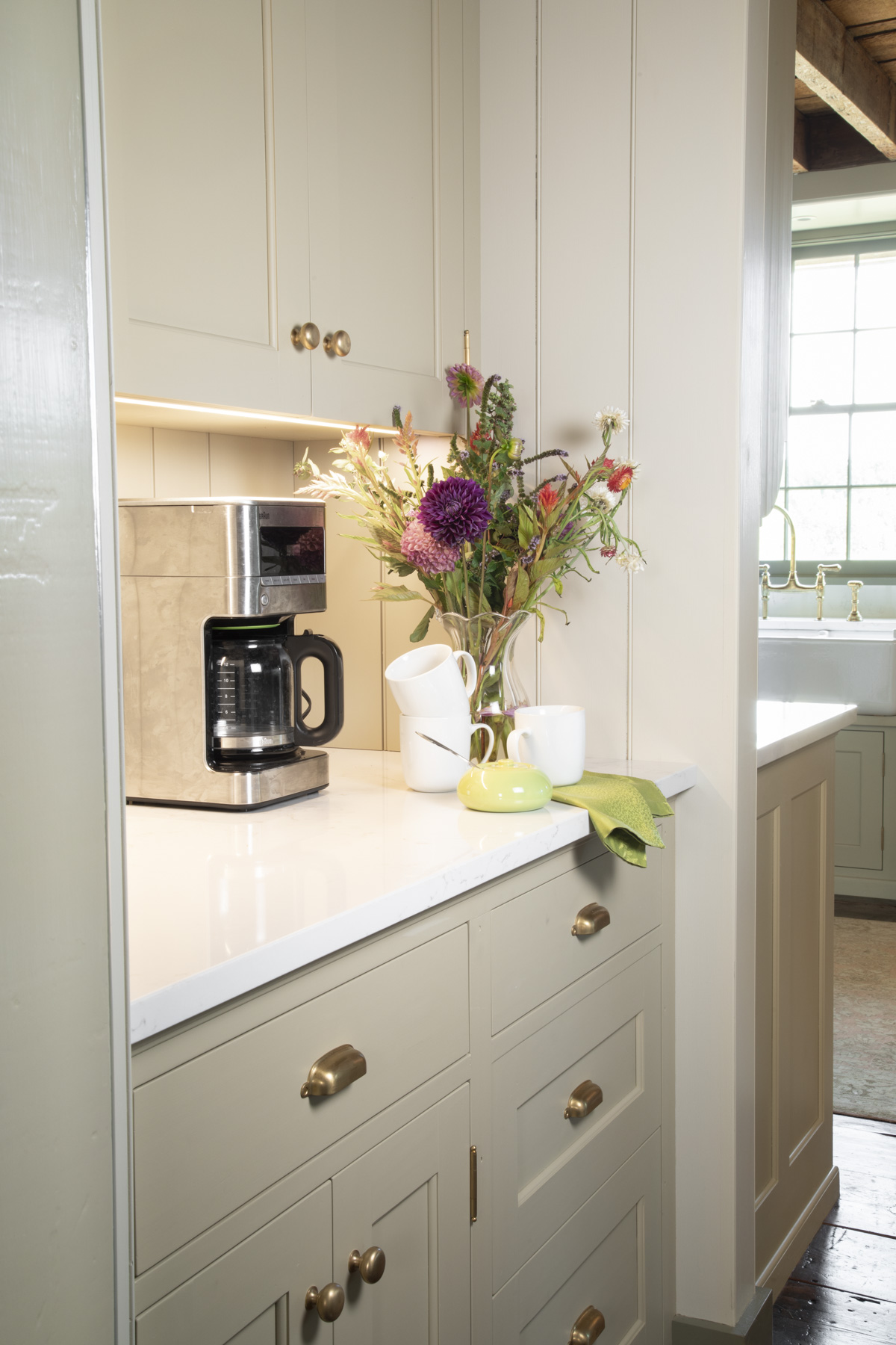
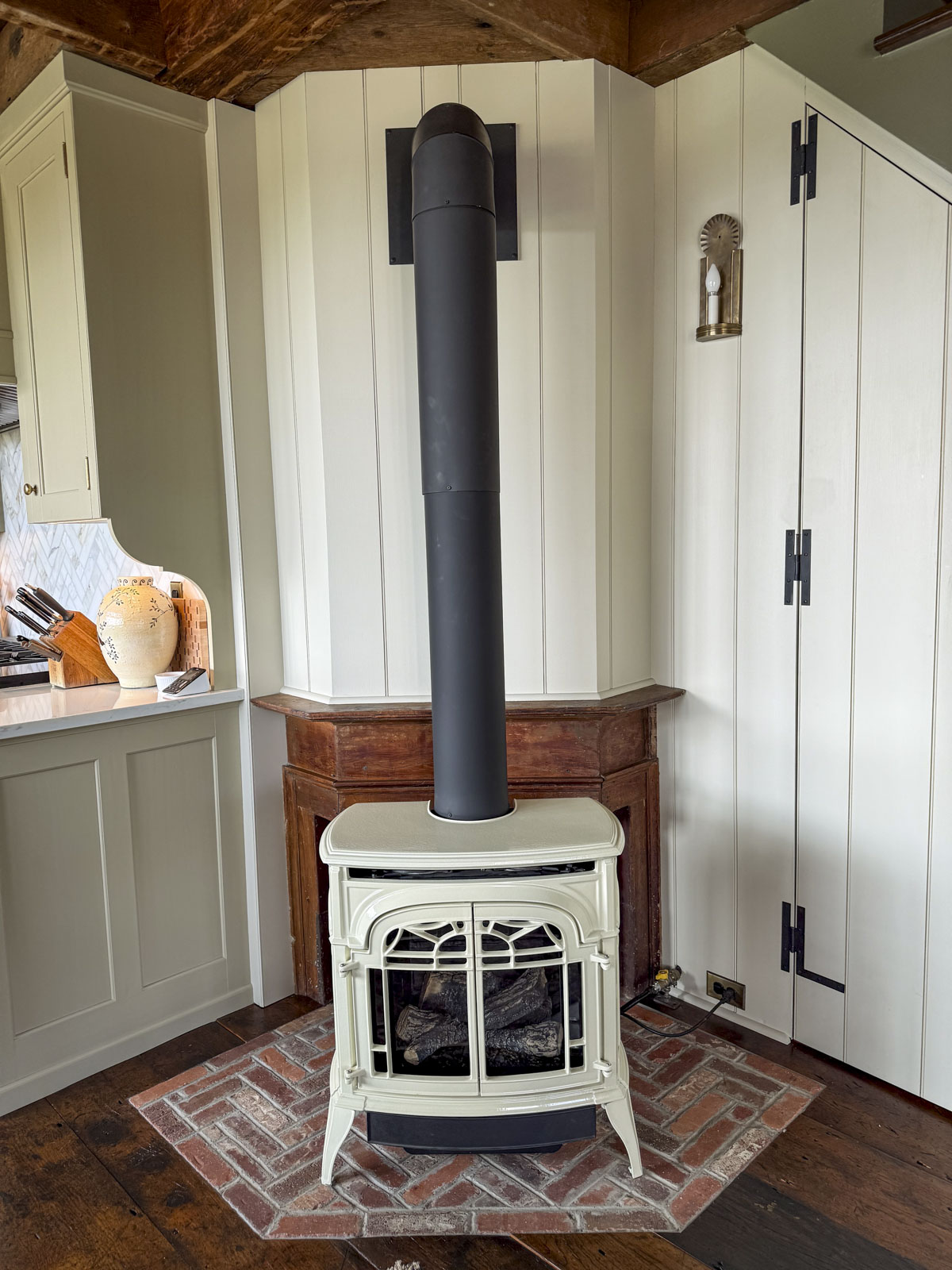
Wool Skein by Sherwin-Williams delivers the cozy, approachable vibe people want, without locking you into an obvious beige. It is mellow enough to use as a whole-house color. And can even be used to “drench” a space, which is paint-nerd speak for painting the ceiling, trim and walls all the same color. I used it on the walls in my kitchen in conjunction with a dark trim color and it passes as a white in this application.
Sherwin-Williams Wool Skein Color Scheme
Because Wool Skein is a light khaki with restrained saturation, it pairs beautifully with muted accent colors. Try soft greens for a calm, organic look, or low chroma reds for a richer, grounded palette. These pairings enhance the natural warmth of Wool Skein without overpowering it.
Here is a custom color palette featuring Wool Skein.

How to Use this Color Palette:
Wool Skein is meant to be the main color to use in the main living space or in an open-concept floor plan. You can use it in the entry way, main living space, and kitchen. Then use these other colors to guide you when choosing featured colors in smaller spaces. Of course, this is just a jumping-off point! Work with the fixed elements, lighting and your personal style to make it your own.
Greens To Pair with Wool Skein
Wool skein is the perfect warm neutral to pair with greens, thanks to its green undertone and low saturation level. This keeps it from looking too circusy and colorful.
- Passion Vine by Ben Moore: I love it with Passion Vine by Benjamin Moore (which is the green in all of the above photos of my kitchen.)
- Nantucket Gray by Benjamin Moore: This gray green is warm and muted anda great match for the khaki undertones in Wool Skein. It would look fab with the Wool Skein on the walls and Nantucket Gray on the trim.
- Liveable Green by Sherwin-Williams: A softer green from the Color Mix 2026 lineup from SW: Liveable Green is also gorgeous with it. Livable Green is soft, muted, and looks lovely with the subtle tones in Wool Skein.
- Creekside Green by Benjamin Moore: Another deeper shade of green is Creekside Green by Benjamin Moore. It’s a sage gray with depth and subtle grace.
Reds and Russets For Wool Skein
Any shade of brick, peach or terracotta clay is going to look flat-out fabulous with Wool Skein, so you really cannot go wrong. I picked a couple for this palette, but really, you could go with a much wider variety!
- Ben Moore Peatmoss: This would be a gorgeous door or shutter color with Wool Skein on an exterior. It would also be a great color to paint your dining room chairs or custom built-ins in a room painted Wool Skein.
- Fox Hedge Tan by Ben Moore: If you know me, I have have a thing for peach tones and I add them to practically every color palette I create! Sorry not sorry! This one would be stunning in a powder room with marble tiles and Wool Skein just outside in the hallway. Or use Fox Hedge Tan to paint your mudroom cubbies and then use Wool Skein on the walls. Wow!! So pretty!
Blue with Wool Skein Sherwin Williams
Go with blues that have a lot of grey in them and a touch of warmth (yellow) to take them slightly more to the green side than the purple side, and they’ll be a good candidate to pair with Wool Skein.
- Waterloo by Sherwin-Williams: A trendy navy color with a good amount of saturation. Waterloo has a slight green undertone that makes it a good pairing with Wool Skein Sherwin Williams Paint.
- Templeton Gray: A moody blue with tons of gray- so it will not read too jewl toned. This color pairing is preppy, classic and utterly timeless.
Earth Tones To Pair with Wool Skein
- Quiver Tan by Sherwin-Williams is one of the many dark earth tones that go with Wool Skein paint.
- Olives and Browns: The key is Wool Skein doesn’t like clean colors, so it’s best to pair it with a lower chroma brown or olive. I love using a higher contrast brown with it so don’t be afraid to pick a darker shade with an LRV in the 20s or lower.
Which White To Pair With Wool Skein
As you can see in the photos of my kitchen, I used Wool Skein as the “white” paint color on the walls. Then I used darker paint colors for the trim and cabinets.
Of course, you can also pair it with white for a traditional look. Here are a few whites that go with Wool Skein:

- Perfect Creamy White For Trim and Ceiling: I like the creamy, bright look of Whitetail by Sherwin-Williams with Wool Skein. This is a high LRV shade of white (LRV 86) but it is more saturated with plenty of warmth and rosy pink tones. (Look at this color next to Atrium white, which is virtually the same LRV and rose undertone and you can really see the saturation difference.) Whitetail is my top pick for pairing with Wool Skein because it has the same orange base color so it matches really nicely yet adds good contrast.
- All Purpose White: If you are working with multiple rooms and trying to pick a white to go with Wool Skein for your main house color and have coordinating colors in the other rooms you can go with one of my top all-purpose whites like Alabaster by Sherwin-Williams. It will look more grayed than Whitetail, but side by side with Wool Skein and it is still a very nice pairing.
- Tone On Tone Look: Dover White is like a sister from another mother. It has the same dreamy khaki undertone but is much brighter so provides contrast. This is a great option if you are looking for a soft, high-end and elevated look. Use Dover White (LRV 83) if you want your room to instantly look like you hired an expensive designer!
Other Colors To Try
Wool Skein Appears on the same paint chip as Sherwin-Williams Relaxed Khaki and Universal Khaki, the color of the year for 2026. These are both options to check into/test if you are worried Wool Skein will be too dark.
If you like the low-saturation level but want a cooler (less yellowed appearance) try either Slumber Sloth or Accessible Beige from Sherwin-Williams.

If you want a paint color that’s a touch lighter, I have great luck with Neutral Ground by Sherwin Williams. It has the same warmth of Wool Skein without a ton of saturation. It’s a great whole-house color- and won’t pull green if you use white trim.
Sherwin-Williams Wool Skein on Exteriors
Now let’s talk about the potential for Sherwin-Williams Wool Skein exterior color schemes. This color happens to work for trim or siding. Its warm, muted undertone looks amazing on classic house styles such as farmhouse, colonial or capes.
Make sure to read through my recommended process for picking your exterior scheme. And for those of you who read it already, you’re probably wondering if this is one of those beige paints to avoid. Well, good news, there is no pink to this beige paint, so you are safe to use it on your exterior in snowy climates.
Here are four exterior color schemes to use Wool Skein:
UPDATED MODERN FARMHOUSE LOOK:
Wool Skein is a pretty siding colors for a light minimialist look. Say bye bye black and white and warm up with the following combo. If you are sick of the stark contrast of black and white but still want to go with a classic minimalist style, I’d go with the following combo:

- SIDING: Wool Skein Sherwin Williams on your clapboards, board and batten or shakes
- TRIM: Dover White by Sherwin-Williams for your trim and windows (if they are wood.)
- ACCENTS: Urbane Bronze by Sherwin-Williams or Dragon’s Breath by Ben Moore. This would be so pretty with a Dark Bronze standing seam roof and dark bronze windows too! Oh my! I am swooning. These darker elements will read as “black” without looking cheap or stark or dated (like the black and white farmhouse trends of the early 2020s.)
CLASSIC EARTH TONES

Wool Skein SW 6148 works as a trim color when paired with a deeper taupe like Urban Jungle from Sherwin Williams. Go with a black like shade for your doors and accents like Urbane Bronze. Or for a pop on your front door or shutters go with low-chroma greens and earthy reds.
VICTORIAN COLOR SCHEME
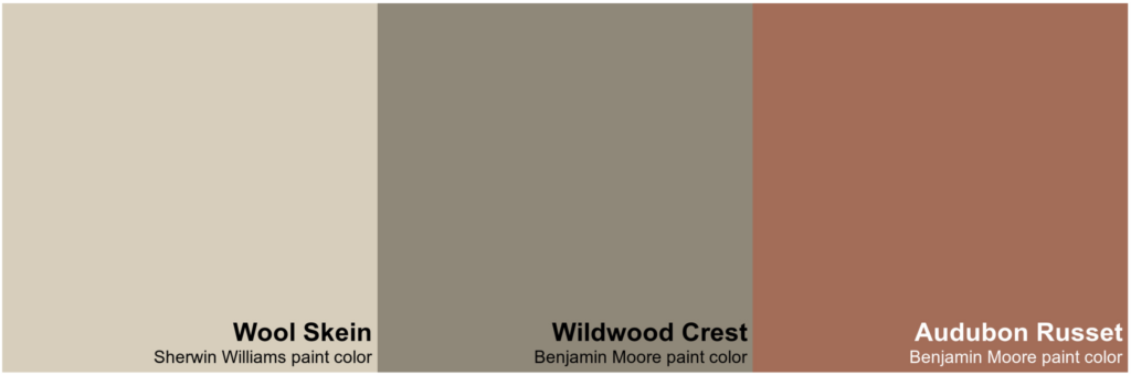
On more ornate houses, like Victorian-style homes, try using wool skein on the trim and then use an accent color like Audubon Russet by Benjamin Moore on the window sashes only if your windows can be painted.
CLASSIC PAIRING
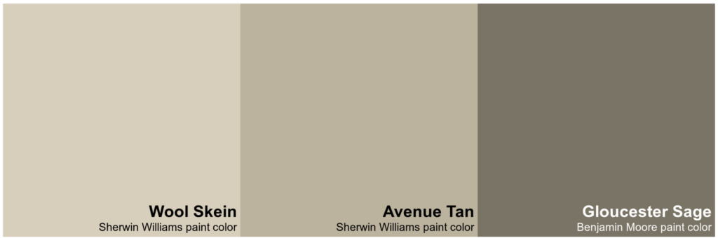
I cannot think of a single home where this combo wouldn’t work. Use Avenue Tan on the siding, Wool Skein on the trim and Gloucester Sage on your Accents and Doors. The light green undertones will give an overall appearance of a Green Exterior Paint Scheme, but without looking childish or cutesy.
How To Use Wool Skein In Your Home

This color is one of those rare shades that can be used in a wide variety of applications. Here are some ways to use it in your home:
- Whole House Color: When paired with Dover White on the trim, this is a beautiful Whole House Paint Color. Use it in open concepts spaces, a great room or entry way and hallways that connect rooms painted in more vibrant shades.
- Color Drench: This color is a great option if you want to try color drenching a space, painting the ceiling trim and walls all the same color. It is light enough that it will not feel oppresive so it is not as risky as trying this trend in a shade like dark teal.
- Kitchens: You can use Wool Skein Sherwin Williams on kitchen cabinets or on the walls in your kitchen. While the warm cream colored cabinet trend of late is a perfect way to use this color, I think this paint will endure beyond this trend. It has a timeless feel that you’ll be able to live with throughout several trend cycyles.
- All Neutrals: If you have moved beyond all white, but aren’t much of a color person, this paint color is for you. Try it with other khaki paint colors in the same family if you like to decorate with neutrals. Instead of black use dark brown and wood tones to provide depth to make this tone-on-tone look work.
- Contrast Trim: I used it as a wall color in my kitchen paired with dark green paint on the trim. It is light enough that it passes as “white” (see above) without feeling stark.
Final Thoughts
Sherwin-Williams Wool Skein is an up-and-coming warm neutral that fits perfectly into the current shift away from gray. It’s approachable, versatile, and low in saturation, which means it won’t overwhelm your space or feel dated anytime soon. It’s perfect for interiors and whole house color palettes. It’s also great for a siding or trim color for your home’s exterior.
Thank you for this review, it was very helpful! I have a antique looking faded red brick on foundation, garage, & large front bump-out. We painted the siding Wool skein last year with Relaxed khaki on the shutters & it looks so much better. *When we moved here, the house had taupe siding with purplish undertones and burgundy shutters. We are now getting ready to have the trim painted. Our house faces mostly North(& a little West)so I need a little warmth. Dover white sounds like it will work.
I am so glad you found this useful! If you take any pictures send them my way! I would love to see how the new trim color works for you.
I am painting my walls alabaster and have heavy molding and trim in my 2 story foyer and hallway. I was leaning towards wool skein for all my molding and trim, do you think that will be enough of a contrast. I was going to choose relaxed khaki but was worried that that maybe too heavy.
First of all- I love that you are doing contrast trim! Especially if you have heavy molding and trim. And second, IMO, it will be plenty of contrast. These two paint colors have a 20 point differential in their LRVs so that will be a great look! In my review for Benjamin Moore Muslin https://aseasonforhome.com/benjamin-moore-muslin-paint-color-review/ you can see photos of a 18 point differential with contrast trim. In those photos you can see BM White Dove with BM Muslin. This will give a similar effect as the colors you are pairing. Good luck! Please report back!