Best Deep Teal Paint Colors
Deep moody teal paint is having a moment. I’ve been noticing clients asking about dark bluish greens in my paint color consultations in the last few months. I am also seeing dark teal popping up more and more on social media as well as marketing from paint brands. Dark teal is undeniably “in” right now.

Yorktowne Green: One of our featured dark teal paint colors. Source
Trend Alert: Dark Teal Paint Colors
We are embracing color! Blame it on whiplash from the gray trend, followed by the surge of minimalist black and white farmhouses, now more people are embracing adding colors to our spaces. With that, there is a documented movement toward dark paint colors.
According to color psychologist, this color trend is not arbitrary! It is our desire to make our spaces feel secure, cave-like and cozy. Additionally, as a reaction to minimalism, we have opted to add joy to our spaces in the form of color. Which is why going with a bold statement color, like dark teal green, is a great way to make a space calming while providing a marked departure from everyday neutrals and off-whites.
Having started adding dark paint colors in my own home, I can say it feels good to go bold after so much timidity! If drenching a room in dark paint seems a bit scary, I am here to lend my expertise so you can try this trend in confidence.
Read on for details on my favorite dark teal paint colors for you to try. Pick up a can up at your local Lowe’s, Sherwin-Williams or Benjamin Moore paint store and make a statement with one of these rich and dramatic shades.

Cascades by Sherwin-Williams SW 7623

In all fairness, Cascades has been trending for a couple of years now. It was color of the month for Sherwin Williams in September of 2023, and there are plenty of color reviews out there if you are considering this color. Here is one I found helpful.
Highlights of Sherwin-Williams Cascades
- It pulls more green than blue when compared to the other colors in my lineup.
- It is supremely dark with a LRV of 4 – one of the darkest I have pulled.
- It’s a really great dark green paint for an exterior on a Modern Farmhouse if you are looking for an update from black or white. I love the way this color looks with black windows!
Storms In Paris by Tonester Paint
Tonester’s Storms in Paris is a glorious deep teal paint color that’s having a viral moment on the internet. {Can I just say how happy it makes me that paint color can be viral? I love my job!} One of my Vermont color consulting clients told me about this paint color and I was instantly in love!

This tiny little paint company, which according to LinkedIn, has only two employees, claims this paint color is its best seller. I’m assuming that has to do with the virality of it, not so much its mass appeal, but I can see why someone would make the effort of mail-ordering a paint like this.
I give Storms In Paris mad props for being both bold and enigmatic. It is much darker than any of the Benjamin Moore dupes I could find, so if you want a really dark dark teal and Cascades isn’t quite right, it is probably worth ordering and having it shipped. They do offer peel-and-stick color samples, so if you’re not in a rush, you can test first.

Now I have not painted with this color myself yet, so I am only going by what I have researched but here are a couple of things to know about this color:
Storms In Paris Paint Color Highlights
Tonester paints come in ceramic and latex so make sure you know what you are ordering. Ceramic paints are durable and low VOC, but they are more expensive and can be more challenging to apply.
The drydown of this color is noteworthy. {Drydown is when a color changes when it dries.} I’ve noticed that the color in the can and video appears more blue than the way it looks painted in a room, according to official images published by the brand. I am not sure if this has to do with the way they color corrected their media or if the actual paint itself changes a lot. I watched several TikToks (like this one) about this color and the paint color looks much lighter in several of the videos. So buyer beware, and test test test!
Yorktowne Green by Benjamin Moore HC-133
While Yorktowne Green is one of those beautiful, timeless historical colors, it also happens to be quite trendy right now. I have specified this color to a couple of clients in the last couple of months, and I noticed it was the main featured color on the homepage of Benjamin Moore in March. With thousands of colors Ben Moore can choose to feature, this says a lot.
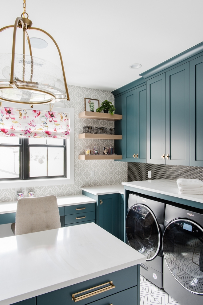
Laundry Room cabinetry painted Yorktowne Green by Benjamin Moore in Utah Show House, photo by Jessica White Photography
highlights Of Yorktowne Green (aka Vanderberg Blue):
- Compared to the rest of the deep teals this one has a subtle gray pallor that gives it a vintage look. So if you are not sold on the idea of an almost-black shade, this may be your perfect dark teal paint color.
- While it’s not necessarily more pigmented than the other dark teals, it comes across as more saturated because it is lighter in value. So it will feel more bold than the others.
- This is the perfect color to use if you are thinking about color drenching, as it has just the right level of ashiness to give it a velvety feel.
Pacific Sea Teal by Benjamin Moore 2049-10
I adore this color! It is so wildly dark but still distinctly teal. It has a LRV of 5.93 which puts it into the nearly black category.

Pacific Sea Teal bedroom on Instagram
When I was looking for a dupe for Storms In Paris, I came across this paint color and loved how dark it was. So if you are wondering what is a good dupe for Storms In Paris? Here’s my pick! I definitely choose Pacific Sea Teal from Benjamin Moore. It has the same depth and richness as far as I can tell from the way SIP looks online. I have verified Pacific Sea Teal in the flesh and it is a truly gorgeous color!

Highlights of Pacific Sea Teal:
- This is a very dark blue with hints of green. While Benjamin Moore calls it a blue-green, make sure you know it is not a green.
- In the fan deck, this shade is the darkest on the strip which is mathematically arranged. If you are looking for a slightly lighter version of the color I would say go for Oasis Blue but avoid the lighter ones unless you have cool neutrals in your house, as this is a very high chroma strip!
- Pacific Sea Teal is an ideal dark teal color for painting wooden furniture in a semi-gloss finish. Or you can use it to paint cubbies in a mudroom. I’d love to see a bath vanity painted in this shade, especially with the blue undertones of Carrara marble.
- Pair it with pops of bright, high-chroma colors like orange or chartreuse.

Mallard Green by Benjamin Moore 2053-10
I included Mallard Green in this collection because it is a lighter value option and a bit more saturated but still gives moody enveloping vibes.

Highlights of Mallard Green
- Mallard Green by Benjamin Moore is more brightly teal than the other colors here. It is about the same value as Vanderberg Blue but has more pigmentation giving it a more obviously teal appearance and contemporary vibe. I’d choose Mallard over Vanderberg/Yorktowne if you need a bit more color saturation.
- If you are painting a powder room or basement without much (or any) natural light, this is my recommendation for the color to pick because artificial lighting makes paint seem less colorful, and the slightly higher level of saturation in this paint will compensate for that fact.
Deep River Green by Valspar 5010-3
Valspar Deep River Green is a great dupe for Storms In Paris with a similar LRV and tonality.

Valspar really knocked this color out of the park: Deep River Green is so pretty! If the higher-end paint brands are not in your budget, you should still be able to bring joy into your house with a gorgeous moody teal paint color!
In general, I do not recommend Valspar if you can have room in your budget for premium paint. In my color consulting training and talking with professional painters, I learned that Valspar is not as high quality as Sherwin Williams (who owns Valspar.) They explained that you’ll need more paint for the same coverage. Furthermore, the durability is not as good, so you’ll have to paint again sooner. {For fashion enthusiasts, think of it like Old Navy vs Banana Republic.}

Highlights of Valspar Deep River Green
- I love how this color looks in Valspar’s “dead flat” finish- like rich green velvet! A matte finish gives great hide and conceals all the blemishes on your walls. Though I say that, but note that matte and flat paints have the lowest durability. I tell my clients to only use those finishes in low-traffic areas (like for an accent wall in a basement rec space or family room.)
- This is a beaut of a color for pairing with monochromatic neutrals and white. It gives that high energy feeling of a black and white room, but with a more earthy feeling from the green hue. Add lots of textures and woven textiles for warmth.
- This particular shade of green is awesome for an exterior accent color, especially for shutters and doors. Check at the paint counter or with your painting contractor to make sure you’re opting for the best paint product for durability.
Coordinating Colors For Deep Teal
If you are wondering what colors to decorate with for accents or in adjacent spaces, I have some ideas below. Note that I’ve used Yorktown Green here for illustrative purposes. This paint is a slightly lower chroma and more grayed out shade so the coordinating colors are of the same level. Dial up the chroma to match your chosen shade of teal.
In general, dark teal is one of those hues that works with both high and low chroma colors thanks to the very dark value. When picking your coordinating colors, make sure the specific teal works with it.

Colors To Go With Dark Teal Paint
- Off White: Go with a darker shade of off white in the cooler family like Snowbound from Sherwin Williams. See more favorite whites for trim and ceiling.
- Gold and Yellow: Trendy pale lemon yellows look so good with dark teal. I’m loving Goldtone by Benjamin Moore. For a brightly saturated accent yellow try Dorset Gold.
- Lime Green, Chartreuse or Citron: This family of colors looks so good with dark teal. I’ve picked Baby Bok Choy but Agave by Ben Moore is also super fun with it.
- Brown and Tan: You really cannot go wrong with beige, tan and brown teamed up with dark teal. I love the redder shades of brown like Saddle Soap, warm tans like Artisan Tan and the cooler taupes as well.
Conclusion: What is the Best Dark Teal Paint Color?
The answer is: none of them because they all have their plusses and minuses and it depends on where you are using them. Here’s a rundown of each color:
- Cascades: This is an absolutely gorgeous color. Very dark and a smidge more forest green than the other teals listed here. There are lots of online reviews and photos so there’s lots of opportunities to read up more on it.
- Storms In Paris: Though this looks like a great color, I recommend ordering one of the large peel and stick samples before using it to make sure it looks the same in real life.
- Yorktowne Green or Vanderberg Blue: If you want a slightly lighter paint with historical vibes go with this one. It’s great for exteriors and color drenching.
- Pacific Sea Teal: If you want the look of Storms in Paris, but want a major paint brand use this color. It has the same depth and value but a hair less blue.
- Mallard Green: Use this if your room has limited natural light. It is more saturated and a brighter value to compensate for the limited spectrum of visible color with artificial lighting.
- Deep River Green: If you are looking for an inexpensive option, this is the best choice! Valspar is available at Lowes.
Whatever you choose, have fun adding a bit of drama to your space and enjoy the enveloping coziness you create with one of these deep teal paint colors!