Taupe or Beige: What is the difference?

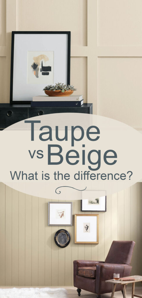

If you’ve ever stood in front of a wall of neutral paint chips, you know how confusing it can be to tell taupe from beige. Today I will show you how to tell them apart, where to use them and what to avoid!
Beige and taupe are both timeless, versatile, and endlessly useful, but they each bring a different mood and undertone to a space. Understanding those nuances can help you choose the right neutral for your home, especially as current color trends evolve.
But wait, what is a warm neutral? If you need a refresher on what is the difference between warm and cool colors, take a look at my post about it then head back over here to read on!
What is Beige?
Beige is a catch-all term for a warm neutral color with a sandy tone. Beige is technically a light brown with a good deal of white pigment added to it to lighten its value. Beiges include a wide swath of warm earthy light tans that can have undertones including pink, orange, yellow and green.
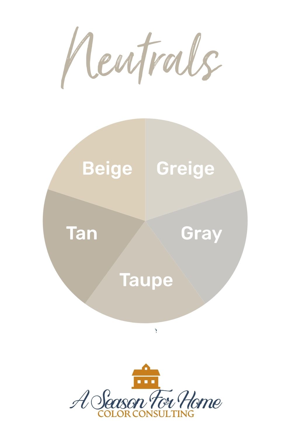
What Is Taupe?
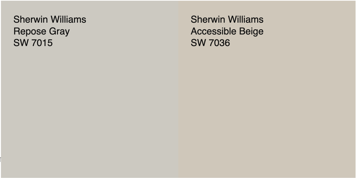
Taupe is a warm neutral that lacks saturation. When compared to a neutral gray like Repose Gray by Sherwin Williams, it is definitely warmer.
Comparatively it feels much cooler than brown or beige. It is like a desaturated version of tan that falls midway between tan and gray. If it were to be lightened in value it would become a greige.
Taupe can have hidden undertones that can feel violet, purple or blue, however it comes from a base tone of orange or brown. These sneaky undertones are best identified when compared to other shades of gray, taupe and tan.
If you are looking for the perfect Taupe Paint, make sure to check out my collection of favorites here.
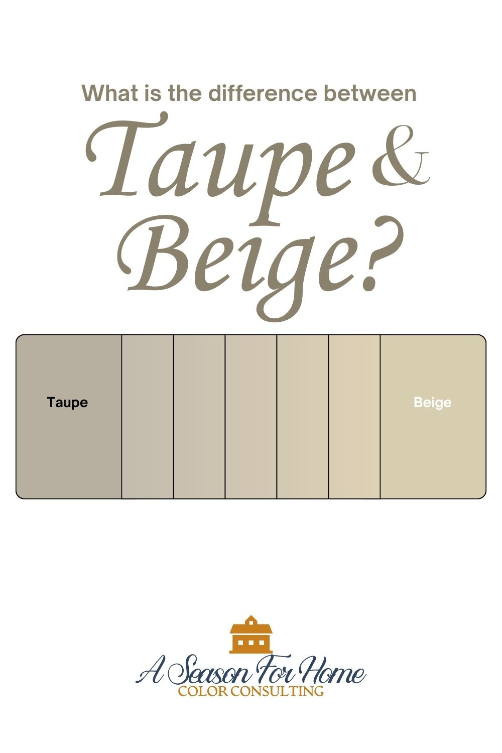
What is the difference between Beige and Taupe?
Both taupe and beige come from a base color of orange (a mix of red and yellow.) The difference is in the amount of gray that is mixed in. Taupe has more gray which gives taupe a desaturated cool feeling when compared to beige. Conversely beige feels warmer and more saturated than taupe.
Which to pick: Taupe or Beige?
I have found in my Color Consulting business that clients tend to shy away from the warmer rich beige paint colors associated with the late 1990s and early 2000s. And they are simultaneously trying to avoid gray, which dominated interiors for the last ten to fifteen years. Now, homeowners are looking for warm neutrals that do not feel yellowed, dated or too gray. The key is to find either contemporary beiges (that lack gold tones and too much saturation) or taupes that have enough warmth that they don’t feel gray!
So how do you know which to pick? Should I use taupe or beige? Well, if you have read my tips for picking your home’s color combination then you already know that the first step is to analize your home’s fixed elements!
If you have a golden granite countertop or other surfaces in your home with distinct pink or yellow undertones, you will need to pick a beige that will harmonize with the undertones in these materials. Conversely, if your space was last updated in the gray trend you can use taupes to warm it up without clashing.
Next, you can determine which you like better by comparing taupe and beige paint colors side by side. I have some favorites listed below! A lot of times you will gravitate toward one or the other.
You can also compare your taupe or beige to a known neutral like Sherwin-Williams Repose Gray. Repose is a true, balanced gray that can act as a benchmark. If your taupe looks significantly warmer than Repose, it’s likely a good middle ground. If it looks cooler you’re back in the gray trend all over again!
The Shift Away from Gold Beiges
Over and over again, in my color consultations I hear that folks want to avoid yellow! Why? In the early 2000s, warm, golden beiges and gold paint colors dominated interiors. These rich beige tones went with the popular Tuscan-style finishes of that time including, gold and brown granite, yellow-based whites, and wood cabinetry.
But today’s neutrals are headed in a different direction. Color trends show that designers and homeowners alike are gravitating toward beiges with softer, less yellow undertones. Polular beige paint colors are feel lighter and more natural and organic rather than saturated or rich.
These modern beiges still add warmth, but they lean away from gold and toward the subtle side of beige’s personality. They’re easier to pair with today’s more muted decor, including light wood tones, black accents, and cooler whites.
Avoid These Pitfalls
Warm or cool lighting afect these neutrals considerably. I have noticed in my color sonsutation appointments that vaulted spaces and open concept floorplans that have windows on opposing sides of the house, but no natural light in the middle can create havok on neutral paint colors! So below make sure you read what to avoid before you get out your paint brush!
While my clients are gravitating toward taupe more and more, I have noticed in some homes that taupe’s gray influence is both its beauty and its challenge. If you choose a taupe that leans too gray, it can start to feel too cool or oddly purple, especially in rooms with low natural light or north-facing exposure.
Whereas certain shades of taupe can look too gray, some beiges can appear too yellow! The main pitfall with beige paints is that its warmth and saturation can sneak up on you really quickly. I’ve noticed that on the paint chip, a color like Benjamin Moore Carrington Beige can look squarely in the beige category. However, when brushed out in a whole room, Carrington Beige can appear decidely yellow, which many of my clients want to eschew.
The moral of the story? Make sure to test your paint color by brushing it out before committing to the whole space! I always recomend starting with large scale paint sample sheets, like the ones from Samplize. These are a great mess-free way to see the paint color in your space on a larger scale.
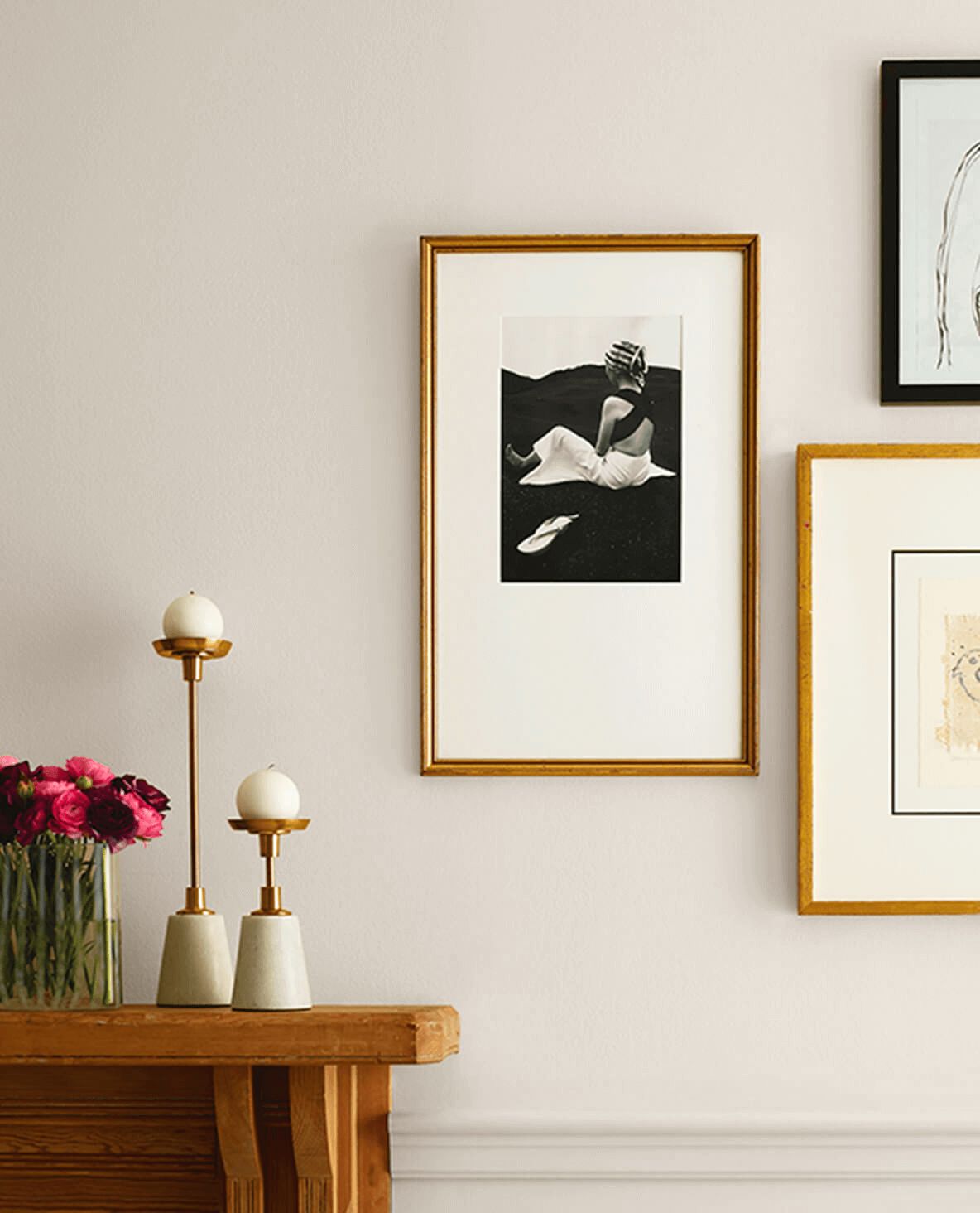
Taupe Paint Colors to Try
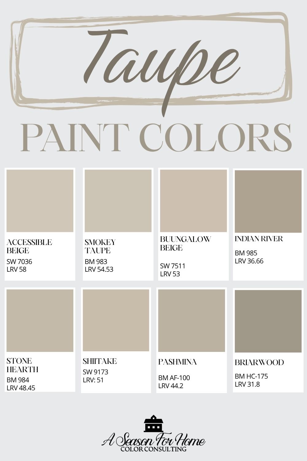
If you’re looking for a balanced taupe, start with these tried-and-true favorites:
- Accessible Beige (SW 7036): Probably the most popular taupe today. With an LRV of 58, this taupe is light enough that it won’t darken a room but any lighter and it would be considered a greige and not a taupe. It’s beautiful for cabinets or walls.
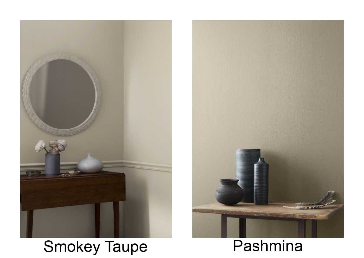
- Smoky Taupe (BM 983): Soft and sophisticated, Smoky Taupe reads as a classic mid-tone taupe. This is one of Benjamin Moore’s most versitile mid-tone taupe paint colors and only get’s purplish notes at the very end of the day or in darker days of winter.
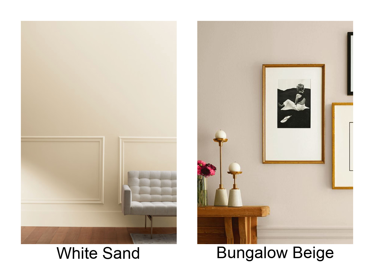
- Bungalow Beige (SW 7511): More saturated than Accessible Beige, and a great one if you’re torn between beige and taupe because it has more warmth that my other picks.
- Indian River (BM 985): With an LRV of 36 I’d reserve this for high-drama spaces (like a moody dining room or small bathroom) or to paint cabinetry or millwork. I used it in a small guest bathroom and Smoky Taupe in the adjacent guestroom.
- Stone Hearth (BM 984): I adore this color and think it is a great alternative to Accessible Beige. They have a similar value, but stone hearth has more green to it, so it will goes nicely with warm wood tones.
- Shiitake (SW 9173): I’ve used this one in my color consultations. If you like Accessible Beige, this is like a darker version of it.
- Pashmina (BM AD-100): Super popular taupe with a darker LRV 44.2. This can even work on an exterior! It’s lovely with grayed out off-whites and ashy pale oak wood tones.
- Briarwood (BM 1016): A deeper, earthy taupe that adds depth without going too gray.
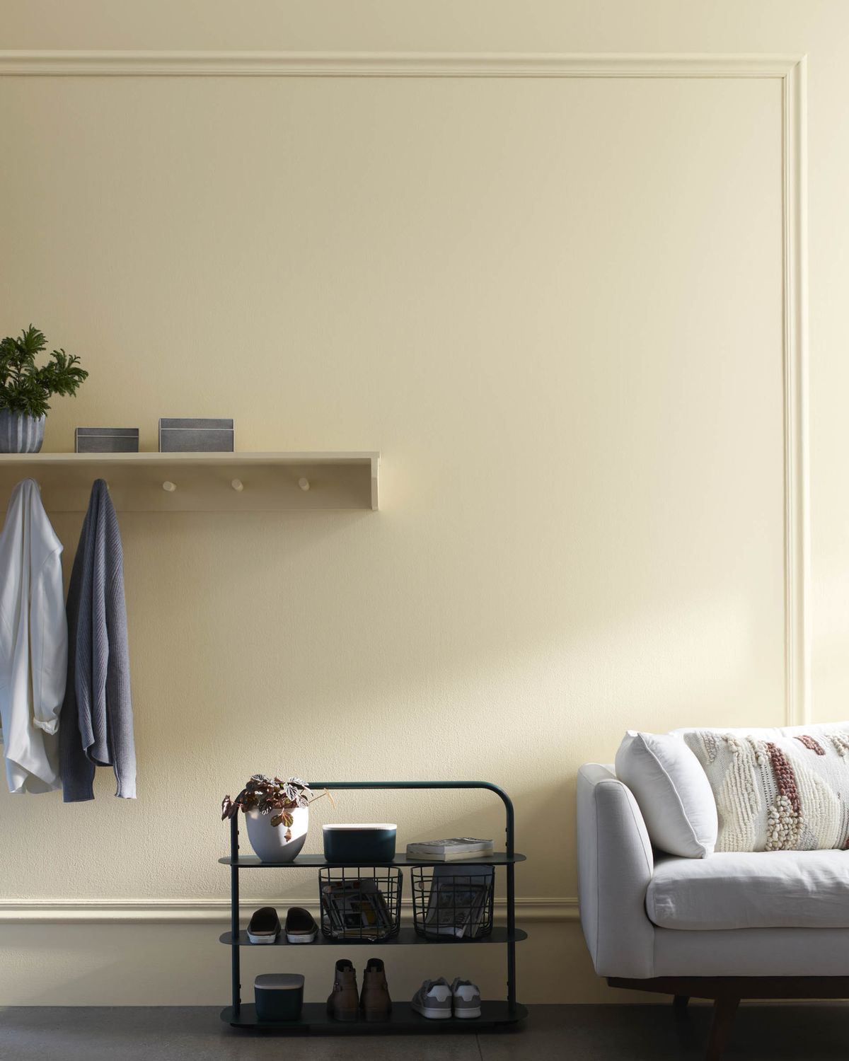
Beige Paint Colors to Consider
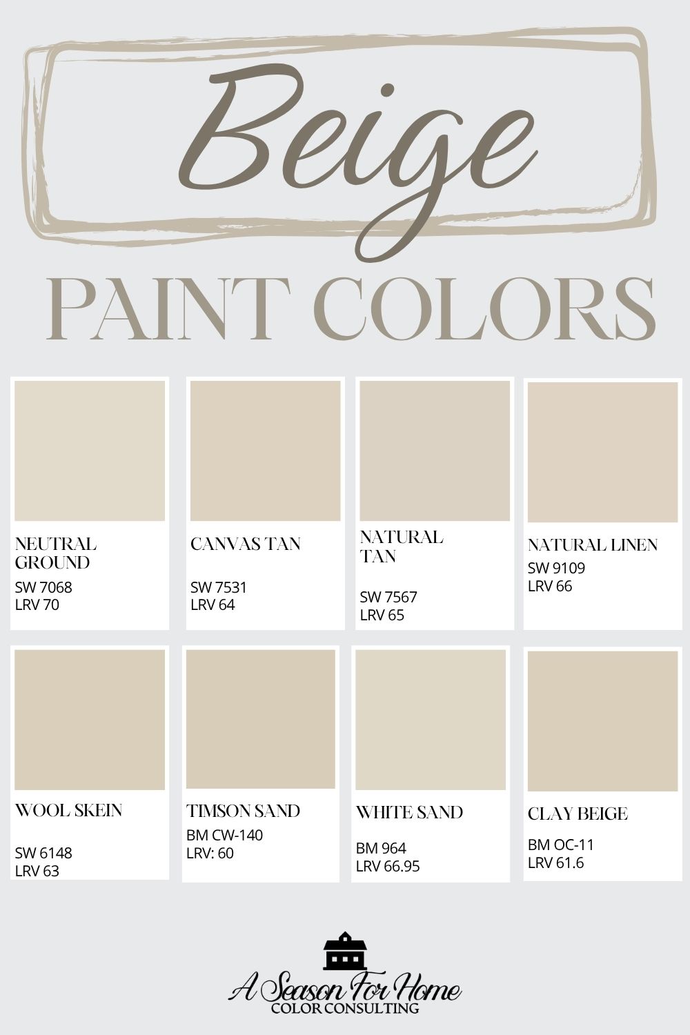
For those drawn to a lighter, more traditional neutral, these updated beiges stay clear of the heavy gold tones of years past:
- Neutral Ground (SW 7568): A modern beige with subtle warmth that works beautifully in open spaces. One of my all time go-to paint colors!
- Canvas Tan (SW 7531): While it lives in the off-whites collection for Sherwin-Williams, don’t let that fool you. There is plenty of beige personality in this paint color to call it part of this collection. It has nice warmth wihtout heaviness.
- Natural Linen (SW 9109): In low lights this warm neutrals is bordering on greige but in sunnier spaces it feels warm and creamy. I’ve used this in color consultations quite a bit. It is a good fall-back neutral that can work on kitchen cabinets or walls.
- Wool Skein (SW 6148): This khaki-backed beige is light and soft. While Wool Skein does have subtle hidden green undertones they are lacking in saturation so it plays well with other colors, especially earthy greens and brick tones.
- Natural Tan (SW 7567): A light and airy beige with balance. It is a modern take on a beige which gives it appeal for designers.
- Timson Sand (BM CW-140): This cooler beige comes from the Williamsburg Collection, which means it’s based on a historically researched pigment. Today it brings warmth into a space without harsh yellows.
- White Sand (BM 964): This has a whisper of pink undertones in it without becoming bratty thanks to a bit of yellow that balances it. It is light in value (LRV 67) which makes it a great whole-house option paired with white trim.
The Bottom Line
The best way to tell taupe and beige apart is to compare them side by side and to a neutral gray. Beige tends to feel warmer and more saturated, while taupe feels a bit cooler and grayed out.
As design trends have shifted away from gray, homeowners are looking for warmth in their space, but they are not quite ready to head back to the rich gold tones of the early 2000s. Todays beiges are softer and less saturated, and are a great option if you have fixed elements in your home (like tiles and countertops) that have a good amount of warmth. Taupes may be your best bet if you are looking to warm up a gray interior, or find yellow tones too harsh for your taste.
Ultimately testing the colors in your space is the best way to tell if they are right for you. And if you are still struggling with a paint color choice, I am just a click away. Shoot me a message via my contact page or sign up for a virtaual color consultation!
Hello Katie
I have ‘interviewed’ so many of your suggested neutrals and appreciate your observations. My dilemma, however, is that my honey oak floors (prominent orange/yellow ) tend to skew the wall colours. BM Tapestry Beige turned yellow/pink (eww!)at the base, green above. Canvas Tan is very peach, Edgecomb Gray is green with pink bits, especially with the overhead lights on, Accessible Beige is heavy and seems very taupe. I’m looking for a neutral, lightish colour but have been told I need to go darker and grayer. Which doesn’t seem to work in my space.
I like my floors and am keeping them. But wonder if is there a solution and if so, could you share it with me?
Thanks
Patricia
Hi Patricia, Thanks so much for reaching out. You may want to look at some good old fashioned beige paint colors. The lower-saturation greige and taupes you mentioned above are probably too cool in comparison to the brightly colored oak flooring. Look at Shaker Beige (darker) by BM or White Sand (lighter). These won’t fight with the floors because they are more of the same undertones but soft and neutral. If they feel too rich, the other option would be Bungalow Beige or River’s Edge by SW. These are a little less warm/saturated. The other thing I always suggest is to think about an non-neutral! Like a soft blue or pale gold. I am not sure what your other decor is, so maybe these examples aren’t right. But my point is, a lot of times neutrals can be the trickiest to nail down, and a “color” can feel better.
Oh and one more thing. Make sure to look at the paint colors with the lights off during daylight hours. The descriptions you mentioned above lead me to believe that you may have been noticing the cast from the bulbs.