Color Value
Have you ever wondered what color value means? In our color theory series, we’ve covered hue, saturation and chroma. Today we are discussing another important defining property of color: its value. In essence, this is the darkness or lightness of a color. However, there is much to learn about color value! So read on to understand why representing a range of color values throughout a space is an essential way to create contrast and harmony. You’ll also learn how we measure color value and how you can see if your space has a good balance of values.
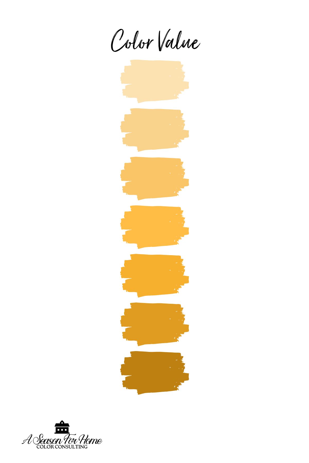
What is Color Value?
Color value refers to how light or dark a color is, and it plays a big role in how a room feels. Think of it like a scale from white to black—every color falls somewhere on that scale. A pale blush pink and a deep burgundy might technically be the same hue (both red-based), but their values are totally different. Understanding color value helps you make smarter decorating choices because it affects everything from how spacious a room feels to how easy it is to read a paint swatch or coordinate furniture.
Think of a gray scale from white to black and everything in between. Once you can visualize that you can understand value.

One of the most practical reasons to pay attention to the value of your paint colors, textiles and surfaces is contrast. High contrast, like pairing light walls with dark furniture, can add energy and definition to a space.

Low contrast color pairings will feel more subtle and understated. Finding the right balance can be tricky. If everything in a room is the same value, it can feel flat or one-note. Or if a room is too high contrast, it will feel stark and unwelcoming. But when you mix light, medium, and dark tones intentionally, it adds visual interest and depth, even if you’re working with a neutral palette.
How is Color Value Measured?
When it comes to house paints, color’s value is measured on a scale called Light Reflectance Value or LRV. LRV measures the amount of visible light a color reflects, on a scale from 0 to 100, with 0 representing absolute black or no light reflected, and 100 is pure white, with maximum light reflected.

- Colors with a high value (or high LRV) are lighter, like soft pastels or whites, which reflect more light.
- Colors with a low value (or low LRV) are darker, like deep navy or charcoal, which absorb more light.
I recommend waiting on picking a paint color until after all of the other interior decorating elements have started to come together. Even though I love paint colors, they shouldn’t drive the other decor, nor be the star of the show! This way, you can also satisfy an area of the value scale where other materials and textiles have left holes.
How To Use Value In Interior Design
The value of color is an important consideration for all aspects of interior design as surfaces and materials throughout the space must be balanced and provide contrast. In my color consultations, value is commonly overlooked.
When a space feels overly contrasty, or falls flat: value is often the culprit! It is important for high contrast schemes to incorporate mid-tones, and it is important for monochromatic, subtle interiors to include values at the far ends of the scale too!
In the example below on the image on the left from Architectural Digest, the black window hardware is one of the only dark elements in the room, and they really pop. In the example on the right, I asked Chat GPT to add some dark pillows and a bold high contrast piece of art to help draw values from the far ends of the value range.

Adding pops of high-contrast elements throughout the space helps to balance the otherwise relatively low-contrast interior. Repetition of the dark values takes some of the focus away from the window hardware.
How To Know If Your Space Needs More Or Less Contrast
If you are not sure if you have overdone it with a high contrast look (I’m looking at you Black and White Farmhouse!), or you think you space feels flat, there’s an easy way to assess your space for value. Simply take some photos with your smartphone and then turn them into a black and white photograph. When you see your space in a gray scale you will be able to easily identify if you need more mid tones or more high contrast elements in your interior design.

In the above example from Joanna Wood in House and Garden, you can see she used a range of values, from white to black and many mid-tones in between. I think her use of a mid-tone paint color for the walls and white trim on the window was an excellent choice for exactly this reason! This provides a good deal of mid tone color value and a pop of high contrast white to make the look feel lively and fresh.
3 Tips For Decorating with Color Values Like A Pro:
Now that you know what color value is, you will notice it everywhere and it can seem overwhelming to know how to start fixing spaces that lack contrast (or that have too much.) Use one of these three tips to help make this process more systematic.
1. Add Depth To a Monochromatic Room
When decorating with a monochromatic color scheme, picking shades of the same color in a range of values can provide interest to the space. This will help soften a high contrast look and make it feel more approachable and livable.

2. Use a Color Scheme and Add a Range Of Values
Picking a home color scheme can be easy when you work within the confines of the color wheel. You can further narrow your color choices within common color pairings, like complementary or analogous schemes, by picking a range of values. For example, picking a soft peach and a navy blue would be a way to pull colors from opposite ends of the value range, and stay within a complementary color scheme.

3. Decorating with Color Values in Neutrals
Don’t forget that neutrals have a range of values too. Dark wood flooring can provide the needed depth on the darkest end of the range, while lighter neutral paint colors like Navajo White or Benjamin Moore Muslin can provide lighter value.
If you went all in on the black and white trend and now feel your space is too high contrast- it’s probably because it lacks mid tones- try painting your all-white walls with one of my favorite neutral paint colors: Smokey Taupe or get a similar effect from one of these neutral paint colors for minimalists.
Are you thinking of hiring a color consultant? I offer virtual consultations to clients all over the US. Sign up today!