Ballet White Benjamin Moore Review

As a certified color expert, I’ve seen my share of off-whites and warm neutrals—but Ballet White by Benjamin Moore is one I keep coming back to. It’s a color I’ve personally used in my own home and have recommended to many of my color consulting clients. It is bright without feeling blank, so it is a great choice to lighten a space without adding too much personality. Read on to find out all about this popular paint color, and get my free whole-house color pallet for Ballet White.
My favorite thing about BM Ballet White OC-9 is that it lacks any bossy tonality or noticible undertones. I go to it over and over again when someone wants a paint color other than white, but doesn’t really want much color at all!
What Color is Ballet White Benjamin Moore?
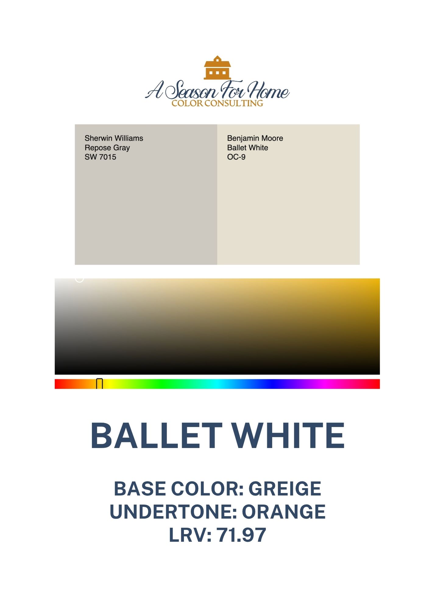
Ballet White (OC-9) is a beautifully balanced, soft neutral that sits somewhere between an off-white and a light greige. It’s part of Benjamin Moore’s Off-White Collection, which includes some of their most versatile, designer-loved shades. Ballet White has a creamy warmth that gives it a gentle, inviting feel without trending yellow.
In natural light, it feels fresh and soft without being stark. In low light, I’ve noticed that it deepens into the gray side of its personality, while retaining just enough warmth to prevent it from looking like a gray paint color. In sunnier rooms it can lean peachy at times.
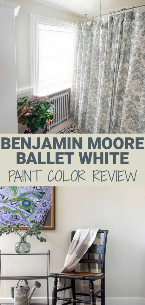
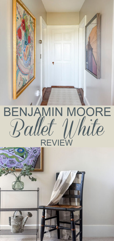
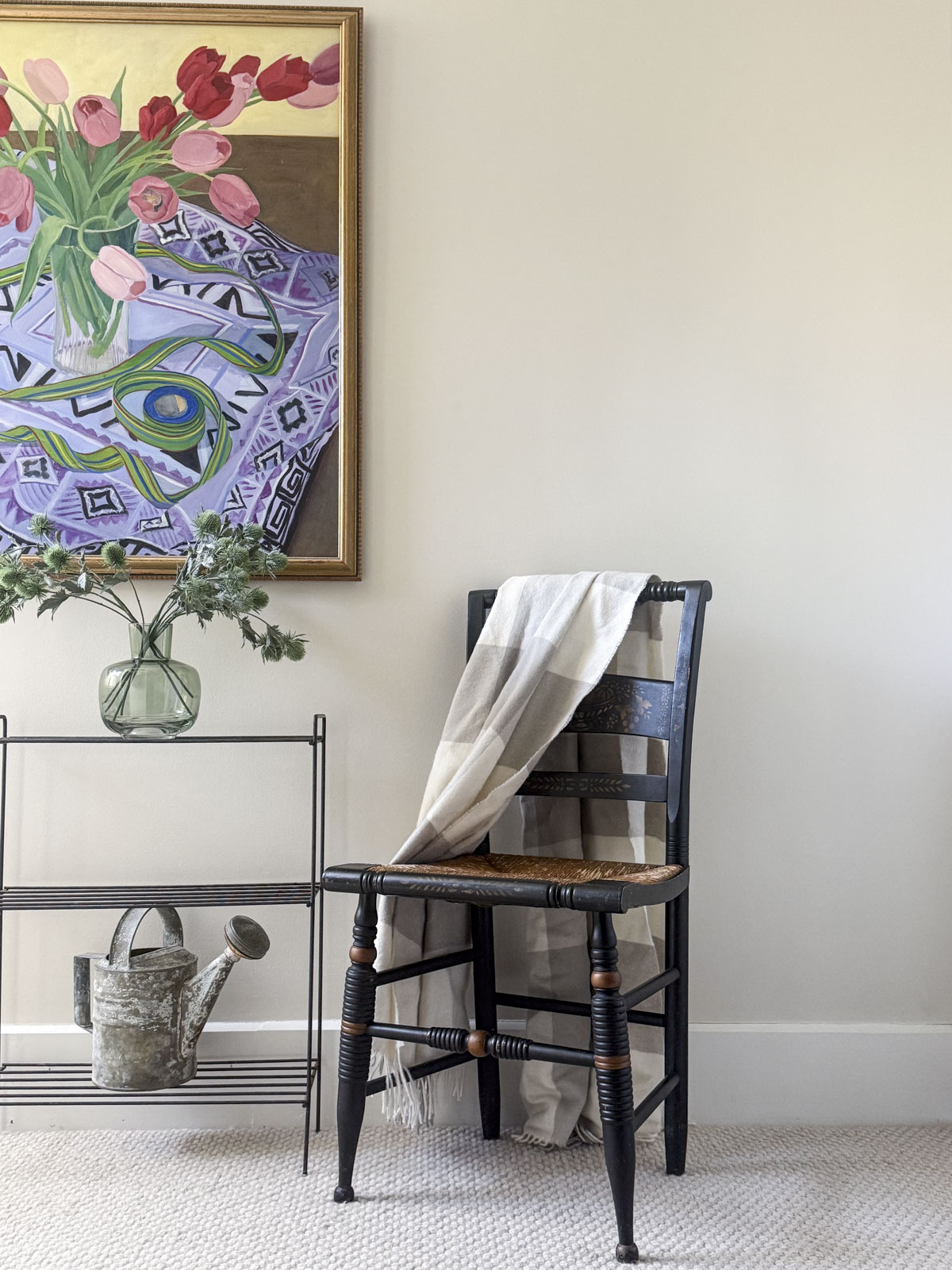
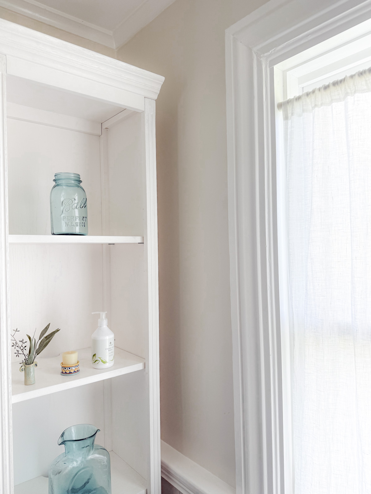
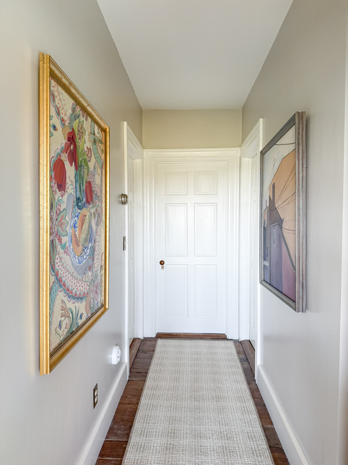
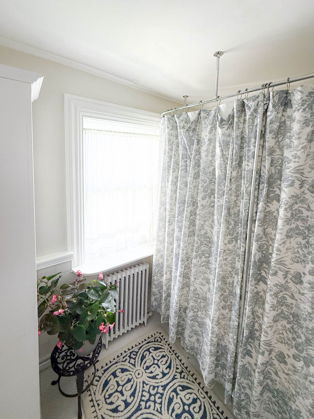
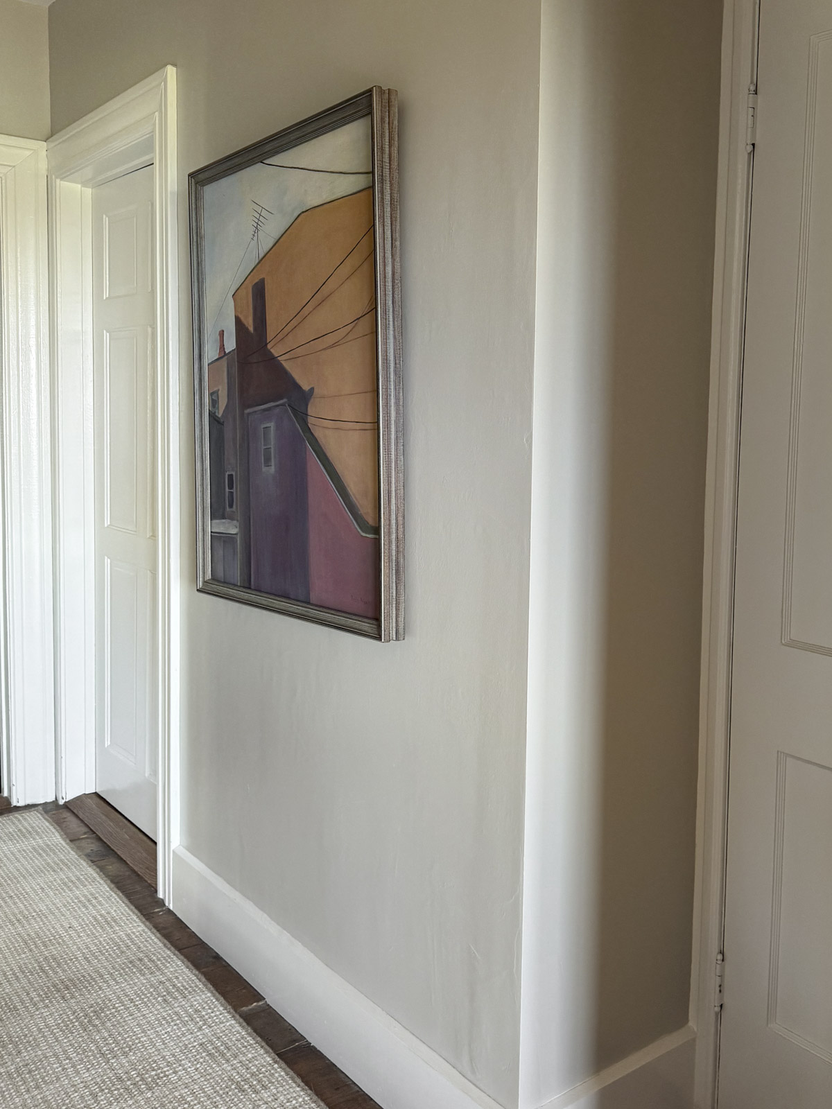
In my house I used it in our primary suite. Our bedroom is painted Benjamin Moore Natural Cream, and I used Ballet White which is a bit lighter, just in the darker hallway and dressing room. In my work as a professional color consultant, it is one of the Minimalist Paint Colors I turn to again and again for clients who don’t want to paint their walls white but who are looking for a bright neutral that won’t darken their space.
What is the LRV of BM Ballet White?
Ballet White has an LRV (Light Reflectance Value) of 73.54, which means it reflects a good amount of light while still having enough body to show up clearly on the wall. Its color value is bright enough to keep a space feeling open and airy but not so light that it washes out. In other words, it’s the kind of neutral that looks intentional, not just “painted white.”
What Are Its Undertones?
Ballet White has warm undertones with a mix of beige and gray, and a very subtle hint of peach. It’s like a greige with a creamy twist. The undertones are soft and muted, which helps the color stay neutral and flexible. It rolls from lightly peachy to warm gray depending on the lighting exposure.
Notes About Lighting and Exposure
As with any paint color, lighting makes all the difference.
- In the winter, I have noticed a cooler green-gray tonality in the spaces in our primary suite (those that don’t have much direct light.) While I personally do not have Ballet White in North Facing spaces, I can surmise that without direct light, you’ll notice this cooler gray quality more.
- In our daughter’s East Facing bathroom, there is quite a bit of reflection that pulls out the warmth.
- When the setting sun hits our West-facing dressing room, Ballet White has a soft peachiness that feels lovely. In rooms with southern exporsure warm light brings out any paint color’s warmth.
If you’re using Ballet White throughout your home, these shifts in tone can actually be a strength. The color adapts beautifully to changing light, which is one reason it works so well as a whole-house color.
Whites to Pair with Ballet White by Benjamin Moore
Because Ballet White leans warm, it pairs best with softer, warmer whites rather than crisp, cool ones. A few great options include:
- Benjamin Moore White Dove (OC-17): a soft, creamy white that complements Ballet White without feeling too yellow. All of the photos in this post show White Dove trim and ceilings.
- Sherwin-Williams Pure White SW 7005: This tried and true all-purpose white is a great match for Ballet White. I’ve included it in our Ballet White Color Palette below.
- Benjamin Moore Simply White (OC-117): Slightly brighter and cleaner than White Dove, it’s perfect for trim if you want more contrast.
- Benjamin Moore Swiss Coffee (OC-45): adds a tone-on-tone warmth that feels cohesive and cozy.
Ballet White Color Palette
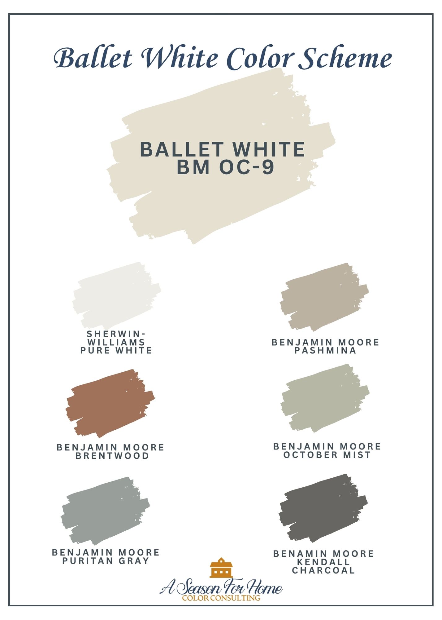
Ballet white is an ideal whole-house color! Use this Ballet White Color Palette to plan your home’s interior. It’s lovely for large open concept living spaces. Or use it in transitional spaces (like your foyer and hallways) and the accent colors for rooms off of the main space.
- Sherwin Williams Pure White: This softened white has a smidge of gray and warmth to it that goes with nearly every paint color. This is a beauty paired with Ballet White. It is crisp without feeling dated or stark
- Benjamin Moore Pashmina: Use this soft taupe in spaces adjacent to BM Ballet White when you want an enveloping coziness. It is great for a family room or home office.
- Benjamin Moore Brentwood: I love the way rich terracottas and low chroma reds look with Ballet White Benjamin Moore. Paint built-ins or cabinets in this russet color with Ballet White on the walls for a look with classic appeal. I’d encourage you to fins accessories in this hue as well to repeat this color through your space.
- Benjamin Moore October Mist: This softened green is a notch lighter than Creekside Green and appeals to those who favor lighter tones like Ballet White. October Mist and Ballet White would make a stunning combo in a kitchen!
- Benjamin Moore Puritain Gray: Don’t let the name fool you, this is a blue paint color without any vibrant saturation. It looks so good with reverse trim. You could also use it to paint furniture pieces in a bedroom painted Ballet White.
- Benjamin Moore Kendall Charcoal: Instead of a harsh black, opt to give your scheme depth with a little softness. I love Kendall Charcoal for its warmth while lacking any overt yellow tones.
If this paint color scheme isn’t perfect for you, but you love the idea of having a planned out cohesive color palette, make sure you download our 5-free color palettes.
How to Use in Your Home
Ballet White is one of those colors that truly shines as a whole-house paint color. It flows beautifully from room to room, creating a sense of continuity and calm. It’s especially well-suited for open-concept homes where you want subtle variation without sharp transitions.
As you map out your home’s color palette, remember that it’s important to create flow from room to room. Ballet White can help smooth this transition in any hallways or spaces where a more colorful hue would feel jarring. I like to use colors like this in hallways and large
It brightens a space and pairs well with warm wood tones, woven textures, or brass accents. This is the ideal color to use in an Accented Neutral Color Scheme. In bedrooms and living spaces, it provides the perfect soft backdrop for art and textiles without feeling flat or sterile.
If you have a vaulted ceiling, Ballet White is light enough to use on the walls and ceiling, which will help to avoid the patchy effect created by the angles where the walls and ceiling join.
Ballet White for Exterior
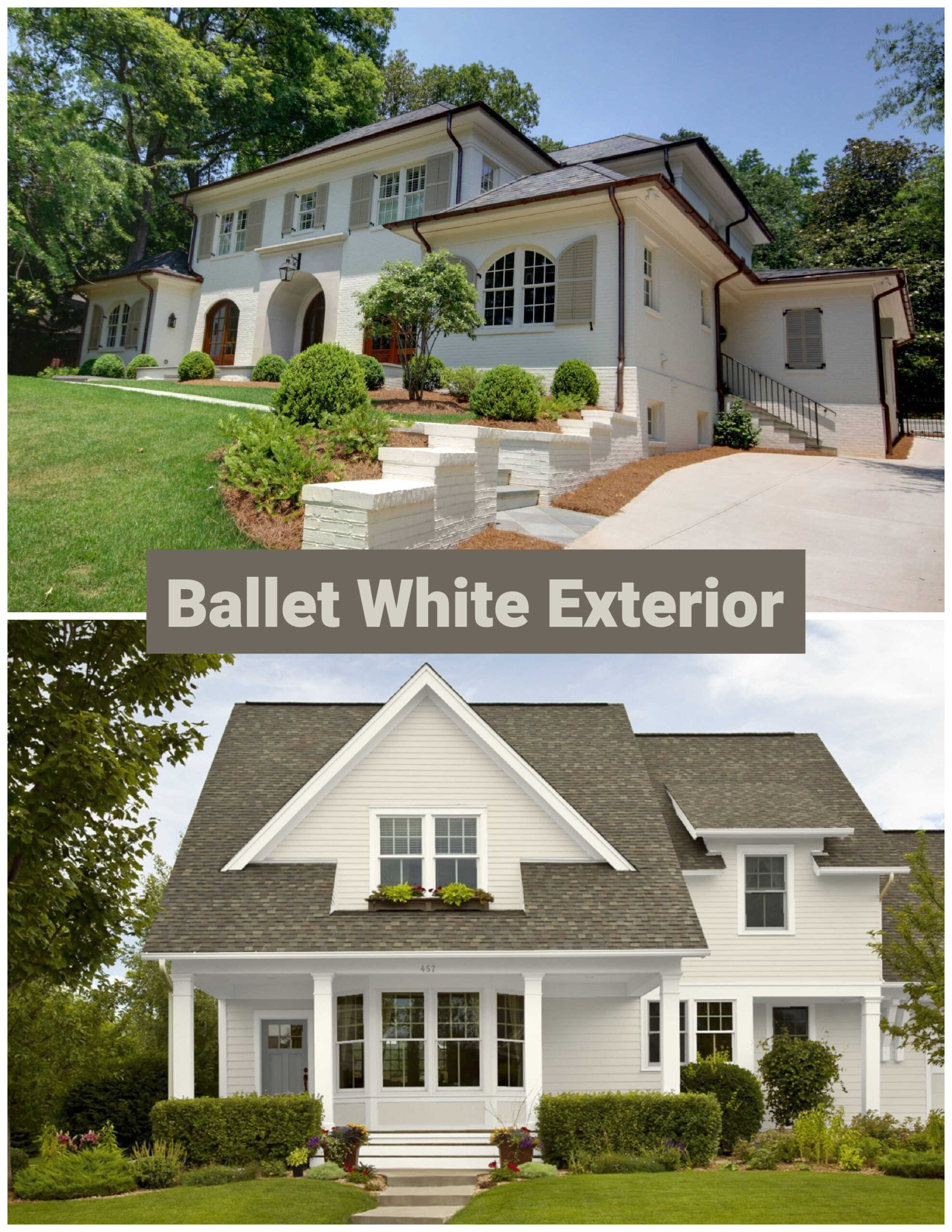
For exteriors, Ballet White reads as a creamy off-white. It won’t look stark in bright sunlight, and it maintains just enough warmth to complement both stone and brick. Paired with a crisp white trim and soft black accents like Benjamin Moore Wrought Iron, it creates a balanced, classic look.
Ballet White Cabinets
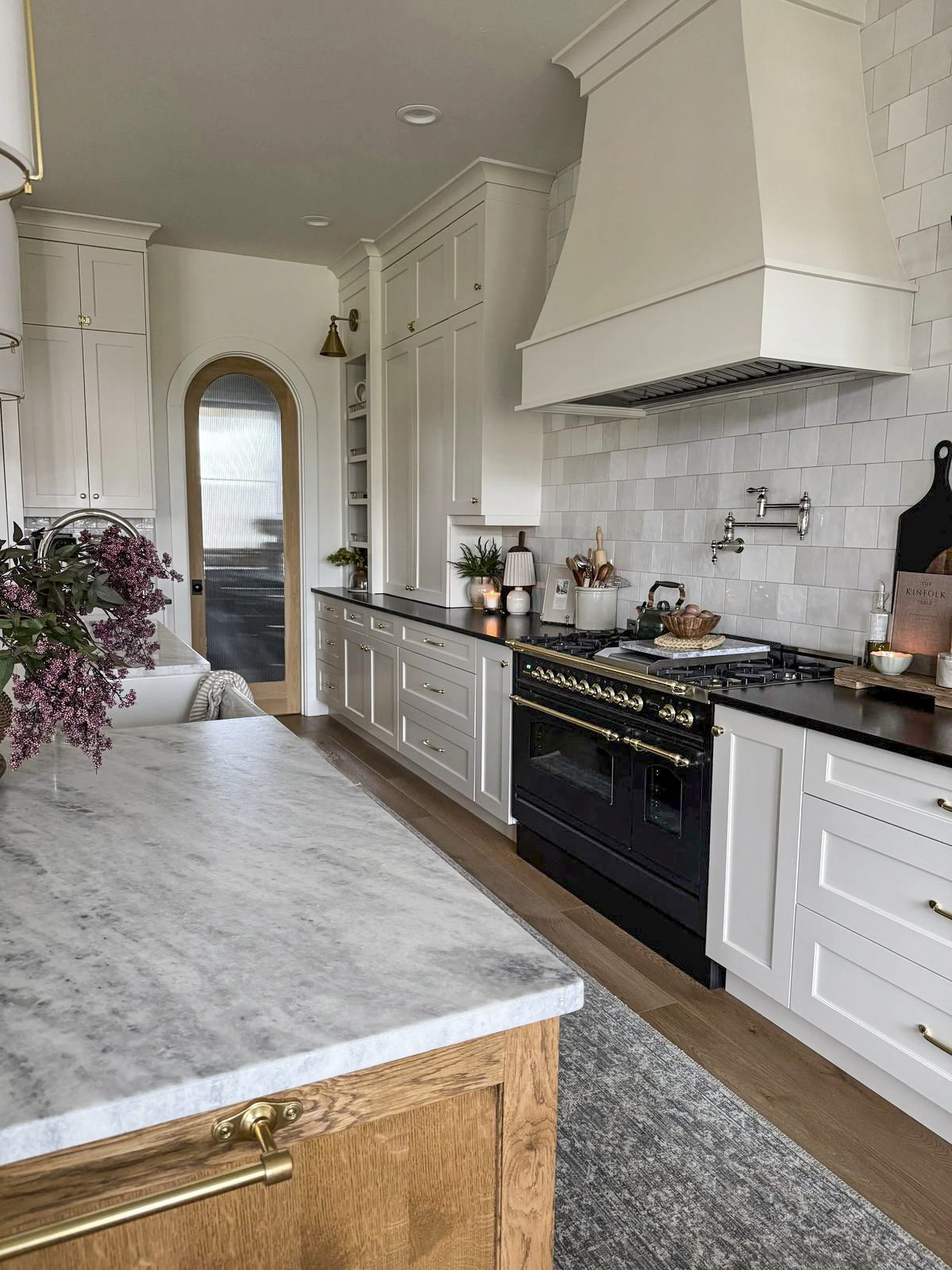
Ballet White kitchen cabinets are a great option if you are thinking of white cabinets, but want something a little creamier or warmer. Pair the cabinets with marble-like quartz or natural stone countertops, light wood floors, and brass hardware for a lighter feel. To balance the brightness of the Ballet White you could opt for a darker countertop like granite or soapstone to offer contrast. If you love the trend toward a Cashmere Kitchen, defintely look at Ballet White as an option!
Similar Colors to Try
If you’re drawn to Ballet White but want to explore a few close alternatives, consider:
- Benjamin Moore Classic Gray (OC-23) – a lighter, cooler and whispy option that passes as white when color drenched. To see its effermal warmer character pair it with a stark white like Chantilly lace or a cool white like Decorator’s White.
- Benjamin Moore Natural Cream – Natural Cream is a touch darker than Ballet White and a good choice to paint in adjacent spaces with more natural light. This is a very popular color (for a reason) and another great one to look at for cabinetry.
- Sherwin-Williams Accessible Beige (SW 7036) – a comparable taupey greige paint color with considerably more depth.
- Benjamin Moore Winds Breath (OC-24) – similar softness, a bit less warmth. This paint color can look light gray in certain houses- but is a good shade to look at if you want a barely there look.
How to Know if Ballet White Is Right for Your Home
The best way to know if Ballet White will work in your space is to test it. Paint a few large swatches on different walls and observe how it changes throughout the day. Look at it next to your trim, flooring, and furnishings—these fixed elements will affect how the undertones appear.
If you’re looking for a color that feels calm, timeless, and elegant without being too white or too beige, Ballet White might just be the perfect middle ground. It’s one of those colors that quietly supports everything around it, and in my experience, that’s exactly what makes it so enduring.
More Warm Neutral Paint Colors
If you are researching neutral paint colors don’t miss these other color reviews.
- Benjamin Moore Tapestry Beige: This greige has a subtle touch of green
- Benjamin Moore Collingwood: This is a more gray option if Ballet feels too warm for you.
- Muslin by Benjamin Moore: A soft pink undertone gives this beige a bit of character without clashing
- Navajo White by Benjamin Moore: A popular cream paint color with peachy undertones
- Sherwin-Williams Wool Skein: A soft khaki with very little saturation.
- Smoky Taupe by Benjamin Moore: A mid-tone taupe without any brassy undertones. So if you like greige and taupes vs beige, this is one to look at. Consider it for additional spaces in your home if you like Ballet!
If you are still not sure, sign up for a one on one virtual color consultation with me!
I used Windsbreath in my north facing living room,dining room space, it’s beautiful, do you think Collingwood would look good adjacent in a 2 story entryway also north facing? there is carpeted stairs in a gray with purple undertones.
I think more purplish gray may be too much with the carpet. Instead try going with another greige like Wind’s Breath with a slight greenish undertone. But go one shade darker. In a vaulted space you want to use a slightly darker LRV so it doesn’t feel the walls look like you left them blank by mistake. I think Edgecomb Gray would be a much better choice than Collingwood. It won’t feel too yellow but has more body than Wind’s Breath. Please let me know what you decide to do!
I was going to paint my whole house ballet white. Would you advise against doing the trim and ceilings ballet white too?
I love Ballet White drenched in a space. It is so soft that you can totally do this and the look is not only more current/on trend but it is flattering. It’s like adding a filter to a photo! It’ll just soften the whole space. If you go through with it, please report back. I would LOVE to see photos!
What do you think of Sherwin Williams Accessible Beige(on the walls without tile) in a bathroom with tile (Romana Bianca;Floor & Decor tile store) of white & beige marble shower. White with beige striation on the floor too. Hickory dark wood trim and doors. Champaign gold fixtures and glass doors. No windows.
The second bathroom is the same tile. It is in a little girls room. I would like to use a pink that is more white than pink. Can you recommend a white with a hint of pink. Is pink a bad idea? I want to add a sweet girl touch. (Maybe Sherwin Williams White Dogwood??
Thank you for your reply.
Karen
Hi Karen, thanks for reaching out. My recommendation is to get samples of everything together. Put them all in natural light (no artificial) and then look at them together. If the undertones clash, you should be able to see it. Double check with the lighting in the room you’re using the samples. And also check in the room with the lights on since there are no windows in the first bathroom. It is really hard for me to know not seeing actual photos (taken in natural light with a white card that are color corrected) or seeing the samples in the space so I can only make an educated guess based on internet photos. Given all that: To me it looks like Romana Bianca has a yellow undertone that would not work with the cooler tones in Accessible Beige. Accessible Beige is a soft taupe which is a desaturated and more grayed out warm neutral. You may have better luck with another one that is slightly warmer like Bungalow Beige or Minimalist from Sherwin Williams. You could also look at Wool Skein which I think would go with that tile better. It is a soft khaki and has a slight hidden green undertone that looks like it would go with these tiles better. Maybe order samples of all of these paints. Third, as far as a pink, I am not a fan of White Dogwood color because it looks too clean and lacks sophistication. I like a warmer peachier tone with a complexity like Tissue Pink by Benjamin Moore. This complexity should pair with the tones in the warm neutral tiles. Note neither pink paint color will feel white so I am not sure this is what you are looking for. They will be pink. If you want a pink white look at Atrium White by Benjamin Moore. As far as them going with the tiles, I would again advise you to gather the samples and look at them together to see if they go. Best of luck! Hope this helps.
I have Ballet White for trim and I love it. However, I would like to paint my dining room a warm gold/yellow. Is there a gold/yellow paint you would recommend with Ballet White. Thank you, Kelly
Oh, yes! Love this idea. What about Philadelphia Cream by Benjamin Moore- it is buttery, warm and complex without looking too saturated next to the Ballet White. They have a similar LRV and Philadelphia Cream is not too overtly yellow to look childish compared to Ballet White.
Thank you soooo much for this thorough article! You’ve made a hard decision so much easier. A question, we have popcorn ceilings (which I’m not a fan of but they are too expensive and too much trouble to remove), would you paint them Ballet White as well? I’m going to go with the White Dove for trim and baseboards.
If there is no trim where the wall meets the ceiling you could choose either Ballet White or White Dove. White Dove will reflect more light into the room whereas the Ballet White will meld into the walls a bit more. Either way, using a flat sheen on the ceiling is essential to minimize the texture of the popcorn. For the trim you’ll want to use semi-gloss as it is the most durable. If you do have a strip of trim or crown moulding at the top of the wall (where it meets the ceiling) you will want to use White on the ceiling or it will stand out too much against the trim (and you don’t want that.)
Thank you, this helped to solidify I’m going to use Ballet White for our new build kitchen cabinets. I’m wanting to color drench the walls and trim (and I still need to figure out the ceiling) in the same color that’s lighter than Ballet White, what color would you suggest for that?
I looked through my fan decks and I kept returning to White Dove by Benjamin Moore. If you have good light in your new kitchen I think this would be a safe choice. If it is a darker room, let me know. If you want a more tone-on-tone look you could do Soft Chamois by BM. I also like Futon by SW with it for a lower contrast look.