How To Pick Exterior Paint Colors
If you are wondering how to pick the perfect exterior paint colors for your home, read on for my step-by-step method to choosing the ideal paint colors for your home’s exterior.
Being married to a builder for more than 20 years, I have helped pick exterior paint colors for countless houses. I have made my share of mistakes, and I have learned a lot along the way. So if you want to skip the expensive and embarrassing trial and error part of picking a house exterior color scheme, read on. Today I am sharing my complete guide to picking your home paint colors.
Highlights For This Guide
We will cover the following essential points in our discussion:
- Why window and roof colors are a key consideration
- How light will change your paint colors
- Why your house style and neighborhood are important factors
- How to create harmony with your exterior trim and accent colors
And more! Read on to learn how to pick exterior paint colors with confidence!
How To Create a cohesive Exterior Paint scheme
Picking a house siding paint color is much more than going to the paint store and picking out a color you like. And just because a color looks good on Pinterest doesn’t mean it will look good on your house. That’s because the color of siding doesn’t exist in a vacuum and you will have to consider all the colors on and around your house as one cohesive theme. Full stop.
That’s why I have a list of 12 considerations to help you find the ideal color scheme for your house exterior. So before you go looking for the perfect green paint color for exteriors, read this guide first!
1: Work With Your Fixed Elements
When I work with clients for color consultations, identifying the fixed elements is always the first step!
Ask yourself “What isn’t being painted?” These are our fixed elements. Examples of fixed elements for exteriors include stones, metal accents, brickwork or stained wood. If you are changing the paint on an existing home, you may be stuck with certain elements that you should not ignore, even if you don’t like them!
That means the color for your siding, trim, shutters and doors must go with the surfaces you won’t be painting like the roof, chimney, foundation, outbuildings, landscaping, hardscaping, other fixed elements and other surrounding elements (and houses.) Once you have identified your fixed elements, you will have to match them or coordinate with them and their undertones.
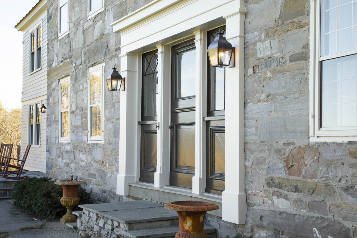
Working With Your Windows
Windows are the number one factor to consider when picking an exterior paint scheme. So your first order of action is to identify if your windows are made of vinyl or wood and whether or not they can be painted. Some can be painted, so you’ll have to check!
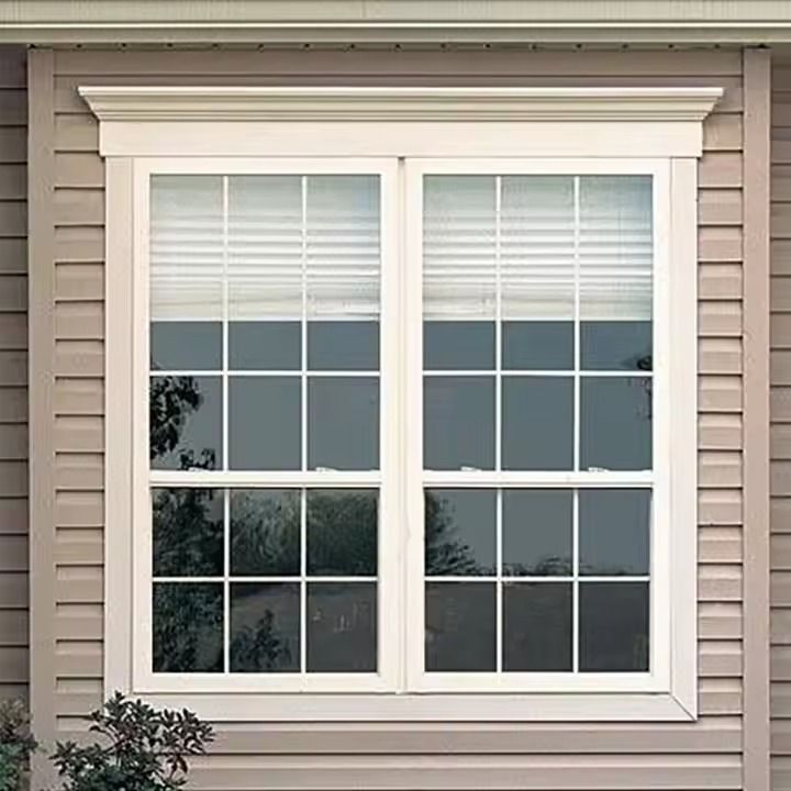
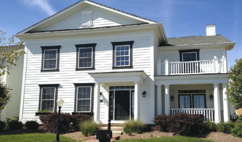
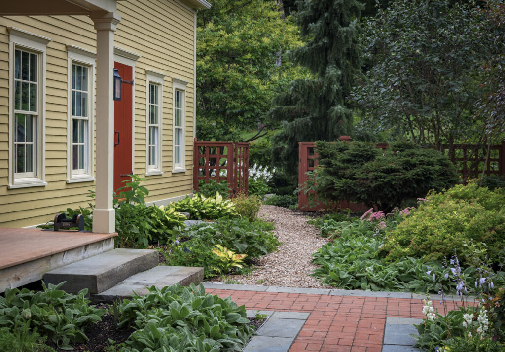
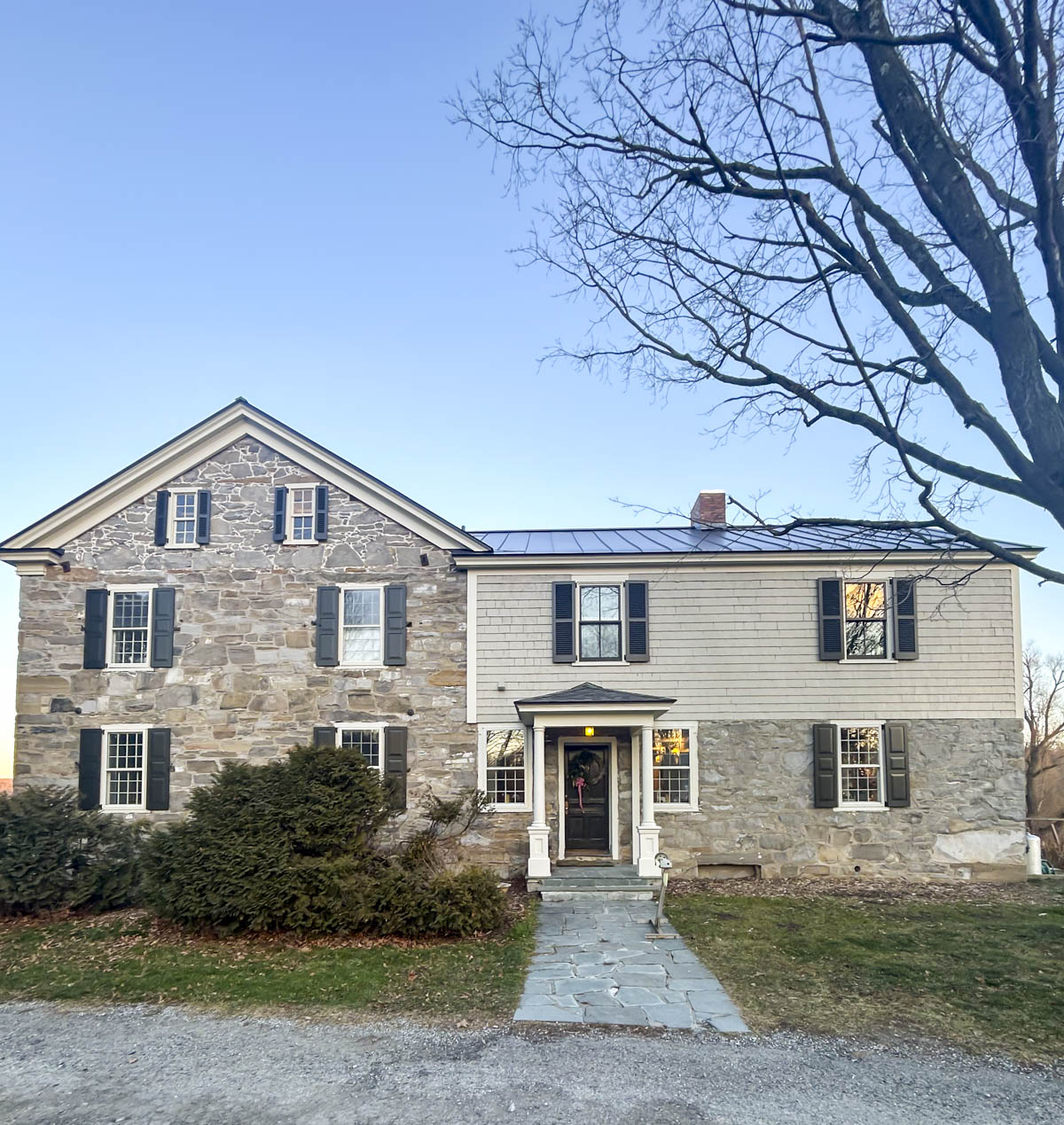
If you have white vinyl windows, you will probably want to find a white paint to match them to make your windows look right. Our eyes like to read the trim and the window as one whole entity, so try to get the two colors as close as possible. See above of a great example of matching window and trim colors successfully.
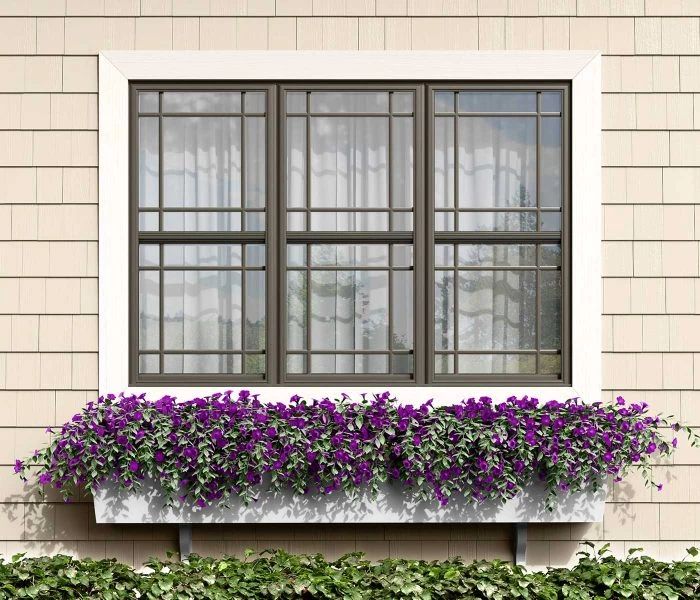
Another option is to contrast the trim with the windows. I find this looks best when using a dark sash with light trim, not the reverse. White windows with black or dark trim can make the windows look inexpensive or inauthentic on a historical home.
More Fixed Elements To Consider
- Stones: Matching your undertones is super important. Compare your stone to a neutral gray to see if it is warmer or cooler. Treat a slate roof as you would stone elements and compare it to a neutral gray (like Repose Gray. That’s an affiliate link by the way.)
- Bricks: If you have brickwork, you’ll need to find colors that go with it, including picking one in the correct chroma. More on chroma below.
- Roof: The roof is also a fixed element that must be considered when picking out your paint colors. If you have a green or red roof- you will be very limited for the rest of your scheme! If your asphalt shingles or standing seam is brown- you’ll know that you need to go with warm undertones. For charcoal or black you’ll have more leeway, but make sure you identify the undertones and they are in the same warm vs cool color family as your paints.
No fixed Elements? Picking Colors For New Builds
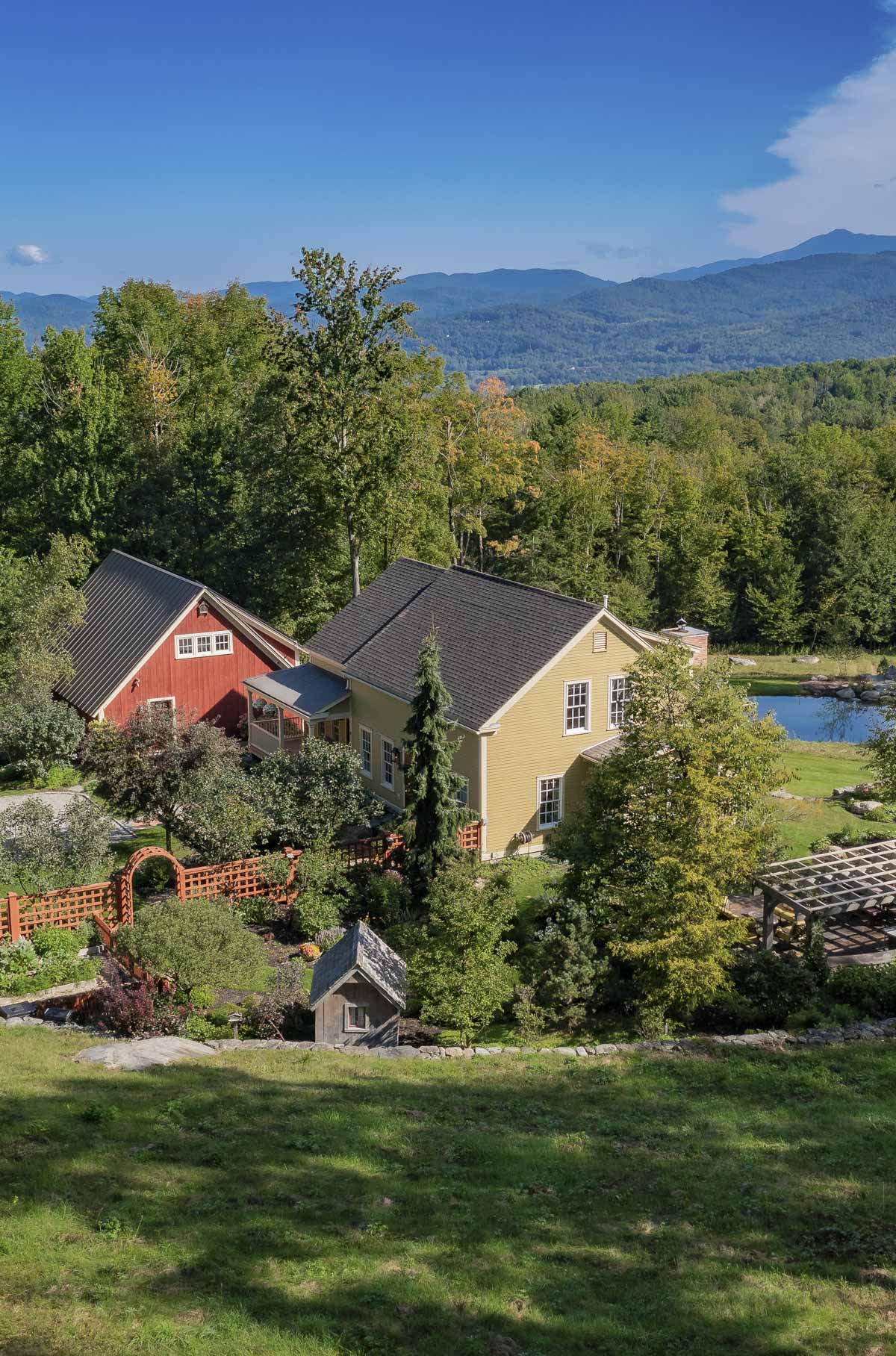
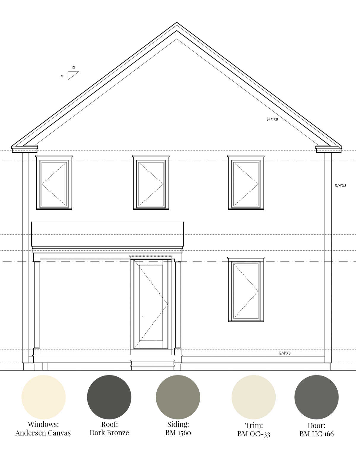
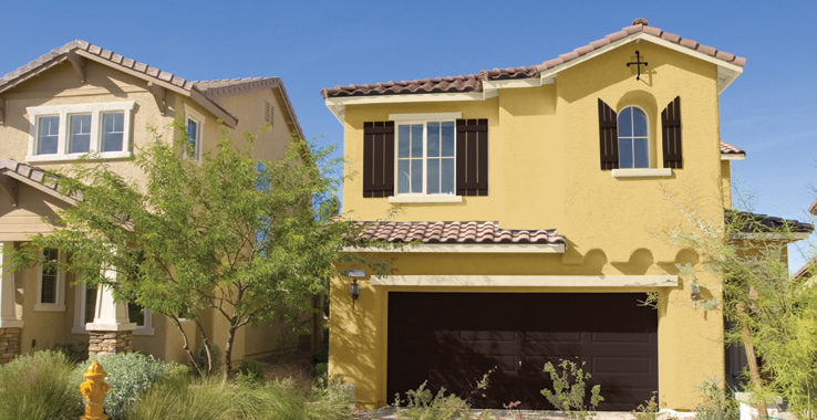
If you are doing a new build, the good news is you can pick your roof and windows as part of the entire scheme. This is where we always start when I help out with my husband’s work. {See above the house we are currently working on.} There are far fewer window and roof colors than paint colors. So if you have the luxury of picking the color of your windows and roof, do that first and then find the perfect paint color to complete the look.
2: Where Do You Live?
Different areas of the country have different color traditions, and even different neighborhoods have their own color customs. In the Mid-West and New England houses are commonly painted muted, low-chroma colors like those found in the historic color collection by Benjamin Moore.
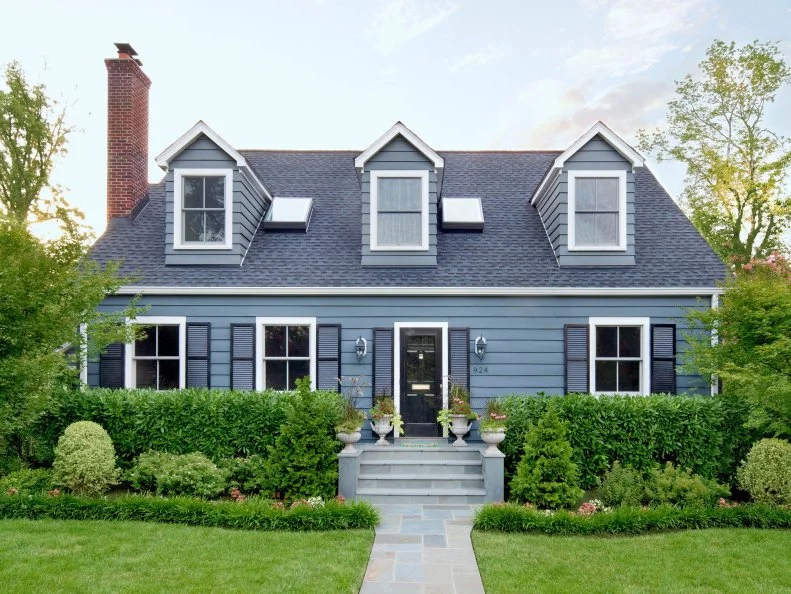
A blue Cape with A-Dormers painted dark blue with navy blue shutters Source: HGTV
In the South, along the coast and in the Southwest, it is common to see houses painted more vibrant colors and colorful pastels. A combo of pastels, earth tones and natural tones are found along the West Coast. Of course these are huge sweeping generalizations, but knowing this can help you narrow your field of paint colors.
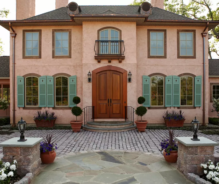
Photo Michael Partenio Source
Another consideration in this category is the weather: If you live in an area with a ton of sun, you may want to avoid very dark paint colors (like deep red, charcoal or black.) This will help keep your house cooler and the paint will not fade as quickly.
Lighting also changes from place to place which can affect house paint colors inside and out! For example strong sunlight in the south will make colors appear warmer whereas in the Pacific Northwest cooler grays can appear more blue.
If you live near the ocean, or in a historic district, take cues from the houses in your surrounding neighborhood to determine your palette.
A note about snow: I live in Vermont, and we get a lot of snow in the winter. I have noticed how the white snow can make certain paint colors (cough cough I’m looking at you pink beige) simply awful. It can also really amplify the grunginess of the splash zone of white paint and make yellowish whites look odd.
Katie’s Pro Tip: I recommend looking at Benjamin Moore’s Regional Palettes or Sherwin Williams Exterior Schemes by region to learn more about exterior color traditions in your part of the county.
3: What style of home is it?
Rules are meant to be broken, but in general, certain paint colors go better with certain styles of homes. For example, a high posted Cape will work best with traditional colonial New England colors while a Mid-Century ranch will look great with dark browns, blacks and warm rich earth tones. Stucco siding in warmer regions and Victorian houses can be painted much more vibrant colors than a Modern Farmhouse which will look great in white or dark primary shades.
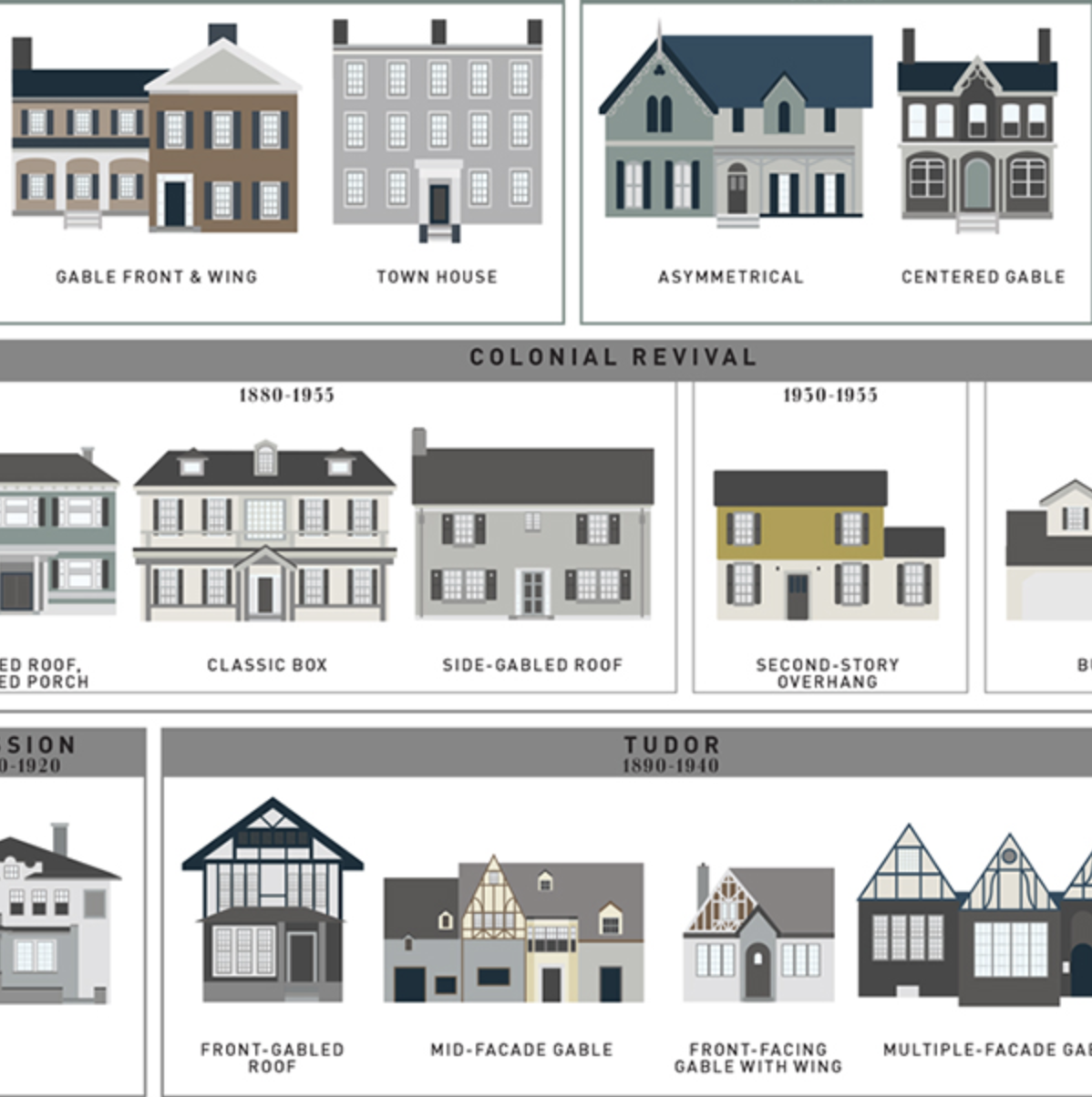
Source: What Style Is That House?
If you are not sure what style of house yours is, look to cues from the other homes built at the same time in your area. How are they painted? This can help point you in the right direction.
Different exterior materials absorb and reflect color in unique ways, which can significantly impact how your chosen paint appears once applied. For example, brick and stucco tend to absorb more light, making colors appear slightly darker and more muted than they do on a paint swatch. On the other hand, wood siding and fiber cement (like Hardie Board) have a smoother, more reflective surface, which can make colors look a bit brighter or more saturated. If you’re painting vinyl siding, keep in mind that darker colors can cause warping due to heat absorption, so some manufacturers recommend sticking to lighter shades specifically formulated for vinyl.
Another key factor to consider is texture—rough surfaces like brick, stone, and shake siding create natural shadows, which can make the overall color appear deeper and more varied. This means that if you’re choosing a warm neutral, it may pull even warmer on a textured surface. Conversely, smooth materials reflect more direct light, often making colors seem slightly lighter than expected. If your home has a mix of materials, it’s crucial to test your paint on each one, as the same color may look different depending on where it’s applied. Taking these material differences into account will help you avoid surprises and ensure your exterior color scheme looks exactly as you envisioned.
4: Identify the Sun Exposure of Main Façade
If the front of your house is North-facing, it will always be in the shade and will look darker and less vibrant. Conversely, sunlight will lighten and brighten Southern-facing facades. Sun helps bring out subtle color undertones. Our door paint looks black on our front door on the north side of our house, but the back doors look deep green in the sun.
Keep this in mind because if the “road side” of your house faces south, you may want to go with a slightly darker shade than you think! And if you notice an unwanted undertone but only in the sun, it is important to avoid those shades. Keep this in mind when you are testing your paint. You will want to choose your test area accordingly.
5: Consider Landscaping (including fences, Driveway Material, outbuildings and gardens)
If you live on a property with a detached garage, barn or other structures, it is important to consider them with the rest of your scheme.
Is your driveway black pavement, blue crushed stone, gravel? If you are not planning to change this, consider this when picking your house colors.
If you want your house to blend into the trees and greenery around it, maybe you’ll choose a deep green paint color. Or if your home is in the desert, a sandy toned paint color will help it go with the landscape.
Another consideration is the shade a tree can provide will darken a color too!
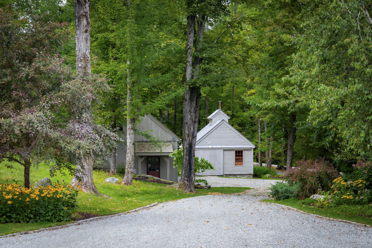
Katie’s Pro Tip: If possible, try to plan ahead. When we built our first house, we knew we wanted to eventually build a red barn. Even though it wasn’t in our budget to do so immediately, it was part of our grand plan. I chose a red for our door and I picked out the barn red as we picked the colors of the siding and door for the house. We went with a historic gold color for the main house, and used a warm red with yellow undertones for the door, fence and barn. Over the 20 years we owned the property we kept the warm tones from the original colors in mind. When we stained our other outbuildings (including our playhouse and sugarhouse, shown above) we used a warm gray stain to go with the warm gold and warm red.
6: Make Sure It Goes with the Neighboring houses
In neighborhoods with small lot sizes and houses packed close, it is essential to look to the right and left of your home and consider the existing colors of the other houses.
Source: Sherwin Williams
Many HOAs and Historic districts will enforce a particular color palette or scheme. In planned developments, the colors are intentionally limited to those that compliment one another. It makes the whole neighborhood look nicer if the houses go together. So be a good neighbor, and make your own house look better while doing so, and pick colors that harmonize with the neighbors.
But before I move on to the next step, note that there is a trick to this! Do not try to match too closely because that can backfire. Think about creating harmony more than copying.
Katie’s Pro Tip: When we picked out our house color, I asked our neighbor if I could bring my paint samples over to look at them next to their siding. I am glad I did because our first choice was so close to their gray that it would have looked too similar, but not in a good way!
7: Go Darker Than You Think
At this point in our process, you have probably narrowed down your paint colors to a general idea and you have probably already selected a few colors that you want to try. I would encourage you to also look at paints with a deeper color value or one or two shades darker.
It’s important to know paint gets super washed out outside in the sun. So what seems like a lovely light greige indoors will look white outdoors.
If you remember nothing else from this post, please, go with a much darker shade of paint than you would use for an interior. Like, way darker than you probably think! Look at Hardy siding standard colors and you will see just how dark you can go on an exterior color.
Use the LRV of the paint color as a guide. Don’t be afraid to choose a color with an LRV in the 20s, 30s or 40s!
8: Don’t go too bright- use muted low chroma colors
This is a matter of opinion, but in my experience, low chroma colors are MUCH better for exterior colors than high chroma ones. Bright splashy colors are best used in interiors.
This is particularly true if you have bricks or other low chroma fixed elements. If you are picking shutters or a door for a brick house, you will need to stick to a muted shade to vibe with the bricks. Read clean color vs dirty color for more info.
It is important to choose your entire scheme in the same chroma. Meaning if you are going with a low chroma color for the siding, you need to choose a low chroma trim and a low chroma door color too.
9: Pick Trim and Accent Colors
Like picking a paint color for interior trimwork, it is also helpful to know what type of look you want for your exterior. Do you want a crisp contrast or a tone-on-tone look? Do you like a contrast trim look, where the trim is darker than the siding? Do you have shutters or other accent features you want to paint in a contrasting hue? This is where you can finally drive around and look at existing colors, and go online to get inspiration. But you’ll do so knowing that you have loads of other factors to consider, and this will help narrow your search.
Accent Color Considerations
- Match Windows: In most cases, my clients want to match their window color to their trim color. This will influence the entire scheme by forcing you into a white trim if you have white windows- which will dictate how dark you can go on your siding- depending on your desired contrast. If you have dark bronze or black windows you can use a contrasting trim for a nice look.
- Contrast: In both our homes we’ve used a paint scheme with an LRV differential of about 20 between siding and trim. Particularly for historic homes, this lower contrast look is sophisticated and not as jarring as using a bright white trim color but it still provides contrast and gives the house the look of white windows and trim.
- Use Paint Company Recommendations: Benjamin Moore and Sherwin Williams websites have recommendations for coordinating colors. Pick the main color you like and then scroll down and you’ll see recommended color pairings. So if you are at a loss, this is a great way to complete your scheme.
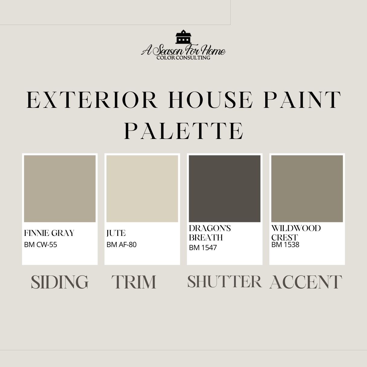
- Shutter and Door Accent Colors: When picking the accent color, it is important to provide some tonal variations in your scheme, so be brave and go with a darker shutter color or accent shade. This will make your elements pop. While we used Ben Moore Dragon’s Breath (LRV 9) for our barn, it was not dark enough against our stone on the main house, so we had it custom darkened for our house’s shutters.
- Repetition: Our eye loves repetition. Consider using your accent or door color on your shutters or garage doors. Another way to repeat it is to paint your mailbox, a fence, window boxes or lattice work under your porch.
- Bonus Color: If your house is Victorian or has a lot of interesting detail work, I strongly suggest picking a bonus color. We did this for our scheme and picked a shade that’s a little darker than our siding, but not quite as dark as the accent color.
10: Use a visualizer
Both Benjamin Moore and Sherwin Williams have paint color visualizers on their websites. I have found them extremely useful for picking exterior colors. If you have a house with a lot of architectural details, it is a great way to figure out what color goes where. When I had to decide on a scheme for our Victorian water tower, I used the Benjamin Moore Personal Color Viewer to decide which paint went on which surface.
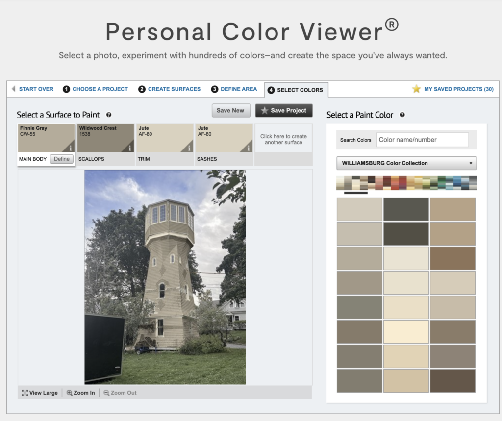
KATIE’S PRO TIP: If you have access to any basic photo editing software, I strongly suggest “desaturating” your photo before loading it into these tools. I have used these tools a bunch, and it is much easier when you do not have much of your existing color showing through. You want your photo to look almost like a black and white photo.
11: Test Before Committing
Before you start buying large quantities of paint, it is always best to test first.
How To Test Exterior Paint
I checked with my painter on his recommendations for the best way to do this. He told me to do the following:
- Isolate a section of the siding and trim where you cannot see the other color
- Try to paint an area next to your fixed element (like a window, stones or bricks.)
- Paint a slightly larger area so you can really see it.
Other Ways To Test
- At the paint store they told me that if need be you can paint a large piece of foam core and use that instead.
- When we picked our stain for our barn we tested it on the loose siding because they stained it before hanging it.
When we tested paint on our house, first we tested six different grays before settling on Finnie Gray. You can start with large samples like those from Samplize (that’s my affiliate link BTW) first. But I would suggest you buy small pots of actual paint samples so you can cover a larger area.
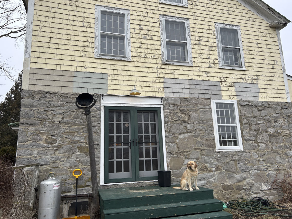
We first painted it in a section right next to the stone (or fixed element) to make sure the gray went with the stone.
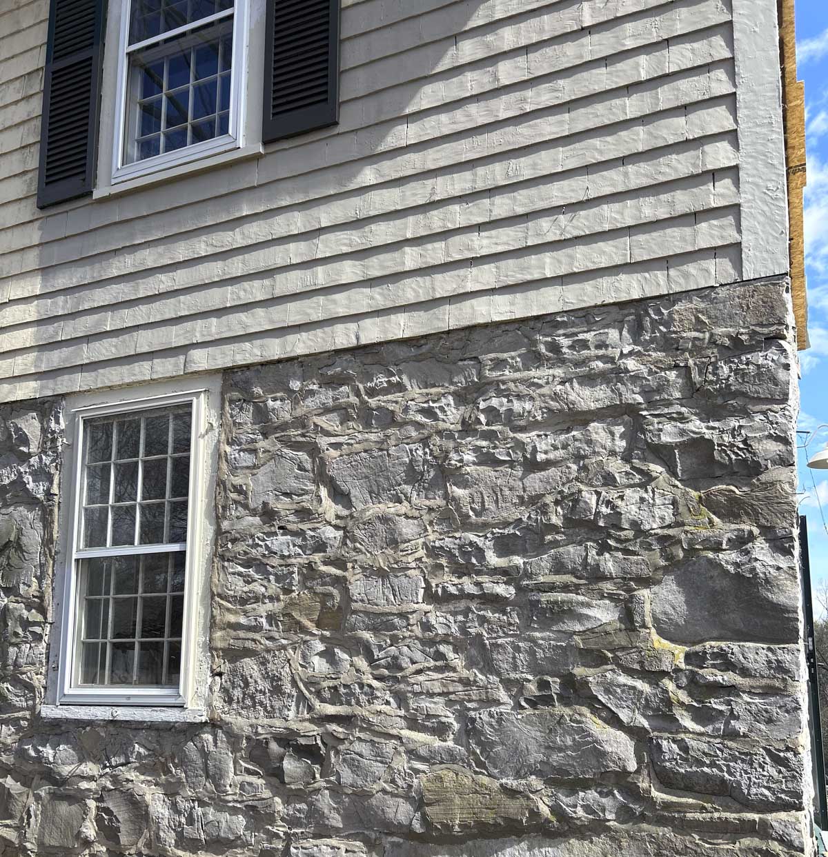
After we decided we liked Finnie Gray we double checked how it would look by selecting an area where we could see it without the yellow affecting our perception of what it looked like. You can see above the area we chose. It allowed us to look at the shutter, trim and siding near the stone without the old yellow paint affecting our perception of it.
What If I Want To Paint My House White?
We have used Benjamin Moore OC-17, White Dove and it looks great here in Vermont- especially when it snows. It is bright enough that it doesn’t clash with the snow and look too yellow. Benjamin Moore suggests two cooler-toned whites: White Diamond and Distant Gray. I know China White is another popular off-white that looks white on an exterior. Avoid super white paints like Chantilly Lace (LRV 90.04) as it will be too brilliant and unnatural looking.
Above: Dover White on Ohio Farm House against bright white snow
Some paint experts suggest that you can use darker off whites with an LRV in the low 70s like Ballet White, or Dover White (above) but I would caution you to avoid these darker off-white paints if you live in an area that rains a lot, doesn’t get a ton of sunny days or is snowy. These darker off-whites will look grungy or have an unintended cast to them when it snows. Instead I suggest going with a white with a slight cool gray cast to it.
Hire A Consultant
And if all else fails, find a color consultant in your area. Working with a color consultant one-on-one can really take the stress out of this process. I offer virtual color consultations and Vermont color consulting appointments.
Quick Tips For Choosing Exterior Paint Colors
- Go Darker Than You Think – Exterior paint appears lighter in natural sunlight, so choose a shade or two darker than your initial preference.
- Stick to Muted, Low-Chroma Colors – Less saturated hues work best, especially when coordinating with brick, stone, or other fixed elements.
- Coordinate Trim, Windows, and Accents – Decide on a high-contrast or tone-on-tone look, and ensure all elements (trim, doors, shutters) are in the same chroma family.
- Use Online Tools and Large Test Swatches – Paint brand visualizers can help you preview colors, but always test large swatches on your actual exterior in different lighting conditions.
- Repeat Accent Colors for a Cohesive Look – If using a bold color on your front door, incorporate it elsewhere (shutters, garage doors, mailbox) to tie everything together.
- Consider Material-Specific Factors – Colors can look different on brick, stucco, wood, or vinyl, so test samples on your specific surface before committing.
- Choose the Right White – If painting your home white, opt for a slightly cool or off-white shade rather than a stark, bright white to avoid an unnatural look.
- Use Paint Brand Recommendations or Hire a Consultant – Many paint companies offer suggested color pairings, or you can work with a professional to simplify the process.