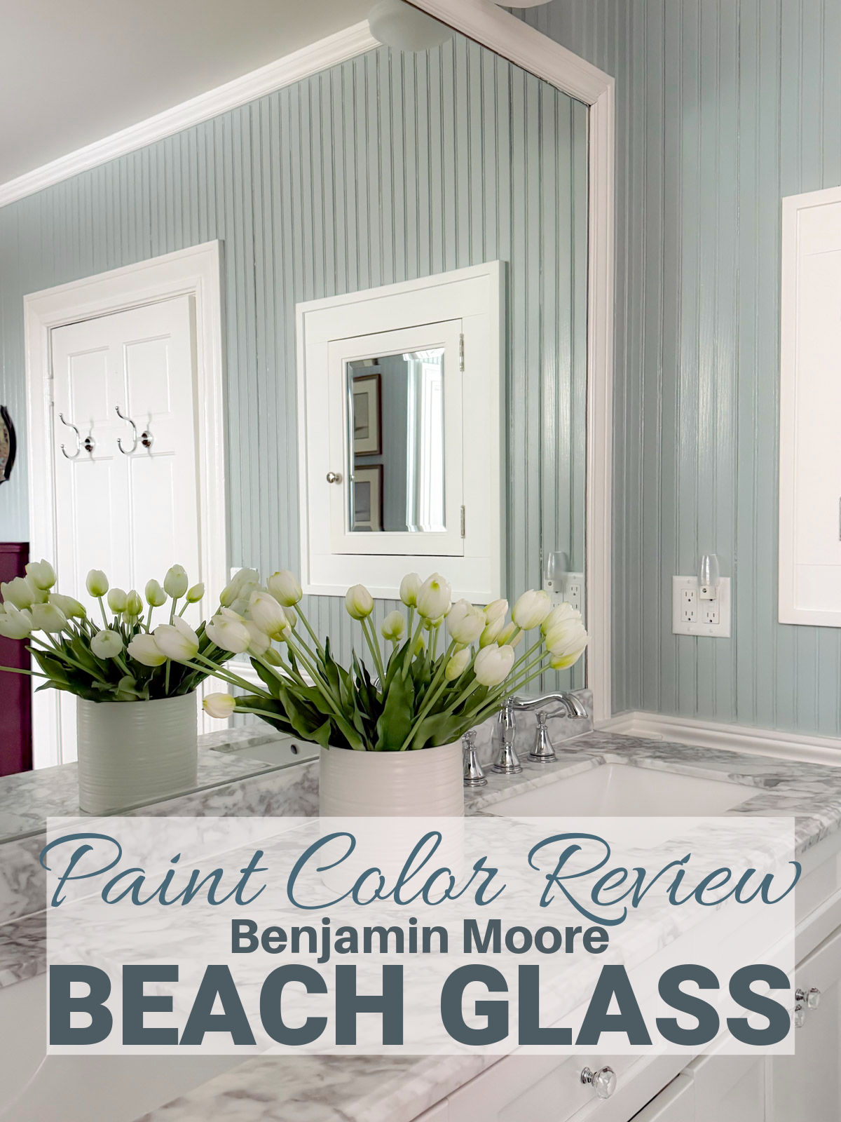
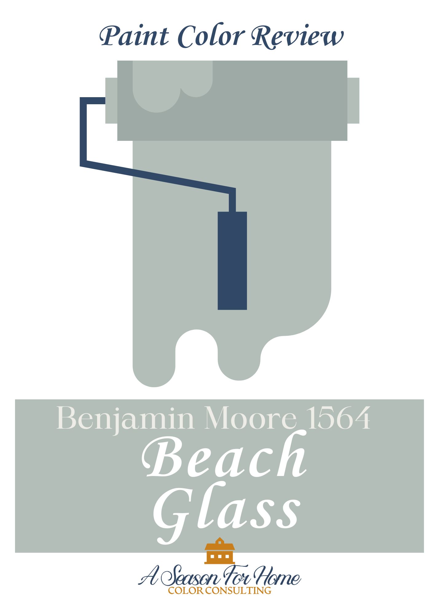
Benjamin Moore Beach Glass Paint Color Review
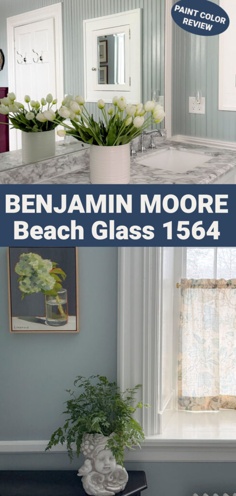
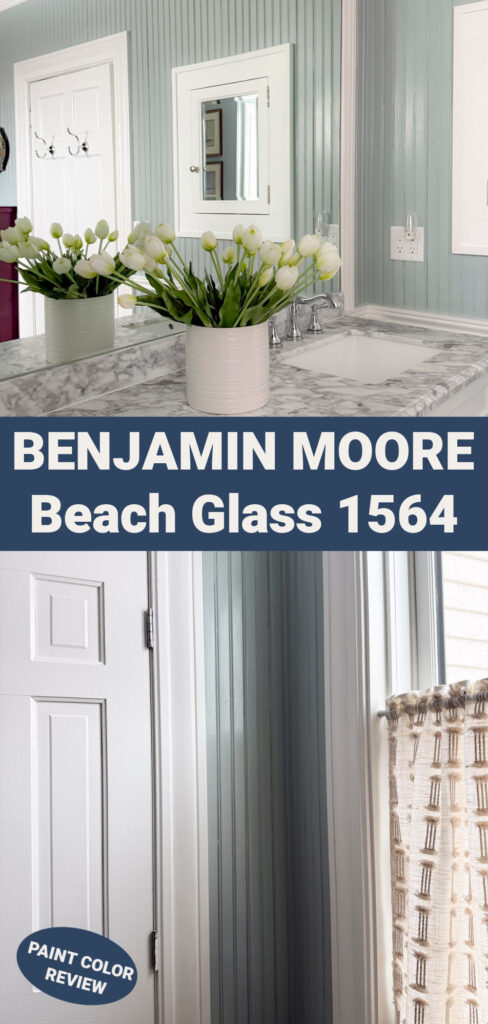

I’ve used Benjamin Moore Beach Glass in my own home, so this review comes from real-life experience, not just flipping through a paint fan deck. If you’re wondering what color trim works best, what to pair it with, and the big question, is Beach Glass blue or green, I’ve got you covered. I’ll walk you through how it reads in real rooms, where it works best, paints and wallpapers to pair with it and how to test it before committing.
Hi, I’m Katie Webster, the color consultant behind A Season For Home. I’m a trained color expert and I help homeowners choose paint colors that work with their lighting, finishes, and architecture, not just what looks good on Pinterest. My recommendations come from real-world use, client projects, and hands-on testing.
Pin this post to save this paint color review for later!
See Benjamin Moore Beach Glass 1564 on the Ben Moore website.
What Color Is Benjamin Moore Beach Glass?
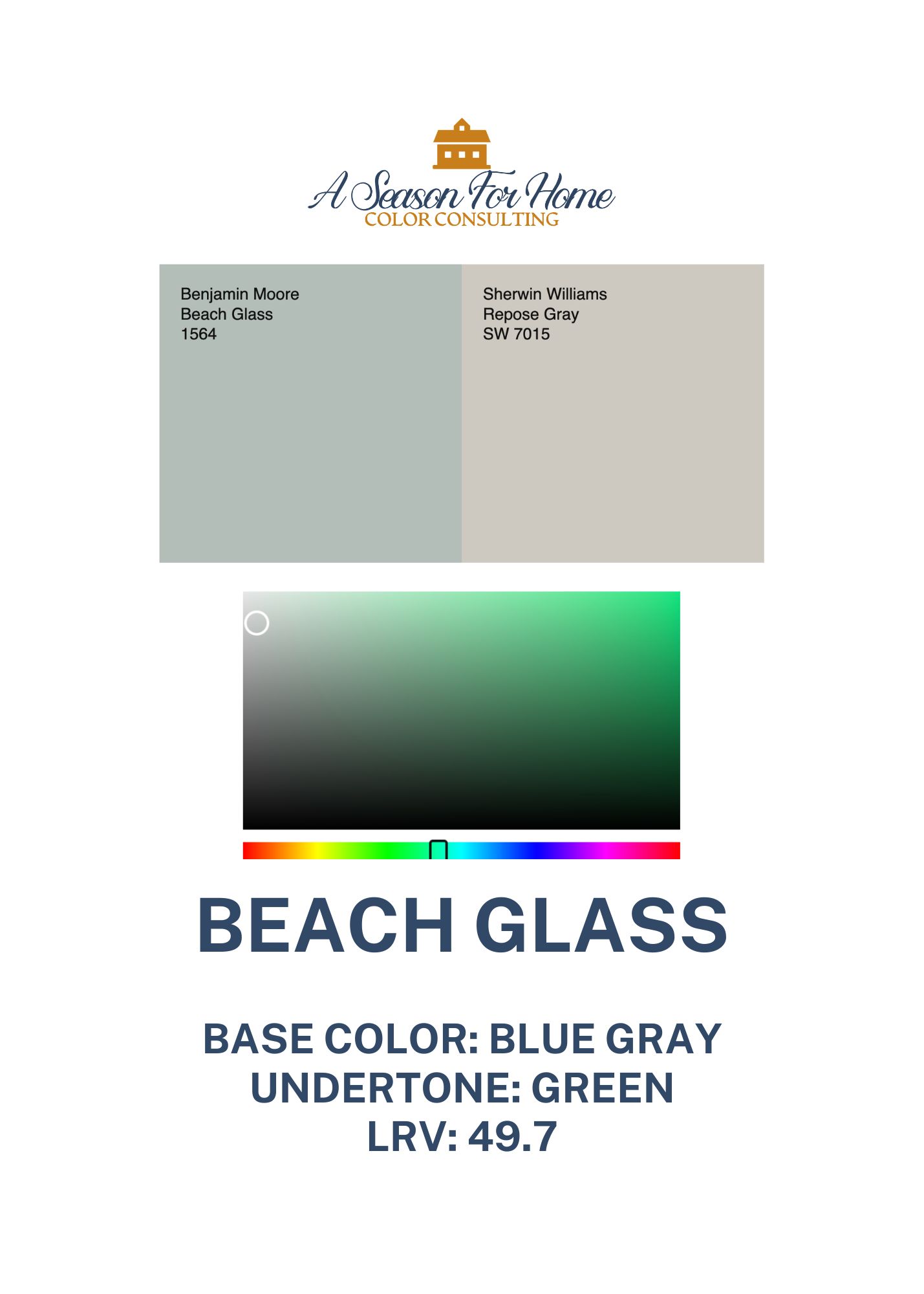
Benjamin Moore Beach Glass is a low chroma blue paint color with a green undertone. When people search for Beach Glass BM or BM Beach Glass, they usually want to know if it leans blue or green.
Here’s the honest answer: it reads as a muted blue-green, but in most spaces it feels slightly more blue than green. When I analyzed it on a digital level, I found that it is technically a green base (see graphic below) but our eye doesn’t see it this way. Because it has so much gray in it, the saturation collapses and we see it as blue with a beautiful green undertone.
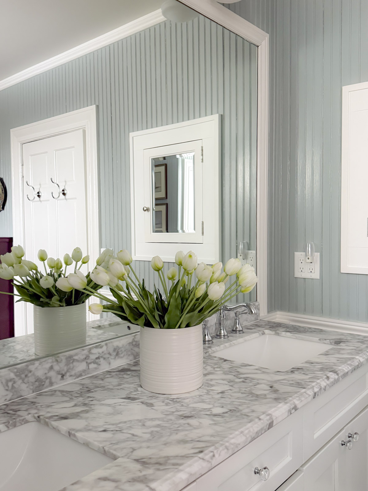
Sorry if that was too technical! In real life, what this means is it won’t feel too icy or overly pastel. It has that hazy, coastal quality that makes a room feel calm and settled.
If you want something crisp and clearly blue, this may feel too softened but don’t let the paint chip fool you. Compare it to other gray blues and you will see that it has plenty of character for most spaces. If you love colors that shift subtly throughout the day, Beach Glass Benjamin Moore is a beautiful option.
LRV of Beach Glass
The LRV of beach glass paint color is 49.7. That places it in the mid-range.
What that means to you and me:
- It reflects a moderate amount of light
- It won’t feel heavy in small rooms
- It can look deeper in low light or north-facing spaces
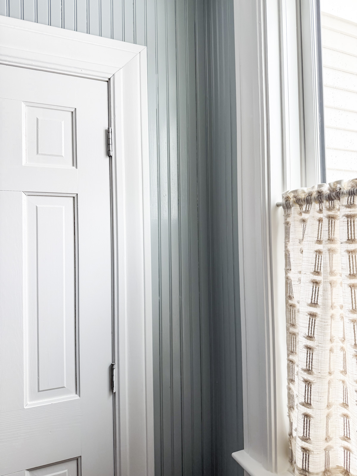
In bright light, it softens and looks airy. In dim light, the green undertones become more noticeable.
Where Beach Glass Works Best
In my experience, beach glass paint shines in more enclosed spaces. It feels grounding rather than expansive.
I especially love it for:
- I love a Beach Glass Benjamin Moore bedroom with linen, cream or white bedding and natural textures like jute or sisal.
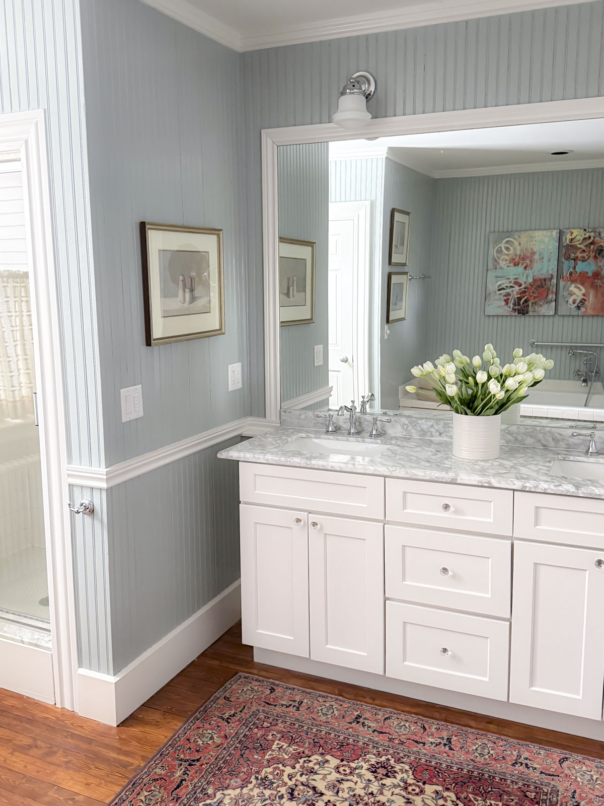
- Bathrooms are the perfect place to add paint colors with a bit of personality. If your home has mostly neutral wall colors, beach glass is a perfect low-chroma hue to add to a smaller enclosed space.
- Dens or home offices with coastal or relaxed traditional vibes expecially with oatmeal colored textiles and layered neutrals
In large open-concept spaces, it can have too much character. For open concepts, I usually recommend a warm neutral and instead add colors like beach glass to rooms off of the main living area that are more contained by cased openings or doors.
Is Beach Glass Good For Exteriors?
If you are wondering if Beach Glass is good for exteriors, the answer is “it depends.” In many cases, Beach Glass on an exterior is going to feel too light and too colorful. But for a beachside home that may be just right! If your home is not on the beach and you don’t want it to feel too pastel, I would instead choose a darker blue-gray with green undertones like Brewster Gray. This will still have a strong coastal feel but not look too pastel or unintentionally washed out. Note that it all depends on what you pair it with (like the window color!) Read more about how to pick exterior paint colors here.
The Best White Trim Colors for BM Beach Glass
Because Beach Glass has green undertones, the white you pair with it matters. Too stark and it looks cold. Too creamy and it looks dingy.
These are the whites I reach for:
- BM White Dove: a fantastic all-purpose white with a subtle warmth
- BM Pure White: a cooler grayed-out white that fits with the cooler nature of beach glass paint
- BM Decorator’s White: one of my favorite cool whites because it has enough gray that it doesn’t feel stark
- SW Dover White: a gorgeous option for historical homes and low light conditions
- SW White Duck: my go-to trim color for a softer tonal effect
- SW Creamy: this warm white has unbeatable yellow undertones that are perfect for New England coastal homes and to pair with low chroma colors
If you want a crisp contrast, go with Decorator’s White, Pure White or White Dove. If you prefer soft and cohesive, White Duck is beautiful. If your house is older or your room is dark use Creamy or Dover White. Read more about picking white for trim.
Color Pairings I Love With Beach Glass
One of the reasons I recommend Benjamin Moore Beach Glass is that it plays well with both warm and cool tones.
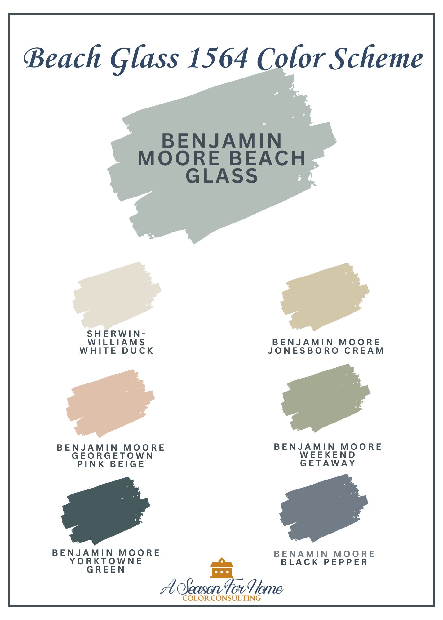
Here are some combinations that feel intentional:
- Khaki tones like Jonesboro Cream for warmth and balance
- Peachy neutrals like Georgetown Pink Beige for a subtle, flattering glow
- Soft gray navy like Black Pepper by Benjamin Moore for depth and contrast
- Deep teal like Yorktowne Green if you want a richer, layered coastal palette
It also looks beautiful with natural wood, rattan, and aged brass.
This color is a beautiful choice for an accented neutral color scheme. Pairing it with beige, cream and another accent from the above list is a perfect start for a soft beachy interior.
Pro Tip: Katie’s Wallpaper Picks To Go With Beach Glass
Many of my clients are asking about wallpapers in our color consultations and so I am anticipating that you’re wondering what wallpapers would go with Beach Glass. Today I’ve pulled two options for you:

Lewis and Wood Georgia in Gold Slate: Though it has clear inspiration from historical motifs, the scale of this pattern is giant which keeps it feeling fresh and contemporary. See more info here.
Ronald Redding by York Courtyard in Neutral: This would be stunning above wainscotting in either an entry hall or dining room. See more info here.
Comparing Beach Glass to Similar Blue-Gray Paint Colors
If you’re considering Beach Glass, you’re probably also looking at other blue-gray paint colors. Here’s how it stacks up:
- BM Smoke is cleaner and more clearly blue. It feels cooler overall.
- BM Tranquility is more muted with stronger green and gray influence.
- BM Gray Mist leans more green and reads softer.
- BM Gray Cashmere is noticeably brighter and lighter.
Beach Glass sits right in that balanced middle ground. Soft, slightly green, coastal without feeling themed.

Should You Use Beach Glass Benjamin Moore in your home?
If you love calm, muted colors that shift gently with the light, Beach Glass Benjamin Moore is worth sampling. It’s especially strong in bedrooms and bathrooms where you want a relaxed atmosphere.
How To Test Beach Glass Before Committing:
- Test it on multiple walls without the previous paint color showing around the edges.
- Observe it in the morning, afternoon, and evening
- Compare it directly to similar shades like BM Smoke and Tranquility
Paint large sample boards and move them around. That extra step prevents expensive mistakes.
If you’d like expert help narrowing down your choices, I offer virtual color consultations where I guide you through undertones, lighting, and cohesive whole-home palettes. You can learn more about working with me through A Season For Home. Let’s make sure your paint choice feels right every time you walk into the room.