Sherwin-Williams Universal Khaki Paint Color Review (Color of the Year 2026)
Sherwin-Williams has officially crowned Universal Khaki (SW 6150) its Color of the Year for 2026—and I have some thoughts. Not just because I live for all things paint colors! I’ve actually used this color in my own living room, so I can give you a firsthand take on how it really looks in the home. Spoiler: it’s a bold choice for a “neutral,” and it’s not for everyone but it is one of my favorite khaki paint colors. Let’s break it down.
What Color is SW Universal Khaki?
Universal Khaki is a mid tone beige paint color with minimal undertones. It is slightly lighter than a true tan, yet darker than an all-purpose warm netural. Sherwin-Williams picked it for their color of the year for 2026 for its foundational and essential qualities.
In the accompanying media blast SW pushed when they announced this choice for Color of the Year, they claim it’s meant to be versatile and grounding, but in my experience working with everyday homeowners (those who are looking for livable paint colors) SW Universal Khaki is outside the scope of what most people will be comfortable with.
As I said, I have this paint color in my Living Room and I can personally attest that it comes across with a lot more personality than your typical “safe” neutral. Due to its deeper value and hidden undertones it is not as safe a choice as you may think!
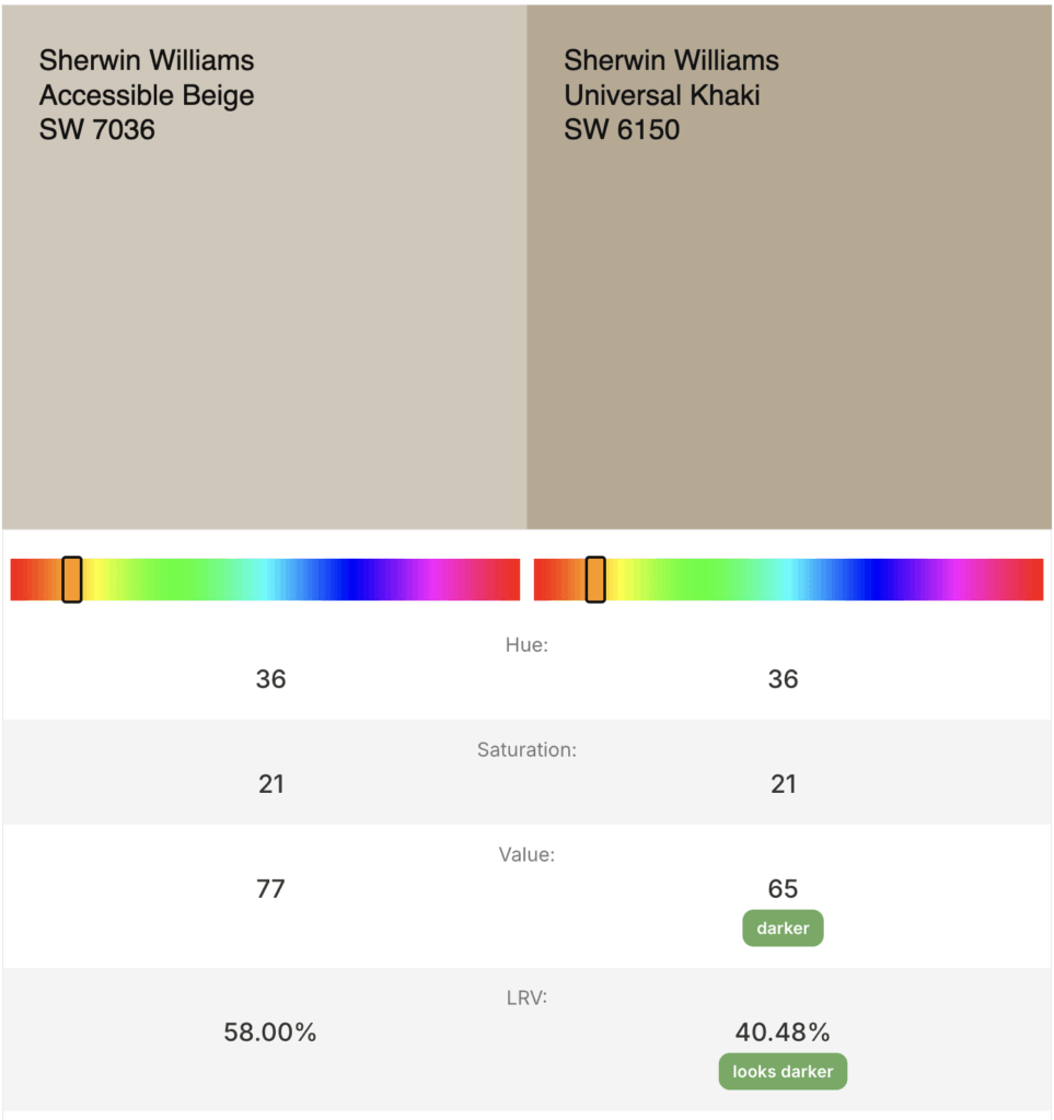
Universal Khaki is on the same paint strip as Wool Skein and Relaxed Khaki, both of which are gorgeous paint colors. Interestingly, I did a little digging and found that Universal Khaki is exactly the same hue and saturation as Accessible Beige, one of the most popular colors that Sherwin-Williams makes. The only differnce is that Universal Khaki is 18% darrker than Accessible Beige.
Read on to find out if this is the right color to try in your home and where I think it works really well!
Undertones for Universal Khaki Sherwin-Williams
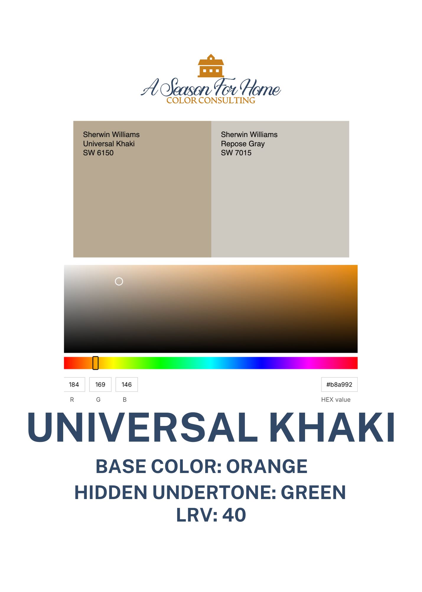
Sherwin-Williams Universal Khaki comes from a base color of orange and has hidden yellowish-green undertones. It is relatively low chroma; meaning it is a dirty color, is lower in saturation and has quite a bit of gray in it.
In my North-facing living room, it leans warm—sometimes even too bronze or golden in the warm afternoon light. That warm undertone and deep value is what makes it cozy, but it’s also what makes it a little tricky to work with.
LRV for SW 6150 Universal Khaki
Universal Khaki is a dark mid-tone paint color with an LRV of 40. This means on a scale of 0 (pure black) to 100 (pure white) it is moderately dark and can be used for exteriors or interiors. LRV is our way of measuring color value.
Now if you are wondering why the LRV is important, I’ll explain. To put this in context let’s look at the uber popular Sherwin-Williams color: Accessible Beige. As a paint color consultant I have recomended Accessible Beige in countless homes. However, with an LRV of 58, homeowners are often reticent to use such a “dark” color. While I personally have plenty of darker paint colors in my house I find that most folks are comfortable with walls in the 60s or higher.
Now let’s look at Universal Khaki. It has the same exact hue (base color 36 on a hex scale) and saturation (21) as Accessible Beige. But it is just a lot darker (LRV 40 vs 58.) {FYI heres a refresher on color hue.} Having seen it in the flesh in my own home, I can tell you this is not necessarily a “universal” color for walls because it way too dark for the vast majority of people. That said, it is a great choice for other (non-wall) purposes and I LOVE it in my living room. Read on to learn more about this color.
How to Use Universal Khaki in Your Home
I’ll start up front by saying: gone are the days of painting your walls a dark color and your trim crisp white. This look is dated and evocative of paint trends 25 years ago. So keep this in mind if you are looking at any paint color darker than a 60 LRV. That includes Universal Khaki (see above LRV explanation.)
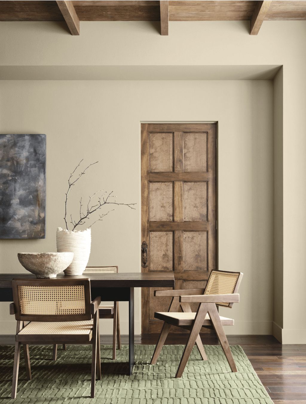
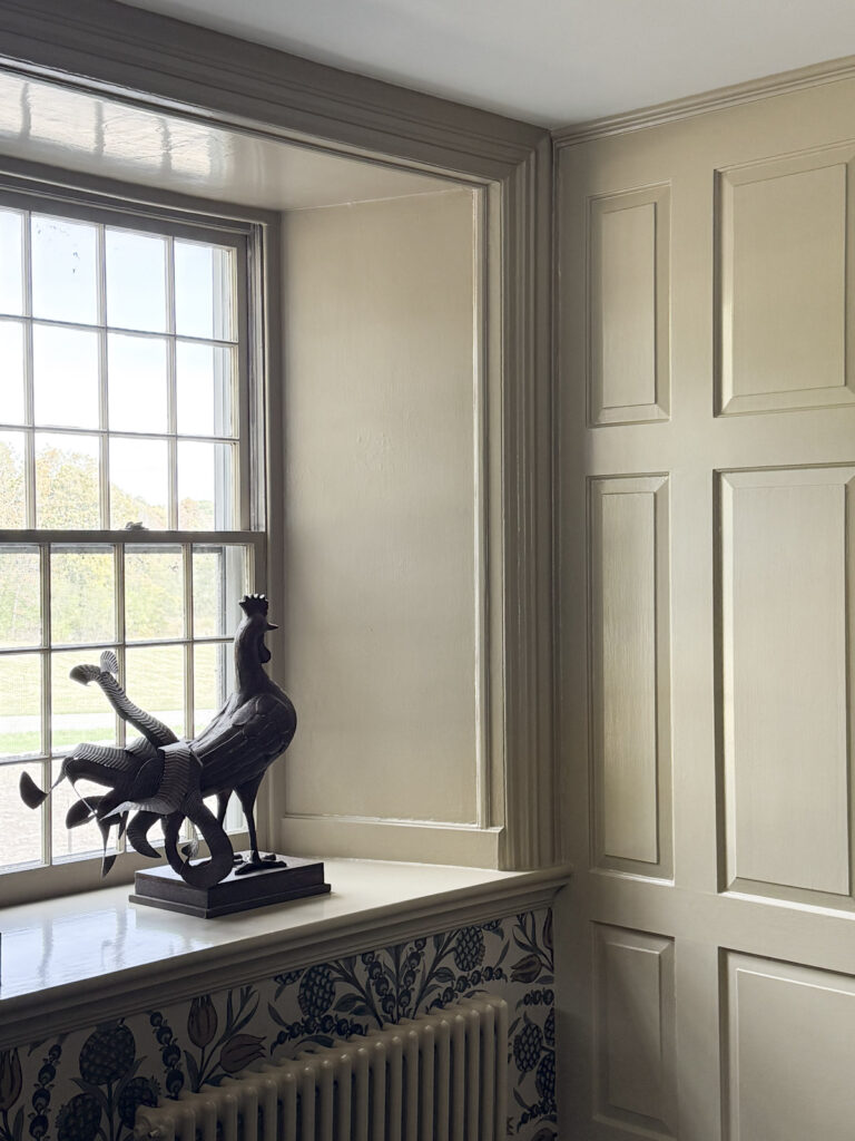
If you’re going to go for Sherwin-Williams Universal Khaki, I think it works best in contrast applications like painting your trim khaki and keeping the walls off-white like Emily did here. Other places to use this paint color are built-ins, millwork, wainscotting, or even interior doors. In my own living room we wallpapered the walls and painted Universal Khaki on the window trims, baseboards, crown molding and wooden paneled wall and fireplace mantle in it.
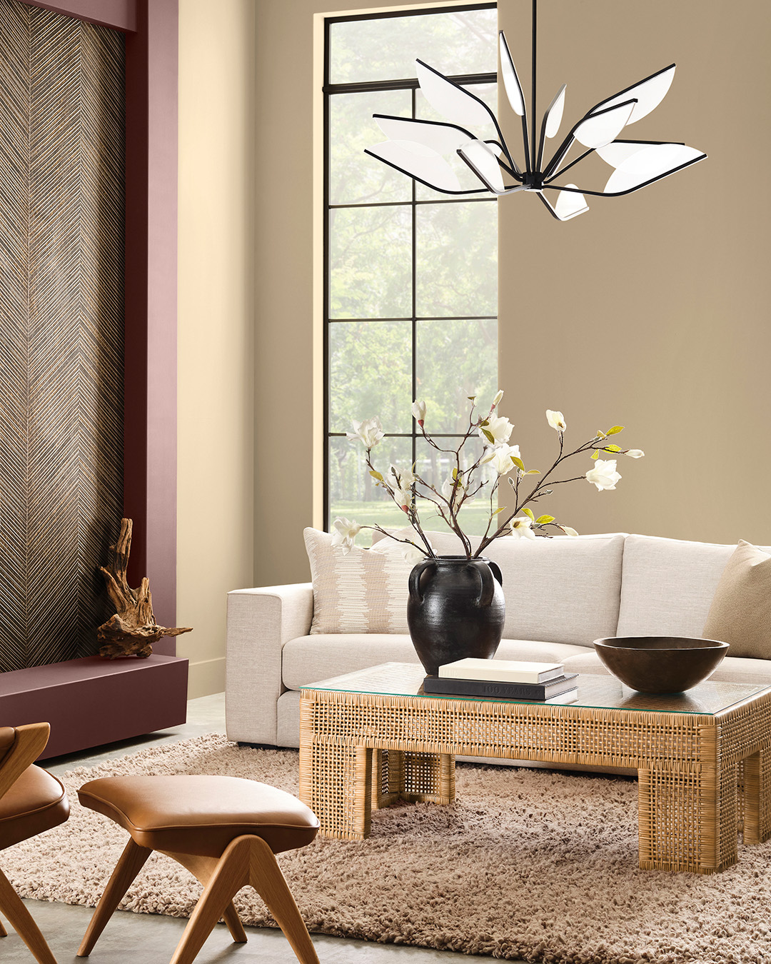
I’ve also seen it used really effectively in a color-drenched space like the above image, where the walls, trim, and even the ceiling are all painted the same shade. That keeps it looking fresh and intentional instead of dated.
Decor To Pair With Universal Khaki
If you are loving the latest interior decorating trends of maximalism, English Country, and the Ralph Lauren aesthetic then this is a paint color to fold into your home’s color scheme. I personally think Sherwin-Williams chose this color for the year 2026 because this look is big and getting even bigger and khaki is a super important part of pulling it off!
Universal Khaki goes great in rooms with lots of textures and patterns. For a family room, pair it with leathers, courderoy, velvet and checks. All of these materials are screaming for Universal Khaki! Or vice versa!
You can also use it in a more minimal way, just make sure to use really softened off-whties, not crisp ones or it can be too high contrast. The key is to pull your tones to the middle ground!
What to Avoid
Universal Khaki is a favorite, don’t get me wrong! But there are some clear don’ts with this paint color:
- Don’t think of it as a neutral when you are looking for a light, airy neutral background color- look at Sherwin-Williams Wool Skein for a light option or Accessible Beige for a moderately light paint color instead. Or look at our warm neutral paint colors for minimalists.
- Do not pair it with bright, crisp white trim. This looks super old-school in not a good old-money way! Instead use it on millwork or color drench with it.
- Warm light can make this color look yellowed. In my living room we get afternoon sun that is very warm and it really makes it look bronze colored. The key is you need to make sure to sample it before commiting!

Similar Colors and Other Colors To Consider
If you like the vibe but want something more forgiving, check out:
- Relaxed Khaki (SW 6149) – This would be my top recomendation for those of you who like the Ralph Lauren vibe of Universal Khaki, but don’t want to commit to the depth. Relaxed Khaki is softer and easier to live with. While you are testing paints grab Accessible Beige and Wool Skein too (both from SW.)
- Benjamin Moore Bennington Gray (HC-82)– This is a little brighter and warmer with more golden undertones. When I put these two colors side by side the Universal Khaki looks more taupe and cool.
- Benjamin Moore Market Square Shell CW-30– Before you look this up on the computer or phone, please note that on a screen this paint color doesn’t look similar but in person these two are a good comp. Market Square Shell is a smidge greener and overall brighter but still firmly Khaki (not gold beige.)
- Benjamin Moore Crisp Khaki 234– A brigeter and warmer option. It has less green undertones, so if you feel like Universal Khaki looks too green, give Crisp Khaki by Benjamin Moore a try.
Complementary Colors for Universal Khaki and Whole-House Color Palette
Universal Khaki plays well with muted greens, earthy terracottas, and soft creams. For a whole-house palette, you could try:

- Universal Khaki (trim, built ins or wainscoting)
- White Duck (walls and ceiling)
- Sagey green accent: Khaki is always gorgeous with sage greens like SW Green Earth. Paint this in adjacent spaces or use this color as inspo for your furnishings in the room painted Universal Khaki.
- Terracotta/rust tones: You can use textiles and furnishings in this color. Or paint a side table or built in with Natural Brown by Ben Moore.
- Navy: Use navy with plenty of depth to stand up to the tonality of Universal Khaki. Mysterious from the Affinity deck by Ben Moore has a whisper of purple in it, giving it a classic military vibe.
- Brown: Skip true black and use a dark brown like Clove by Sherwin-Williams
Together, it creates a grounded, earthy palette that still feels current.
Whites to Pair With It
Instead of going for a bright, stark white, pair Universal Khaki with softer off-whites for a more modern look:
- Dover White (SW 6835): This warm white is great if you are looking for a brighter white to go with it because it has an LRV of 83.
- White Duck (SW 7010): For a slightly darker option go with White Duck. It has an LRV of 74. I love the grayed-out quality of this off-white because it goes with a lot of muted colors without becoming overly saturated. And it doesn’t head in the other direction and look too stark or cold.
- Neutral Ground (SW 7568): This is a great darker off-white (LRV 70) to pair with it. I’d love to see Neutral Ground in a vaulted space on the ceiling and trim, paired with Universal Khaki as the wall color. You could also use Neutral Ground as your “white” for the walls for a contrast trim scheme.
These keep the contrast more subtle so the khaki feels fresh instead of harsh.
How To Know If Universal Khaki is Right For You?
Test It Out: The only way to know if this color will work for you is to test it out. Start out by picking up a paint chip at your local Sherwin-Williams store. If you love it, consider ordering a large scale sample on Samplize. (That’s an affiliate link, by the way.) Then go a step further and brush out a sample of the sheen you plan to use on your walls. Test in an area where you can isolate it between two elements so the surrounding color doesn’t taint your view.
Pair With Intention: This color thrives on “all in” decor. So if you are loving the upcoming trends featuring khakis paired with earth tones, and layered with patterned textiles, florals, plaids and loads of texture, this color will happily be a part of your decorating scheme.
Paint The Right Surfaces And Pick The Right White: It can feel dated if treated without much imagination (think beige walls and white trim from the year 2003.) But when painted on the right surfaces it is yummy! Color drench, use it for built ins or use a darker trim color. Or if you are using a traditional paint scheme, just remember to go with one of our muted off-whites for a more contemporary feel.
Remember I am always a click away. If you need help picking the perfect colors for your home I offer virtual color consultations and in person too. I’d love to help you pick a custom color scheme for your home!