Benjamin Moore Silhouette Review (Color of The Year 2026)
Benjamin Moore just announced Silhouette (AF-655) as their Color of the Year for 2026, and it’s a bold, moody choice I didn’t see coming—but I completely get it. This deep, chalky brown has a soft purple undertone and an LRV of 10.18, which means it’s dark. Like, “wrap-you-up-in-a-cashmere-blanket” dark. It’s dramatic, layered, and sophisticated in a way that feels both familiar and fresh.
I have a lot to say about this choice so read on to learn about why they picked this color, what colors it goes with and my two cents on how to use it (or not use it!) Read on for this paint color review of BM Silhouette.

If I were to try to explain this color I would say the following: Silhouette is to brown what charcoal is to black. It has a bit of white pigment added to it to make it seem a little ashy.
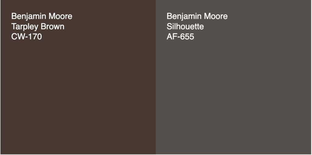
It also has an aubergine undertone that can be seen in brighter lighting conditions or when you look at it next to redder browns.
Why I Think Benjamin Moore Chose Silhouette as the Color of the Year 2026
I think Benjamin Moore picked Silhouette AF-655 for three big reasons.
First, fashion is having a huge influence on interiors right now. You can see it in all the Ralph Lauren-inspired plaids, tailored menswear patterns, and rich layering happening in both runways and rooms. There’s this cozy, tailored vibe that’s very “country club library meets downtown loft,” and Silhouette fits right in.
Second, we’re seeing a shift toward slightly grayed-out colors. For a few years now, pure darks—think inky blues and jet blacks—have dominated walls and cabinetry. Lately, though, people are pulling back a little, looking for colors that still feel deep but are easier to live with. Silhouette has that muted, chalky quality that makes it moody but not harsh.
And third, we’re moving on from the black-and-white era. Neutrals are getting softer, but we still crave contrast. Dark values anchor a space, give it depth, and make the lighter tones sing. Silhouette does that beautifully, while bringing just a hint of color to the mix.

The Undertones of Silhouette
Silhouette isn’t your typical dark brown. It carries a quiet purple undertone that gives it a smoky elegance—almost like espresso with a hint of plum. In bright light, you might catch a whisper of violet, while in dim light it leans more earthy and grounded. It’s the kind of color that changes personality throughout the day, which is part of its charm.
Benjamin Moore AF-655LRV Factor
If you’re new to the term LRV, it stands for Light Reflectance Value. Basically, it measures how much light a color reflects on a scale of 0 to 100. With an LRV of 10.18, Silhouette absorbs most of the light in a room. It’s definitely a dark paint color, so it works best in spaces that get some natural light—or as an accent in smaller doses, like on cabinetry, an interior door, or a moody dining room wall.
How to Use Silhouette in Your Home
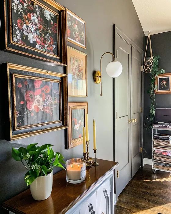
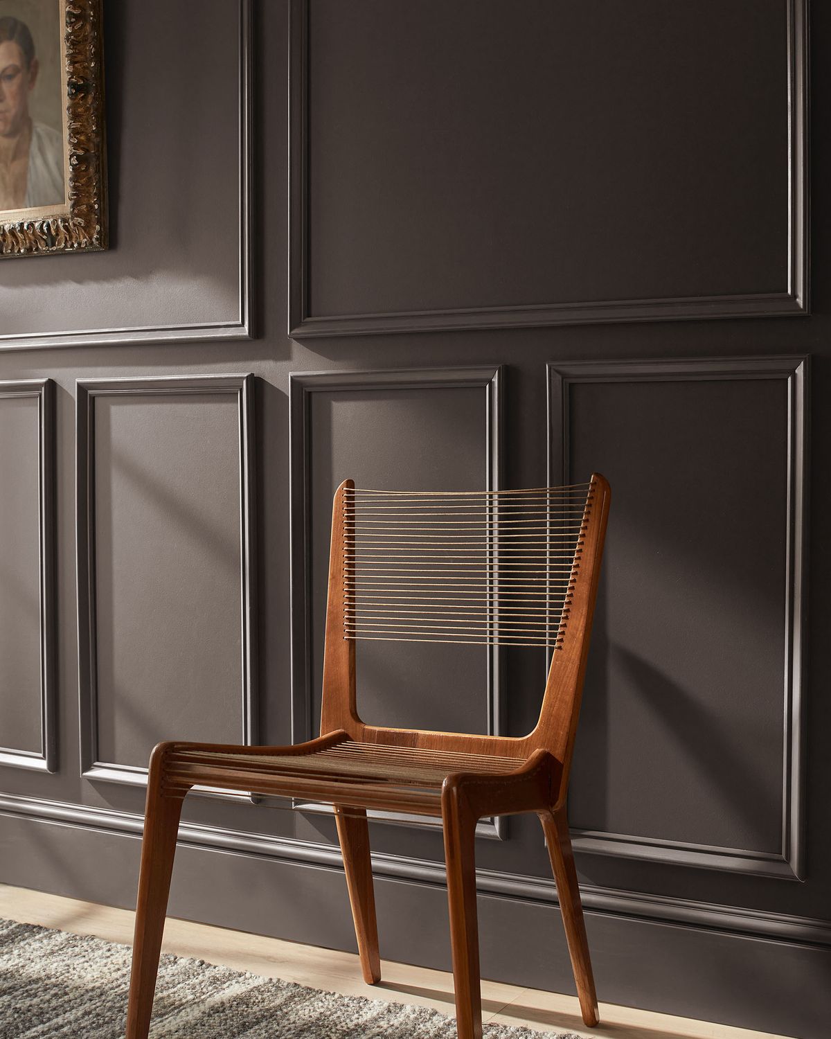
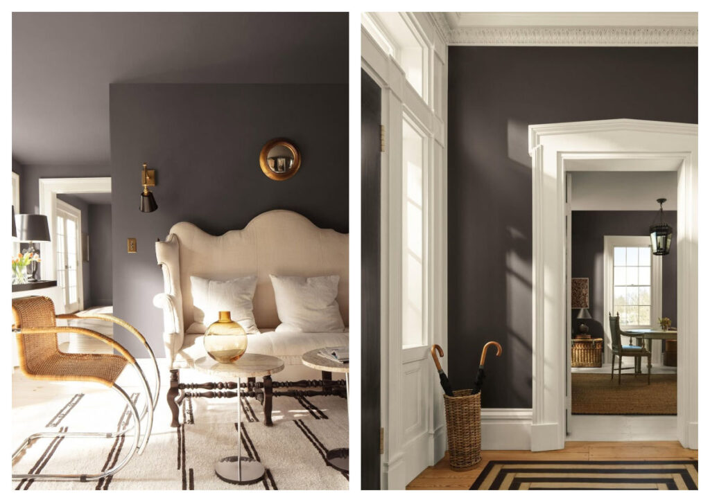
Silhouette shines when used in places that benefit from depth and contrast. It’s a natural fit for millwork, trim, built-ins, cabinets, and stair risers—anywhere you want a polished, architectural look. On woodwork, it feels classic and substantial.
If you’re craving a little drama, try it in a small space like a powder room. Instead of painting just one wall, drench the whole room—walls, trim, even the ceiling. This approach gives it a cozy, jewel-box effect. Add brass or warm metallic fixtures to reflect light and keep the space from feeling too heavy.
Silhouette also plays beautifully with texture. Think grasscloth wallpaper, linen window treatments, or natural stone. The contrast of rich color with tactile finishes gives a room so much dimension.
Color Palette For Silhouette
Because Silhouette is so deep and sophisticated, it pairs best with warm neutrals, khaki and low-chroma, unsaturated midtones. I’ve put together a palette that balances it beautifully:
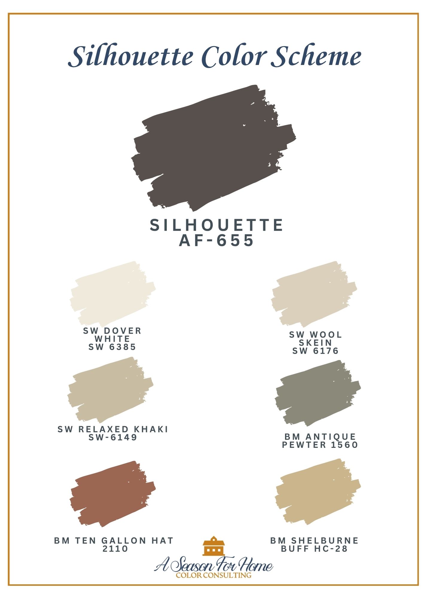
- Dover White (SW 6385) – a soft, creamy white that adds warmth
- Wool Skein (SW 6148) – a soft khaki, Wool Skein balances Silhouette’s depth
- Relaxed Khaki (SW 6149) – an current-moment warm neutral with midtone depth. This is one shade lighter than Universal Khaki, Sherwin-Williams’ color of the year.
- Antique Pewter (HC-187) – a mid-tone gray-green that adds subtle contrast
- Ten Gallon Hat (SW 6361) – a spicy, reddish saddle brown that brings energy
- Shelburne Buff (HC-28) – a dirty golden beige has plenty of complexity to pair with the tones in Silhouette
Together, they create a palette that feels warm and layered—like a well-tailored outfit that never goes out of style.
What to Watch Out For
As gorgeous as Silhouette is, it’s not a paint-it-and-go kind of color. A few things to keep in mind:
- Avoid pairing it with high-chroma colors. Bright, saturated hues will fight against its subtle, smoky quality. Stick with other muted tones or neutrals for the most harmonious look.
- Be mindful of the purple undertone. If you don’t love that slight violet cast, avoid pairing Silhouette with strong yellows or reds—they’ll exaggerate it. It behaves best in spaces that lean warm or have balanced light.
- Pay attention to your light bulbs. Cool, blue-toned bulbs will pull out the purple and make the color feel colder. Warm or soft-white bulbs will bring out its brown side and make it feel richer and more grounded.
- Use with intention in dark rooms. Silhouette will read even darker with limited natural light. In that case, embrace the moodiness rather than fighting it—just layer in warm finishes and soft lighting.
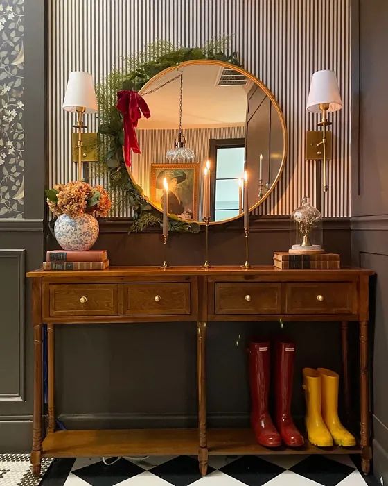
PHOTO SOURCE: Magical Manor.
What Whites Pair With Silhouette
I would pair it with warm whites and those with a bit of gray in them some favorites include:

White Dove by Benjamin Moore: This is my go-to white and great for a whole-house white.
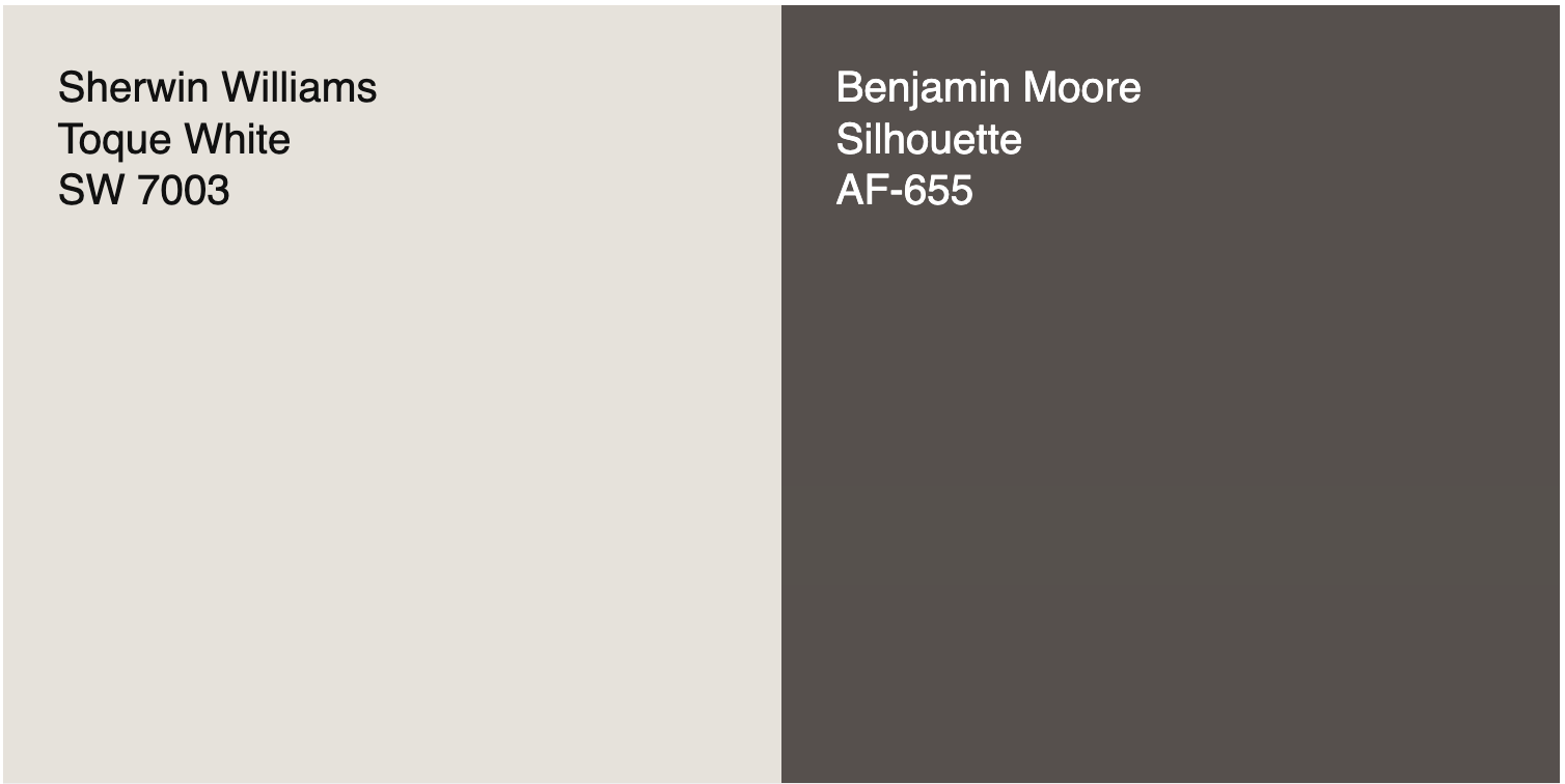
Toque White by Sherwin Williams: This muted white has a bit of a violet undercast that will be a good match for the undertones in Silhouette.
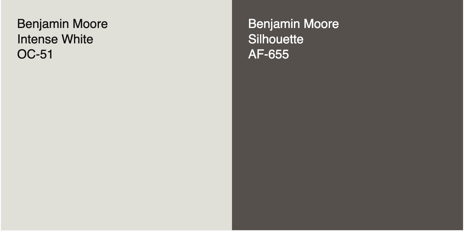
Sheep’s Wool or Intense White from Benjamin Moore: This has the depth that Toque White has but with a gray cast. It’ll give you the feeling of contrast without any harshness.
my Opinions For BM Silhouette AF-655
I was wrong. I predicted Ben Moore was going to go with a rich bronze toned paint color for 2026. While I am trying to set aside my *sniff* hurt feelings, I appreciate their thought process in why they picked this color. Essentially, Silhouette feels like the natural next step in color trends.
On a side note: I will say I am not sure why they went with another purple for the second year in a row, I have only had one color consulting client in the last year ask for a purple, and that was for a little girl’s room. So I think they may be off on a slightly odd tangent with that aspect of this color. That said, Silhouette feels like the natural next step in color trends as far as its dark value and grayed pallor.
In my eyes, interior trends have already embraced black and white, explored the deep blues and charcoals, and now we’re ready for something that feels softer, warmer, and more nuanced. This color brings mood and depth without feeling stark or cold.
As a rule I stay away from true blacks, and always try to choose deep dark paint colors that have a hint of a hue in them. I can see an occasion where I may need a black-alternative that has to have a purple undertone. However having used Bucktrout Brown, another brown with aubergine undertones, I would say to use it with extreme caution. Test it in your space and make sure it works in all the lighting conditions.
I do think I will recomend it upon occasion as it is a sophisticated way of bringing depth into a space without the harshness of a true black paint.