Color Hue: What is It?
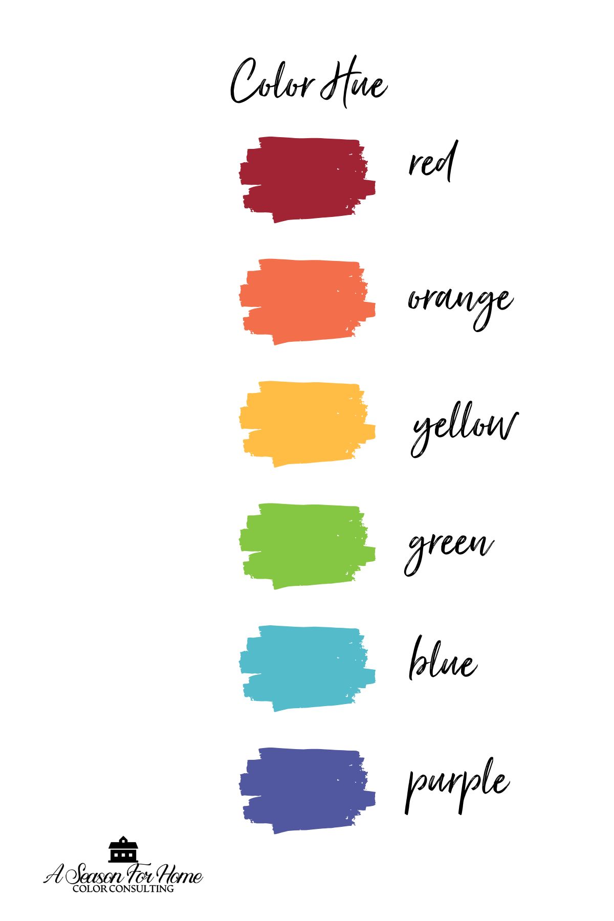
In color theory, hue refers to the pure, base color of the spectrum, such as red, blue, yellow, green, etc. Hue is the color’s name. Today we will discuss how to determine the hue of a color and how to distinguish it from other characteristics of color such as value, saturation and chroma. I will also discuss the most common pitfalls I see when selecting hues for your interior space and how to avoid them!
This post contains affiliate links.
What Is Hue?
In color theory, hue refers to the pure, base color of the spectrum, such as red, blue, yellow, green, etc. In other words, hue is the color’s name.
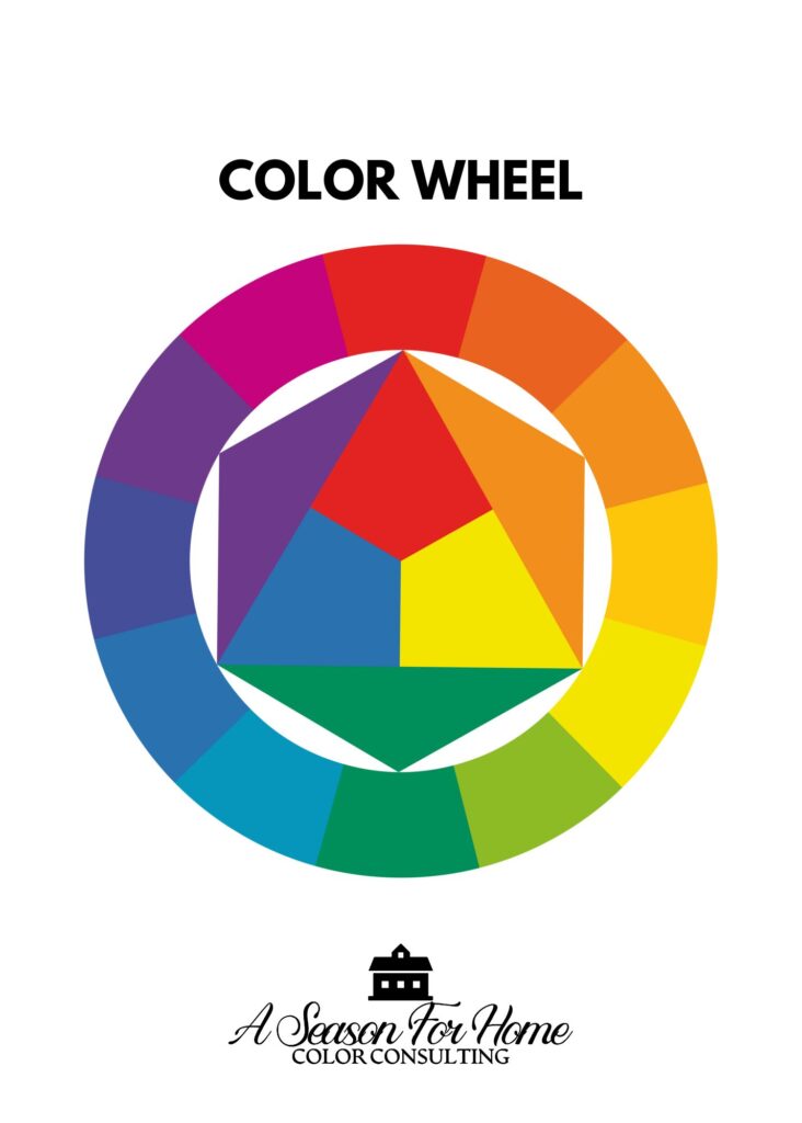
The color wheel is a simplified representation of an infinite prismatic gradation through the color spectrum. It breaks colors into three categories of hues:
- Primary hues: The primary colors are hues like red, blue, and yellow. These cannot be created by mixing other colors.
- Secondary hues: Secondary hues are created by mixing two primary colors to get green, orange or purple.
- Tertiary hues: These are created by mixing a primary hue with its adjacent secondary color next to it on the color wheel. Examples of Tertiary colors are: Red-orange, orange-yellow, yellow-green, blue-green, blue-violet and red-violet.
Hue versus Other Color Properties
While hue refers to a color’s pure identity—such as red, blue, or green—it is just one aspect of how we perceive and describe color. Chroma, value, and saturation are additional properties that influence how a color appears.
- Chroma refers to the purity or intensity of a hue, with highly chromatic colors appearing more vivid and muted colors appearing more subdued. Read more about chroma in our primer on Clean Colors vs Dirty Colors.
- Value determines how light or dark a color is, regardless of its hue. For example, a pastel blue and a deep navy both share the same hue but have very different values.
- Tints and Shades: Another key distinction is between hue and tint, tone, and shade, which describe how a pure color is altered by adding white, gray, or black. A tint is a hue like red is mixed with white to create a lighter, softer version of the color known as pink. Shade is a hue mixed with black, making it appear deeper and richer.
- Tone: The term tone encompasses tints and shades and refers to a hue mixed with gray, which mutes its intensity.
Understanding these differences helps in interior design because they affect how colors interact and how they are perceived in different lighting conditions.
Warm vs. Cool Hues
In addition to breaking hues into primary, secondary and tertiary colors, hues can be further broken into warm versus cool colors. Color temperature describes the warmth or coolness of a color, based on its position on the spectrum of light. Warm colors (reds, oranges, yellows) have lower temperatures, while cool colors (blues, greens, purples) have higher temperatures, influencing the mood and ambiance of a space.

Warm colors are energizing while cool colors are relaxing. Furthermore, color temperature also affects our perception. In general, cooler colors recede while warmer colors come forward visually.
Color undertones affect color temperature on a relative basis. While blue is considered a cool hue, there are warmer blues with green or yellow undertones. Even so-called neutrals have an undertone which will give them warmth or coolness.
The Role of Hue in Color Perception
We see hue because our eyes detect different wavelengths of light. Cone cells in our eyes help us distinguish colors, but factors like surrounding colors and reflections can change how a hue looks.

Lighting affects hue dramatically.
- Notice how the above gray paint color, Sabre Gray from Benjamin Moore, changes as it gets closer to the window on the right side of the frame. The light makes the gray’s hue appear lighter, less vibrant and a little cooler.
- Additionally, artificial light can shift the hue depending on the color of the lightbulb. When I meet with clients for virtual color consultations, I show them how natural light shows the truest color. A gray wall may seem blue under LED lights but warmer in sunlight, so it’s important to test colors in different lighting.
Color is Relative

Colors are relative to whatever is next to them. When we pair colors together in a space we must also consider this fact. Look above at how our gray paint color from the example above, Sabre Gray compares side by side to Benjamin Moore’s Platinum Gray. Now in the context of another color, Sabre Gray no longer looks gray but instead looks green!
Metamerism happens when two colors look the same in one light but different in another. This is why a paint color that looks perfect in a store may seem off at home. Checking colors in your actual space helps avoid surprises.
How Hue Influences Interior Design & Home Aesthetics
Choosing a color hue to reflect a desired mood for a space is a key component of interior design. A warm khaki color with rich reds and browns gives a cozy and enveloping vibe. While crisp whites, dusty blues and muted greens will create a calming, peaceful atmosphere. Knowing what you want the space to feel like will help determine the correct hues for your space.


Choosing a second color to complement the dominant hue is a great way of adding interest and personality to a space. For example, adding a small amount of a complementary color (from across the color wheel) can add contrast and balance.
PRO TIP: Using an accented neutral color scheme is a great way of simplifying the process of decorating your interior. Choose one favorite hue, then use it in small amounts with mostly neutral furnishings, textiles and paint colors. Just make sure to match your neutral undertones so they don’t clash!
Hue and Color Harmonies
You can create pretty color combos and visual balance when you study how the colors interact and make use of standard color harmonies. In design we follow some basic rules of color harmonies. Here are the cliff’s notes:
- Analogous Colors – Three hues next to each other on the color wheel (e.g., blue, blue-green, and green). Great for a peaceful vibe.
- Complementary Colors – Two hues directly opposite each other (e.g., blue and orange). For a high-energy bold statement.
- Split-Complementary Colors – This is similar to complementary but slightly mellowed. Instead of pairing a primary with its complement, you go to the hue just above and below the complement. An example is a base hue of blue plus the two colors next to its complement which are yellow-orange and red-orange. It is a favorite because it will give you plenty of contrast with less intensity.
- Triadic Colors – Three evenly spaced hues on the color wheel (e.g., red, yellow, and blue). To keep this from seeming childish it is best when used in an accented neutral scheme. I also recommend going with low chroma colors to pull this off with aplomb! See below how I paired low chroma versions of the primary colors in a color triad.

PRO TIP: When using color harmonies, consider hue dominance—one color should take the lead, while others play supporting roles. Also, adjusting saturation and value can soften contrasts and make color combinations more natural.
Common Pitfalls When Choosing Hue
Ignore Glaringly Obvious Colors
In my interior color consultations the most common mistake I see in clients home are much brighter colors than the client intended. Looking at a fan deck can really make matters worse. I tell people to disregard 90 percent of the fan deck and to stick with the most muted shades!
For example, if I were to pick up the Benjamin Moore color preview fan deck and look for a green paint color. I would flip to the green section, right? Wrong… Take a look below. The greens in this paint deck are much too bright and garish. Instead look in the muted grayed out colors and you will find much more pleasing hues for interior design. Here I used Dry Sage to illustrate how even a muted shade like this will make your space appear green, but in a more pleasing way.

Another way to avoid this mistake is to make sure to use large paint color samples, like those from Samplize, and brush out paint colors before committing to it.
Try A Large Sample Of Dry Sage For Your Space.
When choosing accents, make sure to match the chroma of the other hues in the space. Do not mix dirty tones with clean ones or vice versa!
Identify Hue undertones In Neutrals
And lastly use caution when picking neutrals. In my mind, even neutral colors have a hue. After all, neutrals are essentially low chroma tints of a pure hue.
Neutrals are by far the hardest hues to get right. They often have seemingly subtle undertones that are amplified when used to scale. One favorite paint color, Wickham Gray HC-171 by Benjamin Moore is a tricky one! It has undertones that can be overlooked when viewing the paint chip. See below, it just looks like an innocent gray, doesn’t it?
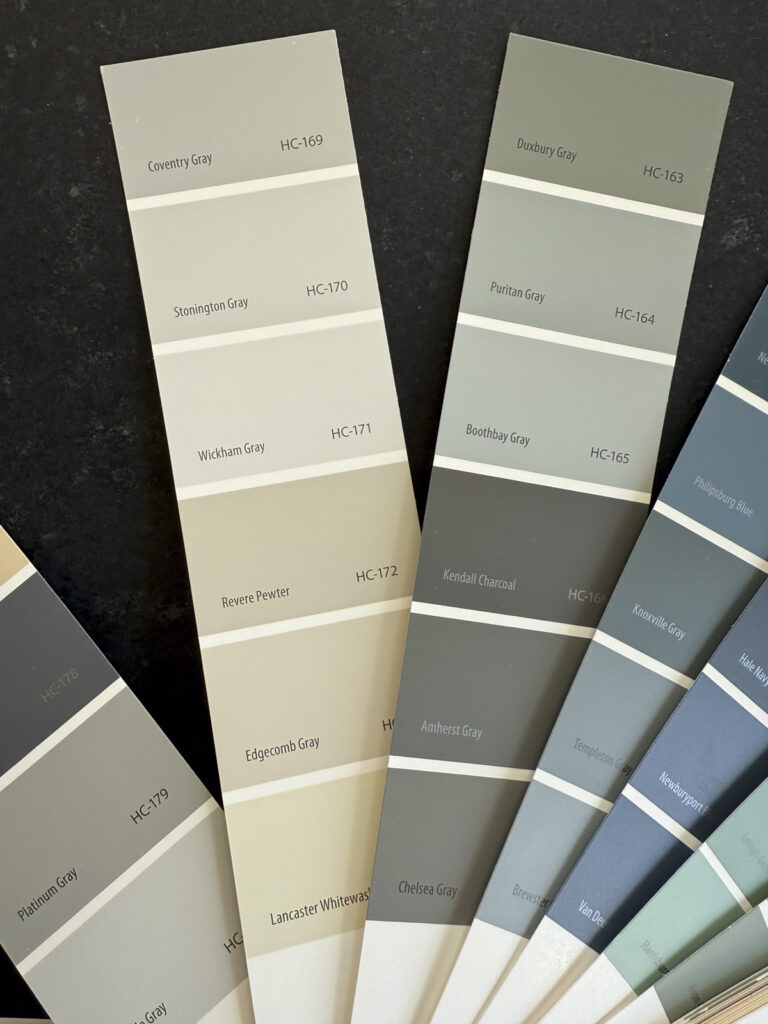
Welp, not so my friends! It is actually a low chroma tint of blue. Aka it has a blue undertone.
To dig in, I find it is helpful to compare paint colors to see these subtle undertones. Take another neutral and place them side by side. Now, below you will see how the blue undertone of Wickham Gray is much more noticeable when it is compared to Revere Pewter. Incedentally Revere Pewter has an orange undertone (it’s complement!)

Lighting
The other big mistake I see with picking hues for interior design is due to lighting. Artificial light limits our eye’s ability to perceive entire sections of the visible color spectrum. In other words, colors will look much more muted at night. And depending on the temperature or kelvin of your lightbulb, the color will read very differently! Simply turning on a light or changing a lightbulb will completely distort our perception of a hue. I always pick paint colors, tiles, stains and fabrics in daytime and then look at them again at night. It is helpful to look at samples at all times of day and in various lighting conditions to determine if it is right for you.
Screen Colors Vs. Real Life Colors
Colors on a computer screen lack the nuance of real-life paint colors. Some of my favorites, like Sherwin-Williams’ Wool Skein or Relaxed Khaki, look flat or dull on a screen but feel rich and complex in person. That’s because screens use additive color (mixing red, green, and blue light), while paint is made with subtractive color mixing, where pigments absorb and reflect light in more intricate ways.
Using Hues Like A Pro
Picking the right hue isn’t just about choosing a color you love—it’s about knowing how it will actually look in your space. Light changes everything, undertones can sneak up on you, and fan decks can be seriously misleading. The good news? A little knowledge goes a long way. Stick to muted shades, test colors in different lighting, and compare neutrals side by side to spot those tricky undertones before you commit.
Even so-called “safe” colors like grays and beiges have hidden surprises. What looks like a soft gray on a tiny swatch might turn green or purple once it’s on your walls. That’s why I always recommend sampling colors on a larger scale and viewing them throughout the day—you’ll thank yourself later!
At the end of the day, getting hue right is less about following strict rules and more about training your eye to see color for what it really is. Take your time, test before you commit, and most importantly—trust what you see in your space, not just what looks good on a screen or in a store.