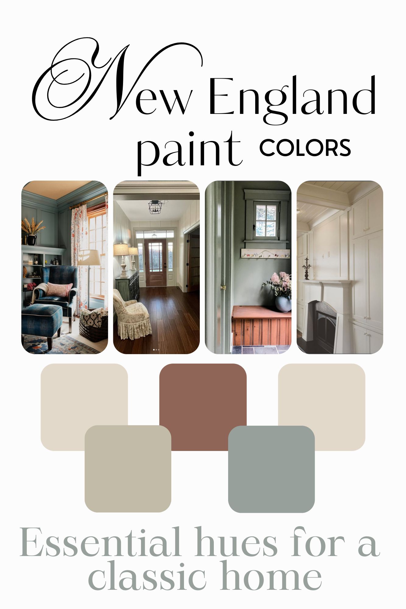
The Essential New England Color Palette: 5 Foolproof Paint Colors for Classic Homes

Choosing paint colors for a New England home feels a little like stepping into a different universe. Our houses come with history: wide-plank floors that have seen generations of feet, deep sills worn buttery-smooth with time, antique trim that refuses to be ignored, and light that changes dramatically from July to January. Colors that look bright and airy in a California new build can fall completely flat in a Connecticut colonial or a Vermont farmhouse.
As a certified color expert, I spend most of my days helping homeowners sift through endless paint chips and talking them off the ledge of second-guessing (because trust me, we’ve all been there). But my love for New England color didn’t start in a color studio. I grew up in a home on the Historic Registry, surrounded by quirky charm and old-house soul. And later, during our own multi-year Vermont farmhouse renovation, I learned just how transformative paint can be. The right color doesn’t just change a room, it makes an older home feel warm, grounded, and true to its bones.
Over the years, I’ve noticed I return to the same tried-and-true hues again and again. Not because I’m stuck in a rut, but because these colors work beautifully with New England architecture and light. They feel timeless, cozy, and instantly welcoming. Today, I’m sharing those five go-to colors with you, plus the color principles behind why they’re so reliable.

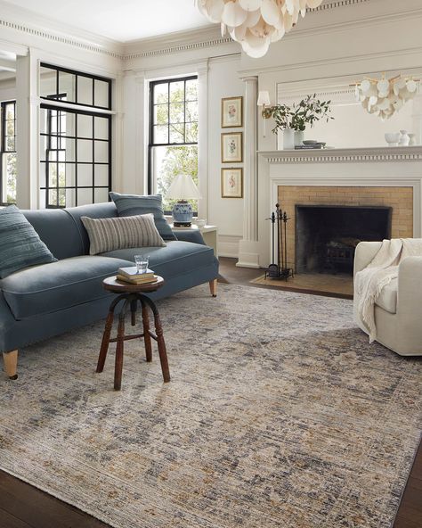
Photo Credit: Crisp Architects
What Paint Colors Are Best for a New England Home?
You might be thinking, Why would paint colors behave differently here? I promise, they do. New England homes come with a special set of characteristics that influence how colors show up on your walls. Here’s what makes this region unique:
- Cooler, softer natural light. Many of my clients, especially those in rural areas, also get strong green reflections from surrounding woods, fields, and mountains especially in the summer months.
- Antique or unpainted wood tones. Older homes often feature warm, rich wood that plays beautifully with some colors and completely clashes with others. Add to that slate tile floors in the mudroom and brick fireplaces, and you have distinct russet browns and reddish earth tones that must be considered when picking paint colors.
- Classic architecture. Colonial lines, farmhouse bones, millwork, and low ceilings give older homes charm but can also create darker spaces. The right paint color can enhance this character instead of fighting against it.
- Major seasonal shifts. Summer sun washes colors out; winter brings cool shadows that make some hues look minty, dingy or muddy. The goal is to choose colors that ride these swings gracefully.
- Bright whites can fall flat. If clean modern whites feel harsh, sterile, or oddly gray in your home, you’re not imagining it. Luckily, there’s a workaround.
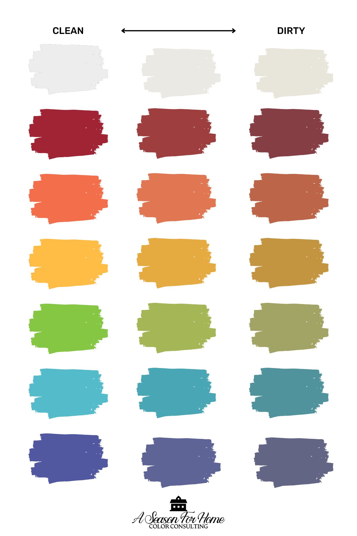
- Timeless New England style favors earthy, desaturated color. Ou color palette in New England is rooted in Colonial Pigments. As a result, low-chroma colors (aka dirty colors) and historically inspired hues feel naturally at home here (and no, you don’t have to stick to the “Historic” fan deck to get the look!)
With that foundation in mind, here are the five paint colors I recommend over and over for New England homes.
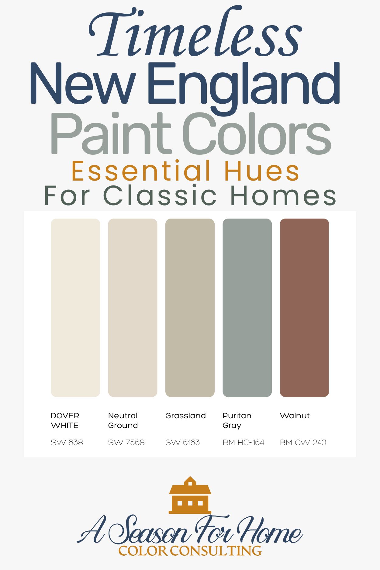
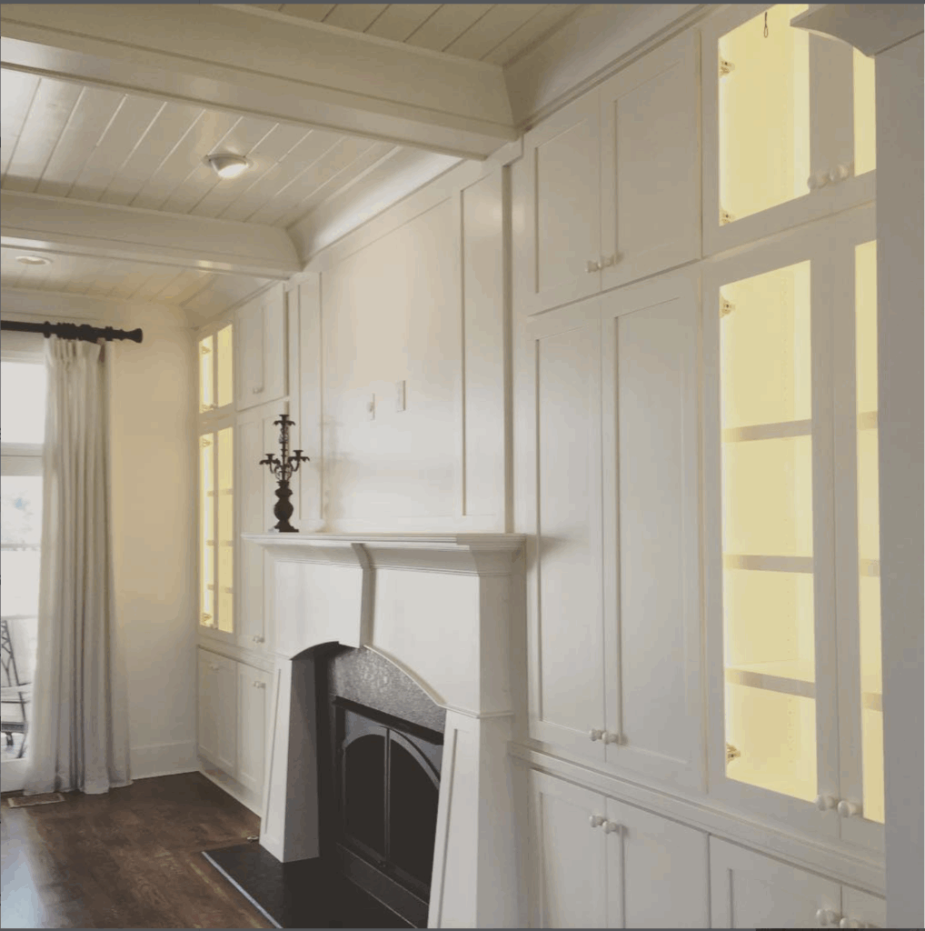
1. Warm, Creamy Off-Whites
It’s hard to pick a favorite, but one of my most reliable creamy off whites that looks gorgeous (even in the darkest spaces) is Sherwin Williams Dover White. This is the white paint I go to again and again for ceilings, trim and white walls.
Sherwin Williams Dover White. Photo Credit: @hatcliffconstruction
Why We Love Dover White By Sherwin Williams
- One of the biggest mistakes I made when we bought our 1790s farmhouse was painting the walls of our dark dining room White Dove by Benjamin Moore. What I didn’t know was that certain white paints look terrible in dark spaces! Silly me, I was just trying to brighten it up.
- What I learned in my Color Expert Certification traing is that this is a common misconception. In fact, bright whites can look flat or dingy in low light, but creamy whites glow in dark interiors with small windows or porches overhanging. Warm whites with yellow undertones can even handle the cool northern light we get in the winter!
- Now I know that Dover White is stunning in low light rooms. It has the same high LRV (83) as White Dove but carries more warmth, perfect for darker New England rooms.
- It plays beautifully with antique furniture, patina-rich wood, and traditional trim.
- While it isn’t stark, sterile, or overly yellow it also feels classic, cozy, and quietly historic.
- I highly suggest considering a warm off-white like Dover White as a softer alternative for trim when you want white but not builder-basic white.
Best for: Trim, ceiling and anywhere you want to use white. It looks great in foyers, on kitchen cabinets, living rooms, bedrooms and hallways.
2. Soft Beiges, Taupes & Warm Greiges
I feel like a broken record sometimes, but I will happily admit that Sherwin Williams Neutral Ground is one of my most recomended paint shades when coming up with clients home color combination . I literally cannot count the number of clients for whom I have specified this creamy warm neutral beige paint color!
But don’t run away when you hear me say “beige” this is much softer and lighter than the beige paints of yore. This is much lighter and not as intensely yellow of the beiges of the early 2000s.

Neutral Ground on The walls with darker contrast trim in a mudroom. Photo: @buildingacasehouse
Why It Works
- Neutral Ground handles both summer’s strong directional light and winter’s cool blue shadows.
- A higher LRV (70) brightens darker homes with low ceilings and small windows.
- Feels grounding and warm during long winter months.
- Doesn’t clash with earthy fixed elements like brick and antique floors.
- A perfect backdrop for the muted greens, reds, and blues often found in historic New England homes. Having a workhorse neutral like Neutral Ground is key when using an accented neutral scheme for interior design.
Best For: living rooms, dining rooms, parlors, historic trim moments
3. Earthy Sage Greens
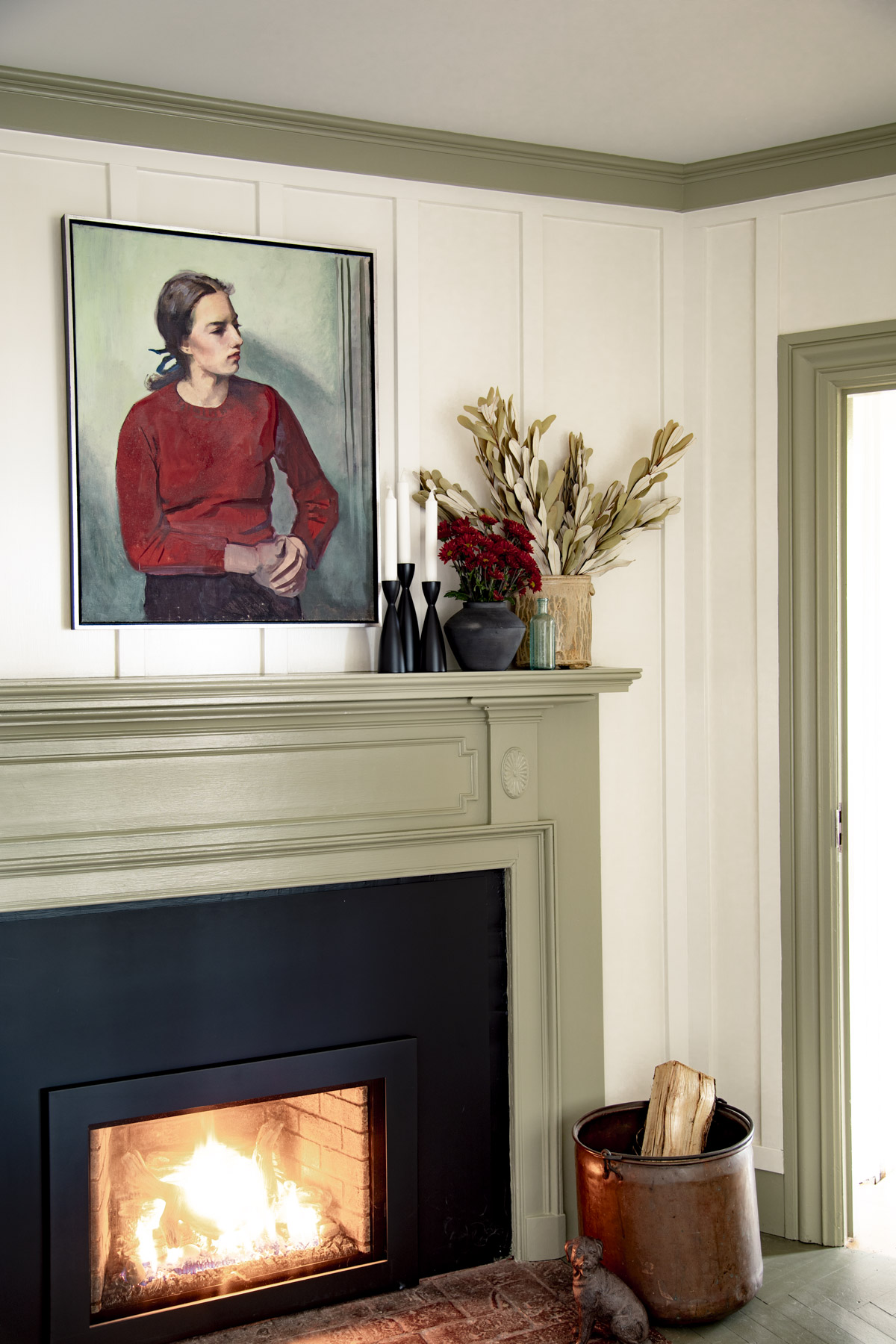
Examples: Benjamin Moore Nantucket Gray (shown above in my office) or Sherwin Williams Grassland
Why It Works
- Soft, muted, low-chroma greens feel naturally at home in New England’s landscapes and historic architecture.
- Timeless without drifting into “colonial kitsch.”
- Beautiful for cabinetry, wainscotting, and even exterior trim.
- Adds color while keeping the overall palette calm and refined.
- Looks great with muddy and complex undertones of fixed elements like stone, brick and aged wood.
Best For: mudrooms, kitchens, libraries, guest rooms
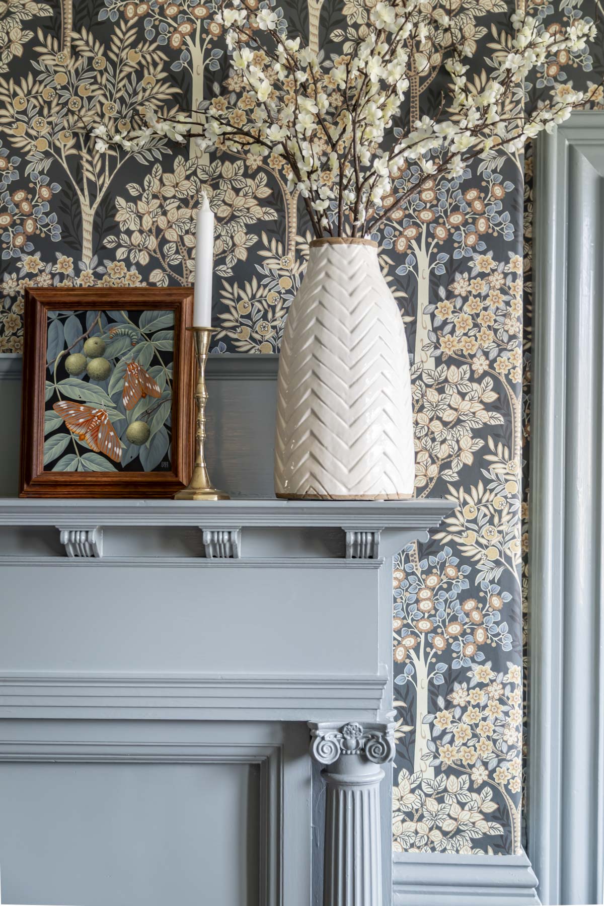
4. Dusty Gray-Blues
When I meet with my clients before our color consulting appointments, I always make sure to ask what colors they are drawn to. Three quarters of the time the answer is often greens or blues. When I sift back through the paint schedules I have created, these dusty blues come up time and time again.
Examples: Brewster Gray, Wales Gray, Templeton Gray, Puritan Gray (all Benjamin Moore)
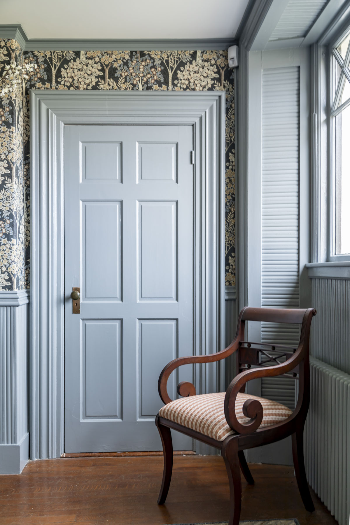
Brewster Gray by Benjamin Moore is a perfect example of a New England paint color that can be used on walls, trim or accents and always feels timeless.
Why It Works
- All of these above mentioned blue gray paint colors have enough weight for traditional millwork but stay soft and livable thanks to gentle graying.
- These mid tones vibe effortlessly with historic wood, clear old-growth pine planks, aged oak, even yellow-leaning maple.
- Look New England coastal, farmhouse, or traditional depending on your styling.
- I love these colors for reverse trim in spaces with lots of ornamental woodwork.
Best For: Stairwells with tons of woodwork, bathrooms, bedrooms, mudrooms, breezeways, Federal-era home’s foyers and stately home offices.
5. Earthy, Desaturated Reds (Brick Tones)
While red is not a paint color that comes to mind for most people, earthy brick colored pigments are traditional early New England and always look at home in the classic homes of the North East. I use these red paint colors in moderation for my paint schemes. The key is to use them for a pop of contrast!
Examples: Benjamin Moore Audubon Russet, Walnut and Boston Brick
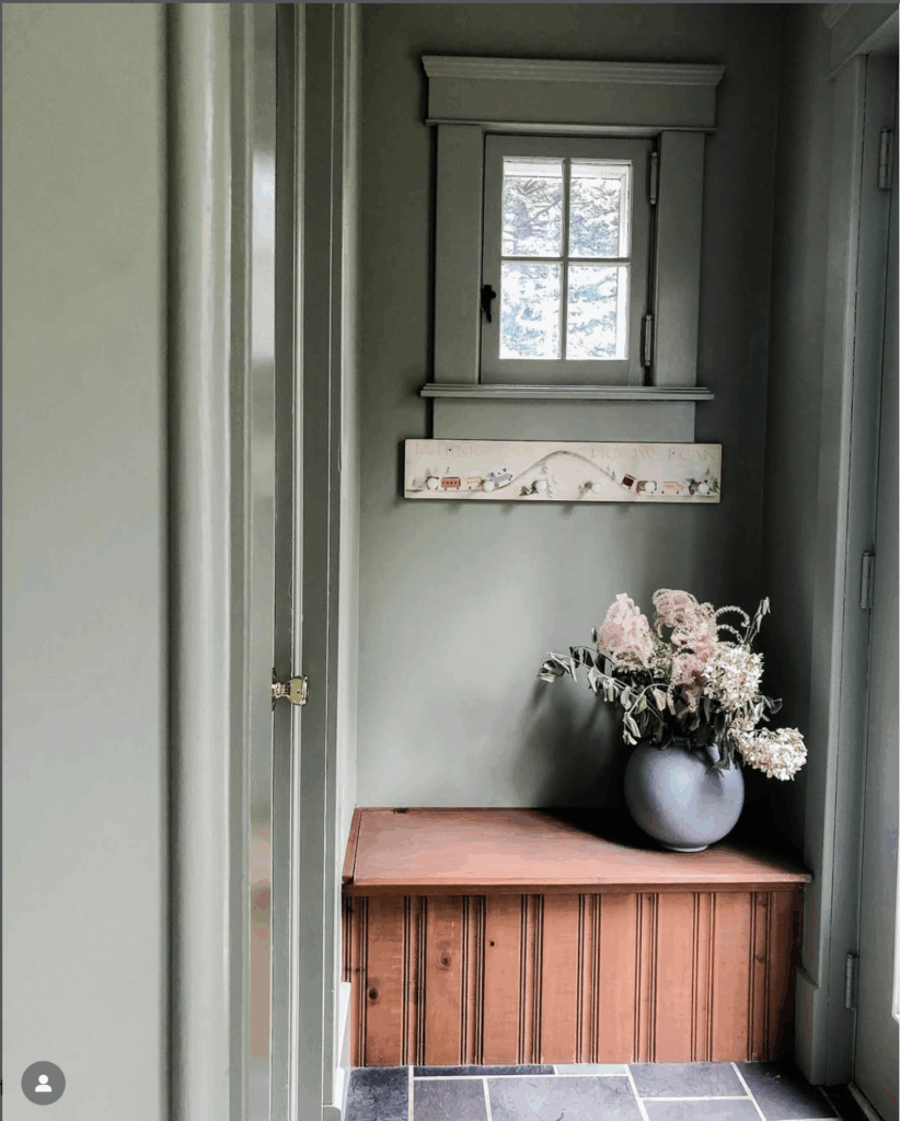
A rusty red bench in a mudroom gives a pop of contrast. Photo: @sanfordcollectiveinteriors
Why It Works
- Browned, earthy reds with warm undertones feel rooted and authentic, never costume-y like blue or purple-leaning burgundies. I love those that look like they were created using natural pigments.
- Provide the “pop” most color schemes need while still looking natural and historic.
- Perfect for unexpected moments of charm: interior doors, stair risers, a kitchen island, or built-ins.
- Echo classic New England barn reds and brick tones.
Best For: front doors, dining rooms, interior doors, built-ins
How to Choose the Right Color for Your New England Home
Keep these principles in mind as you narrow your options:
- Pay attention to light direction, it changes everything. North facing rooms and those with small windows or low ceilings get less warm direct light and the colors will need to be adjusted accordingly.
- Consider your wood undertones, they’re part of the palette whether you want them to be or not. A lot of older wood floors and beams have orange tones which pair well with blues and greens but clash with taupes. Keep that in mind when you are picking your main neutral and your highlight colors.
- Look down. Your floors matter more than most people realize. As do the other fixed elements in your home including brick, stone and slate.
- Your personal style determines how muted or saturated you should go. While traditional New England colors are based on colonial era pigments, if you prefer a bit more saturation, the key is keeping it consistant throughtout your whole home palette.
Need a hand pulling it all together?
If you’re choosing paint colors for a New England home and want a palette that feels warm, classic, and deeply connected to your architecture, I’d love to help you create a color plan that feels just right. Click through to learn more about my Virtual Color Consultations.