
Apple Green Paint Colors

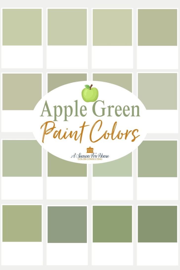
If you love green, then you are not alone. It is one of those timeless hues that folks love to add to their interiors no matter the trend cycle! You are in luck because today we are talking all about Apple Green paint colors.
If you are new here, welcome! I am Katie, a Certified Color Expert and paint color consultant specializing in New England style. I help homeowners in Vermont and beyond, through my online color consulting business, choose paint colors for their homes. My goals is to help you create the home you love to live in through color.
Is Green Paint Trendy?
Green has always been a favorite for interior design, but it is more popular than ever! Over the last decade, the trending shades of greens have followed a distinct path, in the early 2020s we were deeply ensconced in the soft grayed green shades of Benjamin Moore’s October Mist and Sherwin-Williams Evergreen Fog. Both companies dubbed similarly low-chroma shades of sage green for their Colors Of The Year for 2022!
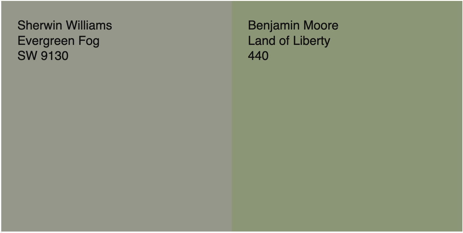
But now, in 2026 (and trendcasting for 2027) the green that everyone wants is much more saturated- like a crunchy and tart Granny Smith green apple! [I say this, then of course, Behr never moved on, and they chose a slightly darker version of Evergreen Fog for the coming year. Facepalm.} I personally have noticed that interior designers and online shelter magazines and retailers are moving to this green apple shade of green more and more. Not only that, my clients in my color consulting business are loving more saturated hues!
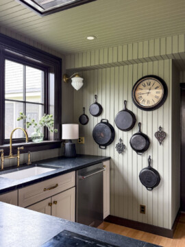
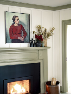
So today’s color consulting blog post is all about the perfect shades of Apple Green Paint. I’ll be sharing my favorite picks that are fun, cheerful and cottage-forward, without looking garish or like a 6-year-old picked them out. These green apple paints are sophisticated and evocative of English Country Interiors with the right amount of high chroma pizzaz!
What Color Is Apple Green?
Apple green is a clean, relatively high-chroma hue, with equal amounts of yellow and blue. Like the name implies, this color is similar to a green Granny Smith Apple.
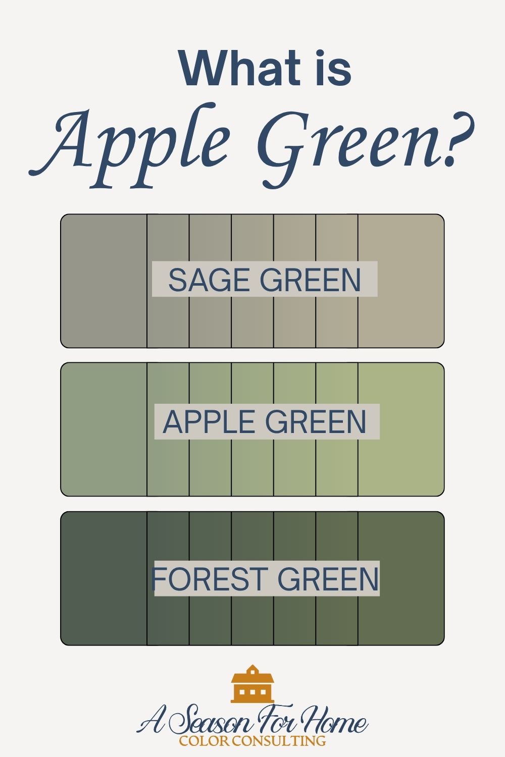
Some other common ways of describing apple green are Spring Green (softer) or Avocado Green (more yellowed.) Apple stops short of cooler frosty or mint shades and sometimes has distinct sunny undertones.
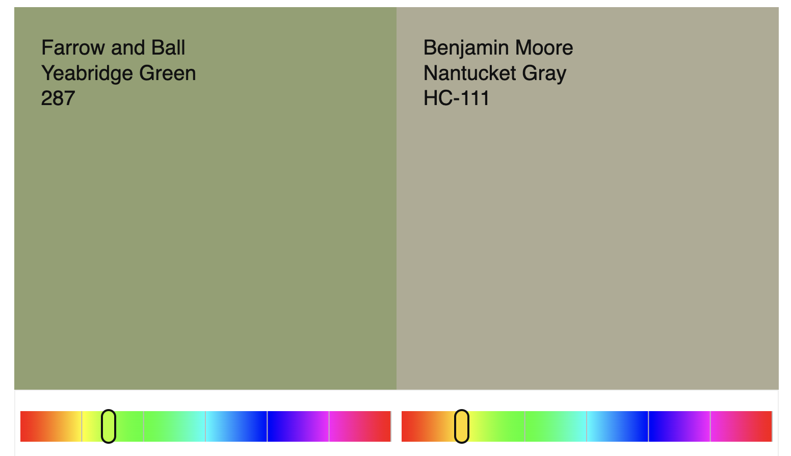
While some sage green paints, like Nantucket Gray or Creekside Green have orange in their formula and achieve their percieved greenish hue when chroma collapses, these much brighter shades of apple green are true green made with blue and yellow pigments.
Why Is It Popular In Interior Design?
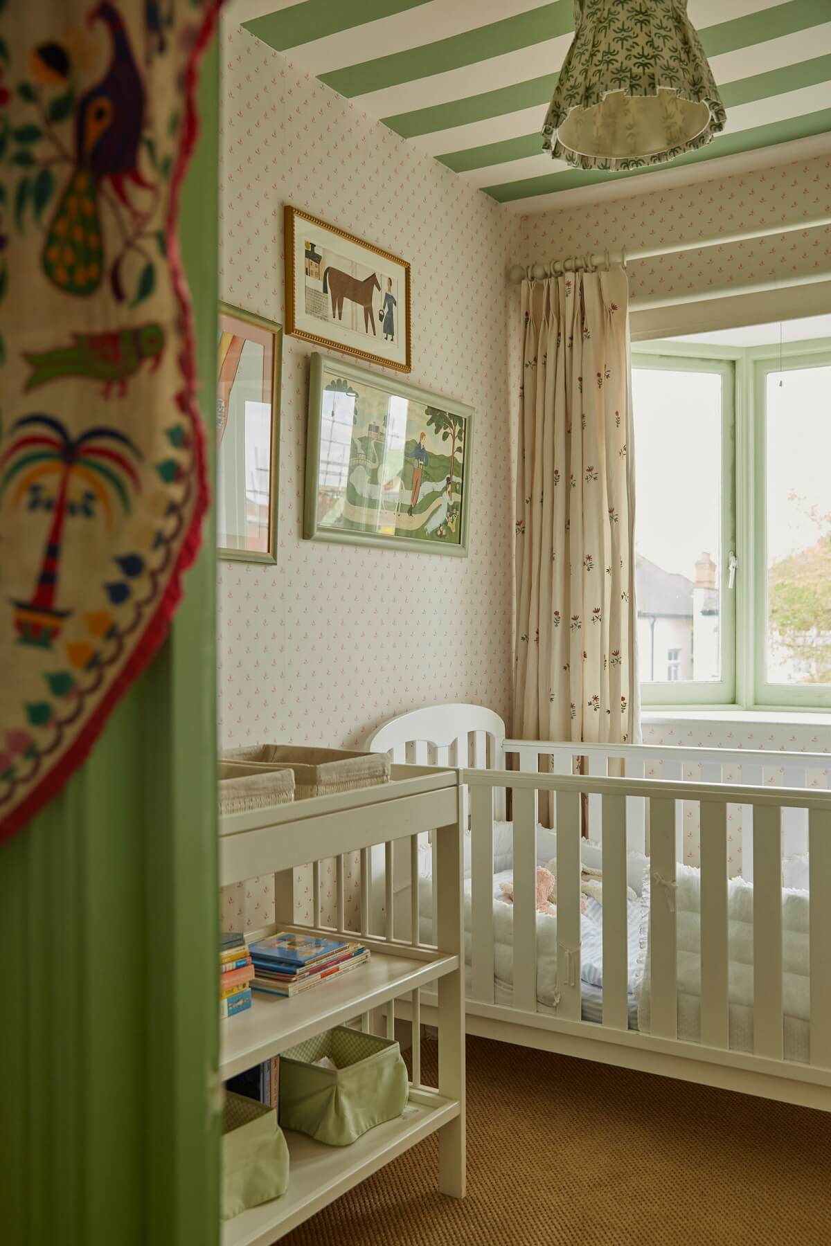
I personally think the trend going from gray-green sage shades of green into sweeter more high-key spring greens, and apple greens is due to the huge influence of English Country interiors. Our collective color palette has become more saturated in only a few year period and I believe it is a logical outcome of this fascination/obsession.
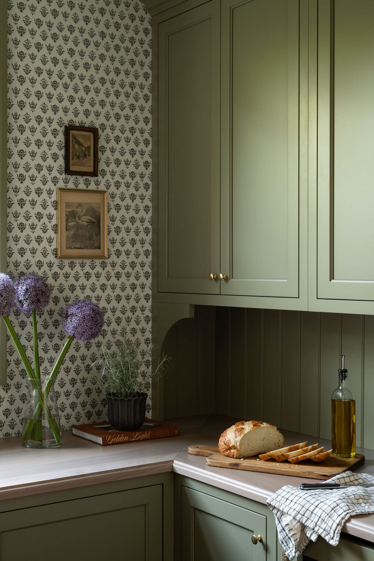
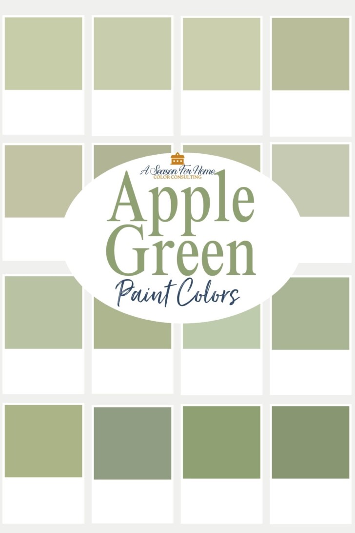
While I touched on this topic in my Color of The Year 2027 prediction post, I feel this Apple Green trend is important enough that it deserves its own palette! So today I have a complete line up of sixteen of my favorite Apple Green Paint Colors!
The 16 Best Apple Green Paint Colors
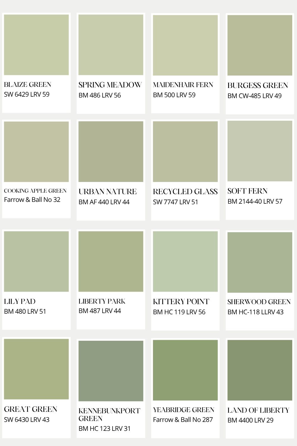
Blaize Green by Sherwin-Williams:
LRV 59. This sunny-tinged apple green is light enough to use in a darker space and would be one of my top picks for an apple green bedroom wallcolor. This would be lovely color capped with Sherwin-Williams Great Green on the trim.
Maindenhair Fern by Benjamin Moore:
LRV 59. Without comparing it side-by-side, Maidenhair Fern would feel almost sage-like. But hold it up next to Grassland by Sherwin-Williams and you will notice how distinctly candy colored and pigmented it is. Like Blaize Green mentioned above it has a soft yellow undertone that keeps it from feeling too minty.
Soft Fern by Benjamin Moore:
LRV 57. If you loved October Mist five years ago, then you will love Soft Fern now. It is similar in value, but slightly amped up in saturation which makes it feel more on-trend for today’s paint color vibes.
Spring Meadow by Benjamin Moore:
LRV 56. This is the lightest of my top three picks of these 16 paint colors. It would be beautiful and cheerful with creamy warm white trim (like Dover White or Whitetail by Sherwin-Williams) for a kitchen or bedroom.
Kittery Point by Benjamin Moore:
LRV 56. This classic historical collection paint color is slightly minty and lighter in value, so choose it when you are looking for a brightening color with a bit of cooler undertones.
Cooking Apple Green by Farrow & Ball:
LRV 53. This dirty shade of apple green is light in value and has complexity. The warmth gives it a slightly olive tone which would pair nicely with peach for a two colored harmony. This would be a great color to use on woodwork in a mudroom or similarly high-energy space.
Lily Pad by Benjamin Moore:
LRV 51. This is clean and simple and a beautiful choice for a nursery or playroom. Pair Lily Pad with a classic white like White Dove by Benjamin Moore or Alabaster by Sherwin-Williams for a crisp and traditional look.
Recycled Glass by Sherwin-Williams:
LRV 51. If Cooking Apple Green feels a little too dirty, try Sherwin-WIlliams’ Recycled Glass. It has a similar level of warmth and value but is higher chroma.
Burgess Green by Benjamin Moore:
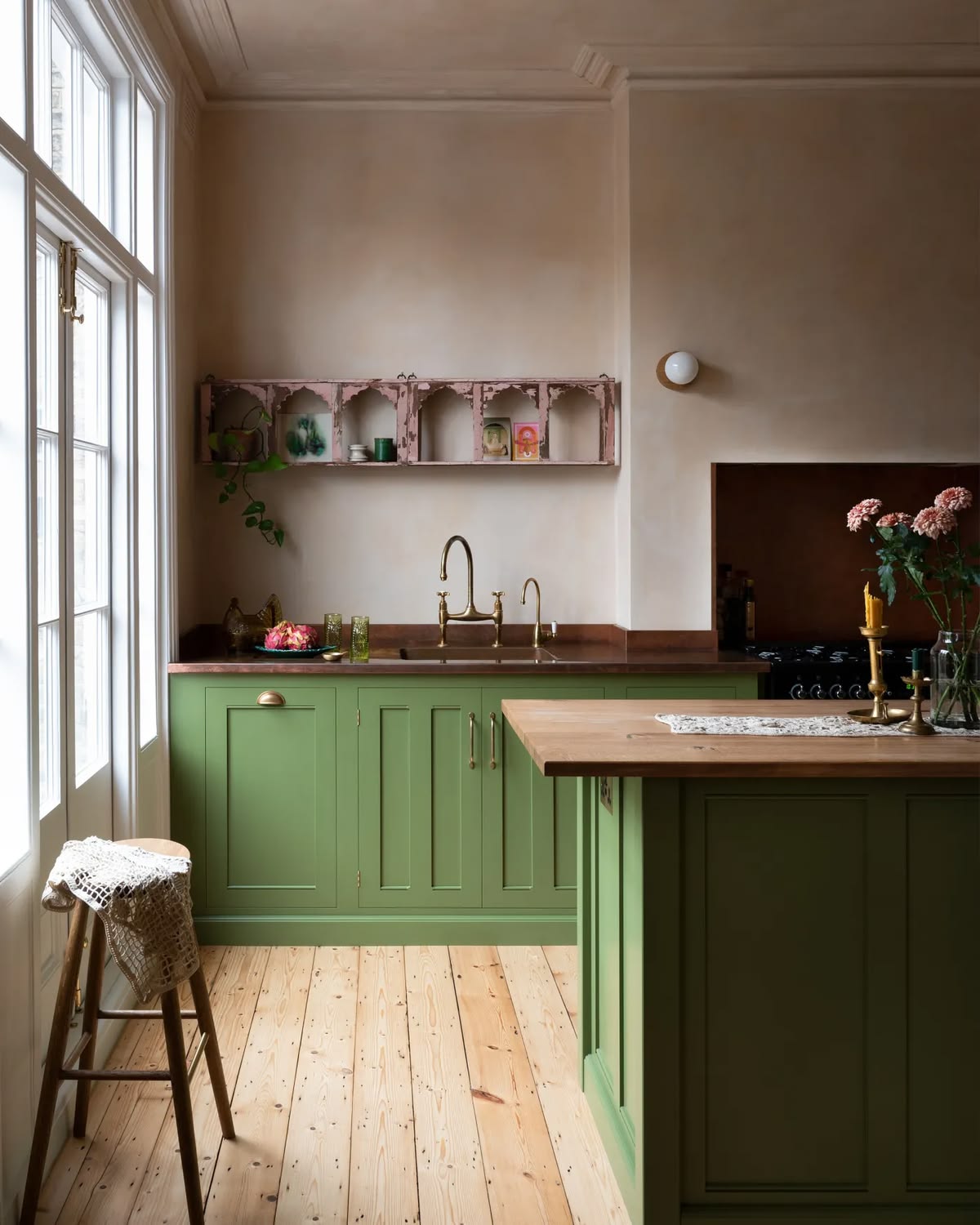
LRV 49. Burgess Green is just right. It is neither too dirty nor too clean. It leans slightly warm and to the yellow end of the spectrum as far as apple green paint colors are concerned. I’d use this paint color on kitchen cabinets for a cottage feel paired with white quartz counters and dark wood floors and accents.
Urban Nature by Benjamin Moore:
LRV 44. Benjamin Moore Urban Nature is a favorite in my color consuting business. This Affinity collection color has a nice amount of complexity, which allows me to fold it into a whole house palette more easily. {I try to keep the chroma level consistent with all the colors in a home so none jump out at you!} In other words, this apple green will play nicely with other popular paint colors.
Liberty Park by Benjamin Moore:
LRV 44. Liberty Park is another of my top three favorite green apple shades of paint! I am currently working on a project and this is my green of choice throughout the home! It will work in both the living rooms and bedrooms! It is cheerful and clean without feeling tiresome or overly saturated.
Great Green by Sherwin-Williams:
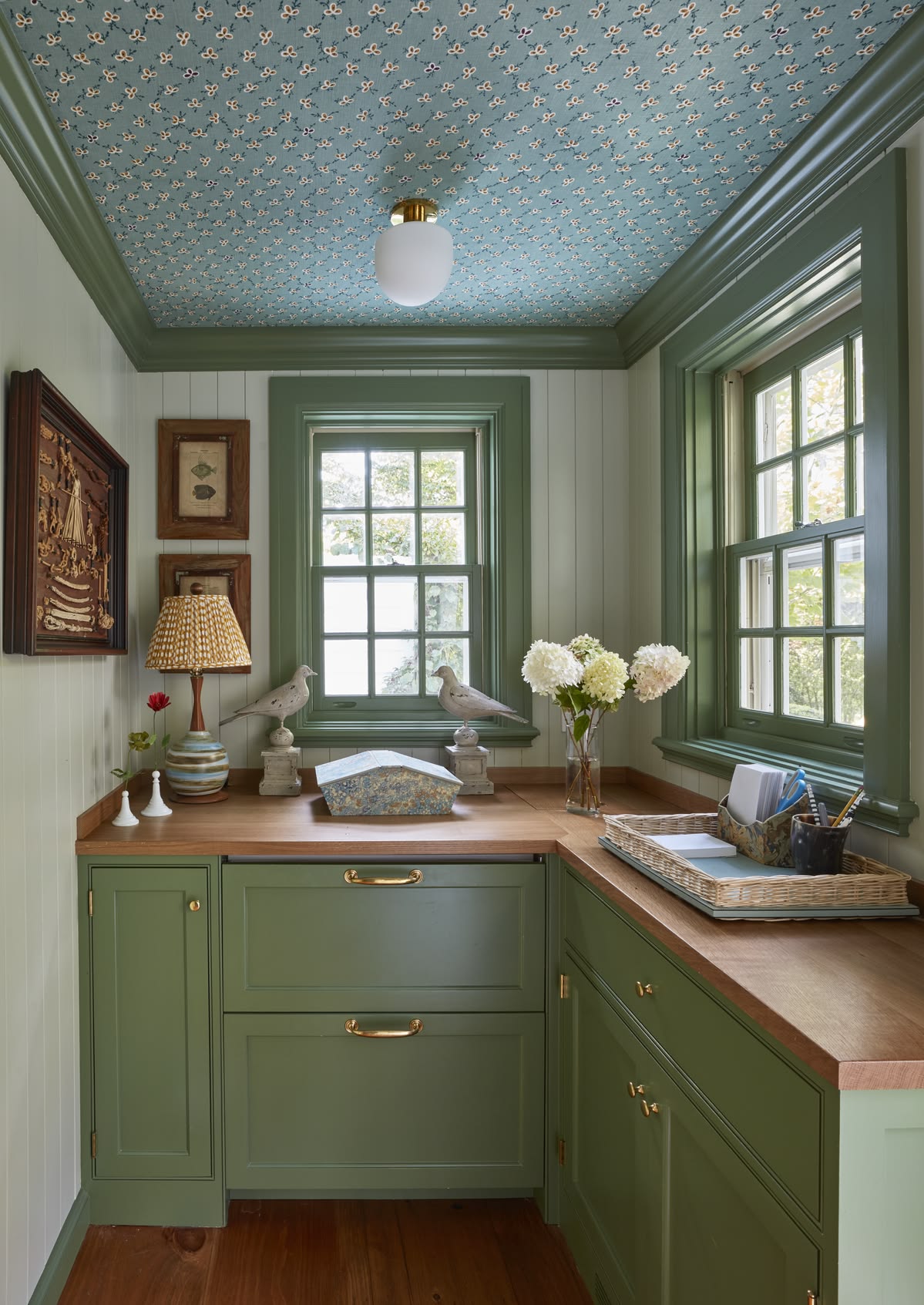
LRV 43. If you really want to go for it, use Great Green. This is probably too much for an all over green IMO, but it would be a great accent color. I’d use it for a kitchen island or a furniture piece. If you are one of the lucky people who has a butler’s pantry, you could go for cabinets in Great Green and then use it in small amounts in the main kitchen. Or you could use it in a small space for the millwork, paired with Blaize Green on the walls. This would give total English Country vibes!
Sherwood Green by Benjamin Moore:
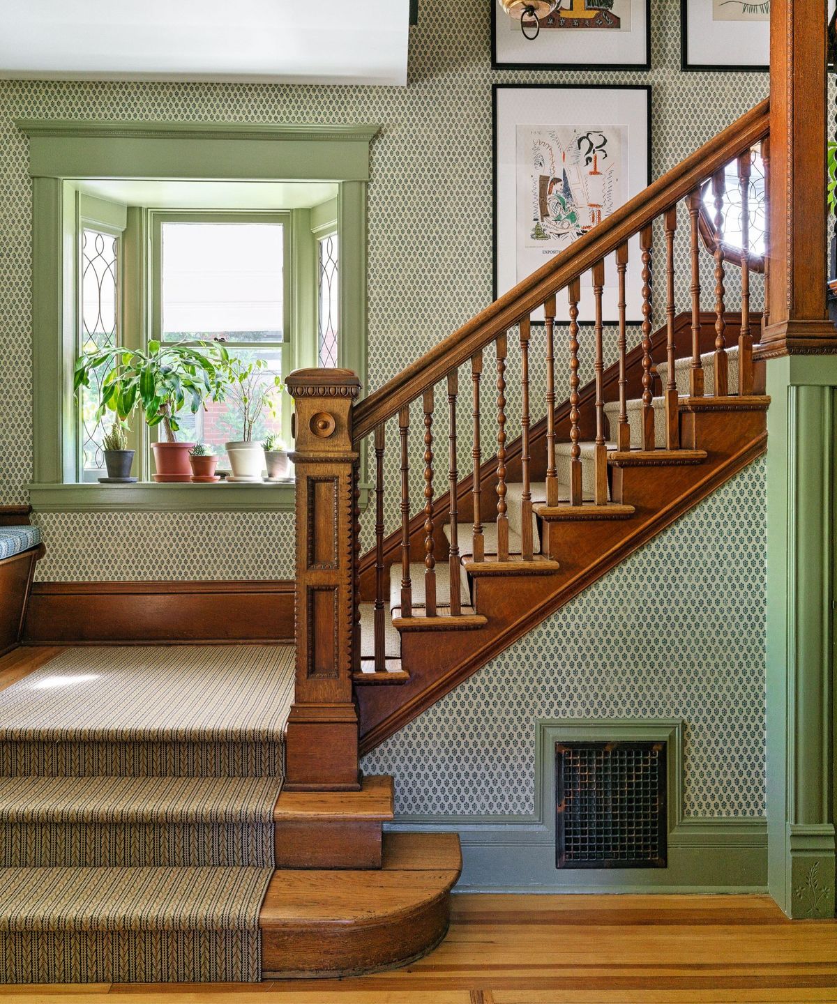
LRV 43. This historical shade from Ben Moore is right next to Kittery Point on the fan deck, and can be paired with it for color capping. It has a slight minty feel so it may be too sweet for some of you. Definitely sample it in your space! I love the idea of using it in an entryway or front stairwell on millwork paired with wallpaper or rich cream paint (like Neutral Ground by Sherwin-Williams) on the walls.
Yeabridge Green by Farrow & Ball:
LRV 32. I adore this fully in your face bright green paint color! It is all there and then some! It is one of our darkest shades here and it is also deeply saturated by comparison to some of the others. Use this for a single statement picece of furniture (like a hutch) or paint your trim with it and pair it with a patterned wallpaper for a charming cottagecore aestheic.
Kennebunkport Green by Benjamin Moore:
LRV 31. This tried-and-true shade is slightly cooler than Yeabridge Green. If you are a fan of Benjamin Moore’s Historical Collection, you will love this beautiful, rich spring green. In a space that leans dark, it can be a surprisingly fresh way to add charm to home office or dark stairwell.
Land of Liberty by Benjamin Moore:
LRV 29. This paint color is one of my top three apple green paint colors. I’d recommend it for furniture pieces or when you need a bit more oomph (depth) from your shade. Compare it to Liberty Park to decide which value is best or color cap with it and use both!
Which White Paint Goes With Apple Green?
I like a creamy warm white with apple green because it softens the feel of it. If you like a more crisp look, try one of the cool whites instead of a high LRV stark white. The feeling will be more soft and sophisticated not sharp or harsh. Here are some top recomendations:
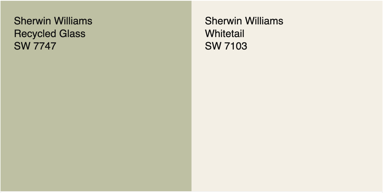
Bright Warm Whites To Pair With Apple Green:
- Sherwin-Williams Whitetail
- Sherwin-Williams Dover White
Creamy Off-White Paints with Green Apple Paint Color Pairing:
- Sherwin-Williams Creamy
- Benjamin Moore White Dove
- Sherwin-Williams White Duck
Cool Whites To Pair With Apple Greens
- Sherwin-Williams Pure White
- Benjamin Moore Decorator’s White
Color Pairings For Apple Green
Apple Green looks great with medium valued and moderately high chroma colors like gold, peach and aqua or duck egg. Here is an example palette of some shades I would pair with Liberty Park
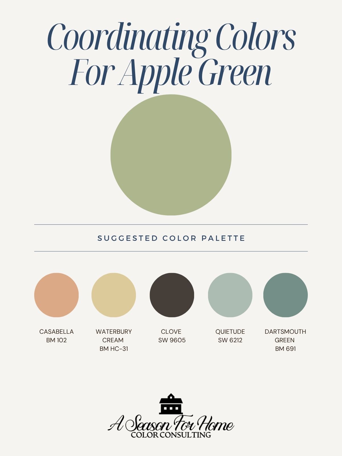
- Benjamin Moore Casabella
- Benjamin Moore Waterbury Cream
- Sherwin-Williams Clove
- Sherwin-Williams Quietude
- Benjamin Moore Dartsmouth Green
How To Pick The Best Shade Of Green
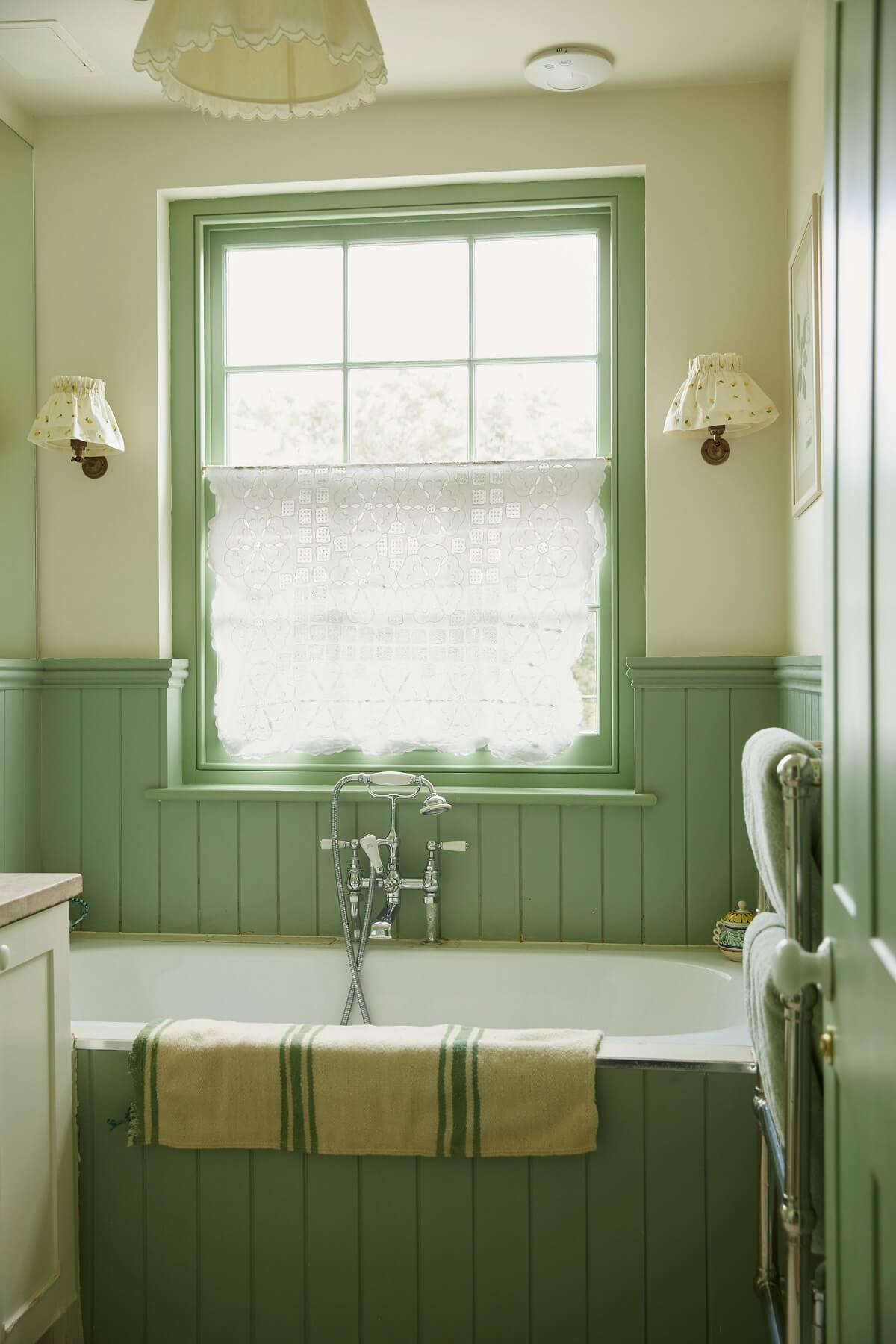
Cohesion With Your Home’s Palette Is Important: Apple green, while trendy, is not for every project. If your home is decorated in muted New England colors, like mine, then apple green may be a better color to accessorize with. Stick with grayed sage greens for your walls instead. But if your home is filled with more vibrant colors, it most certainly will look great with your palette!
Don’t Ignore Light But Ignore Online Photos: Lighting affects paint so much and paint colors in your home will look different than the way they look online! Knowing how light affects color is important. For example, if your space is used more at night, opt for a higher saturation color. If your space has southern sun, try one of the more minty shades with some depth.
Sample before committing! Try a few different paint colors and LRVs to find the right chroma level and value. If you want to try them out mess-free try large samples from Samplize! (That’s an affiliate link.)
Need help choosing the right color?
If you’re feeling stuck or want a second set of eyes, I offer Virtual Color Consultations to help you make confident, intentional choices for your home, wherever you’re located.