

Why I never Recommend Black Paint


What my mom, a fine art painter, taught me about color, tension, and not settling for the obvious choice.
I hate to use the word “never,” but it is rare that I recommend a true black paint. I can think of one time… wait, no on second thought, we didn’t end up going with black. Okay, so I never use it. If you’re wondering why as a color consultant, I don’t tell my clients to use black, read on! And I’ll also tell you which paint colors are the best black alternatives!

This may surprise some of you. Especially those who want their space to feel bold, modern, or grounded and are very sure that black is the answer. On paper, this supposition makes sense: black in an interior equals contrast, drama and sophistication. I have found that true black often reads harsh, flat, or oddly lifeless once it’s actually on the wall.
I learned this long before I ever started working in interiors. My mom is an oil painter, and she never buys tubes of black paint. I knew her philosophy well, and still, when I was in art school, I decided to experiment with black paint anyway. After enough trial and error, I realized she was right. (Aren’t they always?)

What she understood, and what I eventually learned firsthand, is that the most beautiful blacks are mixed from other colors. They have undertones, depth, and a little mystery, instead of feeling flat or one dimensional.

Today, when I work with clients to pick colors for their homes in my color consulting business, I realize I’m doing exactly what she taught me, just on walls, bathroom vanities and shutters instead of canvas. Because what most people want when they ask for black paint isn’t black at all. It’s richness, depth, and contrast, without the visual equivalent of slamming on the brakes.
Instead of me trying to convince you, and you doing what I did with my tubes of paint in art school, is I’ll show you. Deep, nearly-black paints can deliver all the drama of strict black without the starkness of something straight from the can. And they can add tension to your interior design that brings everything alive! Read on to see how this actually works in real-life interiors.
Friends Don’t Let Friends Use Tricorn Black. Here’s Why:
In the art world, black isn’t always treated as a standalone color, at least not by artists who are willing to slow down and ask questions instead of settling for what comes straight out of the tube.

For those painters, black is about tension and interaction: a nearly black touched with red adjacent to a green leaf will vibrate in a way pure black never could.

That same idea applies to interiors.

When you paint an entire wall, cabinet run, or set of shutters black, you’re working at a much larger scale than a canvas. Light hits it differently. Undertones become more obvious. And unlike a small painted detail, these surfaces have nowhere to hide. A flat black will reveal itself immediately.
Why True Black Often Falls Flat in Real Homes
True black excels at absorbing light. That can sound dramatic, but in practice it often works against the room.
Instead of adding depth, true black can:
- Look budget or builder grade
- Flatten architectural details
- Create contrast that feels abrupt or try-hard
- Read harsher than expected, especially in low or uneven light

This shows up most often on cabinets, trim, accent walls, and exterior details, the very places people turn to black for “impact.”
What People Are Really Asking for When They Ask for Black
During my color consultations, when someone requests black paint, they’re rarely asking for the color itself.
They’re asking for contrast. Grounding. Sophistication. A little tension. True black just happens to be the most obvious way to ask for that, not the most interesting one.
Make sure to check out how to create a home color scheme, and join our email list. When you do, I’ll send you a free color palette for Edgecomb Gray!
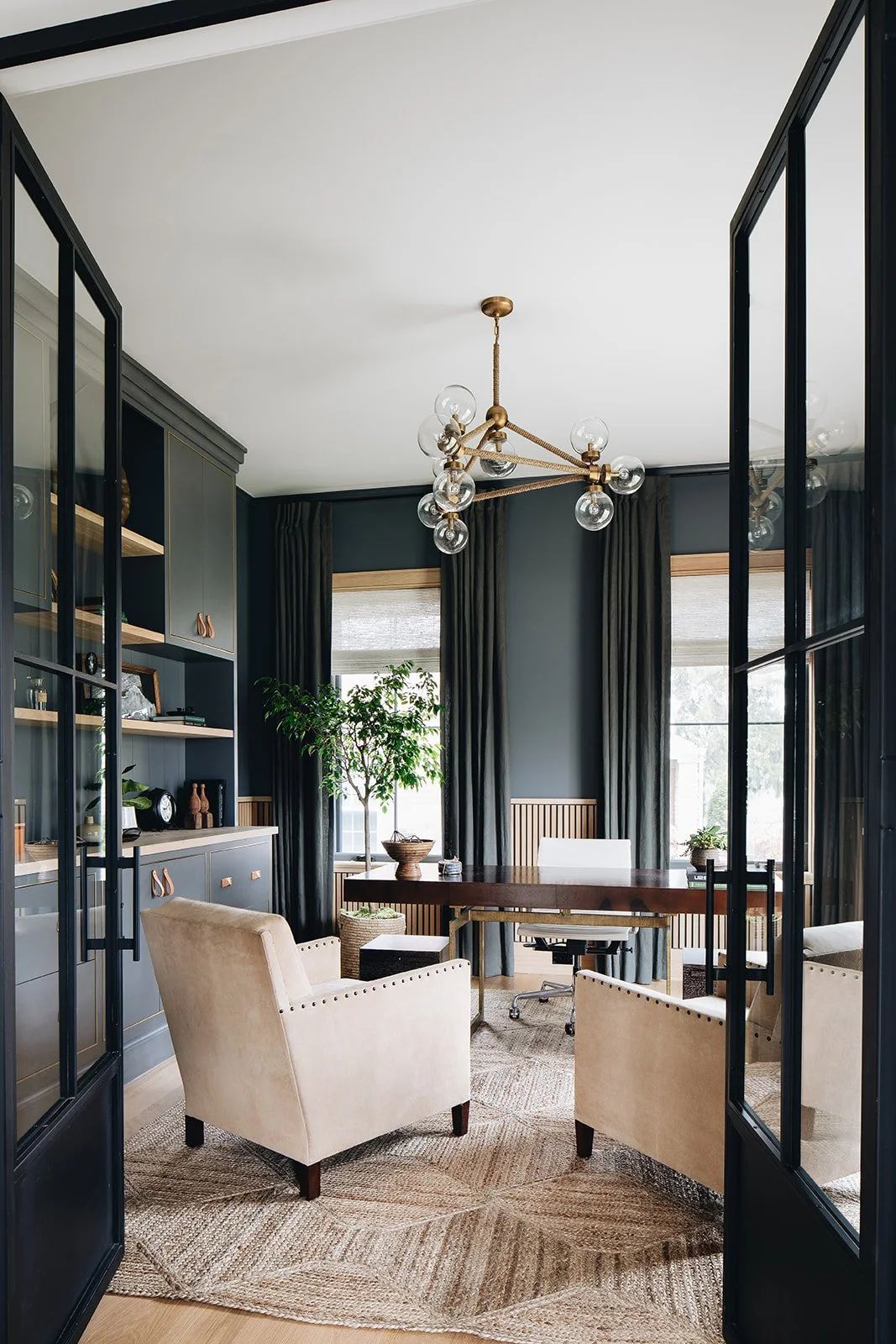
Best Black Paint Alternatives: Nearly Black Paints
When I specify nearly blacks, it’s because someone wants drama without harshness, depth without predictability. These are a few favorites I come back to again and again:

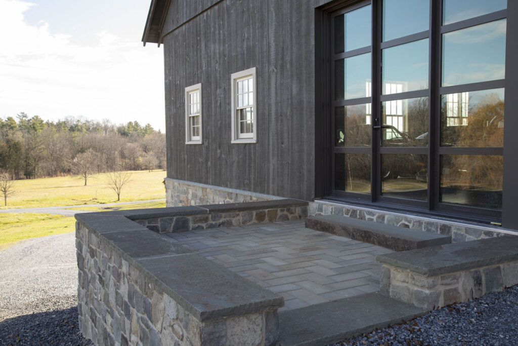
My Favorite Nearly Black Paint Colors
- Sherwin-Williams Clove – A rich blackened chocolate brown with warmth and depth. We used this on the trim in our in-law apartment kitchen, and it creates contrast without sharp edges.
- Bucktrout Brown – A nearly black with a subtle aubergine undertone. We used this in a back stairwell, and it adds shadow and intrigue without feeling flat.
- Benjamin Moore Soot – A deep black-navy that feels tailored and architectural.
- Benjamin Moore Mopboard Black – A chalkier navy-black that works beautifully for exteriors, stairwells, fireplaces, and doors.
- Sherwin-Williams Rojo Marrón – A nearly black-red that feels incredibly luxe, especially in low light or a shinier sheen.
- Sherwin-Williams Cascades – A deep teal alternative to black with movement and richness.
- Benjamin Moore Dragon’s Breath – A rich alternative to black for exteriors. We painted our barn this color, and the subtle green undertone is sublime.
- Benjamin Moore Tavern Charcoal – A green-leaning nearly black I specify constantly in consultations. It is one of my go-to shutter colors and great for painted floors too!

Need help choosing the right color?
If you’re feeling stuck or want a second set of eyes, I offer Virtual Color Consultations to help you make confident, intentional choices for your home, wherever you’re located.
Why This Is About More Than Paint
This entire discussion gets at a larger philosophy I have about design, and honestly, about life in general.
Okay, maybe I’m being a bit dramatic, but I don’t believe in settling for what comes straight out of the box. Asking questions, pushing past the default option, and choosing something unique almost always leads to a better result. (This is the part that drives my builder-and-logistics-minded husband slightly insane.)

But it’s also how homes become layered, personal, and quietly extraordinary.


I’ve found that choosing a shade of paint that is just slightly off-black can land in a way that sharp high-contrast black paint can’t. When you get it right, this feeling is truly sublime. Yes, paint color can be subliime… If this sounds good to you, and you want a bit of help, sign up for a virtual color consultation with me and I can help!