2027 Color Of The Year Palette

It is Color Of The Year season! Late summer and early fall is that time of year when the major paint brands and Pantone elect their picks for the color that will exemplify the coming year’s preference. Today’s post is all about today’s color trends, what I think they’re going to pick, and my own personal choice for the most current color palette for 2027!
My Prediction For Benjamin Moore’s Color Of The Year: Liberty Park
While green has been trending for four or more years, this summer I have been noticing a marked shift in the types of greens we are seeing, and I think Benjamin Moore is going to call it for their choice. This apple green shade known as Liberty Park is my prediction for their choice.
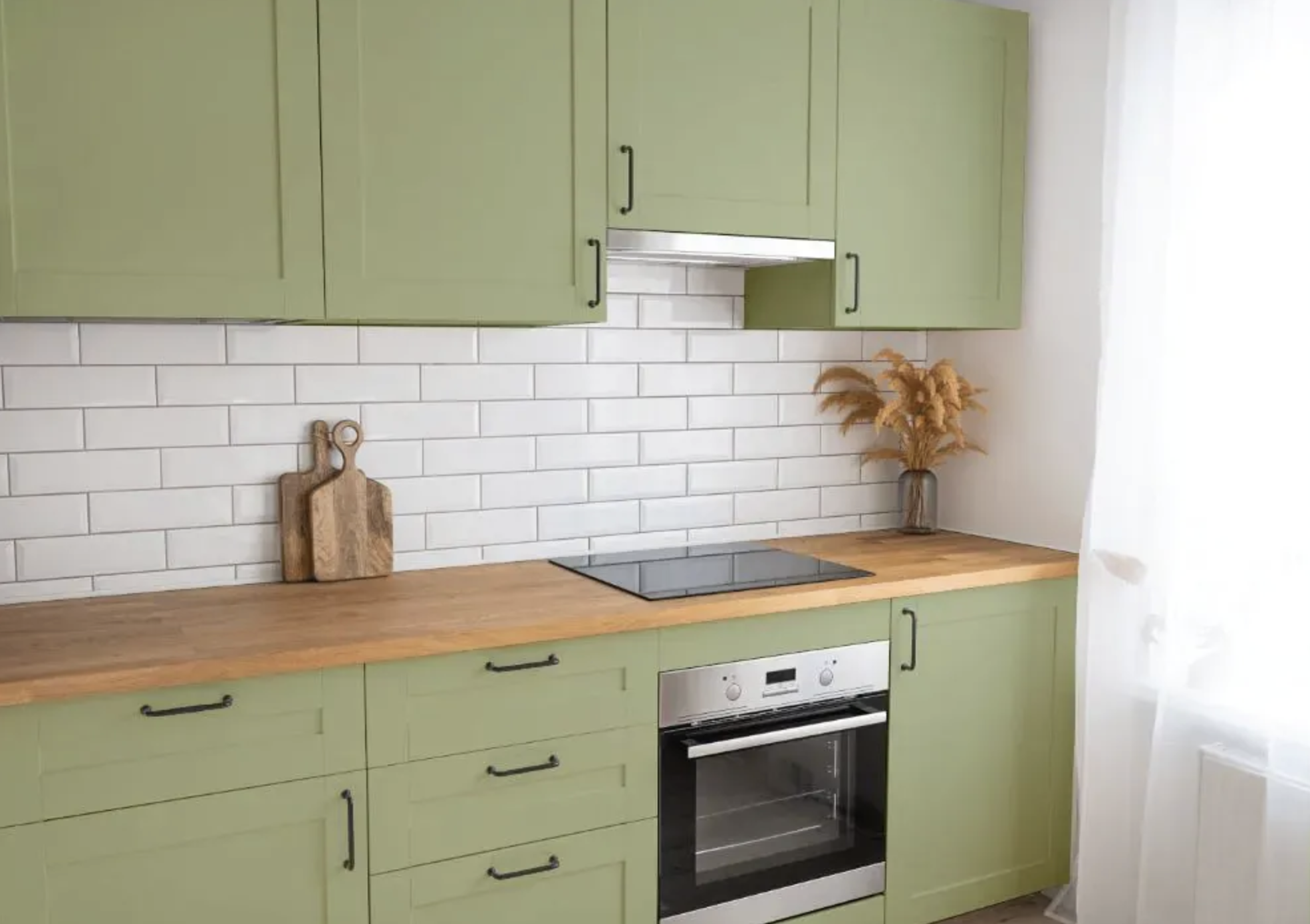
While Benjamin Moore has recently picked a green, October Mist back in 2022, it was more of a stormy pastel gray green. And I have to say, it was one of their most accurate picks ever! But today’s green is totally different. It is an apple green paint color, much more saturated and overtly green. I’m calling Liberty Park as their choice merely due to the undeniable influence of British design trends. Where the instagram famous look of Evergreen Fog (the uber popular Sherwin-Williams 2022 pick) was soft, chalky and grayed, today’s trending green is more Granny Smith than ever before.
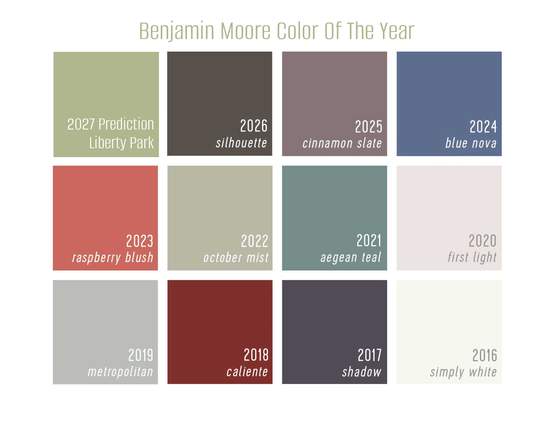
When you look at the above graphic adapted from Young House Love’s annual COTY report, I have added Liberty Park in and it fits with their evolution. In the color world, coming out of the pandemic, we are seeing more saturated playful colors that allow expressiveness while remaining grounded in nature. Liberty Park is the perfect landing place for this theme!
My Prediction For Sherwin-Williams’s Color Of The Year: Red Barn
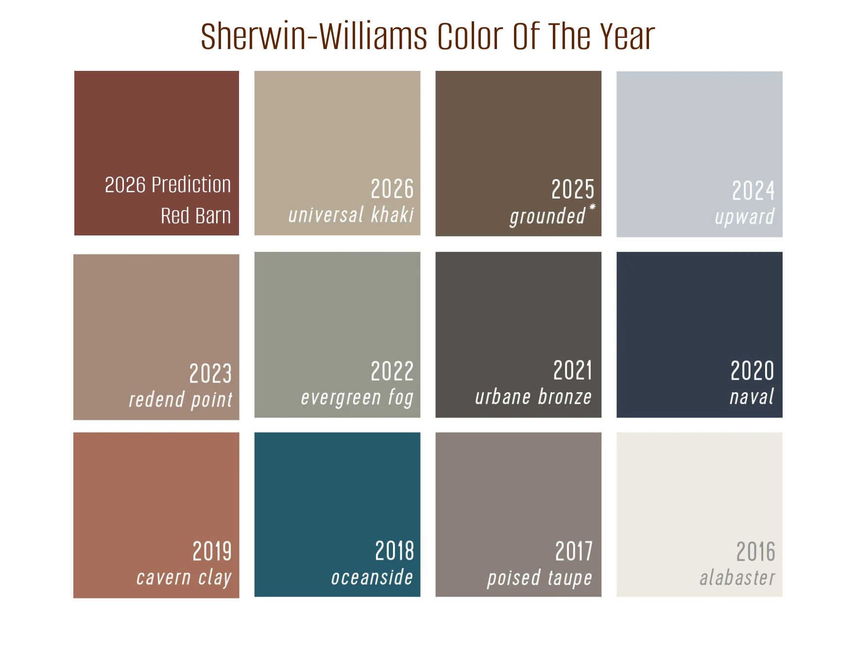
You heard it here first: Sherwin-Williams will likely name Red Barn their color of the year. It is a brown-leaning russet red with slight softness from a little white blended into the formula to keep it from looking too stark or brash.
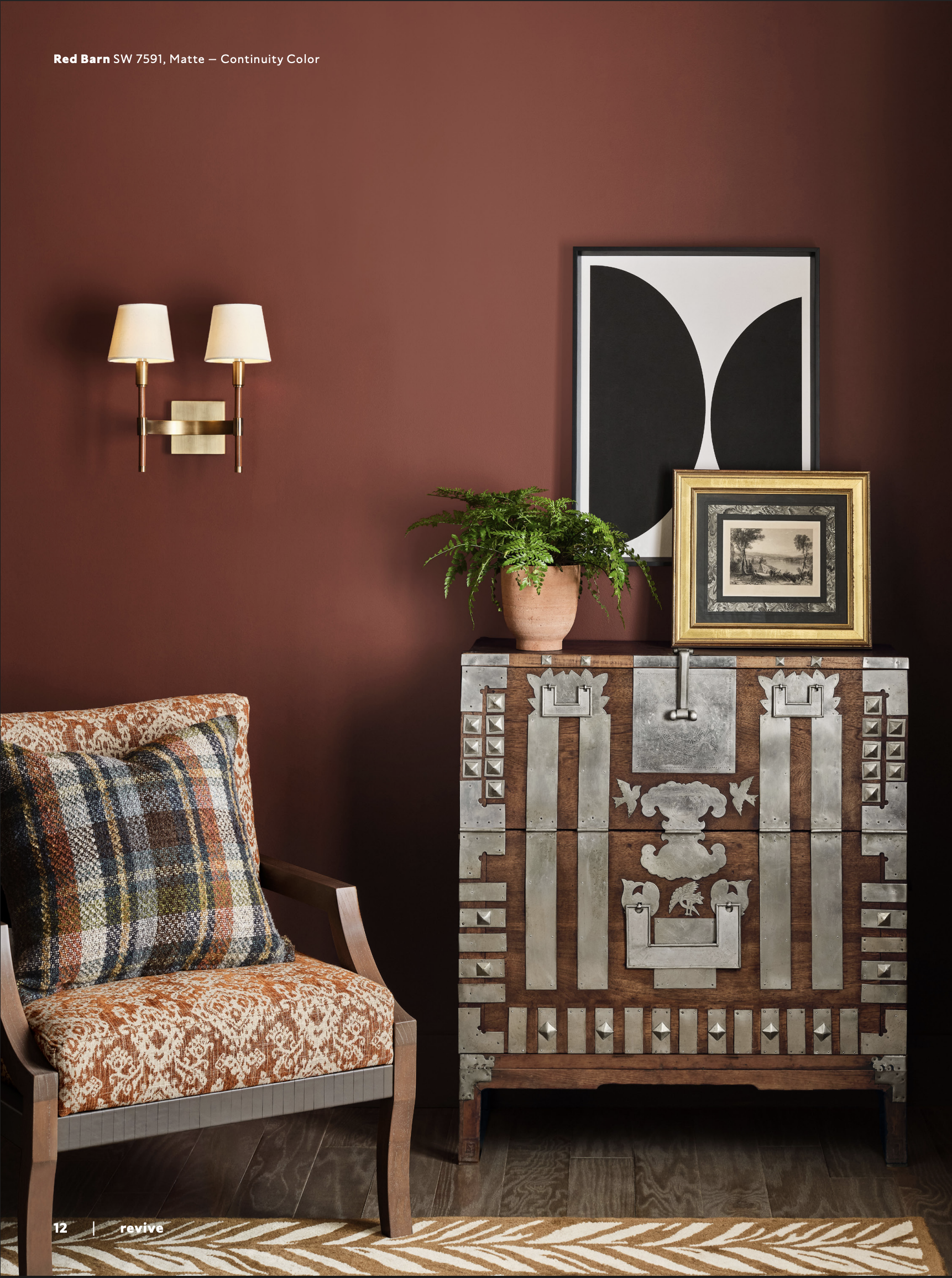
Okay so I may have cheated a little here. Sherwin has already announced the 48 handpicked hues that make up their 2027 palette, but they have not announced their official Color Of The Year for 2027. Last year they picked Universal Khaki out of their previously listed palette, so I am making a somewhat educated guess here.
Disclaimer, if there had been a viable yellow in this new palette, which they are calling Re-Wild, I would have chosen it. IMO, a complex gold-leaning yellow, like Ecru, is a better choice for them for 2027, but alas, they didn’t have any good yellows in the Re-Wild palette. The one gold-leaning yellow in their palette is called Trinket and is laughably childish and totally missed the mark in my opinion.
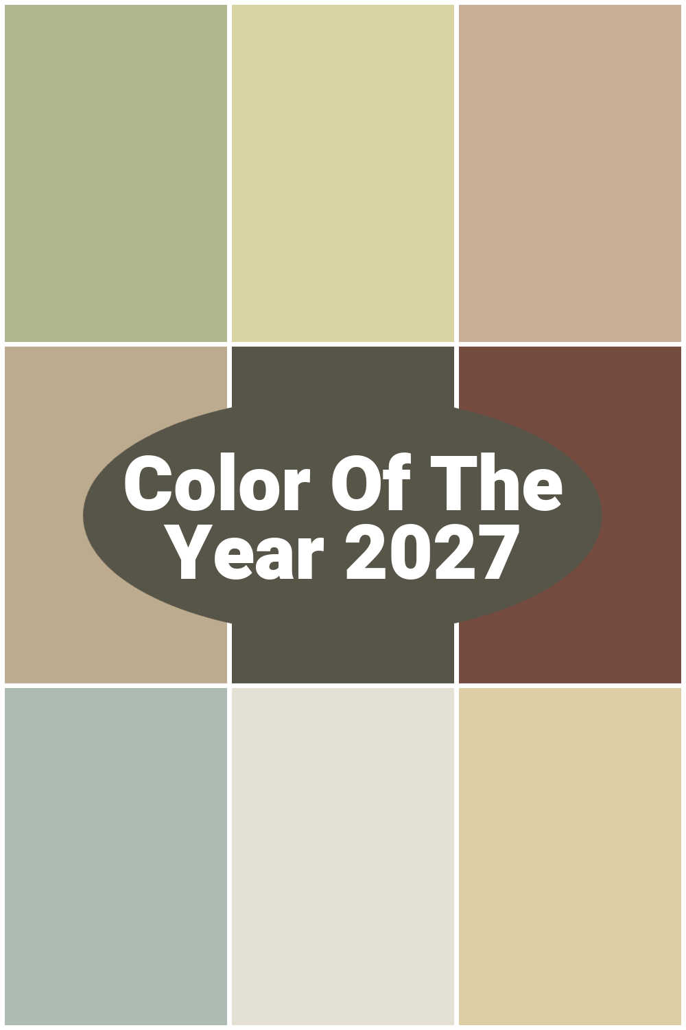
A Season For Home Color Of The Year Palette for 2027
Today, I decided to lay out what my choices would be for the coming year. This is based on what I am seeing in my color consultations. Interestingly, I do color consultations virtually all over the country and I am seeing these trends run coast to coast! First I am going to show you the whole palette together, and then I will tell you which one of them I think is my personal pick for 2027.
If you love this palette, you can sample it by buying large samples at Samplize. (That is an affiliate link, by the way.) Using large samples is a great mess-free way to test paint colors without commitment!
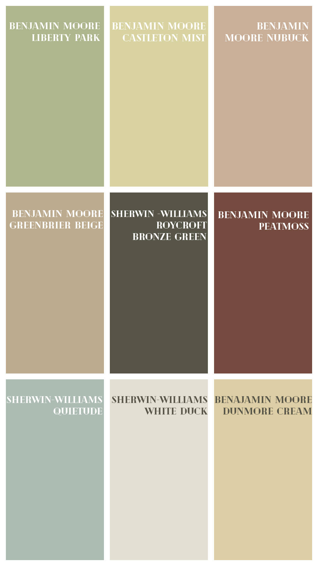
My Color Palette Of The Year 2027
- Benjamin Moore Liberty Park: As I said above, green is evolving. Where gray greens were trending hardcore for the last five or so years, now it is suddenly morphing to a bright apple green for 2027. This color will be everywhere!
- Benjamin Moore Castleton Mist: This color was huge in 2000 and it is coming back. This green-leaning yellow is like a pastel citron or a yellowed celadon and it is going to go off! Okay, I haven’t seen it yet, but I personally think it will be a natural evolution that will take hold mid-way for 2027. It is a great color to add to homes along with the other currently trendy shades. Interestingly, Sherwin picked celery for their Re-Wild collection and its totally within the same color family.
- Benjamin Moore Nubuck: This paint color, also known as Cream Soda has been on my radar for a few months now and peach has been coming on strong for 10 or 11 months, and IMO this coming year is when peach is coming into it’s own. But unlike BM’s Raspberry Blush from 2023 or Peachfuzz from Pantone in 2024, this acts like a new neutral with a bit more personality.
- Benjamin Moore Greenbrier Beige: 2027 is going to lean hard into beige. While 2026 marked a definite swing back to beige for the main neutral in building materials and furnishings, we are going even more old school for 2027 with this time tested hue from BM’s historical deck. See photos of it paired with Navajo White in my home gym.
- Sherwin-Williams Roycroft Bronze Green: This is going to be the new alternative to the all-black house. on exteriors. With a touch of green and brown, it is a great shift away from stark black. For interiors, it is one of those nearly-black hues that will add sublime depth and a creative twist when your space craves contrast. More on why I don’t like black paint and prefer nearly black instead here.
- Benjamin Moore Peatmoss: A slightly more sophisticated version of SW’s Red Barn. This has more chalkiness and brown depth that gives it a universal appeal and will endure a trend cycle.
- Sherwin-Williams Quietude: While this color is not even remotely ground-breaking it is what clients are asking for right now! I’m seeing that home owners are interested in making their spaces more personalized to their taste and want to add more personality. This soft green-leaning aqua is a comfortable, cheerful and serene way for folks to do all of that!
- Sherwin-Williams White Duck: If you have ever tuned into my rants on Instagram Stories you know how much l love this paint color. Anyone who has had a color consultation with me will attest to it. 2027 will be the year we say goodbye to Swiss Coffee, Alabaster and White Dove and people will finally get the memo- whites do not have to be stark! White duck is a beautiful soft off-white that is grayed out enough that when paired with low-chroma colors, it can make a whole room feel like it took a chill pill.
- Dunmore Cream: The only reason I didn’t pick Dunmore Cream for my COTY is that I predicted this the last two years and now that it is totally on trend, especially for yellow kitchen cabinets, I had to move on to other soap boxes to stand on. Read on to find out which one I am on for 2027!
A Season For Home Color Of The Year 2027
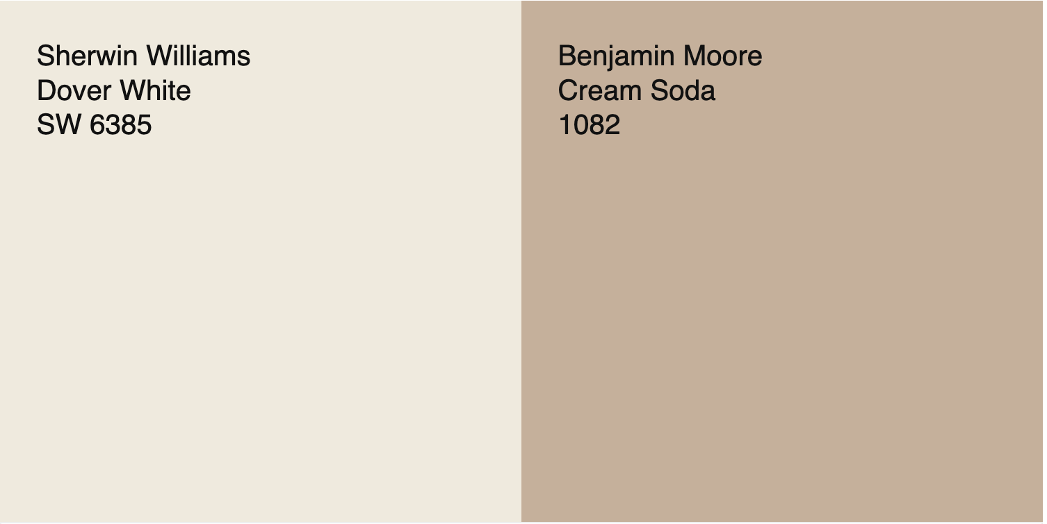
This year I am crowning Nubuck by Benjamin Moore my Color Of The Year. This color, also known as Cream Soda, is a truly sublime shade of peachy beige.
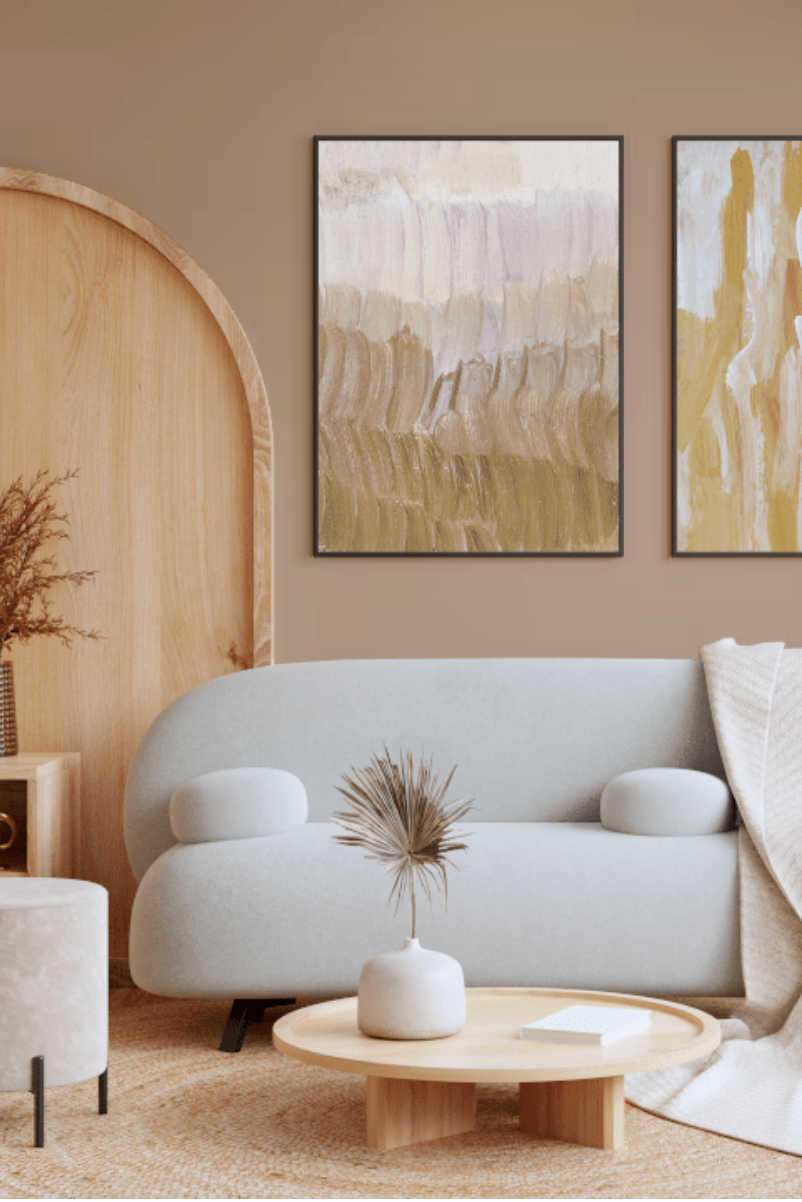
It is neutral enough that when paired with a warm white like Dover White or Creamy from Sherwin Williams it reads like an earthy brownish tan.
Why I picked this color:
I picked Benjamin Moore’s Cream Soda, aka Nubuck, for many reasons. Not only does it work as a warm neutral, the current favored family of neutrals, but it also has a bit of personality. At the current moment, homeowners are adding colored walls back to their homes and adding their distinct style to interiors. It also has a soft chalky feel to it (texturally nappy and velvety as the name implies) that is on trend for what people are wanting in their homes today.
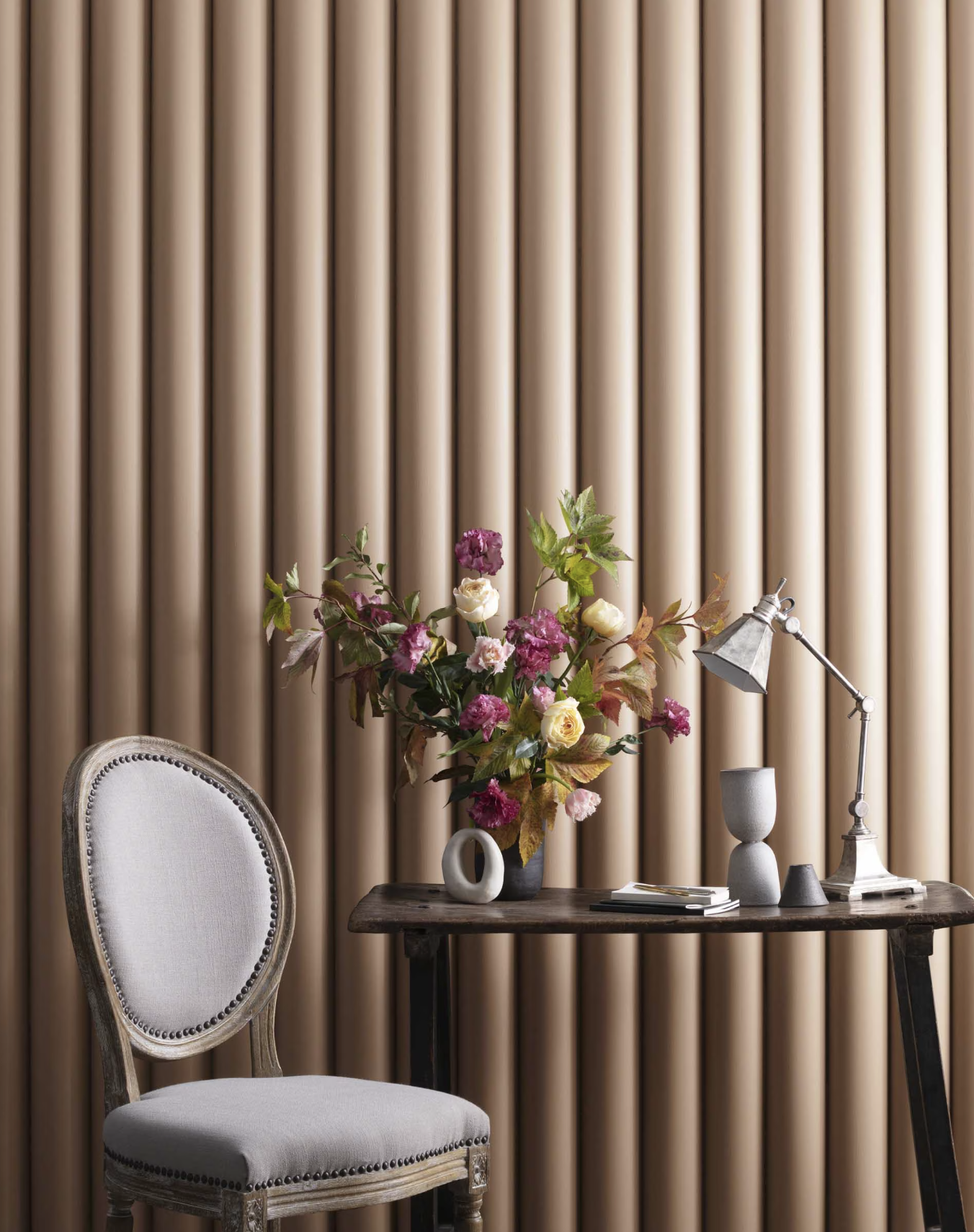
- Warm Neutral: Nubuck has a split personality. While it is somewhere between a pink beige and a peach paint color, it also acts like a neutral. Even though it is not a traditional neutral like white, gray or beige, it can feel neutral and like it is of the earth. This is true more so than a true peach paint color because it is lacking saturation and is much more low chroma (aka dirty) than bright peach colors like Pantone’s Peach Fuzz in 2024.
- Livable Personality: Color trend forcasters are talking about the fact that we are going more bold with our interiors and unleashing our personal preferences. While white, white and white were trending in 2020 to 2023, now my clients are asking for space refreshes and not afraid to take risks. The key is to do so without making a space feel tiresome. Nubuck is a great example of a paint color that has enough boldness to satisfy that desire for personal expression, without being over the top.
What do you think? Weigh in below and let me know what you agree with and what you don’t. I love talking all things colors with my fellow color nerds. And if you are interested in working one on one with me, reach out via my contact form. And if you are curious about my decorating services and paint color consultations, read more here!