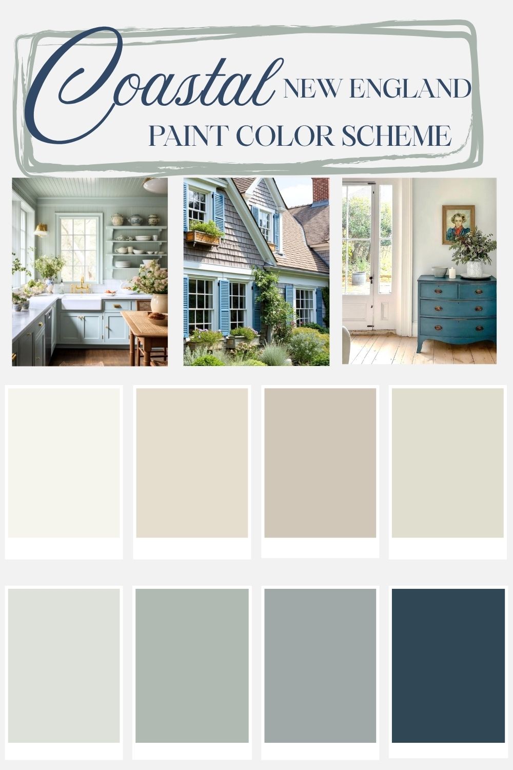
Coastal Color Palette For A New England Style Home
Friends, I’ve found the solution to getting through “stick season” in New England: It’s spending any free moment dreaming of summer vacations spent seaside. If you’ve been wondering where I’ve been lately, I’ve been power-scrolling through vacation listings along the coast of Cape Cod, and I may or may not be on my second novel set on the island of Nantucket.
While the rest of the country calls the season we are in “spring,” here we call it “stick season.” March and April are an achingly long season of high winds with sideways rains, interspersed with snow and lots of mud. All the while, we wait for May flowers, warmer weather and time spent enjoying lobster rolls and watching the seals swim along the shoreline.
You dear reader, are about to benefit from my newfound mental escape: I bring you the prettiest New England Coastal Color Palette. So, if you are looking for a getaway or are looking for a coastal color palette, pull up a chair! I have tons of photo inspiration and actual paint colors for you to get started!
How Are New England Coastal Colors Different Than Other Regions?
In a word: saturation! While bright turquoise and cheerful aquas are right at home on the sunny shores of Florida, here in New England, our coastal palette is more muted and rooted in historical pigments. Our whites are also less crisp and bright. They are softer, less like starched poplin, and more like sun-faded linen. Our navy is classic and true- without the modern influence of teal, and our earthy neutrals range from enigmatic to creamy and complex.
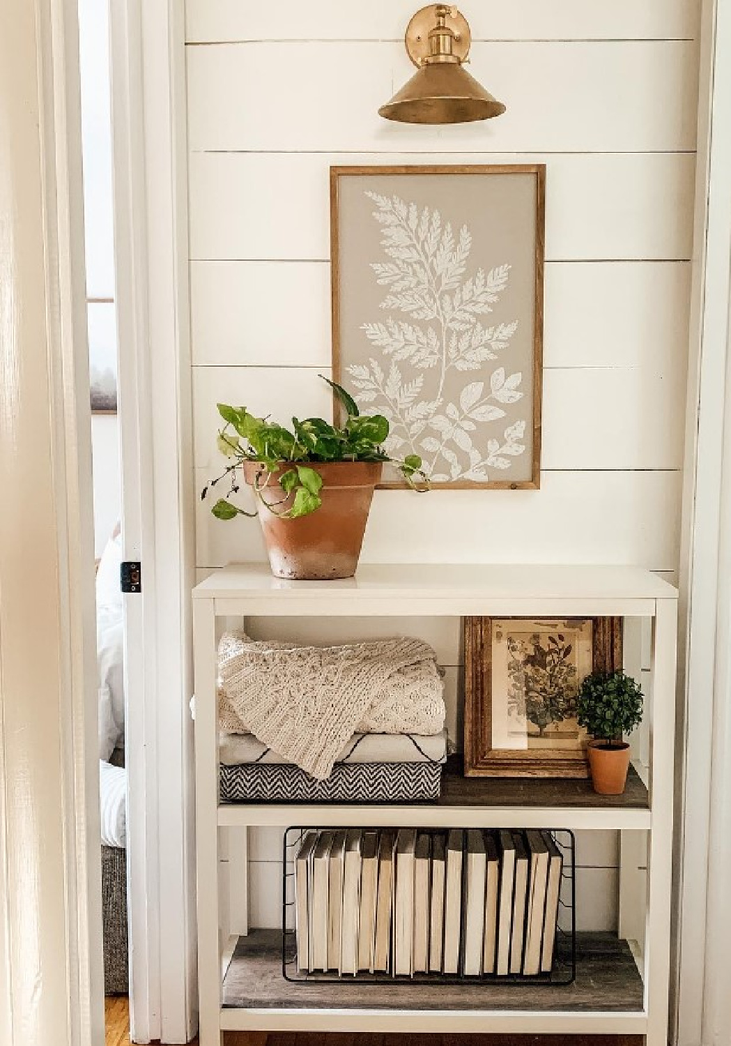
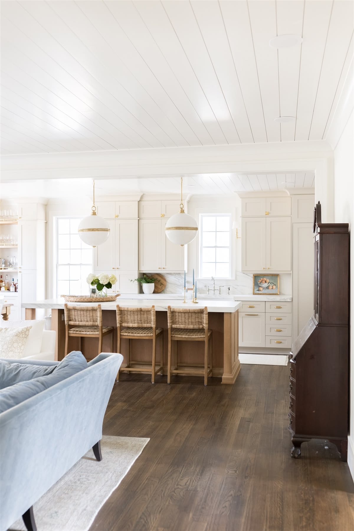
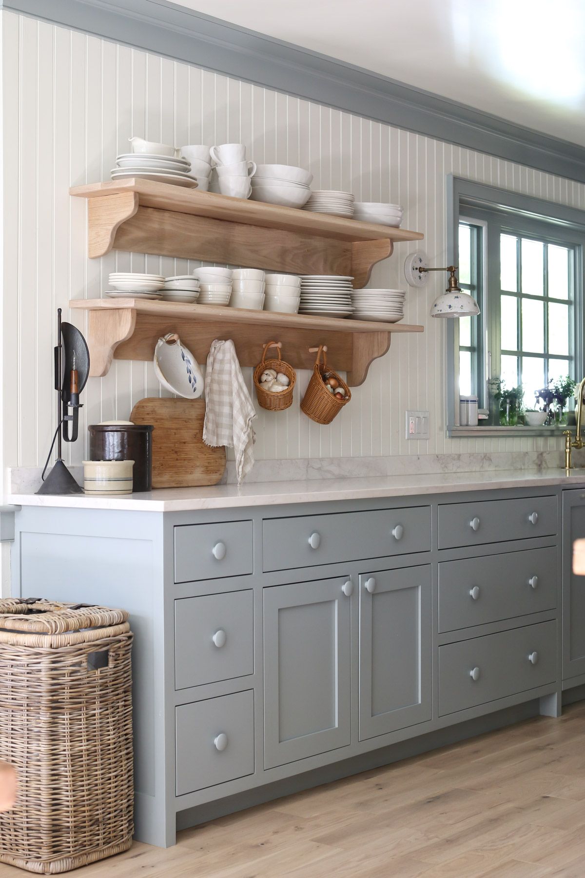
New England Beach House Color Scheme
Our palette includes a range of soft neutrals and greens as well as the requisite blues.
- Simply White: Creamy and bright- this classic white creates plenty of contrast for a classic beach house vibe.
- Sail Cloth: A go-to wall color wherever you need a neutral.
- Accessible Beige: A soft taupe that goes just about anywhere. It can be used on walls or cabinetry and looks stunning with blues and greens.
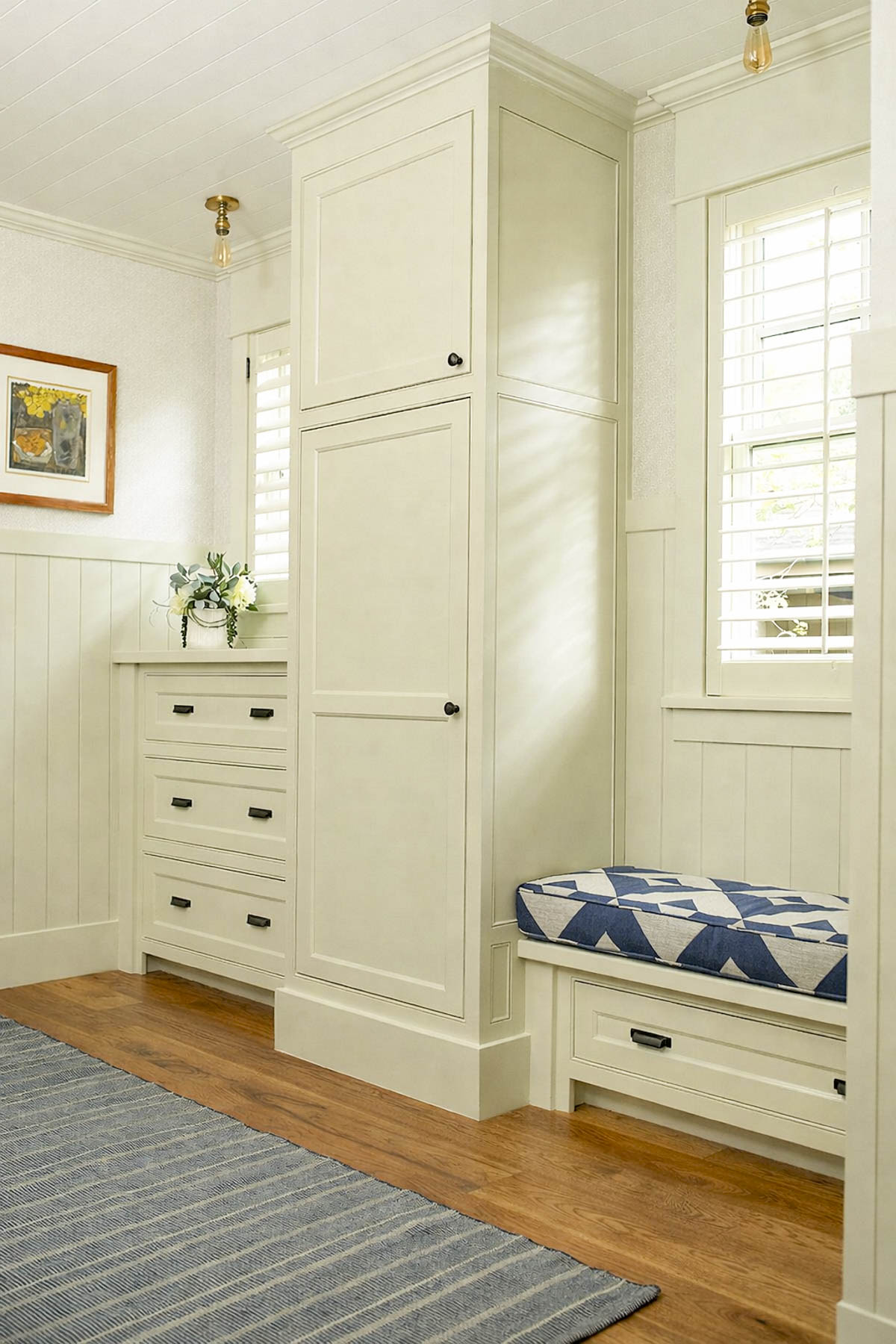
- November Rain: A cross between green and beige- this color is great for bedrooms and transitional spaces.
- Pearl Gray: A super pretty and bright green with hints of blue and gray.
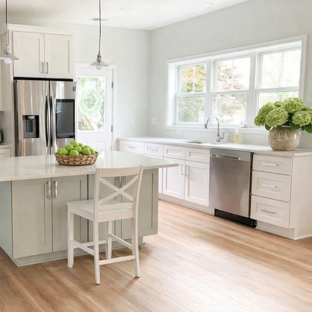
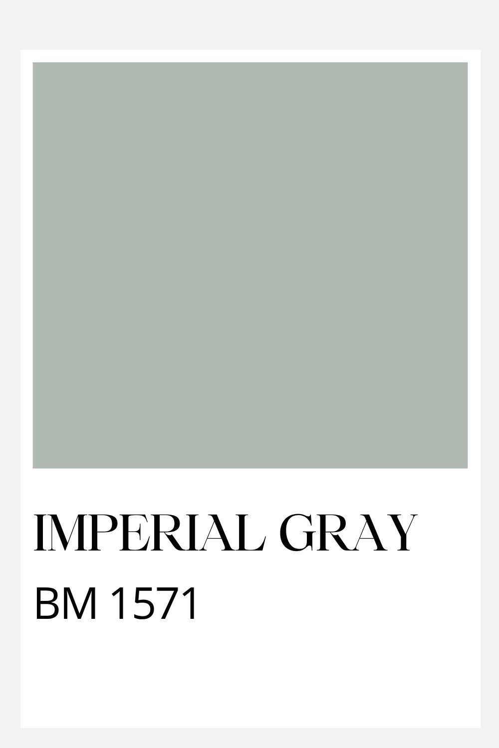
- Imperial Gray: One of my favorite paint colors for any home in New England- but especially appropriate for those along the coastline.
- Adagio: Our go-to coastal blue for that beach house look. It doesn’t lean too green or too purple- and lacks any overt intensity which would make it feel out of place.
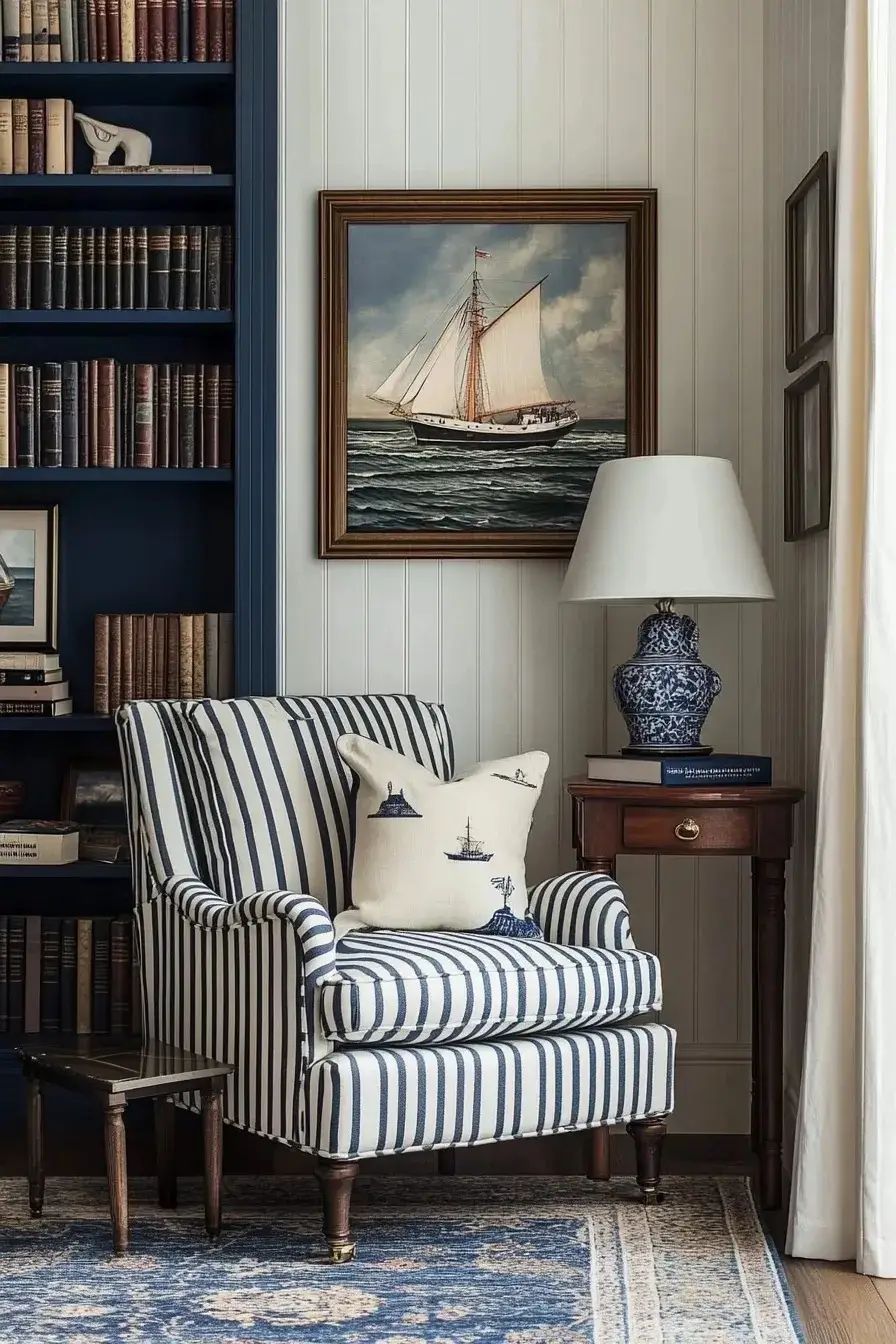
- Washington Blue: No beach house would be complete without Navy! This classic shade is de rigueur!
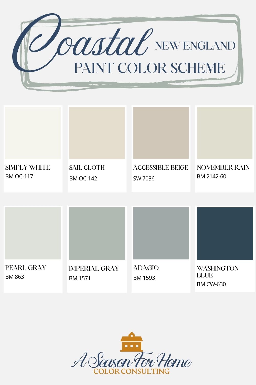
Benjamin Moore Simply White: OC-117
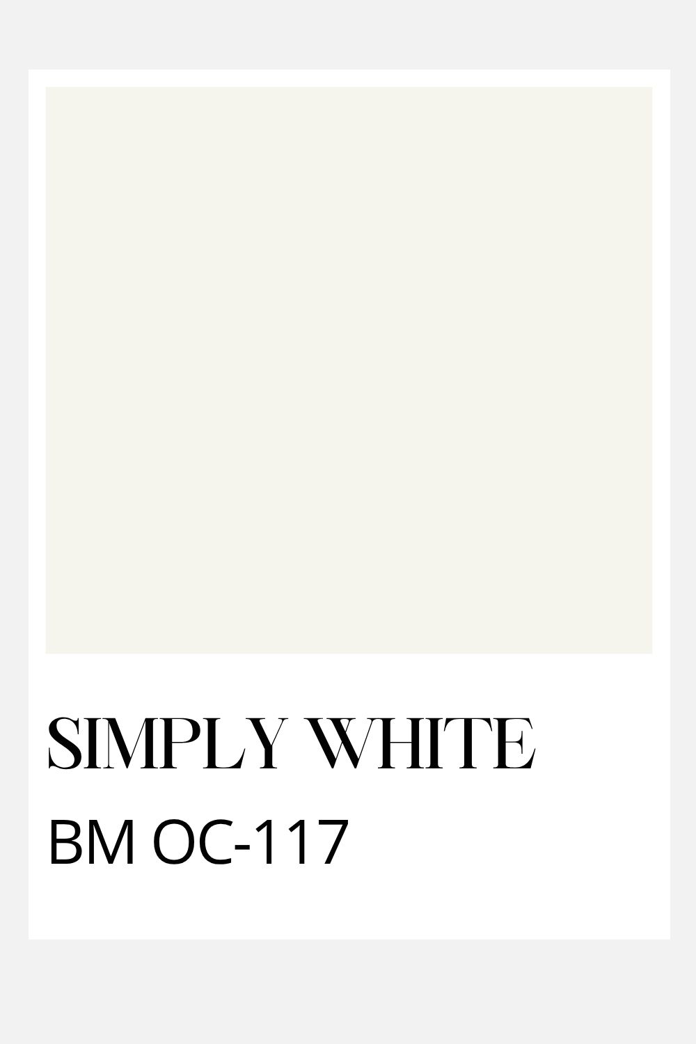
This popular bright off-white paint is creamy and soft when compared to more stark white paints (like Chantilly Lace.) It has an LRV of 89, which means you will get classic beach house contrast for your trim and ceiling but it has enough warmth that it feels softer and relaxed: just right for a coastal home in the northeast.
Use this paint color for walls, trim, ceiling and cabinetry. Keep in mind that the all-white look is best when a room is bright to begin with.
Benjamin Moore Sail Cloth: OC-142
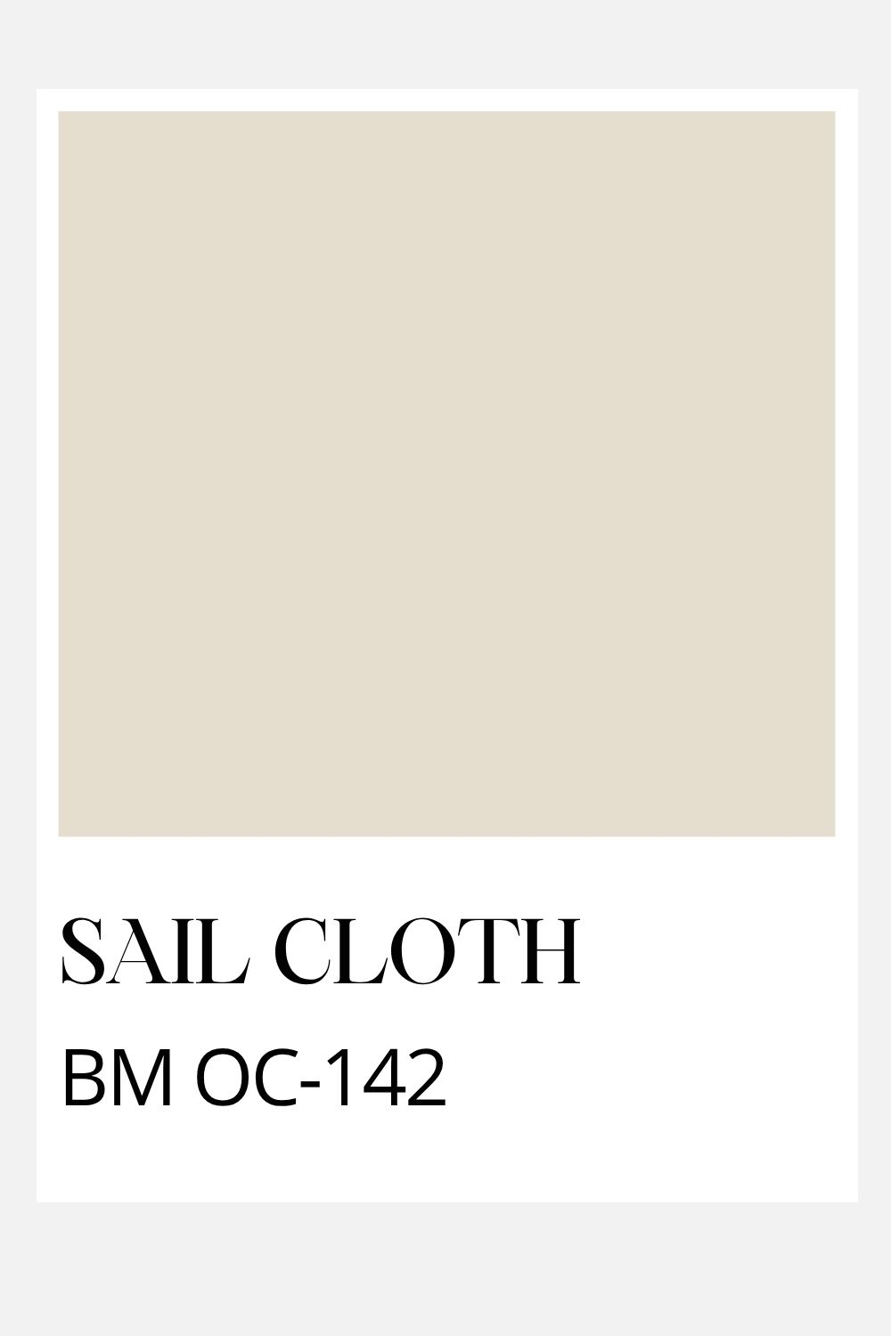
This super-soft khaki beige is the go-to neutral for this beach house color scheme. With an LRV of 71, it can be used as a wall color or for trim. It would work on cabinetry as well.
In brighter spaces, it will feel warm, soft and barely there, and in darker spaces, the yellowish feel may be more pronounced.
Sherwin-Williams Accessible Beige: SW 7036
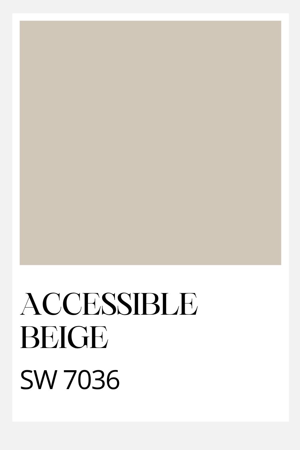
For a cooler, mid-toned neutral I pulled in a favorite paint color from Sherwin-Williams: Accessible Beige. While it has a deeper value and LRV of 58, Accessible Beige can come in handy for built-ins or cabinetry, and works as a wall color as well. It is super pretty with navy and white too.
If you are painting your kitchen cabinets, you could use Accessible Beige, paired with white walls and navy accents for a timeless coastal look that will withstand the latest trend cycle.
Benjamin Moore November Rain: OC-50
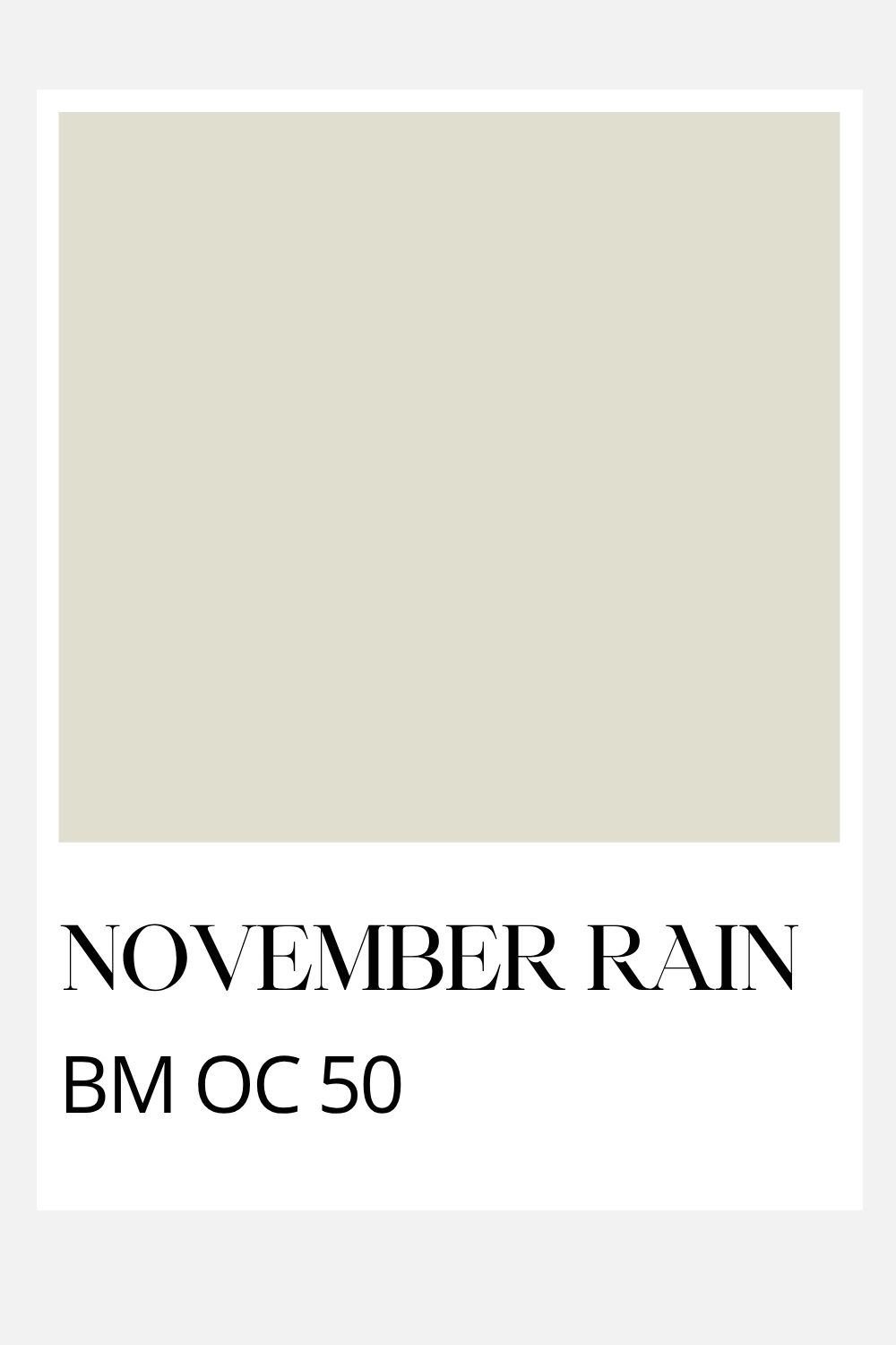
This light neutral paint color has a green personality you may miss at first when looking at the paint chip. But don’t let that fool you. Once you paint a whole room with it, you’ll love the fact that it has a soft green undertone. In other words, it is not your basic builder beige!
I love it with creamy white, jute, sisal, linen and natural fibers. It is also pretty with aqua-gray and navy. It’s a no-brainer for our coastal palette!
Benjamin Moore Pearl Gray: 863
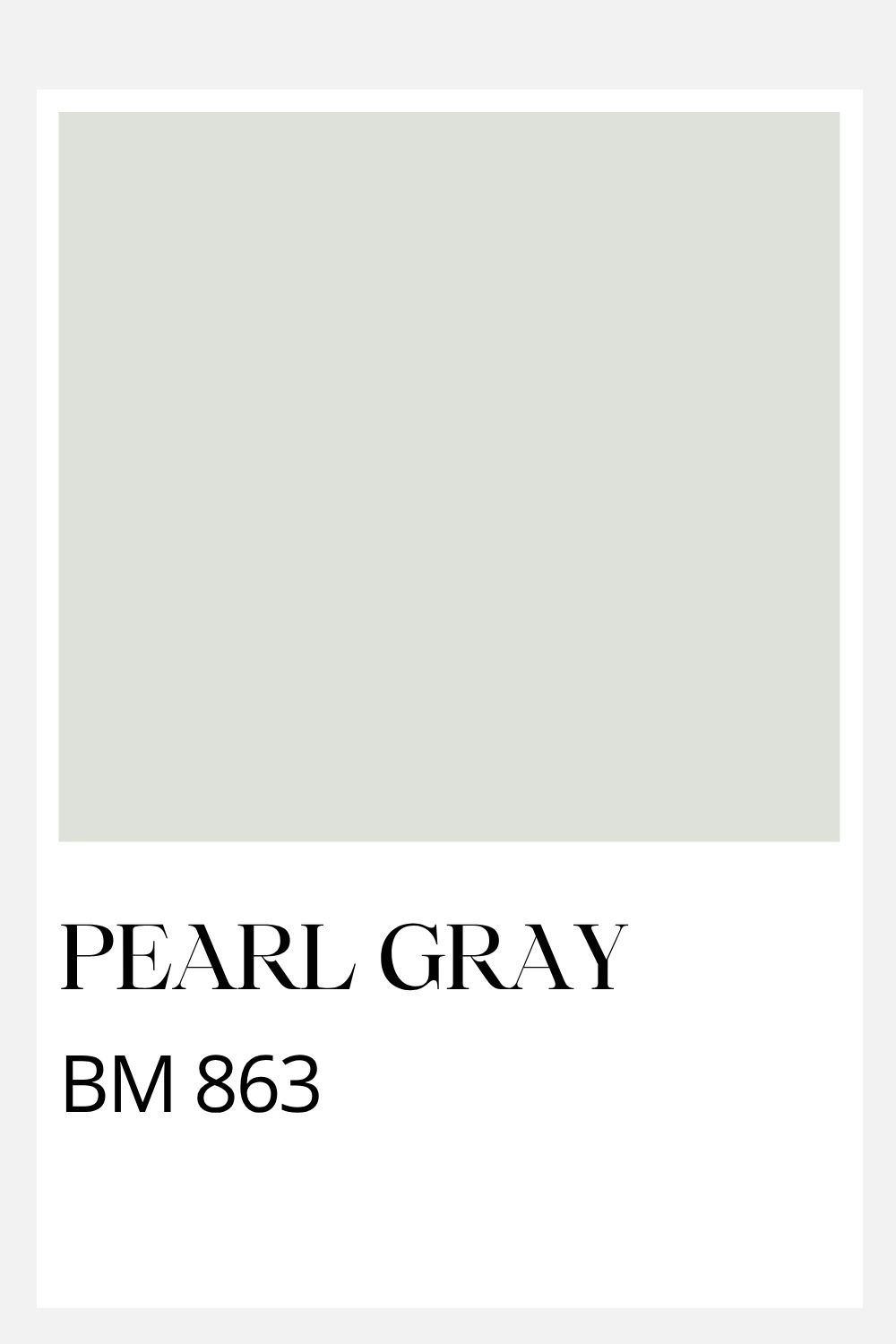
In darker spaces, you may need a paint color with a light LRV- but with a bit of pigment beyond your basic neutrals. Enter Pearl Gray.
This clean and fresh seafoam color has an LRV of 73, which gives it enough brightness for darker spaces. But it also has enough gray to make it feel appropriate in a New England coastal home. This is key! I like this paint color for bedrooms on the north side of a home (or those without a lot of natural light) and in transitional spaces like hallways.
Benjamin Moore Imperial Gray 1571
While splashy turquoise and tropical blue-greens work well in areas with cerulian colored ocean, here in New England, our waters are steely gray- and that means for our interiors the tones are equally understated.
When working with this palette, use Imperial Gray as a paint color, but also take the paint chip to pick out your furnishings too. While on its own, it appears gray- it actually has plenty of aqua in it to make it feel like it belongs in a serene beach house color scheme.
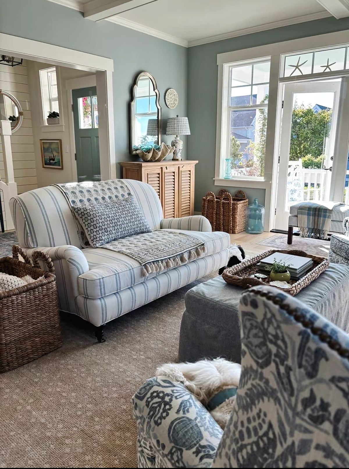
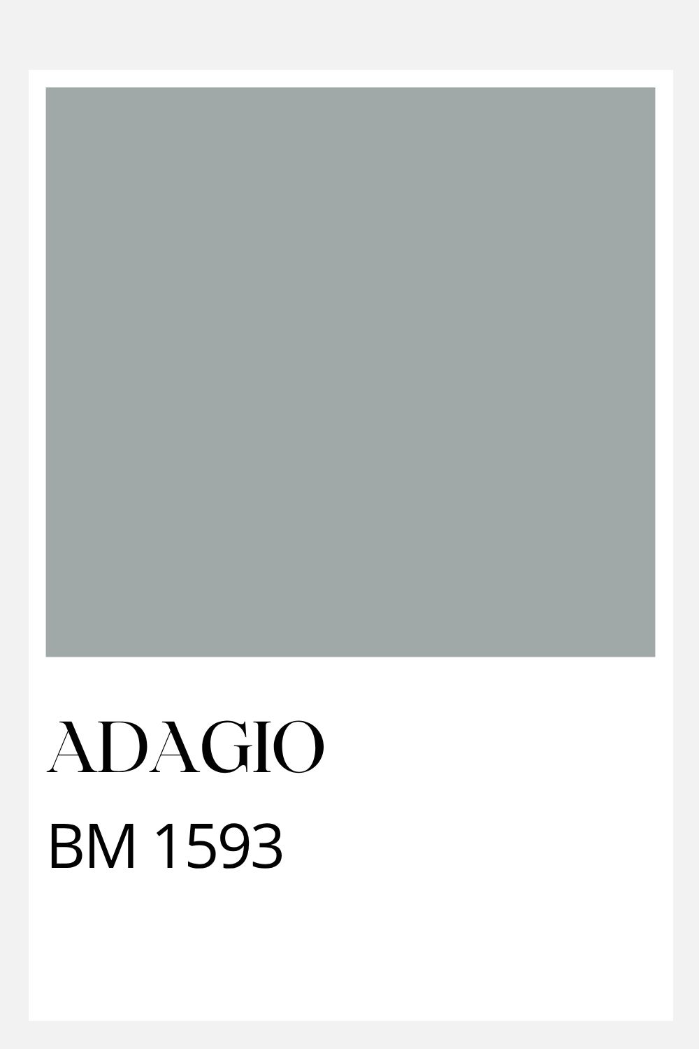
Benjamin Moore Adagio 1593
This blue-in-disguise looks gray on the chip, but blue when painted in a space. This blue gray paint color is classic and historic looking, but can effortlessly blend into a beachy look when paired with Simply White, Sail Cloth, Accessible Beige and November Rain. It also looks super-sharp with navy and natural woven fibers often found in beach houses.
I love the fact that it doesn’t lean too green or too purple- but sits firmly in the middle of the blue spectrum- all while keeping it’s New England chroma levels appropriateely low. {Not sure what chroma is? Read our primer on clean colors vs dirty colors to learn more.}
Benjamin Moore Washington Blue CW-630
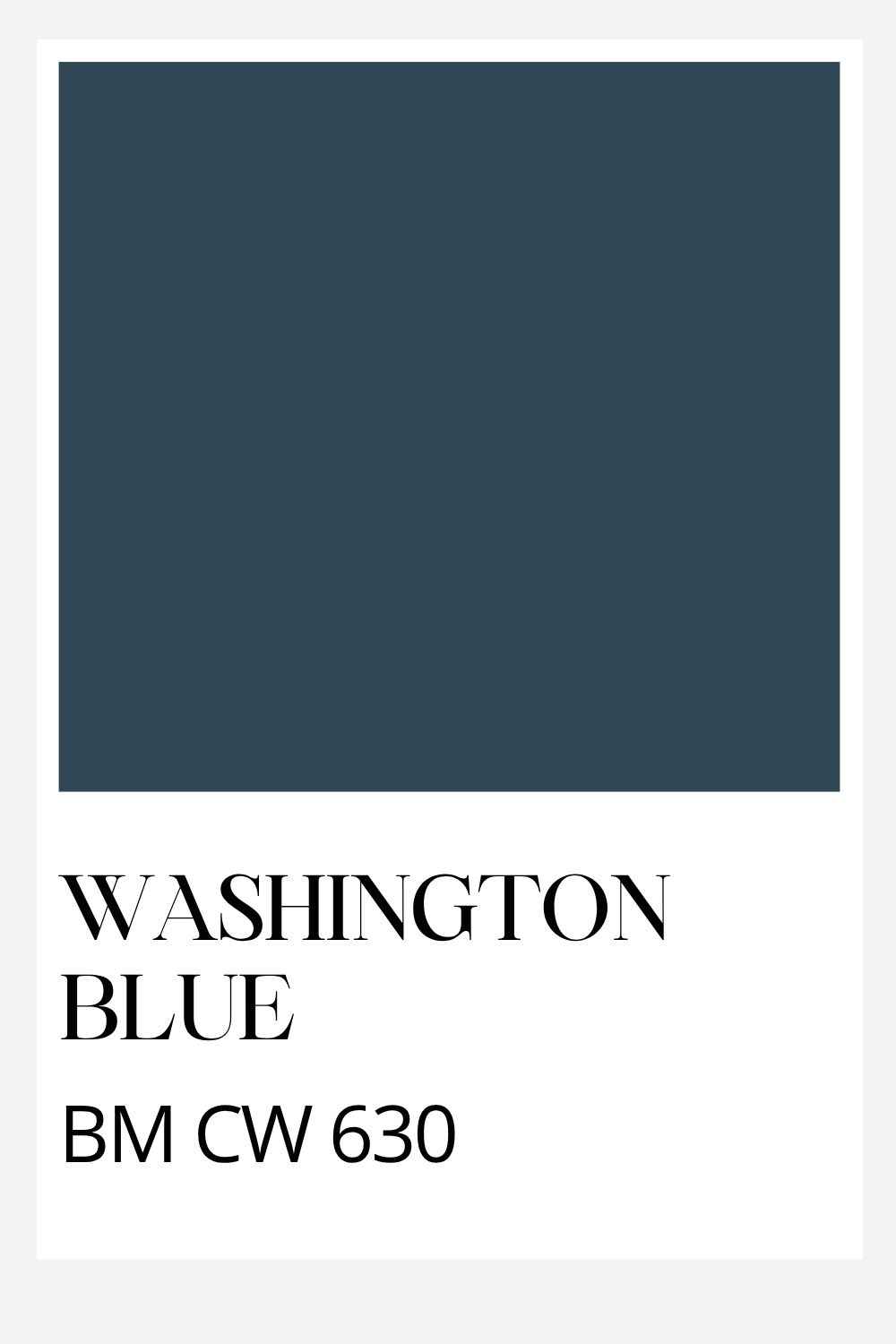
This navy paint color is key to any beach scheme. It is a pure navy without leanings toward violet or teal. It would be a great kitchen cabinet or island color or to paint bookshelves or bedside tables.
Use the paint chip to find navy furnishings and accents, and try not to mix in purple-based navys by mistake. They’ll look off!
Color Pairing Ideas
Use this color palette to inspire your paint colors and furnishings. Here are a few tips to make this beach house color scheme work for your home.
- Make sure to repeat the colors through the entire home to help it feel cohesive.
- Feel free to branch out beyond these colors to make it your own, keeping the chroma level consistent. Rusty coral colors would look lovely with this, as would soft chartruse.
- Test the paint colors in your space before committing to painting the entire room. The lighting in your space will affect the way these colors read.
Need help choosing the right color?
If you’re feeling stuck or want a second set of eyes, I offer Virtual Color Consultations to help you make confident, intentional choices for your home, wherever you’re located.