

Best Minimalist Neutral Paint Colors


If you love the way a calm, neutral interior looks, without a lot of busy colors and distractions, this post is for you! Today I am reviewing the top neutral paint colors for minimalist interiors. This paint color round up includes the best subtle greige and taupe paint colors. These all are warm, without feeling yellow, and range from nearly white to rich and a little moody.
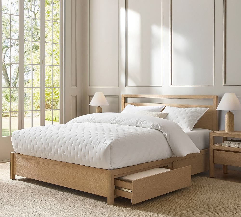
At the beginning of all of my color consultations, I ask my clients to rate how comfortable they are with using color in their homes. On a scale of ten, I ask them to rate themselves, with one being only using white and off white and ten being like the bold use of colors and liking vibrant hues.
Today’s paint color round-up is for people who would answer one, two or three on that questionnaire!
So, if you want to find a barely-there neutral, and the idea of yellow walls makes you cringe, read on! Today’s blog post is all about the best neutral wall color for minimalists and people who don’t like a lot of color. Spoiler Alert: 90% of the time, the answer isn’t white. I’ll go over how not to end up with yellow walls by mistake. Plus you’ll learn which neutral is right for your furnishings. I’ll also share my six best paints for people who don’t like color on their walls.
What is an Accented Neutral Interior Decorating Scheme?
The Best Warm Neutral Paint Color For Minimalists
Here’s my list of the best warm neutral paint colors for minimalists. For this list I only selected paint colors with the following criteria:
- Warmth with no yellowness
- Light LRV (I picked colors ranging from 71 to 52 to give you some options)
- Low saturation and low chroma

Smokey Taupe by Benjamin Moore:
(LRV 54)This is probably the best true neutral I’ve used from Benjamin Moore and falls toward the darker end of my collection. In certain light, it has a touch of pink to it, but nothing like Muslin. Read all about it in my Smokey Taupe review.
Minimalist by Sherwin-Williams:
(LRV 52)This is a gorgeous paint color with more warmth than Slumber Sloth. Ironically, even though the name fits, it is the most saturated pick in this collection. It comes from the Sherwin-Williams designer series and plays well with greens and blues as well as earthy reds and browns.
Accessible Beige by Sherwin-Williams:
(LRV 58)There’s a reason this is the most popular paint color from the world’s largest paint manufacturer. It just works. It goes with everything and is so not offensive in any way shape or form. If you want your walls to be a blank canvas, this is your color!
Slumber Sloth by Sherwin-Williams:
(LRV 56) This color leans gray and is almost completely unsaturated while maintaining minimal warmth. This is a good option if your home has a lot of gray fixed elements and you are trying to gently warm the space up.
Wind’s Breath by Benjamin Moore:
(LRV 69.6)If you want a nearly white option, here’s your best choice. It’s the color to go with if you want a barely there neutral. To my eye this paint reads gray when I see in on the walls so make sure to brush it out before committing. It may not be warm enough for you!
Ballet White by Benjamin Moore:
(LRV 71.97.) If you are afraid to commit to a color on your wall, Ballet White is to the rescue. It is similar to Wind’s Breath but a little less gray and ever so slightly saturated. However, Wind’s Breath and Ballet White are very light in value so if you want a paint color that you’ll barely notice, Ballet White is definitely one to consider.
Buy Large Samples of this collection of Neutrals For Minimalists. (This is an afflilate link which means I will earn a small commission from your purchase at no additional cost to you! Thank you for supporting my small business!)
How To Know Which Neutral Is Right For You
Here is your step-by-step process to pick your winning minimalist paint color.
- Start with a few large sample of the colors you are deciding on. Then head to your local paint store and pick up a couple of small cans of your top choices.
- Prep your surfaces.
- Brush out the samples covering a large area (one foot square or larger.) When I brush out I try to find a place where I can isolate the wall color between two sections of trim. This way I can completely cover the color underneath and see what the new color will look like.
- Don’t forget to do two coats. This makes a difference!
- Let the paint dry. Drydown will affect the final color. Paint can lighten or darken as it drys, depending on its unique recipe so don’t judge it until it is completely dry.
- Look at your brushouts at several times of day in all different lights.
Common Mistakes To Avoid When Picking Paint Colors For Minimalist Interiors
Avoiding Sneaky Yellow Undertones
The majority of my color consulting clients who fall into the Minimalist category want to avoid yellow. And it is easy to be fooled by yellow paint masquerading as a neutral. This is a mistake I see out in the wild all the time.

A classic example of a yellow paint that someone could choose by mistake is “Timid White.” While you may indeed feel timid about picking a wall color, I assure you this is not the right color for you unless you like yellow.
So how do you avoid yellow undertones? If you are not sure if the neutral paint color you are considering is yellow, make sure to compare it to a pure white like Benjamin Moore Chantilly Lace and a true neutral gray like Sherwin-Williams Repose Gray. You can do this on Plan Home or use paint chips. Just make sure to use natural daylight when analyzing paint colors.
Why White Is Not Always A Safe Choice
White is not necessarily a foolproof choice. White walls can be gorgeous in a well-lit house with big windows and tons of natural light. So if you have a brightly lit room and you want white walls, you have a green light from me!
However, if you do not have a lot of light, hold up! One of the most shocking things I learned in my training for becoming a certified color expert is that white paint is not a cure-all for a dark room. In my training, I learned that white walls in a dark space can make a room look sad and draw attention to the fact that it has bad lighting.
Take a look at how bad the white paint looks in my dining room which has almost no natural light. It looks so dingy!
Another consideration is white walls work best when a room is decorated with a lot of white fabrics, textiles and furnishings. If you have colored fabric on your furniture, pure white walls will look blank. It is key to repeat white throughout the space in multiple places and surfaces to make it feel cohesive.
So what is a minimalist to do if they do not have a ton of beautiful light or white furniture? Keep reading.
PRO TIP: You need to have plenty of natural light and white furnishings to pull off white walls.

If you want to find a warm white, check out my Warm White Paint Sample collection at Samplize (affiliate link.)
If you still need help, I am available for in person color consultations in Vermont and I also offer virtual paint color consultations for clients online. Sign up today!